Some Props
Texturing has always been a bit of a brick wall for me. I've let too many of my projects, big and small, just sort of die because I got frustrated with textures that didn't seem to be doing what I thought they should be doing.
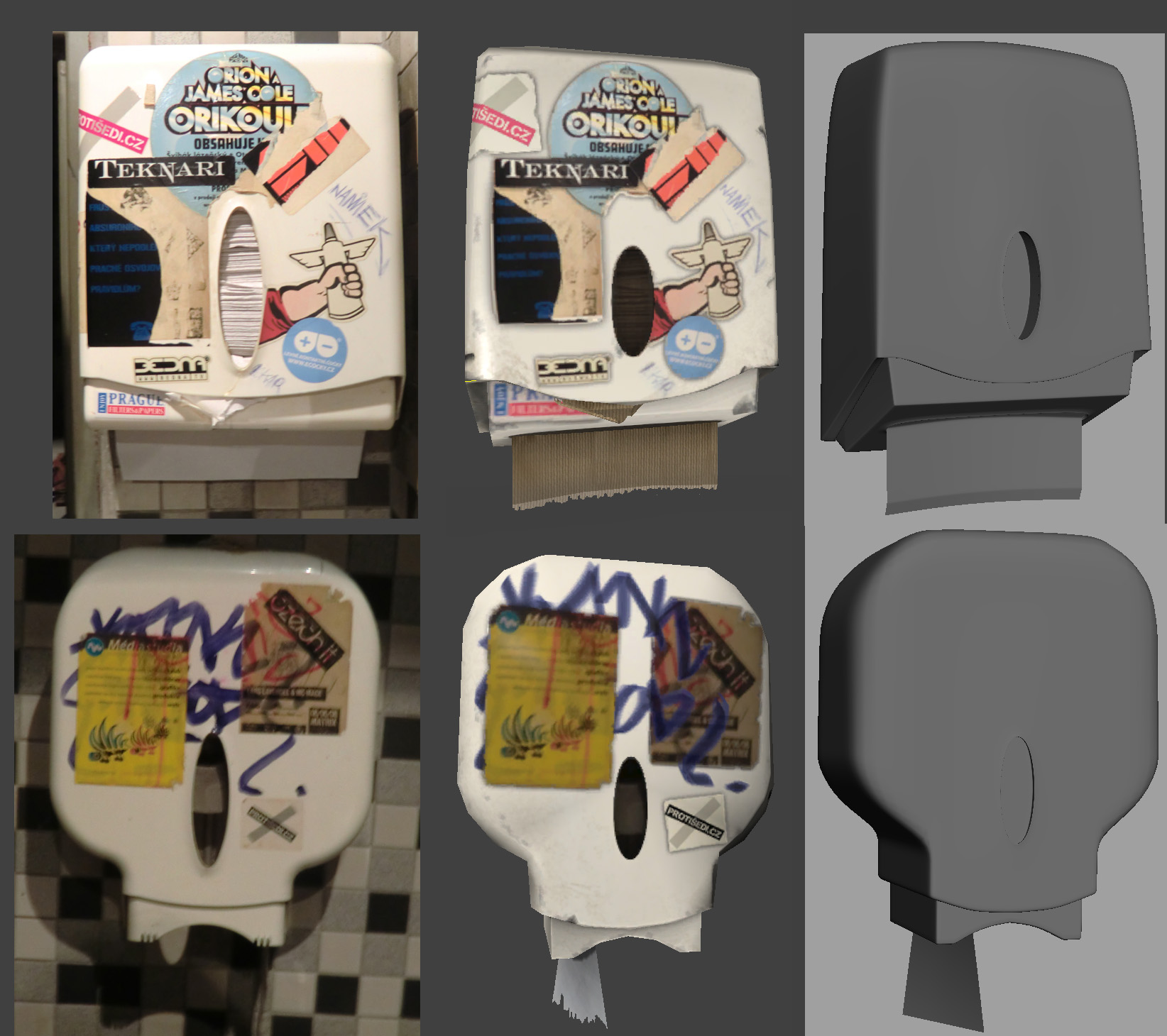
So, after a couple months of being depressed on not doing anything, I decided to finally take heed of the kernel of good advice buried deep beneath layers of non-specific abrasive insults that some anonymous commenter on my blog apparently thought constituted 'good critique' and go back to square one, a simple prop (or two, in this case, because I couldn't really put either one of them into a square UV layout without a lot of wasted space, and they're similar enough that sharing UV's seems like a reasonable choice) that I'm going to make look as good as I possibly can without calling some half-assed textures 'good enough'.
The subjects, taken from an awesome, dark, dingy bar in Prague with a bathroom full of graffiti:
But I'm starting to run out of steam/get to that point where I know stuff still isn't right but need a fresh set of eyes to help figure out what is still off (or, more accurately, augment my to-do list).
Replies
Depending on the type of company you're hoping to work for, you don't actually have to be a good texture artist in order to be hired as an environment artist. If you want to work for a AAA developer, then often times the design process is broken into several categories in order to speed up the pipeline as well as maintain consistency throughout the project. Often times you'll find that there's a dedicated environment artist (or several) and a texture artist, and a lighting artist and a level designer and a layout artist etc. etc.
If this is the type of company you're aiming to work for, then I would put more focus into making sure that your models look gorgeous, your unwraps maximize space and you know how to properly bake normals from your geometry (which you look like you do).
If however you're looking to work for an indie company, then you probably need to learn how to texture well as well. Doesn't look like there's anything wrong with your textures to me. I think you simply suffer from typical Artist's syndrome meaning that you hate your own work cause you're the one who made it :P I've yet to meet an artist who doesn't constantly say that their work is crap. I think its what keeps us improving.
With that said, I think you should work on the textures and to create a texture from scratch. As opposed to taking a picture of the object and then putting the UV onto it. Plenty of free base textures can be had at cgtextures.com and slowly learn how to recreate the materials seen in the objects. For example, in this case, white shiny plastic with stickers on it.
Damn, I used to have a bunch of texturing tutorials but I don't have any links anymore. The only one is to the Eat 3D texturing DVD which costs money http://eat3d.com/texturing
You can also try browsing the wiki http://wiki.polycount.com/TexturingTutorials
Even when working with photo textures, one simple step is to replace the text. Matching a font exactly can be a pain, but even the default fonts supplied with Photoshop/Gimp can get close-enough for most purposes.
For commercial products (the box of towels, for example) you can often find decent images on either the manufacturers' or the distributors' websites. Even these will usually need to be re-touched, but they at least provide isolated images.
The windows on both the toilet paper and paper towel dispensers are much too short when compared to the reference.
The texture for the paper towels confuses me - the picture seems to indicate that they are cheap, smooth towels, but your texture has very prominent grooves that exist in both the normal and diffuse maps. The texture should be barely noticeable from any distance, appearing something like this:
Given the wide range of materials - plastic, metal, printed stickers, and paper - you really should use a specular map. For these objects, an intensity map is probably sufficient.
You might also want to apply a subtle reflection on the plastic, which means you'll need a gloss map as well.
Rather than rendering against a gray background, create a texture for the wall tiles and apply that to a plane behind the objects.
As for the towels, I thought plain white towels would've been a bit boring (as so much of these things is just white), but I may have overdone it by grabbing a less cheap paper towel from the kitchen for photo reference.
So, for starters, I reworked the Hi-poly models a bit trying to get closer to the reference images.
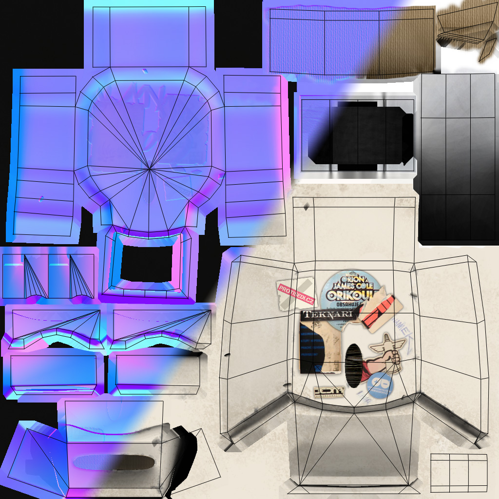
After fixing the Lows to better match the Highs, I got into polishing up the textures to match new UV's. I also masked out the windows so I could give some depth to the inner roll/inner paper. Toilet Paper Dispenser is 233 Tris, 114 Tris for the Paper Towel Dispenser
And for reference, I think it makes more sense to have the opacity map in your diffuse's alpha and the spec in the normal's alpha.
Also try making the UV edges straight. This is usually better when texturing, this seems to work better when you're baking maps to get texturing started.
I'll also have to agree with some people that starting textures from scratch tend to give better results. Now when it comes to your spec I think the main color shouldnt be pure white this might be just me but I tend to not go for pure white nor pure black. Also I dont see why the area where the marker is would be significantly darker than the rest of the asset.
I made a line with a sharpie on a bottle to give an example since I couldnt find reference online. It might not be the same as the asset you're doing but it will give an idea of how it should be.
I left the image high res so that you can see the scratches it has and how it reacts to the light. This will be in the spec map just add some variations to give it some more age to the asset. If anything just make the marker slightly a different color like the reference. Where the lights hits the marker it looks lighter than it actually is.
Eventually everyone will hit an artist block of sorts. Just keep practicing and don't get discourage, practice makes perfect,
Cheers!
That's an interesting point about the marker. I had been interpreting it as one of those heavy paint markers, which, maybe not quite as dark as I did the spec, would certainly be darker than the spec from the Sharpie.
TorQue[MOD], I'm curious, is there a particular reason you'd assign the alphas like that? It seems to me like kinda an arbitrary distinction either way, but to me, since the Spec was derived from the Diffuse, attaching it there seemed to make sense.