The BRAWL² Tournament Challenge has been announced!
It starts May 12, and ends Sept 12. Let's see what you got!
https://polycount.com/discussion/237047/the-brawl²-tournament
It starts May 12, and ends Sept 12. Let's see what you got!
https://polycount.com/discussion/237047/the-brawl²-tournament
Stylized Fantasy Town
Yes, I'm back with another one of these. I didn't finish my last handpainted one sadly, but I'm a big fan of this genre and really want a nice portfolio piece.
Pulling what I learned from the arenanet art test and applying it here (but without low poly limits )
)
My main source of reference will be this building here:
http://www.tabletop-world.com/merchantsHouse.php
The plan is to finish that building, meanwhile making it modular. Then I'll break down those modular chunks and start making other buildings with the pieces.
The setting will be a forest clearing probably.
So first up, textures
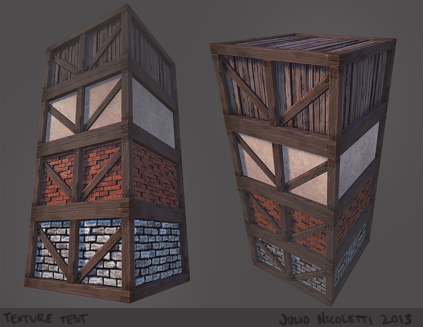
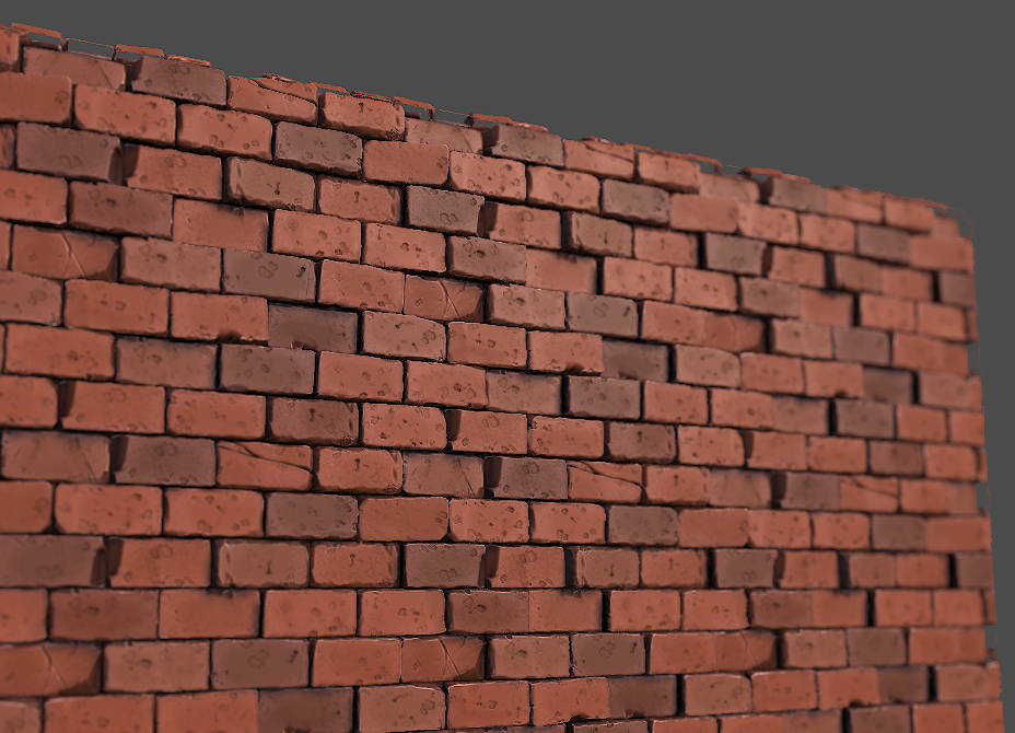
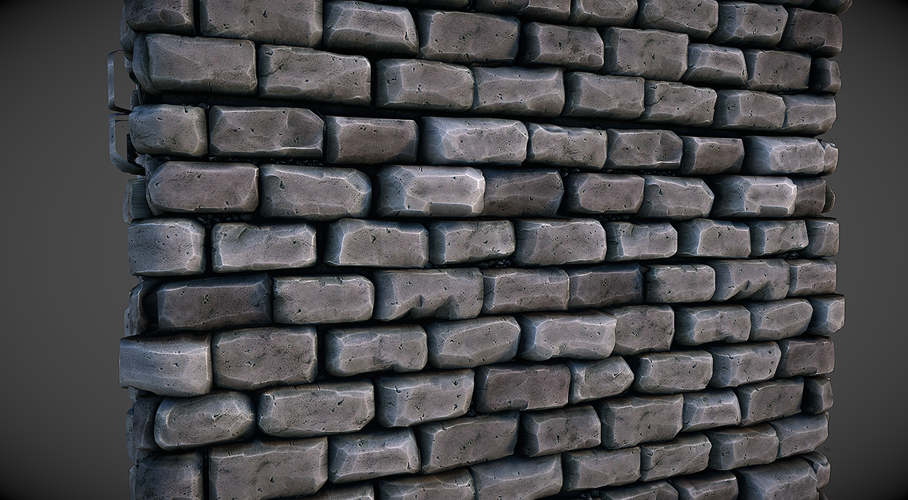
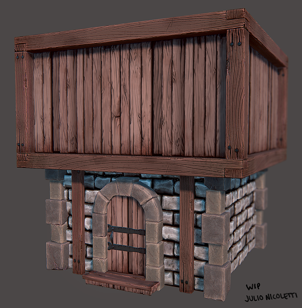
Working on windows right now, and my brother said I should redo the tiling grey brick texture so it matches the stone blocks, so that'll be next. Also the tiling wood could probably be tiled three or 4 times to match the door.
Let me know what you think so far!
Pulling what I learned from the arenanet art test and applying it here (but without low poly limits
My main source of reference will be this building here:
http://www.tabletop-world.com/merchantsHouse.php
The plan is to finish that building, meanwhile making it modular. Then I'll break down those modular chunks and start making other buildings with the pieces.
The setting will be a forest clearing probably.
So first up, textures


Working on windows right now, and my brother said I should redo the tiling grey brick texture so it matches the stone blocks, so that'll be next. Also the tiling wood could probably be tiled three or 4 times to match the door.
Let me know what you think so far!
Replies
I liked the extra beams around the door that you removed. Maybe too much but personally I think you've removed a bit too much. I'd also try maybe cutting the lower stone wall in half horizontally and having the top half be the wattle & daub / plaster. The base currently looks a bit too much like a smithy or fortress. [Edit - just saw the original ref, fair enough!
I'm probably going to redo the base (again -.-) because I'm still not quite happy with how it's looking. In UDK it looks awful with tesselation (triangles are very visible, despite having a polycount of around 200 tris on the flat planes of the wall.)
So, update time. I was helped with the shader for the brick/plaster (I had no idea how to transition more than 2 materials without vertex painting them separately) Pretty happy with it so far.
I also made shingles. Decided to have geo for each shingle. The roof for that small bit there is about 1,200 tris or so. I think overall it's totally worth it.
Still not sure about shingle colour...blue looks very goofy...
And I started making the wall pieces modular. Here's how it's all looking in UDK so far:
@snah and sybrix: What you need to do is lerp 2 materials into one material (plaster lerped into dirt, and that lerp lerped with brick). Then you need to remap the 0-1 on the vertex colours. Here's the shader network:
Roof chunks are finished for the most part:
Trying to place the shingles randomly was a royal pain in the butt:
And would someone be able to give me pointers on the shadows in UDK? I don't want them that dark. I want them to be similar to the default Marmoset lighting (check some of my early Marmo screens). I used red in the screenshot so it's easier to see what I'm talking about (my lightmaps are all 128x128).
- Just above the Env Colour you mentioned there's 'Num indirect lighting bounces', put it up to 4/5 and see how it goes.
- Put in a skylight. Content Browser > Actors > Skylight (in search bar). It's basically ambient lighting.
Great improvements and nice style. Looking great!
You might want to add some chimneys. Before central heating, each room needed a fireplace if it was to be heated. Servants were fine in dank, dismal, frozen rooms, but for quality folk... :P
http://img716.imageshack.us/img716/4552/roofgeo.jpg
Looking like the good old polygon technique amazing!!
Thanks Dan, the skylight worked like a charm!
@DWalker, the beam situation has been fixed, thanks for pointing that out :P
I'm going to do some chimney sketches next, and try to come up with a unique silhouette. Maybe a big chimney and a smaller version that I can sprinkle around.
@Jamie, the roof is pretty expensive. I have 3 sizes; 10k tries, 20k tris, and 30k tris. I can probably reduce each one between 15-20% by taking out the faces that aren't visible.
@Obscura, yeah I made a modular chunk and duplicated it around (you can kind of notice the tiling in the screenshot of the coloured shingles). Definitely saved a lot of time :P I like the way you did yours...makes a lot more sense having the beams going down the edges. I might do that, but I'm worried about losing the silhouette of the shingles.
Time for a window update. Played with my textures and existing models a bit, and made some window variants.
And here's how they look in UDK
Still a lot of lightmap issues giving me headaches...
New issue. Whenever I import my large roof into UDK, it's all messed up.
The one on the right works, but as you can tell, the one on the left is all gooby
EDIT: As for actual art, here's what the roof material looks like when vertex painted. I also added more variation to the tile colours. Critiques appreciated!
As for the roof issue, i can only take a stab at it but are your Xforms reset?
Isn't it wonderful?
I may go back and use a displacement map instead...
Even if you decide to remake the roof so that you can keep on going, I think you should make a thread in the tech talk forum to try to solve this. An asset failing to import correctly is a showstopping problem, not the type of thing you want to ignore in my opinion.
Reset xform is a button on the far right tab of your command pallette. The tab with the hammer icon. Press it with your object selected and it'll add a reset xform modifier to the stack that you can collapse or export as is.
Lookin really sweet so far man
One thing I'd say as no one else has mentioned it - I'm personally not liking the new 2nd level wall. The plaster peeling away to show bricks underneath doesn't make sense. I believe that kind of wall would be built so that as the plaster pulls away you'd see insulation materials, not brick. Also, the fact that you're placing brick on a wood frame just looks visually unbalanced.
Keep this up, enjoying watching your dev on this!
Sculpt:
Kind of worried this won't fit with the rest of the scene...fingers crossed.
Thanks for the input! With the brick/plaster, I was following the reference in the image I posted. For the vertex blending I googled "plaster on brick" and found a lot of reference to that kind of material. Not too sure what I should do about the wood beams though...They are kind of a staple of the scene
Nah, seriously, you created some beautiful art here! I love the style!
Using multiple smoothing groups (which i asume you are for all those tiles) will add a ton more verts to the mesh as it's basically detatching every single poly as a seperate element on export. If it makes too many, your mesh is fucked when you bring it into the engine.
However, this only happened for me on a skeletal mesh, can't say i've tried it on a static object, but it's worth a look. Try cutting the mesh in half along splits in the tiles to hide the seam and then bring it in as 2 objects rather than one, see if that fixes it.
That's if resetting xform doesn't work.
Oh god... been a while since I've seen this problem. Giving me nasty flashbacks.
This happened to be when I would re-import an FBX that was already in my scene into my package that had edited verts. Freeze/Resetting transformations didn't solve this, I had to export another FBX, import that into UDK with a new name, and replace the mesh with the newly imported mesh.
And yeah, better to figure this out before it happens again, you shouldn't have to remake an asset because of something like this.
EDIT: You could also try exporting it as an OBJ, then importing the OBJ into your modeling packing and exporting that as the new FBX
Anyways, here's my livestream. I'll try and keep it under 4 hours or so, feel free to pop in and throw critique at me!
http://www.livestream.com/julionicoletti
Here's what I did during the livestreaming. I have a road now!
I made a dirt material (multiple photo textures using ndo2)
I started making house prefabs:
Also I blocked in a big fantasy tree. Grabbed a bunch of inspiration from old oak trees. I love the way their branches are so heavy that they sink low to the ground.
(disregard the brick texture, I just can't stand default UDK material)
As you can see I also made a brick chimney, some smoke, some more vertex colour experiments, and played around with the colours of the brick and plaster some more. I spent ages trying to get the windows to look good, but I'm still not happy with them. I guess what I'll end up doing is generating a cube map of the final scene and using that as a reflection vector.
Time to stop noodling though, I want to have this level blocked out by the end of the week, rocks, cliffs, forest stuff and all.
I've sort of been getting tunnel vision on the house stuff...are assets repeating too much (like the windows and parts that jut out)
(vertex colours on the small houses were obliterated when I made them prefabs)
I always wanted to build a medieval fantasy town like this but failed every time which makes this even more amazing for me to see how you do it piece by piece.
The general shapes of your tress looking really cool and fantasy-ish. I really like stuff like that.
I'll definatley keeping an eye on this and looking forward to see more progress!
Keep up the great work!
Re-did the tree. Studied more pictures of oaks. Much happier with how this turned out. Tomorrow I'll start sculpting it, but before I do I'm open to critique
Tried to make each side unique enough to duplicate it into a forest, but similiar enough that you don't notice the tiling.
Went for a walk in the park today which was kind of inspiring
I'm not too sure what I'm going to do about the bark... not too happy with how it looks so far.
I'll also put a gradient on the tree, like this