Blizzard Demon Hunter Bust Fan Art
Hello guys !
Just doing some art on my free time!
My model is more cartoony looking not so dark, more like WOW style")
I still need to fix some stuff like seams and lighting. If you have any suggestions let me know!
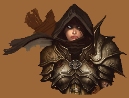
I chose A Concept from Blizzard DIII.
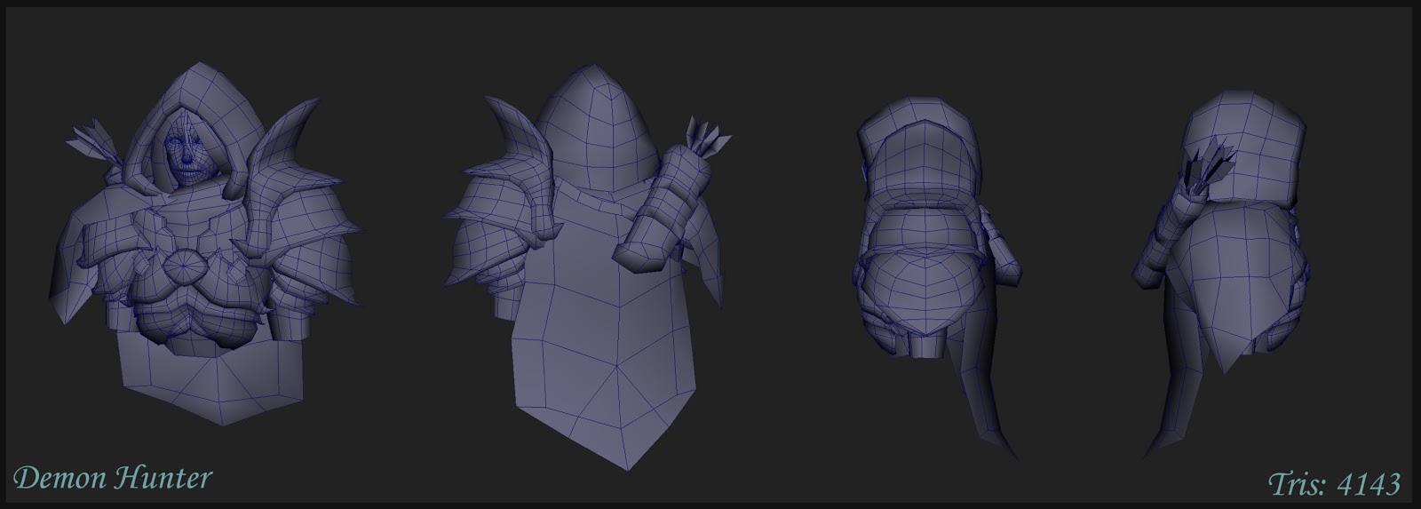
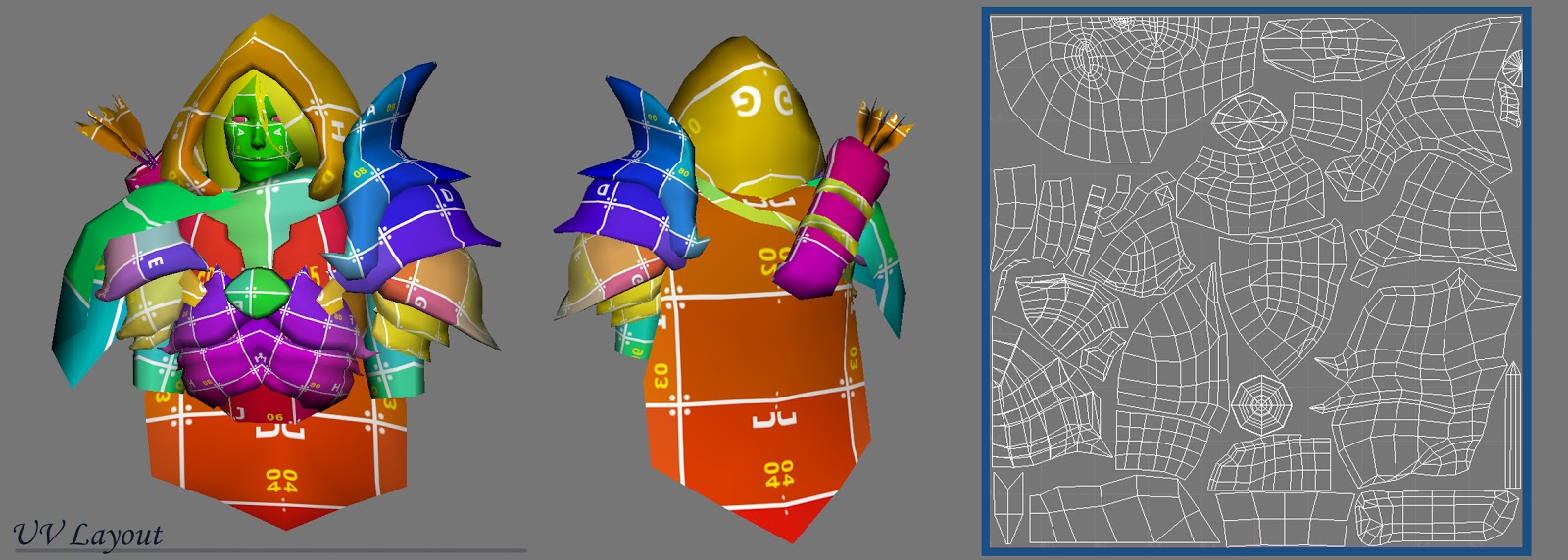
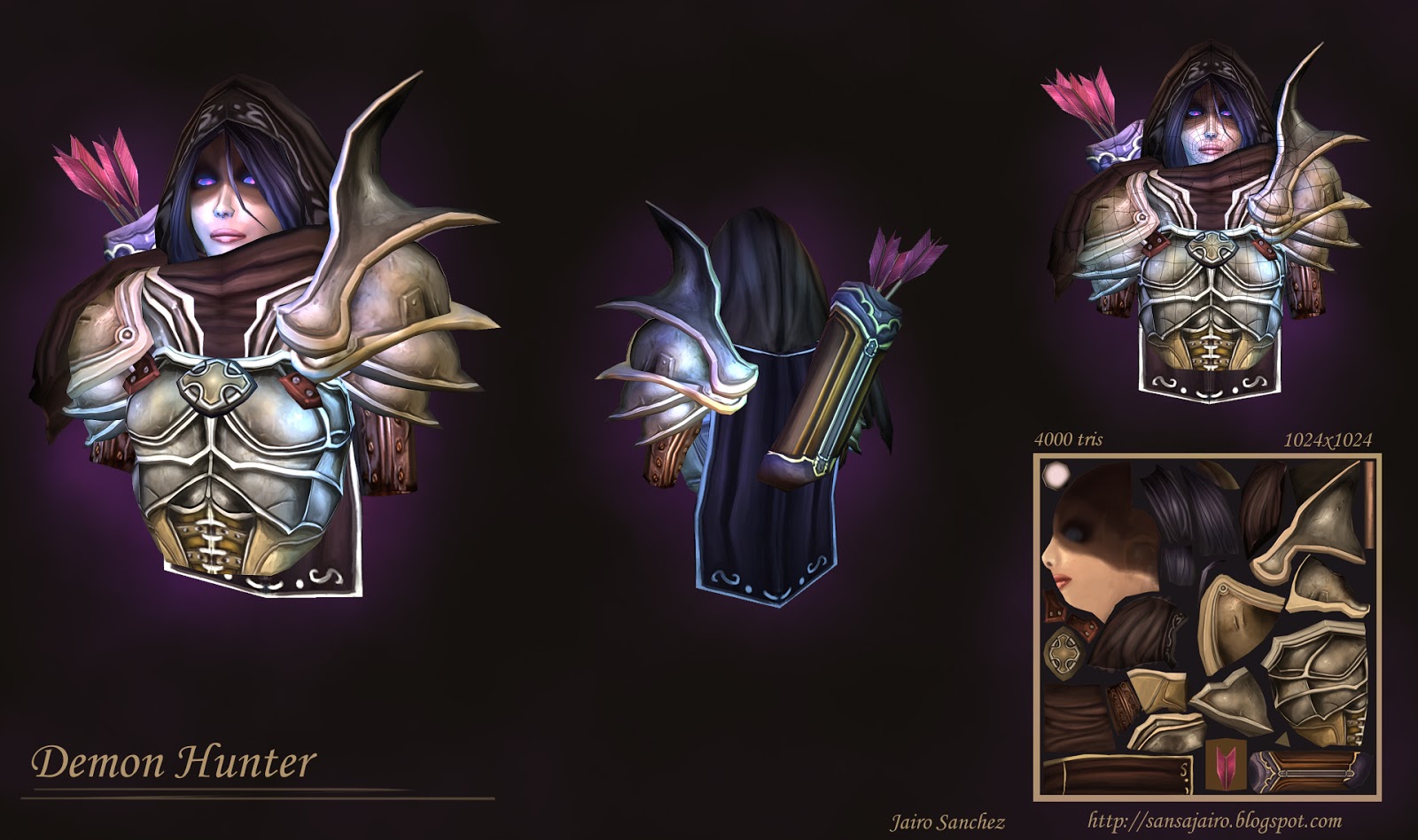
Here's the new update!
I still need to work on the scarf and the arrows...
________________________________________________________________________________________________________________________________
Old Version!
FIRST TRY:
This was my first attempt but it wasn't really working so I decided to remodel!
Just doing some art on my free time!
My model is more cartoony looking not so dark, more like WOW style
I still need to fix some stuff like seams and lighting. If you have any suggestions let me know!
I chose A Concept from Blizzard DIII.
Here's the new update!
I still need to work on the scarf and the arrows...
________________________________________________________________________________________________________________________________
Old Version!
FIRST TRY:
This was my first attempt but it wasn't really working so I decided to remodel!
Replies
The biggest thing for me right now is the attention to detail in the armor isn't there -with areas like the breastplate, shape of the shoulder guard, etc.
You could stand to make the entire thing feel much more alive, put some wind in the cloth, fray the fletching of the arrow. This feels so meh at the moment, it's boring.
Anatomy on the face looks incorrect, ie the area around the mouth, shape of the nose and so on.
The first thing I noticed is how the values and colors do not match with the concept. The texture looks too bright, at least on the beauty shot (the flat looks a bit more ok but still seems to be too bright) and the muddy brown color I see on the concept is not here on your piece. Also, strangely, the shoulder pad and the breast armor color look different when it should read the same.
Something's wrong with the face. Her eyes are too close to each other but I'm bad at anatomy so I'm just guessing. Few mistakes on the lips and nose too. The shadow reads strangely on the face too : I'd say it's too rough, it's like I can see the paint strokes here. I'd like to see a softer, wider shadow on the face.
Why did you changed the shape of the breast armor ? It's all "spiky" on the concept art, everything reads ok and the same but here, you have some weird rounded/spiky shapes conflict.
Silhouette is way not enough detailed for 4000 triangles. I suppose you could have saved some tris on the surface and add small silhouette details like more definition on the shoulder pads, especially near the right joint, it's all curved and spiky in the concept art but very rough in your version. Also you could have add more small curves and details on the breast and the small armor part that is closer to the neck.
I like the arrows but I'm not sure if the color and the brightness helps to read the model. It's very eye-catchy. Also the quiver looks waayy too big to me. And how is it tangled ? No ropes ? You could add details with things like ropes, straps etc..
The back looks very poor. At the moment it looks like you can't imagine things on your own and can only stick to what you see on the concept art.
Overall, even with a 1024 texture and a 4000 triangles model, I'd say it looks too "low res". A more defined silhouette could really help push the details and more definition to the texture could add a lot too. The metal is somewhat ok except the value/color problem but it seems you have rushed some parts like the hair and the flag, the hood (which btw looks to round and soft compared to the concept) and especially the neck part !
Also, last thing, I'd say a simpler and brighter background could help to read the model better.
I may sound a bit harsh but I'm not. It's a nice challenge and you made a good start so keep it up !
Hope it helps
I like the colors, but maybe only saturate certain areas. I agree with Cremuss that it is too intense when everything is saturated.
Good start though!
About the anatomy, the model face is matching the concept on the image plane in maya, but I will definitely check with more anatomical reference.
Thank you again!