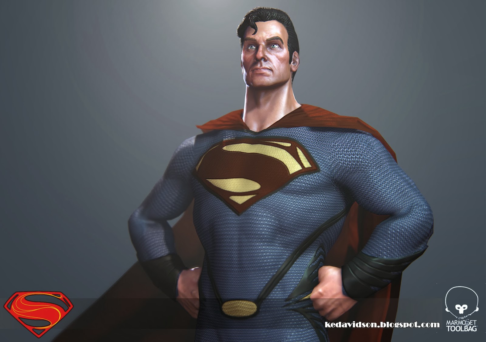
Superman
-Apparently not- Calling this done for now.
About 3(ish)weeks off and on. Huge thanks to those in waywow who gave crits, armt/torso ratio was adjusted in the lp")
The suit is mostly based on the Man of Steal version with a few small differences, mainly the size and style of the trim around the boots and going down the legs.
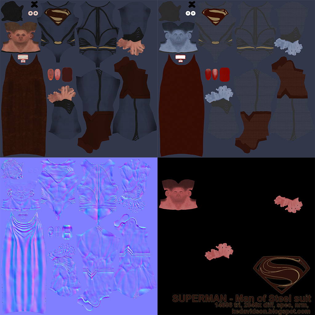
He weighs in at 14686 tri's and uses a 2048 diff, spec, normal and skin translucency map, with a gloss stored in the spec. Rendered in good old Toolbag.
new:
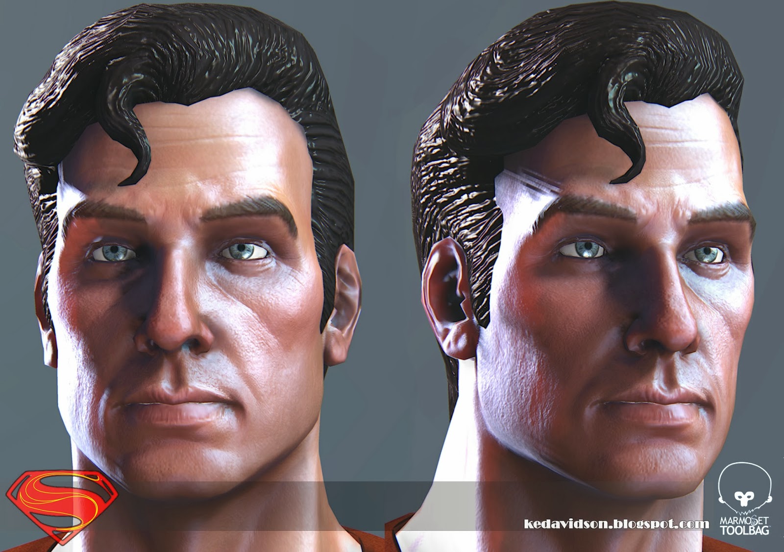
old:

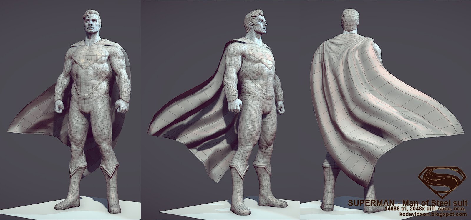
a couple zb shots:

About 3(ish)weeks off and on. Huge thanks to those in waywow who gave crits, armt/torso ratio was adjusted in the lp
The suit is mostly based on the Man of Steal version with a few small differences, mainly the size and style of the trim around the boots and going down the legs.
He weighs in at 14686 tri's and uses a 2048 diff, spec, normal and skin translucency map, with a gloss stored in the spec. Rendered in good old Toolbag.
new:
old:
a couple zb shots:
Replies
also, the waist area looks too wide and the leg silhouette looks off. the ankle area is too fat and the shin curve is off. here is a quick paintover.
also here is the height reference that could be useful:
MM: Thanks very much for the paintover, that's a bit closer to how he was earlier in the waywow thread. How's this look?
here's a few more tweaks, head size and elbow-belly button,
Fair enough though, I like the direction your going with him :-)
That aside, suggest looking at his ribcage muscles.
The serratus anterior/obliques? Toning them back would help showcase his latissimus dorsi.
At the moment, they bulge out more than his pecs & cover his lats from our p.o.v .
Usually it's nice to see a definition between the two, especially with such a sculpted physique.
my 2cents
Superman (View in 3D)
StephenVyas: Thanks man, I deliberatley reduced a lot of the defenition between muscles, since he's wearing a suit and not bodypaint but I'll see what I can tweak in the lowpoly (don't want to re-bakes at this point).
He's looking much better dude
Jigsaw: Still tweaking, I'll keep that in mind thanks:)
Bizzaro variant through texture tweaks. Still have to add an expression and the pose is supposed to be awkward, but this might not be the right type of awkward...
yup, i think so too.
also, the ankles are still to fat and the shape of the legs look off over all.
as for the rib cage, i can tell that you are intentionally exaggerating them which is ok but you have to be consistent through the character so that it works over all. for example, a bigger rib cage would work well if you make him taller to show more bone growth.
and some more Bizzaro:
starting to come together really well man!
Overall I like the proportions and anatomy, as they do feel a bit more real, even with the superheroic hypertrophy. This is a Clark Kent who could actually look like a regular joe reporter in street clothes.
gir: I'm still trying to (seriously) figure out how to get skin looking good outside of the flat diffuse so it's a lot of trial and error. I've been following the Toolbag2 beta thread and really impressed with your results. Someday I'll have money again for the upgrade.
Vallias: Cheers dude! Supe's anatomy is something that really bugs me in most representations. He's almost always super-ripped, but alien-origins aside the dudes a farmer and his build should reflect that. For all that Smallville messed up, Tom Welling had the right build.
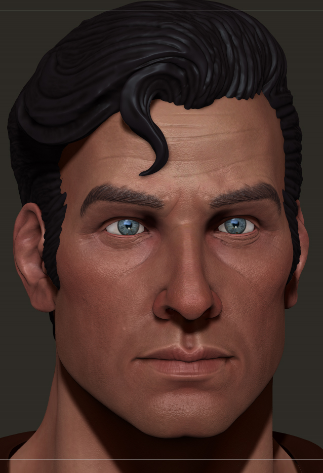
So here's some more work on the skin, adjusted the spec map and the various subdermis/translucency settings in TB. I've also been working on getting some better hair on him. The old helmet works for for full body shots but up close it just looks like poo. As far as I can tell the dithering on the alpha is a scale issue between maya and TB.
I've also re-done the Bizarro sculpt:
(best viewed in IE?!?)
-the old version for comparison:
Gir: in the tb2 beta thread you were talking about doing a stream and then youtubing it. Did you ever get a youtube version up?
So here's an update; he looks better to me but I dunno if that means anything...
http://3.bp.blogspot.com/-LqGyoK0s098/Up7mpFrKiPI/AAAAAAAADAU/UISobG8vnPM/s1600/Superman_34.jpg
Maybe it's just the lighting.
And the eyes look really weird.
The arms are too short, the wrist should be almost at the same level as the crotch. Or maybe the upper body is good, but the legs aren't... ^^'
Why are his arms so short now?
His waist is still a little too wide in my opinion, it does not contrast enough with his chest.
Texelion: The lighting (and thus the effect on the mesh) in that one is from tb1. I haven't been able to get quite the same look in tb2 but I agree with you
I had adjusted the shader on the eye's to use the secondary reflection setting in tb2 but I guess it's not working. His arms are bent slightly back at the shoulders and slightly forward at the elbows in this pose which I believe is contributing to the shorter appearance here but I agree they do seem shorter. haven't changed 'em since the earlier posts though.
For the eyes I was talking about the shape, it's really strange that the outer corner is round and more open than the middle of the eyelids. Also, you have more white on the outer side than the inner one, you should have almost as much white on both sides. Maybe you left the eyes perfectly parallel instead of rotating them ?
Fuisong: What's wrong with the 30's?
So, either the arms are too short, or the torso is too long ( and maybe the waist is too large, you could give his torso more power with a V-shape by shrinking the waist ).
As the legs look a bit short too, I would say that the torso is too long, maybe try to put the crotch higher ?
Not sure how marmoset works (its being long time since the last time I used it..) but I ll advice you that if possible you block out shading values (by that I mean reflection scale/roughness, sss, etc..) on your shaders, and then you texture using those values as a base.
cheers
I am always having a terrible time with that.
maze: Cheers man. Yeah my material defenition is pretty weak atm. It's supposed to be the shiny pleather material of his new suit.
Evil raz: The phenominal miss Tits put this up, the last half of which covers hair and I found it tremendously helpfull [ame="