Handed Painted 3D Environment

polycounter lvl 7
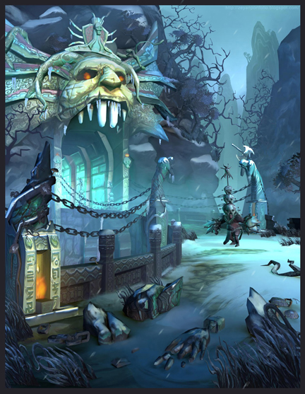
Final
Hi guys, I am creating a hand painted environment piece for the blizzard student art contest during my winter break. starting from a pencil sketch, I have just finished the block-in, please let me know what to fix")
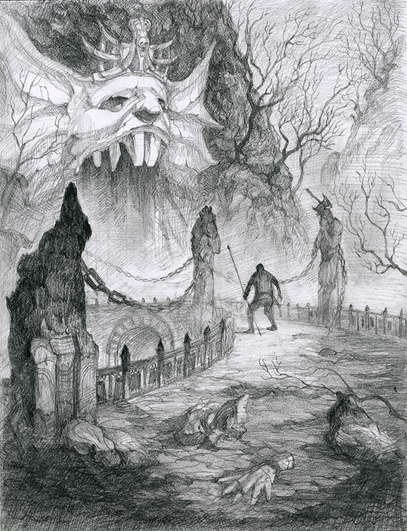
Original Sketch:
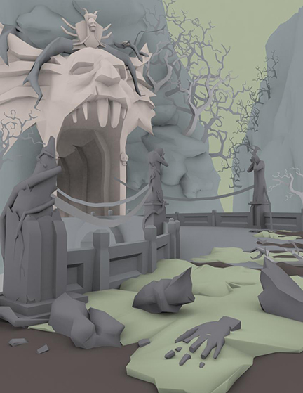
3Dmax Block-in:
http://zeyanportfolio.blogspot.com/
Hi guys, I am creating a hand painted environment piece for the blizzard student art contest during my winter break. starting from a pencil sketch, I have just finished the block-in, please let me know what to fix
Original Sketch:
3Dmax Block-in:
http://zeyanportfolio.blogspot.com/
Replies
To Jessica Dinh, long time no see, hows your holiday ?
To Add3r, Thanks a lot, I was mainly doing 2D stuffs in the past and trying to pick up 3D recently, in order to not fail your expectation, I will try my best~:P
Here is a new block-in image with fixed ear and some broken wall detail on the right hand side
My roommate suggest me to try this composition below, it does add lots of scale and depth but I am not sure because of 2 reasons:
1. Missing some foreground interests..
2 I need to add a lot more details..XD
What do you guys think?
http://zeyanportfolio.blogspot.com/
The second shot feel better because you have a better view/focus on the path and entrance. The problem of the first shot is you have too much stuff in foreground that distract from the head/entrance.
If you want epicness feeling, keep low angle shot like the first one, but move the camera for a better view on the subject (and keeping a good compisition), if needed change the bridge roundness. But add details only on the subject.
If you want a Diablo 3 in game feeling (or any game done with infinite engine like Baldur's gate), keep the second shot, but avoid to detail the bridge too much, keep the focusing on the entrance.
Overall the design is really cool with great atmosphere.
Your block out is really good, and you've definitely got the character of those trees right!
Most of these are suggestions rather than critiques.
Line Tension:
In your latest update you've got a few lines running both perpendicular and uncomfortably close to the edge of the picture causing tension, avoid this when possible.
Up near the top you can probably fix this by making that vine more curved as it goes off screen or just move away from the edge a bit.
Flat Floor:
I'm sure it won't be flat in your finished piece, but as a suggestion you could make the path leading into the mouth of the doorway curve up or down. Down would be like you're sliding into its jaws, as if you're dinner being served up.
Or you could go the opposite way and raise the floor to make the path feel more like a tongue.
Statues:
My final suggestion is that you might like to bend the statues over the path to make it more ominous as if the tortured souls are looming over you, and creating a more intimate journey into the mountain.
These are just suggestions and might not be what you are going for. Either way, I hope they are helpful in some way!
To warren Marshall, I have took off the chain which may confuse people, great call!:)
To Demon Princess, Thank you for voting the original one !!
To Jeff Parrott, I definitely need lots of mist and clouds for this scene, since I am not planing to bring this to game engine, will have to play with alpha masked layers a lot
To SoulWind: Thanks a lot for those critiques, from the image below u can see I have fixed those things:
1. fixing lane tension..
2. I made the floor slightly peaking towards the camera, I may add more angle later, need see how it goes with texture 1st.
3. Making the statues leaning towards road. This is a really genius idea !! It not only adds some mood but also pops out the gate:)
To Jessica: Ye I think I will stick with the 1st one.. I have 23 days left for texture, with need your guidance master! XD
To Add3r: You are right, for this piece I think I need to really focus on creating the creepy mood. I did a quick paint over of my original sketch, this may not be the final color I want, but you can kind of see what I think the final mood will look like... what do you think ?
Thanks everyone !!!! I wish you all have an awesome XMAS eve!! I will be back after the holiday for textures
http://zeyanportfolio.blogspot.com/
I'm looking forward for critiques !!:)
http://zeyanportfolio.blogspot.com/
It's looking good, add some warm tones to highlight some pieces and break the monotone color palette you have going on at the moment.
cheers!
To David.J , Laughing_Bun and Pixelb: You are right, I like the mood of the original sketch better too :P But it is too Diablo3 looking inside of the World of Warcraft style I want..:( Actually I went through quite a process to make the color choice: In the beginning, I started with the grey yellowish tone but It just doesn't look like WOW at all. Since I am making this for the Blizzard WOW Student Environment Contest, I guess I gonna automatically lose if the style doesn't even fit in.. So I start to adjust color around and try to create something new.. Here is my process:
At 1st I started to research the difference of art style between WOW and D3:
Above is a screenshot of WOW, Even through the scene is an ancient troll temple which should be creepy and unwelcome, it is still very colorful and has some kind of playfulness.
Above is a screenshot of D3. It doesn't have much color in it.. the general feeling is dark, scary and moody..My roommate says that my sketch looks like D3 and I guess he is right...
WOW and D3 are both old school cartoon looking, but I think the main difference is the mood: playful vs creepy. To change my scene into WOW style, I figured that I need to add more color and sacrifice the frightening mood:
Version 1: This is what I got after roughing in all the textures, the first thing I got to do was fixing the weird contrast.
Version 2. After adding more mist and adjusting the lighting, it kind of look like my original sketch but like I said it doesn't look like WOW at all..
Version 3: After adding some details and color, The whole scene started to be really muddy..:(
Version 4: Then I decided to get in some snow! It helped to make better contrast and contour lines.. But what really made me a little happier is that the scene started to look like WOW. Since I have only 12 days left before the Jan 15th deadline, I decided to go with this... But ye, like Pixelb said, The scene lost lots of visual flow it used to have
Version 5: This is the newest version I got. I replaced those unnecessary tiles in the foreground with some simple snow and added some more detail. Like David J suggested, I added some warm tone in the scene and it helped a lot!!:) I think I need more warm tone detail tho. I am trying to create a new visual flow but it gets very tricky to "design" sth in 3D
So This is my thinking process behind this... I don't think I have made the best choices, but with only ten days left, I guess I have to go with this one and try the best I can..:)
My Portfolio:
http://zeyanportfolio.blogspot.com/
1. I thought your lighting and colors were a bit over the place, so I added an overall blue atmosphere that gradates towards purple at the bottom. I also changed that pukey green to something a little less warm that fit with the cools a little better.
2. I would use particle coronas to get create the warm accent areas.
3. Make the trees darker and more silhouette like
4. create snow mesh for foreground objects, you need more micro detail in the foreground and it will help the transition of objects.
5. I would make the scene have an overall ambient lighting, with a direct light coming from the inside of the mouth.
6, I would duplicate the chain and rotate it 35 degrees or whatever so you see both chain links it looks flatter than it should.
anywho i'm done. Hope this is helpful.
To laughing_Bun: Thanks a lot for the paint-over sir! I made a new version based on it, please let me know if it works
To Pixelb: Thanks a lot, With all the critiques I got from today and yesterday, I made three new version:)
VERSION 1: This is based on Laughing_Bun's Paintover. I really like adding glow to the demon statue's eyes, also I like the mist in middle ground:) I painted some foreground snow in photoshop. they work too. I didn't put much ambient light coming out of the mouth tho because it fights the focus points...
VERSION 2: I kind of unified the color on this one, also play with the lighting to make the face as 1st interest, the guy in middle ground as the 2nd, foreground fire as the 3rd..
VERSION3: I take off the snow and make it look like my original sketch, The big face does become more powerful without the snow..
Original Pencil Sketch:
So guys.. Please help me decide which one should I go for...??
http://zeyanportfolio.blogspot.com/
http://zeyanportfolio.blogspot.com/
I really like #1 and #3 the most, #2 just feels like a less interesting version of #1, the green mist really adds some more color that breaks up the scene.
It's a hard call, I think between #1 and #3, #1 is far more interesting, I want to look at that one much more then #3, but at the same time, #3 feels much more fitting. They both have two completely different tones.
I think the question you need to ask yourself, is 'snow or no snow'?
Personally I really like thumbnail #1 (Props to the paintover by Laughing_Bun); I think the colour palette makes sense for a bunch of reasons: 1. It has that real stylised painterly style of WoW 2. Snow does make sense high up in the mountains in a remote place and the cool blues gives that vibe in buckets 3. The bursts of warmth from the flame and stone monsters' eyes create real nice contrast with the blue 4. I'm a sucker for the colour Teal, but having that splash across the pathway creates a good middle ground between the blues and reds to tie everything together.
If I would change anything about thumbnail #1, it would be to use a slightly less opaque fog, like the one used in #2.
Just my thoughts anyway. Can't wait to see where this goes and what the end result is like. Keep up the good work!
I think #2 is looking the best because it best replicates the balance from the concept. Perhaps taking some focus off of those clunky foreground objects and better painting of light will really make this piece shine.
Also, in the concept, the fence/railing is much smaller than in 3d. The larger models make the bridge/path feel claustrophobic, or at least it looks like 2 more inches of the canvas was cropped from the right?
Looks really cool, nailing that painted style, I look forward to an update!
As far as the 3D goes from a broad strokes perspective, I would go with option 3. This one rings the most true to your original concept in my opinion. I think you could do some things to push it further though, the illuminated eyes from options 1 and 2 would look good in this one. I would also suggest having a play with some foreground lighting, maybe some cast light from out of the frame onto the foreground elements or some strategically placed torches or magical light sources might be a way to inject some interesting color as this palette is more muted than the other 2.
Anyways great start! looking forward to seeing the progress
To JadeEyePanda, AndrewHelenek: Thanks for helping. Even through I like the tone of the 3rd one better, but after went through last year's winning art work again:http://us.blizzard.com/en-us/company/careers/university-relations/contest-previous.html I decided to go for a more colorful tone.
To JamieROIT: I have lightened the frog in my newer updates, that is a great call!
To Tottot: Thanks for reminding me about the flow on the original concept, that is actually the thing I struggle with the whole time.. I have added some mist to lighten the statue in the center of the picture, lots of other adjustments are still needed tho..
To Pixelatedkiwi: Sorry I didn't go with the 3rd one because it lack the sense of Blizzard art style:P lightening the foreground and adding some magical light to the props gonna be what I will work on tomorrow, thanks for pointing that out!
So here is my new update, I have added some grass,leaves type of foreground elements, some more detailed trees on the mountain, and also some details on the textures.. One week left,work work work :P
http://zeyanportfolio.blogspot.com/
I did a really quick and rough paintover to make some suggestions:
1. Some surfaces should probably have snow collected on top - like the broken statue pieces or the tops of the wall in the foreground. Also lots of rock surfaces and parts of the face/door should probably have snow too.
2. The fore/mid/background is all kind of blending together. You separated these really nicely in the concept, but in the 3d I think you could make the foreground darker and the background a little lighter. Maybe have a strong light coming from the upper right, but the bit of the wall/column/torch nearest the camera is in a shadow? Also some trees seem to be lighter than the background behind them which makes them difficult to read. Unless the bark is supposed to be really light or something, I would either darken them or try to light them so they aren't as illuminated.
3. I think adding some definition and lighting (even just a little bit) to the background rock spires would make them a lot more interesting. If the main light is the sun/bright moon here, I think the rock spires should be lit the same as the other things in the scene. Also throwing some snow on them would be cool.
4. Some of the really distant rock spires are getting lost. You might try lightening the sky to fix this, as well as to give the scene more depth overall.
I'm excited to see where you take this scene!
A: make the grass look fuller and
B: Eliminate the repeated look to an extent
To Xelan: Hey how's your break Alex? Thanks for minding me about the grass, I have rotated them around to avioding the sense of repeating. There are three different kinds of them right now but the eye cannot really tell the difference.., do you think I should add more?
Three days left! wot wot!
http://zeyanportfolio.blogspot.com/
I can't see any repeating grass in your latest shot, seems like you've got enough variations. You might try toning down the highlights on the grass a little, right now my eye is drawn immediately to the bottom of the image cause they're so bright.
Looking good man!
It's coming together nicely good job!
To Pixelb: Ye this three weeks long project is going to be finished~ I will see how it goes in the Blizzard contest, but the most important thing is I have learnt a lot from this process:P
To Stephanie Thanks Stephanie~ I didn't go with the 2nd one because the color is a little dull.. I want the most colorful one to match the Blizzard style:)
So ONE DAY LEFT... This is the newest version...
http://zeyanportfolio.blogspot.com/
Final Image:
Some Textures:
Poly count: 16420 (without characters)
And I made the concept blue...
http://zeyanportfolio.blogspot.com/
Anyway, just some of my thoughts