[Dota2] - Warlock - Cursed Ritual
Hey Polycount peeps!
LATEST UPDATE - Warlock Cursed Dreadwood Set - FINAL IMAGES
Steam Workshop if you'd like to rate it up http://steamcommunity.com/sharedfiles/filedetails/?edit=true&id=111317354

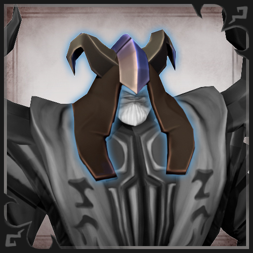
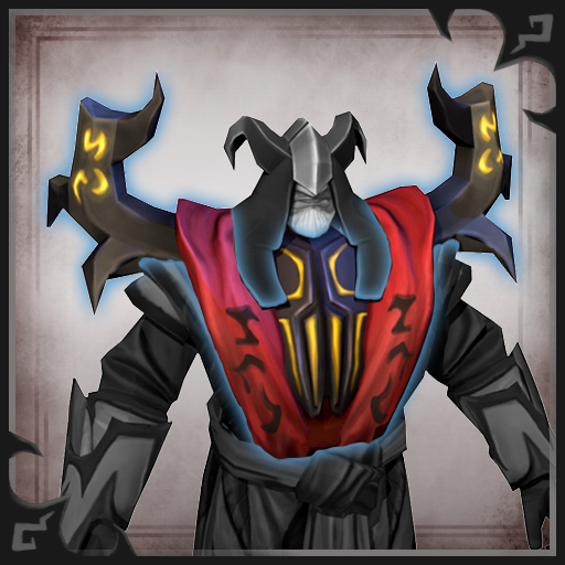
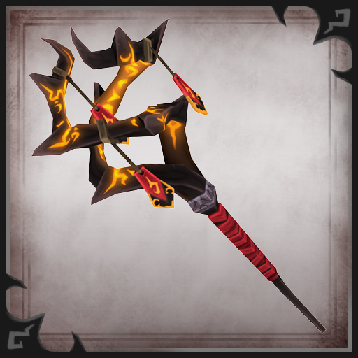
~ Original Post ~
This is a team effort between myself: REKLAS (Justin Messner), Screwonhed (Jeff Seaman), and jwest (Jesse West)
The 3 of us will be creating a set for the Warlock titled...
~ Cursed Ritual ~
Forever on his quest for arcane knowledge, Warlock must don ceremonial garb to handle some of the rarer tomes he acquires or he may become consumed by the dark magic that surround the the foul and accursed texts.
Initial General Direction Idea (REKLAS)
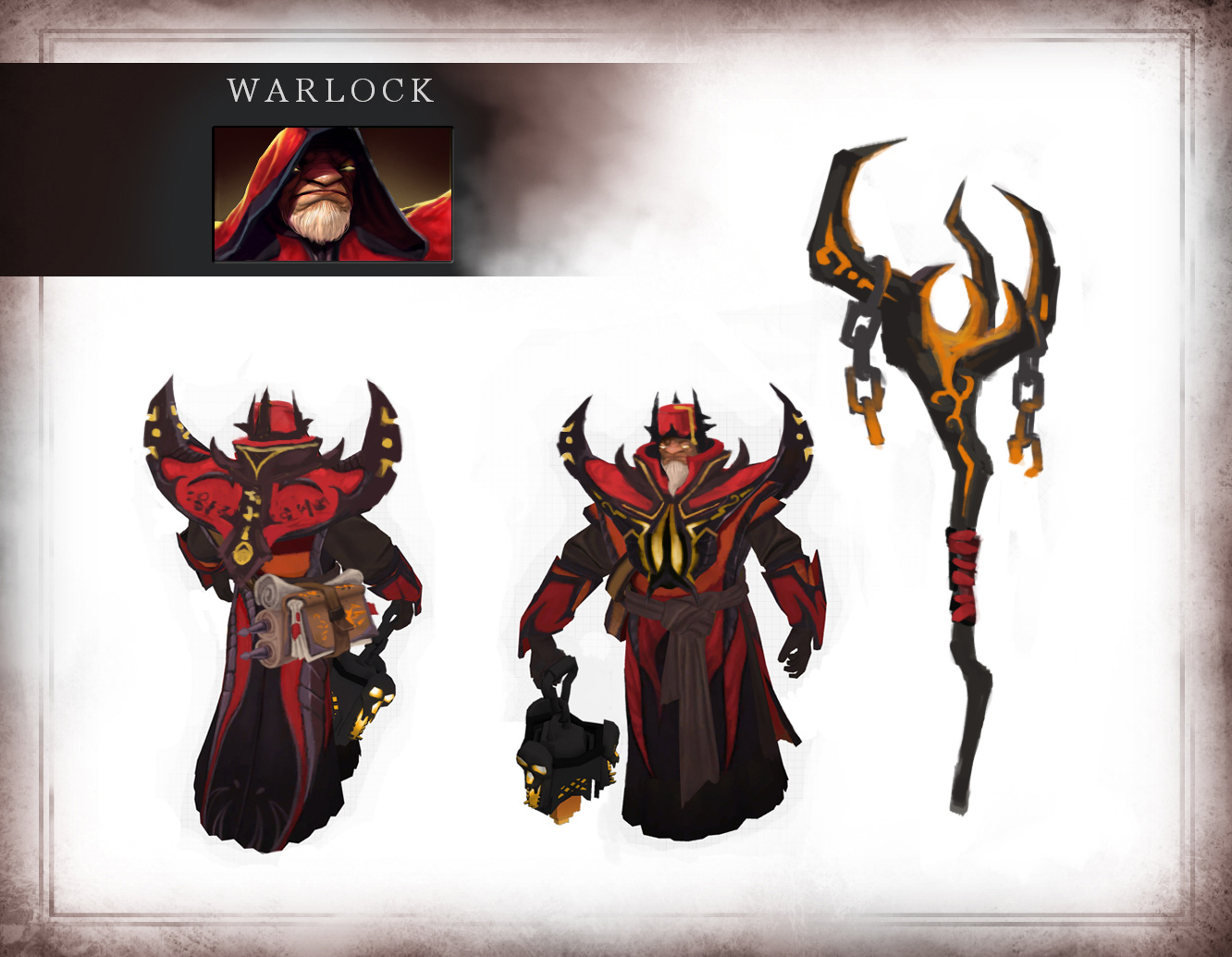
Head and Shoulder Designs (REKLAS)

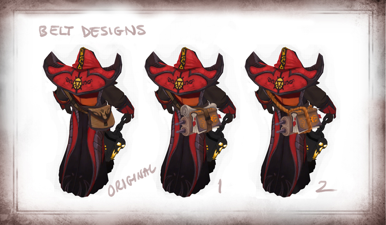
Belt Designs (REKLAS)
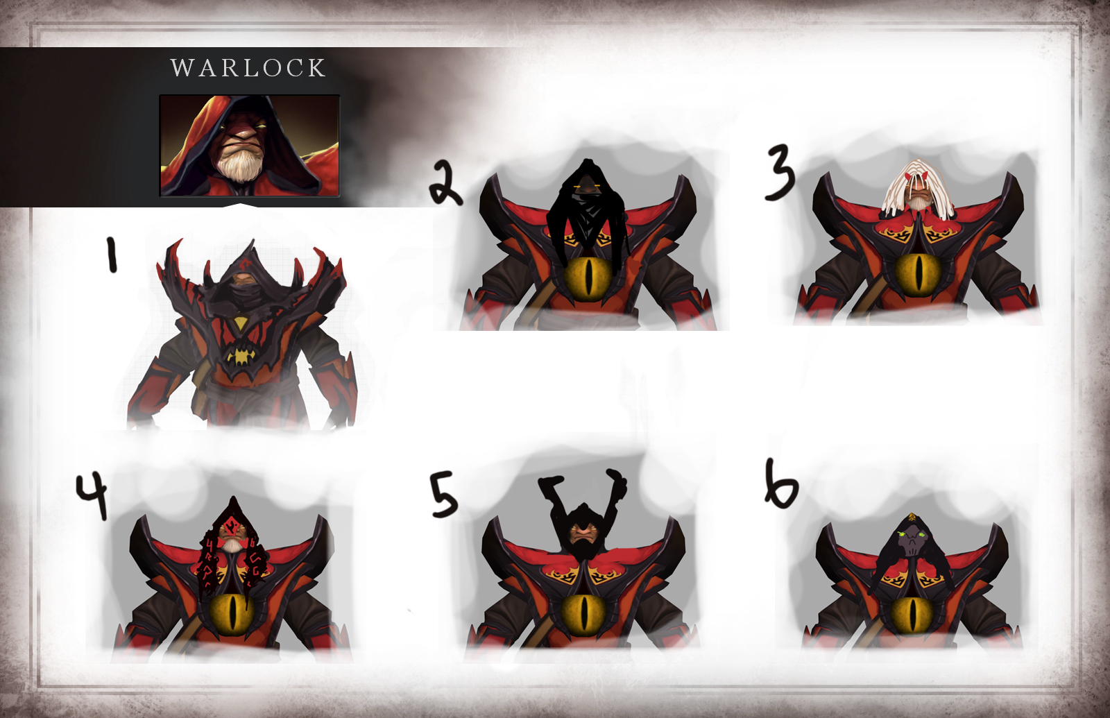
Head Designs (jwest)
Bracer Designs (Screwonhed)
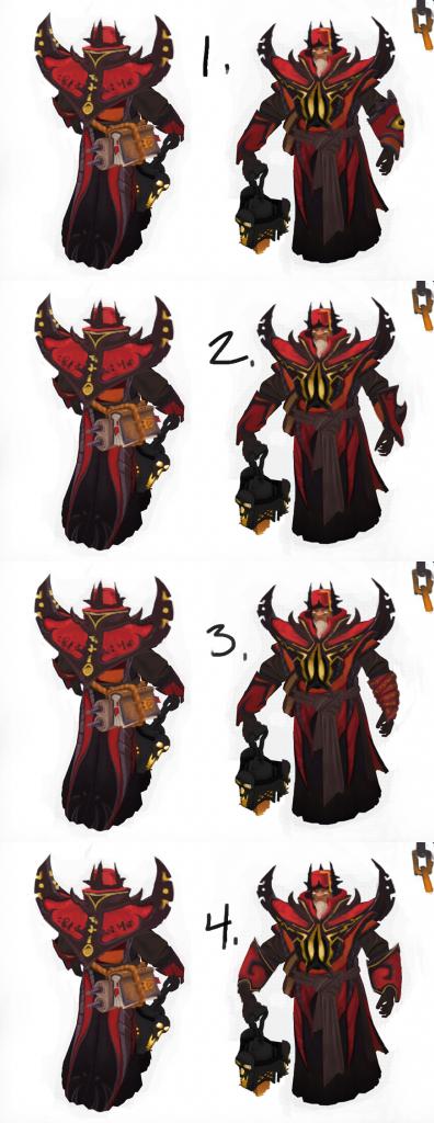
Urn Designs (Screwonhed)

Stay tuned for more concepts as we iterate on our ideas. Please post your thoughts and feedback as we would love to hear it.
Updated with higher res Urn Image
LATEST UPDATE - Warlock Cursed Dreadwood Set - FINAL IMAGES
Steam Workshop if you'd like to rate it up


~ Original Post ~
This is a team effort between myself: REKLAS (Justin Messner), Screwonhed (Jeff Seaman), and jwest (Jesse West)
The 3 of us will be creating a set for the Warlock titled...
~ Cursed Ritual ~
Forever on his quest for arcane knowledge, Warlock must don ceremonial garb to handle some of the rarer tomes he acquires or he may become consumed by the dark magic that surround the the foul and accursed texts.
Initial General Direction Idea (REKLAS)

Head and Shoulder Designs (REKLAS)

Belt Designs (REKLAS)

Head Designs (jwest)

Bracer Designs (Screwonhed)

Urn Designs (Screwonhed)

Stay tuned for more concepts as we iterate on our ideas. Please post your thoughts and feedback as we would love to hear it.
Updated with higher res Urn Image
Replies
throw down.
@erradler - Word. Some sort of skull-esque urn with glowing eyes & mouth would be rad.
Here's more Belt/Satchel Designs. I'm thinking about going with number 8.
Shoulders 1
Head 1 (from head-specific designs)
Bracer 2
Lantern 3
Bag 6 (the book on the outside makes more sense since it could take more wear and tear being less protected, whereas the scrolls are more fragile and need to be protected more inside the bag)
The sharp angles for Brace 2 and Shoulders 1 just look wicked. I'm pumped to see how this comes out.
@Rik - Good point about the scrolls and book.
Here's some staff designs. All of which would have the Warlocks ball of fire particle orb thing within the top of them, just imagine it. I'll detail out a few of these.
@SgtNasty - Thanks a lot
I think a bit more orange glow showing from more of a top-down in-game view would be nice.
Urn designs continued...
besides that, good luck guys, lookin good
Some in-game testing with one of the head-options:
I like the progress! Are all of you working with the same color palette?
@Rhinokey - Hahahahahahaha getting called out Jessie. AGREED! Step your game up!
@TMiuccio - Thanks. Yeah we're all working with the original color palette and aren't planning on altering it too much so he will still resemble the warlock at a quick glance while playing the game. He'll just a more badass enhanced version.
@duoxan: glad you like them! THe above is my first attempt to do a mashup of 6 and 9.
@slence, TMiuccio, Rhinokey, $!nz: Thanks!
-also I would make the helmet wider like the hood and add an alpha plane gradient to enphesise the dramatic shadow on his face to just show his mouth etc. (if its not already painted on the color texture of the chatacter)
The alpha plane for a shadow on his face is really interesting right now he just has a hard shadow line on his face but will definitely explore that idea.
Thanks again!
I can't wait to see more
Steam Workshop if you'd like to rate it