Cammy - portfolio project
Done!
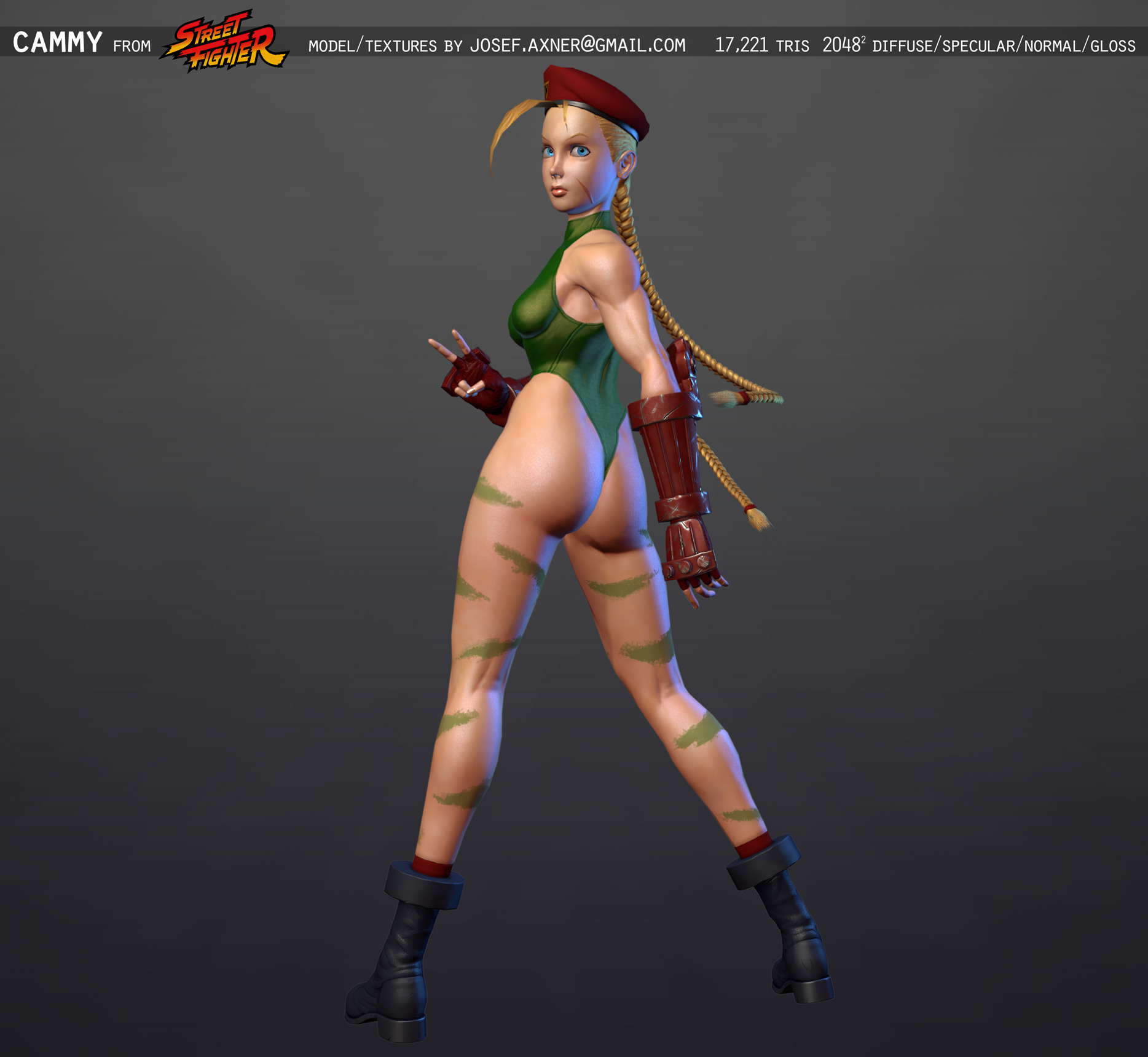
(Original post follows)
My portfolio is starting to get painfully out of date, and I desperately need practice making characters (or at least finishing them!), so here goes nothing. Got kind of inspired by other folks doing Street Fighter characters, so I figured I'd throw my hat into the ring with my take on my favourite SF character, Cammy.
One reason I wanted to do this (and in theory, other SF characters as well) is that I've been kind of unhappy with how certain characters were translated into 3D for SF4 and other games, so my goal with the model is to try to recreate Kinu Nishimura's style as faithfully as possible. Nishimura is my favourite of the old Capcom artists, and she helped define the look of games like SF II Turbo and SFIII. In my book, her versions of the SF characters are the definitive ones.
Without further ado, here's what I've got so far.
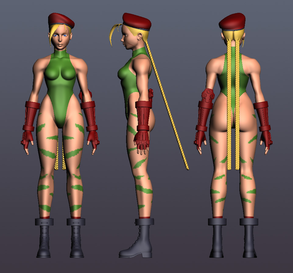
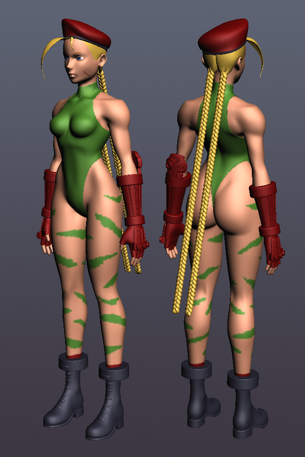
(Get a closer look at the model via p3d.in)
Here are two ref sheets I put together: One Two
As you can see even in these refs a lot of stuff isn't completely consistent - but the two drawings in the bottom centre of the first sheet is probably the closest to what I'm aiming for in terms of style.
I don't have a lot of experience with zBrush - in fact most of the experience I have is getting frustrated because I don't know what I'm doing and I don't have enough groundwork laid out before starting to sculpt - so this time I'm trying a different workflow. I seem to have an easier time pushing verts than sculpting, so everything is done with sub-d modelling in Max so far, with the intention of taking it to zBrush once I'm happy with the size and proportions of things. I realise this probably sounds kind of backwards to most people, but I'm still in the progress of working this stuff out. I have enough experience of not getting things done through other methods, so I thought I'd at least try doing it this way and see how things shake out. Once I take things to zB I will inevitably need help since I'm pretty lost with that stuff, but if anyone has thoughts about my process at this point, feel free to share.
My plan has basically been to try to incorporate as much detail as possible without adding more geometry, still keeping the topology pretty clean. Once I feel I've added as much detail as I can (and/or reached a point where vertex pushing simply isn't time efficient) I'm planning to move on to zBrush and add more detail there. So a lot of the muscle definition and whatnot is a bit wobbly at the moment, but I'm pretty happy with the overall direction things are taking, at least. The braids need finishing, obviously, and the way they connect to her head probably needs to be reworked as well, I'm just a little unsure if there's any point in trying to improve on it in Max - I think I might as well just try to fix it in zB.
So there's not a ton really that needs to be done before I start sculpting, but I figured I'd try to get some feedback before I open that can of worms. Please throw your C&C at me, and if you made your way through this wall of text, Thanks!

(Original post follows)
My portfolio is starting to get painfully out of date, and I desperately need practice making characters (or at least finishing them!), so here goes nothing. Got kind of inspired by other folks doing Street Fighter characters, so I figured I'd throw my hat into the ring with my take on my favourite SF character, Cammy.
One reason I wanted to do this (and in theory, other SF characters as well) is that I've been kind of unhappy with how certain characters were translated into 3D for SF4 and other games, so my goal with the model is to try to recreate Kinu Nishimura's style as faithfully as possible. Nishimura is my favourite of the old Capcom artists, and she helped define the look of games like SF II Turbo and SFIII. In my book, her versions of the SF characters are the definitive ones.
Without further ado, here's what I've got so far.


(Get a closer look at the model via p3d.in)
Here are two ref sheets I put together: One Two
As you can see even in these refs a lot of stuff isn't completely consistent - but the two drawings in the bottom centre of the first sheet is probably the closest to what I'm aiming for in terms of style.
I don't have a lot of experience with zBrush - in fact most of the experience I have is getting frustrated because I don't know what I'm doing and I don't have enough groundwork laid out before starting to sculpt - so this time I'm trying a different workflow. I seem to have an easier time pushing verts than sculpting, so everything is done with sub-d modelling in Max so far, with the intention of taking it to zBrush once I'm happy with the size and proportions of things. I realise this probably sounds kind of backwards to most people, but I'm still in the progress of working this stuff out. I have enough experience of not getting things done through other methods, so I thought I'd at least try doing it this way and see how things shake out. Once I take things to zB I will inevitably need help since I'm pretty lost with that stuff, but if anyone has thoughts about my process at this point, feel free to share.
My plan has basically been to try to incorporate as much detail as possible without adding more geometry, still keeping the topology pretty clean. Once I feel I've added as much detail as I can (and/or reached a point where vertex pushing simply isn't time efficient) I'm planning to move on to zBrush and add more detail there. So a lot of the muscle definition and whatnot is a bit wobbly at the moment, but I'm pretty happy with the overall direction things are taking, at least. The braids need finishing, obviously, and the way they connect to her head probably needs to be reworked as well, I'm just a little unsure if there's any point in trying to improve on it in Max - I think I might as well just try to fix it in zB.
So there's not a ton really that needs to be done before I start sculpting, but I figured I'd try to get some feedback before I open that can of worms. Please throw your C&C at me, and if you made your way through this wall of text, Thanks!

Replies
Your base mesh looks awesome and can't wait to see you push it xD
Again this is opinion and personal preference but i would pull the hips/waist area and below down a bit so the torso doesn't look so crunched.
Either way, it's coming on nicely.
Wireframes, etc could be useful as well for technical feedback
Keep going
yannage: As you could see from the reference materials I've got, Cammy's breast size is just one of those things that will look different in every single picture you look at. I made them a little smaller than in the model sheet I based her proportions off, cause they were pretty much comically oversized, but maybe they could be a little bigger? I have a feeling this is going to be one of those things I'll keep tweaking all the way up to the finish line.
AngryMindtricks: I've had it pointed out to me before that her proportions are a little funny, and I think you're right. I was afraid to change it too much cause I still want that long-legged look, but I tried adjusting her pelvis just a little and I think it looks a little more natural. Thanks!
I was a bit unsure of the wires, you can choose to display them on the model at p3d, and since I'm planning to retopo later on anyway I wasn't sure it was relevant. Since I'm turbosmoothing everything the original mesh's topology looks a little wonky too - but if it's helpful, sure, why not?
with her breasts id say just add an edge loop around it then push the four front polys further up to even it out.
also put an edge loop through her mid drift where there are long vertical polys.
The brow is a little messed up because I forgot to turn a couple of triangles into quads, that's no biggie. I did notice though that I'm getting pinch points on the breasts as well (somewhat visible in the picture) - is there anything I can do to avoid that or will I just have to deal with it/fix it in Photoshop later?
I fixed the issues I had with the basemesh, and as you can see I also changed her pose a little bit to avoid some headaches whenever I get around to rigging the final model.
I've been struggling a bit with her back, but I'm pretty happy with the direction the sculpt is taking. I've got any glaring anatomy issues going on, please let me know!
Very grateful for any and all C&C.
(maybe boobies kind on the small side)
You're probably right about the shoulders, I was trying not to mess up the topology when reposing the arms, so I ended up barely moving the shoulders. Will definitely take a look at it.
Thanks for commenting!
I think that honestly is more important than making them bigger.
Thanks for your feedback.
Unfortunately I won't be able to work on her any during the weekend
Cammy is progressing nicely, I have a couple critiques that may help you push it towards the style you like
I'm convinced Kinu Nishimura is a man that loves the female booty. In all of his works he really puts emphasis on the trapezoid shape of the female hips and makes their shoulder width short so that it really show. He also seems to be a big fan of really showing the seperation of the hip bones and where the leg starts/connects with it.
I see that as his trademark in Capcom, if you nail that I believe Cammy will come out true to Kinu's style.
Here is a paint over to demonstrate, I'm not too good with these, lol
I hope this helps out, keep up the good work
oh, one last thing to note, from Cammy's navel to her groin area she has a pretty noticable flat slope. I think you can pull this subtle effect by slightly pushing her lower abs outward and her groin area inward. A subtle change that makes a big different appearance overall.
Aside from the fact that Kinu Nishimura is a woman, I'm right with you about that conviction.
For Cammy especially it's important to get this area right, because it's so emphasized by her design, so again, thanks a lot for the paintover and coaching. I agree that your changes will most likely push it more towards a recognizable Nishimura-esque style. I can't wait to get back to my PC so I can start tweaking the sculpt
I'm glad the paintover is helpful
http://ps3maven.com/cammy-statue-street-fighter-4/
Hope it helps:)
Thanks for the link, more reference never hurts
I'm MUCH much happier with the way her hips look now
Also started adding a little more detail to her face:
The shape and size of her eyes is still very much subject to tweaking, but even at this point I'm quite satisfied with the likeness. Adding the eyebrows and masking out the pupils helped a lot!
I've noticed that her arms seem a bit long, especially the lower arms - I think I'll try to figure that out before I start sculpting her hands.
Reminds me that I should update my own WIP thread since I've gotten much, much farther on her.
Here's a closeup of the boots:
I was really unsure of how to go about them. They don't really look like any real-life combat boots, and they never seemed to have much detail in any official artwork, but I tried to go for kind of a leathery look, adding panel detail where I felt it made sense. Will probably have to work on them a fair bit still, I like the side profile but not too happy with how they look from the front and rear.
Hand closeup:
Sculpting hands is hard! Geez, those fingers kept giving me all sorts of trouble, and they still look more like wobbly hot dogs than anything else.
I spent a considerable amount of time trying to figure out how best to do the paneling on the gloves, I wanted to make sure I got that part covered before I started going in adding crease detail and whatnot. Lots of trial and error, and I don't know if what I've got is ideal, but it'll work at least.
That's it for now. I'll start working on her hair tomorrow, I guess.
nkonstantino: Do it! I really want to see you finish that model.
I use the same work flow all the time for the high poly when I make characters!
It's hard for me to point things out at the moment. I think you've really gotten the a lot of the major stuff down right now, but there's just some features that doesn't seem to be there just yet.
Her face is what stands out the most right now I think. From the side view, It looks like her forehead is a bit to bulged out? I think it should be pulled back a bit.
Her eyes seems a bit flat also.
I often do a paintover on the face to get a sense of what's wrong. Some stuff looks weird just because there's no texture on it yet, and some faults gets more visible.
Also I think that the chest could be a bit wider, but that may be just me
Really solid anyways! The sculpting looks nice
Nice to see you going for this type of character project again!
Can't wait to see it finished
(If stuff doesn't make sense, it's because I'm le tired ;'<)
Spent a lot of time tweaking the face, mostly around the eyes. I added eyelashes and messed around A LOT with the shape, size and position of the eyelids as well as the eyeballs themselves. Thanks for the feedback, Calle, I think it made sense overall, and helped me improve some things. Good call on the eyeballs, their shape had been distorted a bit after I'd tried to define the shape of the pupils in the basemesh before subdividing (not a great idea).
Here's a closer look at the face:
To be frank I don't think I'm at all closer to that Nishimura style face than I was before, but at least I think it looks better. At this point I'm a little concerned that I'll get stuck spending way too much time fine tuning details and to be honest I think it's more important that I actually finish this, than spending forever trying to perfect the style and look of every single little detail. Not that I intend to purposefully half-ass anything, but just maybe get used to the idea of settling for "good enough". I think I'll have to do that if I'm ever going to finish this, anyway.
Another pic for good measure:
As you can see I started messing around a bit with polypaint, materials, rendering and whatnot. To be honest I was quite surprised to see what difference a few settings and higher quality rendering made. Stuff actually started looking pretty good all of a sudden, lol!
Anyway, next up I'll continue to work on her hair. I started with it a little bit today but it's still a hot mess. It's somewhat problematic since I need a good couple of subdivisions to do any half-decent hair detail, but the braids are already super high-poly. I can work around it, but I'm definitely making a mental note of trying some kind of different approach the next time I do something similar.
As always, any kind of feedback is greatly appreciated.
I decided to call the highpoly done not too long after the last update, and moved on to retopo. I did some baking tests and I'm quite pleased with the results so far, hopefully the same will apply to the rest of the pieces. I still need to finish the hair and add a few things like eyelashes to the model, and there's a bit of optimization yet to be made, but other than that the lowpoly model is more or less done.
Finished the lowpoly model (more or less) and started working on the textures. There's some funkiness going on in some of the bakes, wobbly edges and whatnot, but for the most part the normal map came out pretty nice. Still need to add details, fix some issues, and work on improving the material definition. I feel like the goal is finally within sight, though, and that's a great motivator.
It's not super evident in the pictures, but since the last update I've added a fair amount of detail, colour variation and whatnot. Material definition is a lot better but still has room for improvement. I'm struggling to find a lighting setup I'm happy with though, so any help with that would be greatly appreciated.
RJBonner: The boots and gloves consist of a bunch of separate elements. I'll post some wireframes later.
And a turnaround gif:
(yikes, hadn't realised the anti-aliasing would mess up so bad - oh well)
AlexCatMasterSupreme: I was kind of struggling with some aspects of the textures as I found myself straddling kind of an awkward line between realism and stylization, but I hope you agree I managed to make things look at least a bit less flat and generic.
Minor stuff you added damage and extra details to her forearm guards but none to her shoes or hat, not that her hat needs to get grundged up but some sort of variation would have been nice, even a bit of very faint gradual fading on her clothing would have be cool too. I see the shoes have damage added to them but it's not very noticeable maybe just adding those extra bits on the texture would help liven it up some.
Good job.
It should perhaps be noted that the 4+ year old Street Fighter IV uses roughly 20-40,000 tris for the character models (on account of there never being more than two of them on screen at once), so if anything the polycount is too low for that type of game. Generally speaking your comment is of course very valid though, which is why I decided to go for a lower (if not "low") poly count.
Thanks for your feedback!