Polycount has been updated!


We’re very proud to bring you the latest update to Polycount. This update brings us away from the archaic infrastructure of vBulletin and into a platform that will allow us to easily add features and improvements. Using Vanilla Forums as our backend, Polycount now offers you features that will make browsing content fun and creating content simple.
At its core, we are still a forum. In fact, a lot of it should look pretty familiar to you. There’s the menu and showcase banner across the top of the site and a list of forums and threads for you to browse through. Under the surface are tools that the Polycount Team has to ensure content is being brought out from the depths of the forum and placed front and center. In addition to new things the team can do, you - the Polycounter - can easily get to content you like to see, discuss, show off, or enlighten others with.
So, what’s new?
First and foremost, the front page. “Adam this looks a lot like what we’re use to.”, is probably what you’re thinking to yourself. (Well, actually, its a little bare right now.) And you’re not wrong! However, where that content is coming from and who wrote it is completely different. No longer will front page content be coming from just the Polycount Team. Instead, this content will be coming directly from you. The team here will be able to easily - literally at a click of a button - feed content found in the forum directly to the front page. That means, any time we see something interesting or noteworthy that the rest of the community should know about, we can share it. We’ll still write News from time to time, but ultimately this content will be coming from you.
In the future, we’d like to see users customizing this front page with content they want to see. Whether it’s from artists they love or topics they’re heavily interested in, the goal with the front page is that over time it will become yours.
Then there’s the forums themselves.
On the surface this should look and feel familiar. Sure, we’ve spaced things out a bit - which you’re welcome to comment on and let us know how you feel - to allow for the content to get less cluttered. But hopefully it doesn’t feel vastly different. What is different, though, is what you can now do with the forums.
Thread previewing is now possible. That little magnifying glass in the thread row, when hovered, will now display the first image posted in the OP’s thread. GIve it a try - we think you’ll love it.

All images in a thread page can be viewed in a lightbox. This just made browsing the WAYWO thread a whole lot easier. Check it out yourself and click on an image to pop it out to a lightbox viewer. Use the arrow keys to navigate to the next image. In the future, we’d love to see it where clicking on an image will take you to its spot in the thread. But, for now, enjoy the ease of image browsing in a large thread. Check it out now on this years WAYWO thread.
Showcased threads got a whole lot easier - for us and for you! Clicking on a showcased banner will now take you directly to the thread it was posted on. Clicking on the author’s name will take you to their profile. For now, there is now Showcased artwork so that we can draw attention to this page. In the coming days, the moderators will begin Showcasing threads in the rotation.
As the author or original poster (OP) of a thread, all you need to do is ensure that the FIRST image in your original post is uploaded to the thread as an attachment. Right now, third-party hosting isn’t supported. So if you upload your images to your thread, and the team wants to show case your thread at the top of the site, we can now do it with a click of a button. That means the showcase banner should be on a continuous rotation of new, fresh content. And don’t worry - if we see a thread we want to showcase but the image isn’t uploaded, we’ll work with you to get it uploaded so we can make sure its possible to show it off.

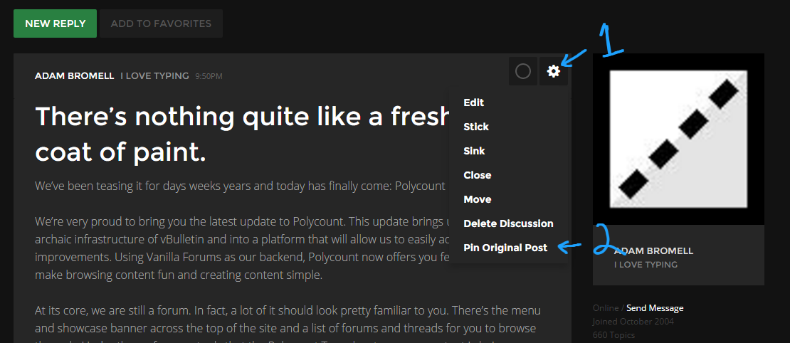
You can now Pin your original post to the top of your thread. This is perfect for anyone who is working on a project and wants to maintain their thread in one central location. As your project grows, simply update your original post with the new content. As your thread grows into multiple pages, the original post will remain at the top of the page for all to see. This way the discussion can continue while your content has one central location that is easy to view and manage. I’ll Pin this thread so we can see it work.
We have fully functioning SEARCH. It works and its fucking great. I am not going to say anything more on that.
Navigation, Favourites, Communication, and Search is vastly improved. You’ll notice now that the menu at the top of the site stays with you wherever you are on the page. Besides the ability to jump between the News and the Forum, you’ll notice that there is a new notification center for your own content on Polycount, a nice clean new chat interface for you and other users, a spot to keep tabs on your favourite threads, and easy access to your own profile.

What state is the new site in?
We probably should have called this a ‘Beta’ launch of the site as you’re bound to run into issues throughout it. There will be a thread for you to report BUGS & SUGGESTIONS but here are some known issues:
The site will not work properly on mobile. Once you’ve picked up your table and all the stuff you just flipped on the floor, please know that this is a top priority for us and the folks at Vanilla. We considered sitting on the site launch even longer to ensure it worked, but we opted to push this live and deal with this in the future.
The front page will render oddly when you resize your browser window. To fix it, just refresh the page. However, if you scale your browser window to a very small width, even refreshing it won’t fix the responsive issues. We’ll work on that post launch, promise.
There will be some formatting issues throughout the site. I won’t list them here, but rest assured we’ve probalby seen them all. If you do come across some, please report them in our BUGS & SUGGESTIONS thread.
Video sites are supported, but implemented inconsistently. What I mean here is Youtube videos will be about 320px wide when posted (just post the URL!) while Vimeo videos will actually be WIDER than the width of the post (again, just post the URL!). We’ll get this fixed.
3D viewers are supported/going to be supported. Sketchfab projects can now be shared via the Sketchfab button in the editor. Marmoset Viewer support will be coming in the future. Both will eventually be formatted to be the full width of a post.
The WYSIWYG editor doesn’t scale well. If you’re like me and like to talk a lot, you’ll notice that the WYSIWYG editor panel will remain at the top of the text editor. This will make editing long form posts cumbersome and more time consuming than necessary. We’ll look at solutions in the future.
----
So there you have it - welcome back to Polycount! It's been a long time coming but we're glad that it is finally here. Over time, Polycount will become yours - the front page will feed you content you want to see and working on projects and sharing it with the world should be better than ever.
This is its first launch so it will be rough around the edges - but that's OK! We'll improve it together: If you notice bugs or have suggestions, please post them here. Keep in mind that if there are new features or design choices you're not fond of, offering suggestions will be incredibly helpful. The good news is with our new work environment it should be relatively easy for us to turn around new features or bug fixes relatively quickly.
On behalf of the entire Polycount Team - thanks for being patient as we flipped the switch on the new site and we can't wait to hear what you think!
Replies
Gonna take some getting used to.
The text is so big I'm seeing less on screen at a time and scrolling way more reading through posts in a thread.
Browsing threads I see less on screen at a time as well.
If I had a hard time reading things I could always size things up through my browser.
Now sizing things down doesn't help at all (It just gives me a super narrow column).
That part of it seems like a step backwards and is the main thing I value most above new features.
I haven't tried out all the cool new stuff though. It looks pretty nice
@simont It's a known issue.
@sideeffect You'll get use to the new font sizes, promise. We'll work on the spacing/padding.
@shrike Look to the left of the thread name when browsing a forum. If there's a NEW icon, there's new content for you. I second the feedback on having the WYSIWYG editor mimicing the posted content. Specifically I am not a fan of the black background and white text that appears.
And for everyone:
Please don't use this thread for feedback or suggestions. Guarantee that it gets looked at by posting the feedback here.Everything else looks great.
is there any chance that could be fixed somehow?
I hope that someone, sometime in the future, will create tutorial on how to use this site
For now I call it a failed experiment and I hope that whoever is responsible for it will come to their senses and bring back old design.
Will check you again in a month.
(Had to test out replying)
Is there a way to view 'New posts' ? like the old site layout? Or is that no longer a thing?
Overall (at least on my setup, which I believe is representative of the average user - that is to say browing Polycount on a secondary monitor) it is obvious that the current layout makes information less legible. The oversized right hand margin is the biggest culprit, but no need to cover that again as its lack of purpose has been brought up already - see the feedback thread for more on that. It also requires more scrolling, which cannot be justified as a plus. Most of the other cosmetic changes I can totally get used to, but I think it is understandable and pretty obvious that a decrease in readability, in a forum of all places, is a negative. Some interactive elements are noticeably slower too, like the reply/edit box.
Now of course that's not something that will make me quit like that other user did, because I am convinced that changes for the better will be made in due time, especially since everything seems to be easier to tweak than before on the back end. In that context I think it is especially important to not sugar coat our feedback. This is Polycount after all - a place that made its name and survived when other forums died out thank to its tradition of harsh yet honest constructive criticism.
I appreciate that it won't go back to the way it was but this new format is not encouraging me to continue visiting and participating in the site.
I'll chime in and say I feel some of your changes do not make it better, @Pior, they make it familiar.
Making the reading column wider, for instance, goes against the grain of Polycount becoming a site that is easier to read and digest the information from. Large format forums turn in to sea's of text that is hard to digest and follow. With the new update - especially for the OP - we were inspired by Editorial websites, not forums. In that line of thinking: you'll be hard pressed to find an editorial site with a wide-width or full-width reading column. Sure, you can easily point me to a forum that has those widths - and yes, we are a forum - but we're building a platform for people who want to not only write about what they know, but for folks who want to read it. Editorial sites are narrower intentionally; its easier to digest the information. That's why we're sporting a thinner column and have moved all irrelevant information to the right side, filling that gap that's left when making the column more narrow. You'll notice there is a hierarchy of importance when reading Polycount now from left to right:
Who wrote it ---> What did they say? ---> What else can I learn about them?
"Irrelevant information?" Post count and join date isn't important in a discussion. Hell, I'd much prefer to hide that information altogether and make it something a user has to actively engage in order to get it (like, say, mousing over an avatar and having it pop-out). My own counter to this argument - as a means of showing that I understand there are things we can work on to improve - is that something that WOULD be important on Polycount is, "What studio does this user work for?" or "How long have they been a professional for?" Under the current design setup, having that on the right side would be a counter-point to our intentions. A challenging problem I look forward to solving.
While trying to make the information easier to digest, we may have spaced things out too much and its something we're definitely going to look at getting changed. A reduction in font size and object spacing will happen well before a complete redux of the format we have going on. Once that happens, I'd like to sit on that design for a good chunk of time and come back to it, asking the community then how they feel about the site. Things like adding thumbnails to the left side of a thread title are far, far out in terms of whats important for us to bring to the site. For some clarity on that, its Bugs, then familiar features (like bringing back a page to read New Posts on), new features we've yet to implement, then we'll review our options for updates/a redux on the current layout of things.
What I love about your updates, Pior, are the changes you've made in condensing the current designs. Less padding, smaller fonts, the odd movement of information. But complete flow redesigns probably won't happen until the current design is properly registered with our users to see how it fits. It's only been about 48 hours, after all.