[UE4] Cruise Ship Hideout

polycounter lvl 12
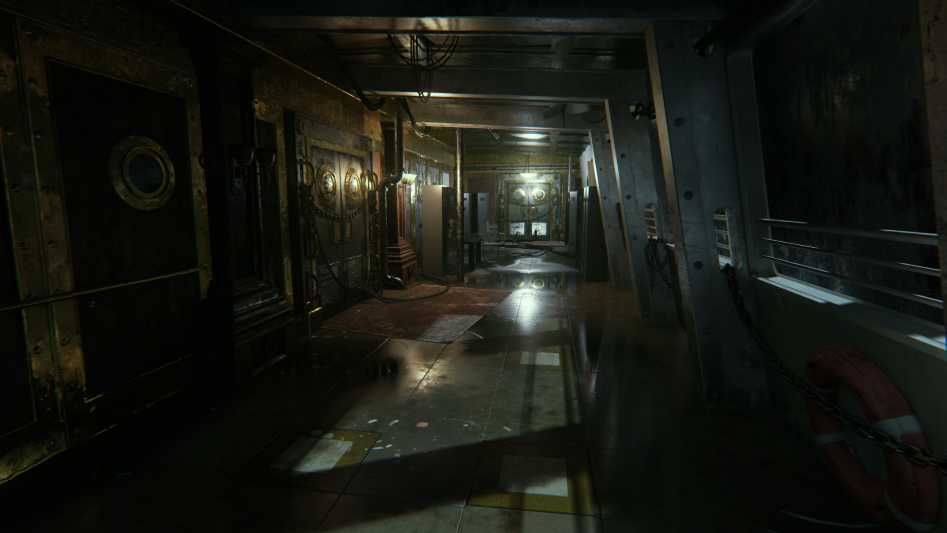
MOST CURRENT:
- - - - - - - - - -
Original Post:

The idea here is that this hijacked cruise ship houses a group of henchmen (IN the Batman universe) and serves as a "home away from home" and a base while they conduct their illegal activities.
This hallway is right outside of the office of "The Boss" but also provides "entertainment" to the henchmen as a place to bond over their illegalness.
The actual environment from Arkham Origins actually came out WILDLY different from the concept so I'm not too concerned with matching the concept exactly, just using it as inspiration for this re-imagining. With all of that in mind, you can expect to see some really unique and borderline silly "hero props" as I try to make it my own but still fit in the spirit of henchmen whos only aspiration is to kill THE BAT

Environment structures are the furthest along but I still have a TON to do. Besides material creation, I still need Light Meshes, Wires, Random Trash etc. The lighting is just "work lighting" completely WIP and some props are blockier than others.
I'm always up for suggestions, questions, or C&C if you have them")
Thanks for checking me out!
- - - - - - - - - -
Original Post:
The idea here is that this hijacked cruise ship houses a group of henchmen (IN the Batman universe) and serves as a "home away from home" and a base while they conduct their illegal activities.
This hallway is right outside of the office of "The Boss" but also provides "entertainment" to the henchmen as a place to bond over their illegalness.
The actual environment from Arkham Origins actually came out WILDLY different from the concept so I'm not too concerned with matching the concept exactly, just using it as inspiration for this re-imagining. With all of that in mind, you can expect to see some really unique and borderline silly "hero props" as I try to make it my own but still fit in the spirit of henchmen whos only aspiration is to kill THE BAT
Environment structures are the furthest along but I still have a TON to do. Besides material creation, I still need Light Meshes, Wires, Random Trash etc. The lighting is just "work lighting" completely WIP and some props are blockier than others.
I'm always up for suggestions, questions, or C&C if you have them
Thanks for checking me out!
Replies
The windows could be more inclined imo!
I will investigate and see if adding more of an incline on the right wall helps
@DWalker
That's a great catch! I think that will really add intrigue to the level; especially if I can't get the level to animate properly with the stationary lighting I am using. The 5 degree cant could be a great compromise.
@chrisradsby
That was something that confused me from the concept, but I do think it would make more sense to integrate the pillars so I will make sure to do that! Thanks! ^.^
----
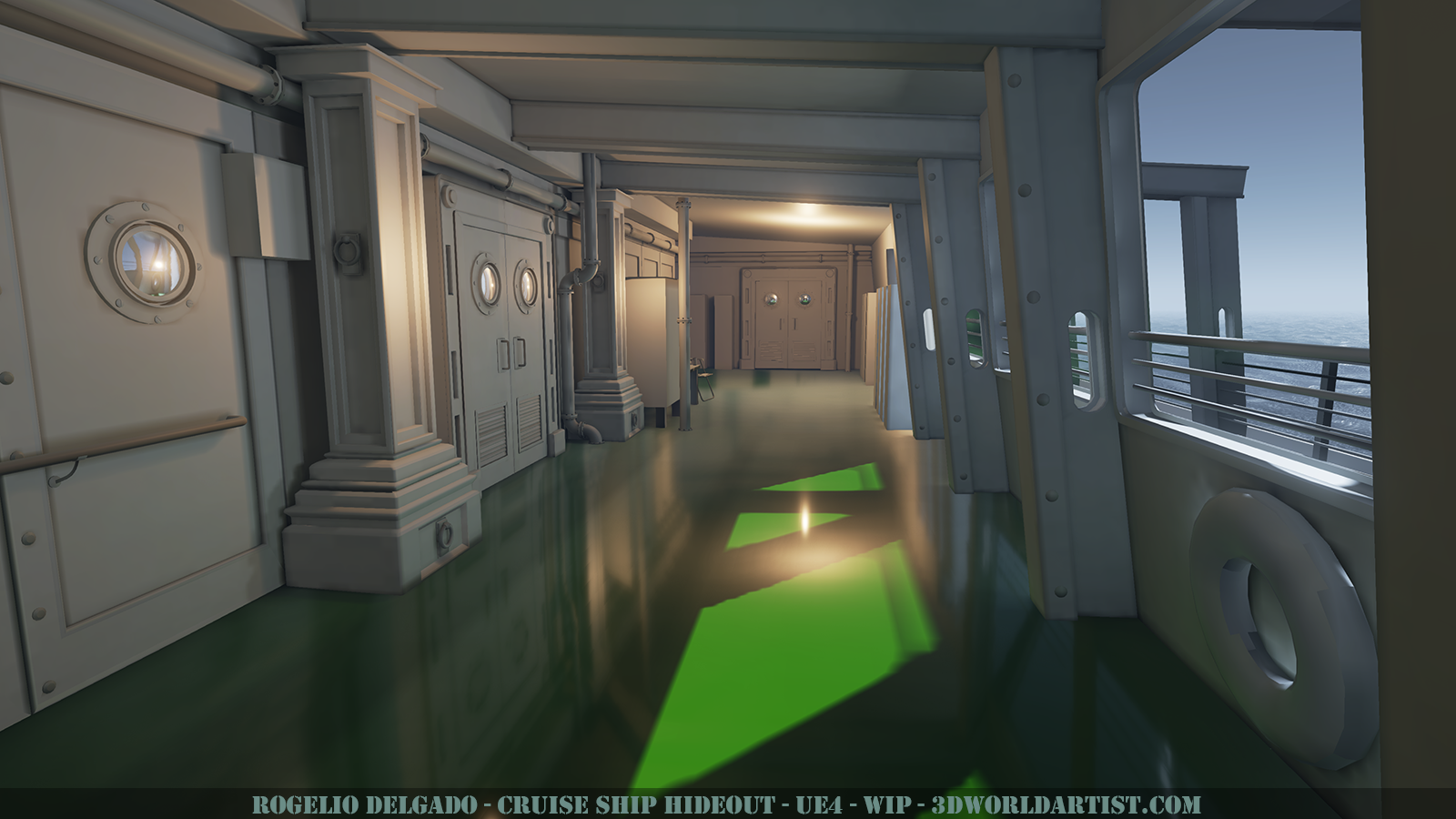
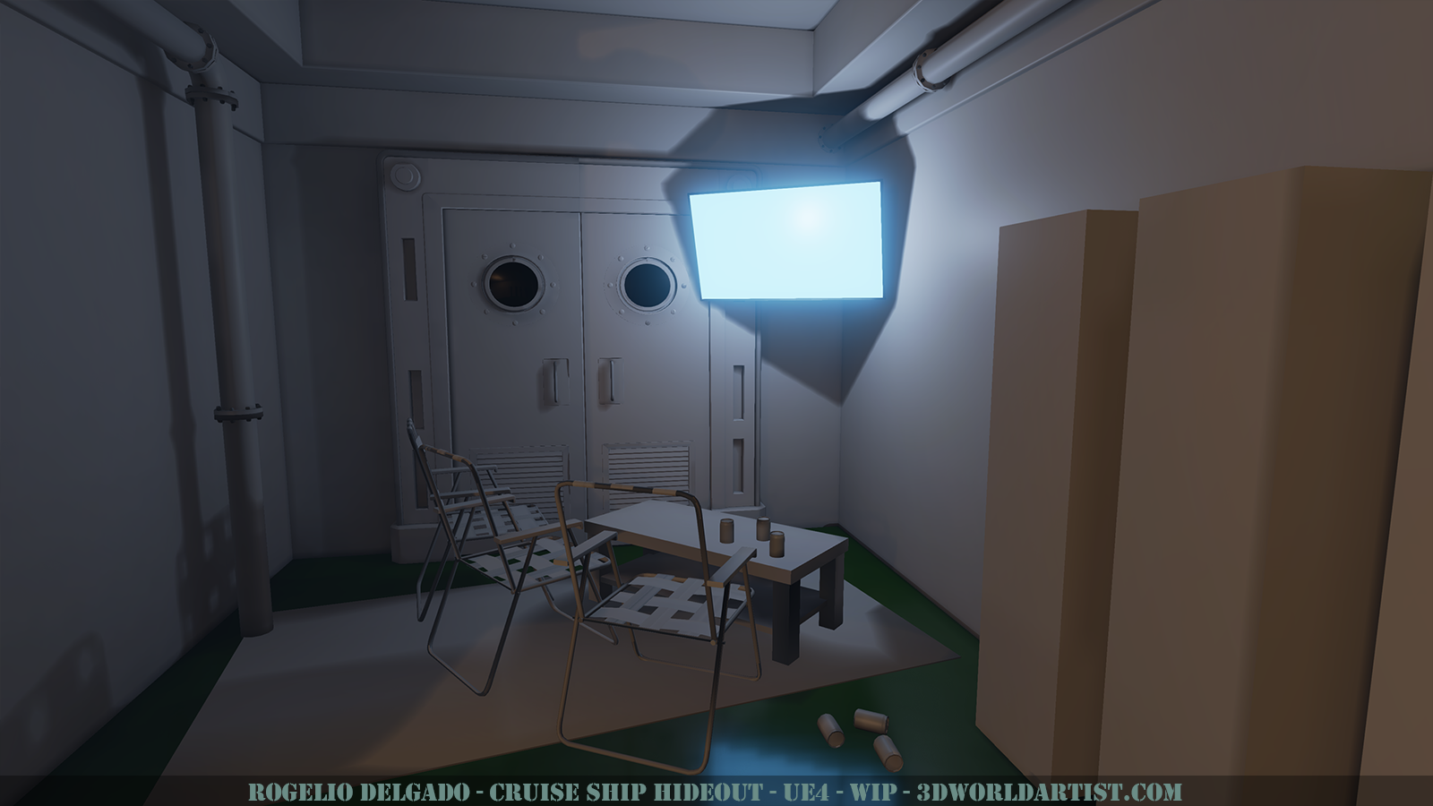
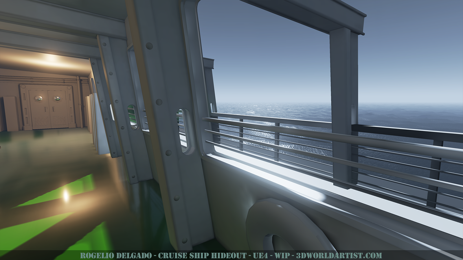
Here is my latest UE4 WIP. Still VERY EARLY progress. Most materials are still in their infancy, most textures are flat, and some props are cubes. Trying to nail the structure first before moving on to hero props. Still a TON to do here but I thought I'd share anyway!
I can't help feel that because of the crooked feeling the composition is giving off (right pillars slanted and angled roof) that you take that direction further and perhaps add more crooked things/destruction to the ship.
Other things to consider: If water were to come aboard the ship where would it go? Maybe some options for trims around the edges of the floor or holes in the side.
Hideout implies an outpost, perhaps have some eyeglasses on the side looking out?
Fishing equipment?
I realise you said very early stages so sorry if I sound condescending, hope I have given you some ideas
Thanks!
@maverickhornet
Thanks man! I completely agree with the potencial it has. Right now it's really rough around the edges but I know if I put in the work I can make this blossom into something really cool!
@jestersheepy
Thanks! Destruction is something that I'm still considering; perhaps some medium to small scale destruction would make the piece pop quite a bit. As for the water, I actually modeled a little bit of a bow towards the center of the floor in order for the water to drain, however I still have to add the circular drainage such as this:
The ship is definitely more of a hangout than a hideout, but still I love the suggestion for more hideout props
Capture the mood with your lighting and you're set!
Cool stuff!
@javier_olazaba
Thanks for the suggestion! I will definitely play around with that first beauty shot composition and keep that in mind! I will probably lean the most away from the concept when it comes to lighting this piece, but I'm still waning back and forth on that every day because while I love the mood of the concept, I do feel it is a bit too dark. I will certainly try and see going forward if I can inject a bit more "mood" into the piece to try and strike a balance between "still visable" but still "dark feeling"... if that makes any sense =P
This is kind of a half-baked update since all I really did was re-work some existing materials and since there is still so much work and polish to do. But this is the state it is in at the moment for better or worse. The floor is next to get some love, then the doors (finally) as well as the lockers and life preserver. Still have the deck to do as well as the lounge area but it's a work in progress and I'm still enjoying myself and the scene so its all good
@SaferDan: Yeah, it's bothering me as well. Luckily, I don't consider anything in this project too far along to change. I really want to push myself as much as possible on this piece so everything is re-workable.
Maybe I need to brush up on my architecture but I don't really know of a better way integrate it. I suppose I should look up more reference but in the mean time if you or anyone else has some suggestions on a better way of going about it, I'd really appreciate the info!
Things still left on the plate (Copy and pasted from my Google Drive Work Doc):
Finalize Interior structure:
Pipe Texture
Painter Pass:
Door Pillar
Door
Window
Beams
Create Model+:
Life Preserver (Material)
Chain and Lock for doors
Chandelier (UV)
Transformer Box
Random Trash (Cruise Pamphlets, Cruise Paraphernalia, Beer Bottles)
Outside Deck Stuff (Floor, Railings, Beams)
Drainage
Wires Material
Soda Cans
Not to mention the 4-6 hero props I have planned!
Thats about it for this update, thanks for checking me out!
I still feel like the scene needs a focal point, my eyes are all over the place atm! I assume the hero props will help though!
Looking awesome though dude!
Thanks! The hero props will definitely help add focus to a currently, admittedly, unfocused piece. But my goal was to finalize the base of the hallway and then focus on props individually which I think I am on track for. Its a new way of creating a project for me and I really like it. Usually I just burn out on modeling, then burn out on UV'ing, then burn out on Texturing, etc etc. This time I really took my time, jumping from thing to thing, having a master list and just generally taking it one step at a time. It's been the most pleasing project to work on to date ,and best of all, I'm STILL not sick of looking at it yet!
ArtbyV
Thanks! That is the goal! ^.^
So, just on a side note, this update got 121 likes on Lunchcrunch, 61 favorites on twitter, 37 retweets, and one of the re-tweeters was Unreal Engine itself! I'm glad the piece is getting a good response, it makes me want to push even harder! Now my goal is to make the polycount re-cap xP
Thanks to everyone who has given feedback so far, and as always C&C is always encouraged!
Keep em coming!
This is gonna be a great piece for your portfolio : D
I made a quick and dirty .gif to help you with the lighting. I think you are too attached to your individual assets and as a result you are over lighting them so people can see them clearly. I would dial back all the light you have by about 50% and then throw a really bright spot at the end of the hallway. Also, your direct light shadows are too sharp and defined. Lastly, one of the major features of the lighting in the concept is rim lighting and reflected light glancing off of all the surfaces from the main source behind them.
Thanks, and thanks so much for the paintover AlecMoody !!
I completely agree, thank you for bringing this to my attention :thumbup:
I will definitely give that a try
Ahh yes, some softer lighting could really go a long way here :thumbup:
I'm not trying to copy the concept 1:1, however the "spirt" of this idea would be nice to mimick and may really help push this piece and give it more of a focal point- for at least this beauty render.
I really appreciate the feedback. I've taken a little break on the scene to catch up on some work work and life stuff, but I'm just about ready to jump back in this week/weekend. This definitely helped- thanks much!
Otherwise looking good!!
Been a long time away from critique, and lighting in general, so I'm gonna dip my toes in gently.
Now, let's get one thing straight - I love black! Contrast is rad, but there's a bit too much here. I think before you start working with practical sources, it might be to your benefit to establish your black/ambient levels with a directional lighting pass.
Turn down the lights and sell me on night first. I do see some kind of directional light coming in, but upon hitting most of the surfaces it stops. There seems to be little to no bounced light, and even though night is dark, it (I think) has more of a diffuse/soft look. Bring down the intensity of the light overall, but pump up a bit more power into the indirect lighting. Establish the base point of darkness without there being a complete lack of light. Maybe also try some cooler tones so that you contrast more with the sourced lights.
Folks have mentioned the light in the left of the scene, and, it distracts me as well. I believe it's a reflection off of the porthole of the nearby wall lights. I think the glass material is a bit hot in general, looks like pristine glass hit by a high wattage bulb. Because we ultimately should move down the composition to the doors, it's a good idea to soften up the intensity and overall influence of these wall sources. Dim the material and light output, possibly try a Tiffany orange along the way to sell that older glass feel that will at the same time, soften the value. Again, with these, pull down the overall impact/intensity but allow more soft fill.
One thing I like is the rhythm in which the beams shoot down the composition, and I like the way the nearby soft light glances off of them. It would be neat to feel the warm lamp light on one side gradating off into the cool moonlight on the other and might would be a way to accentuate the hallway leading to the doors as your focal point.
Regarding the doors/end of hallway, push it. If the whole scene is a 7, make that your 10 (or 11 depending). By push it, don't just make the light crazy bright and flatten out the image, but push the lights ability to shape objects in the scene. I'd allow the light to "kiss" more of the props - the side of the structural beams, across the surface of the lockers, rim out the chair, across the planes of the woodwork on the roof, etc.
Might be advantageous to turn off reflections. Get a good light quality before adding in elements that are so heavily reliant on lighting in the first place. If you can make it look good without the sophistication, it for sure will look #Baller with some tuned materials.
Great work thus far, good luck refining!
Love,
-Jon
- I love the switch to night! Definitely add in some cooler colors into the shadows. I'll leave it to your judgement on how you want to represent night through the color saturation though. I find it fascinating how people see night because everyone sees it differently. I believe this is due to the different size/shape of the rods and cones in the eye.
- I agree with Jon that you need to focus on the lighting. I feel that the materials, props, composition are all great. Lighting is the one thing that could really lead the eye around and make the piece stand out. More indirect lighting to get rid of some of those deep blacks.
- Consider adding in some sort of light volume for the light coming in from the night. Perhaps even make it non-uniform to read as ocean spray or other particles that could be in the air.
Glad you are picking this up again. Looking forward to seeing the progress!
Dude, it is so great to hear from you!! I'm sure I've told you this a million times but you are one of my lighting heroes! So to have you take the time out to give such a thorough critique is really awesome! I appreciate it a ton!
I'm looking forward to implementing your astue advice and kicking it up to 11!
Mospheric
Thanks a ton man! Some great advice there that I will certainly take heed of!
With that said, I really enjoy the progress I've made and all the cool things I've learned about UE4 and Substance
My only major crit, especially since you're wrapping this up soon, is there are still a lot of blacks in the shadows. I've seen some other people mention that as well, which makes me think it's not just me and my monitor. Increasing the light bounces or a weak skylight could help.
Just for the sake of final renders, I'd also adjust the anti-aliasing and SSR quality. I know UE4 has the command for SSR(I think ssr.quality #), but I'm not sure about the AA.
Apparently all my UE4 settings were on MEDIUM... I just jacked them up to "EPIC" and holy crap... the difference is night and day in some areas! The screenshot above should be updated to reflect the changes. You may need to refresh a few times to propagate the changes, but yeah. The reflections are much more accurate and the AA is much better!