Ratatouille Scene, Lighting Study [Critique Welcomed ]
polycounter lvl 10
Making a small scene , from the movie Ratatouille .. The scene looks simple yet the lighting looked great..so, for doing lighting study trying to achieve similar feel..
Here is the Reference shot:
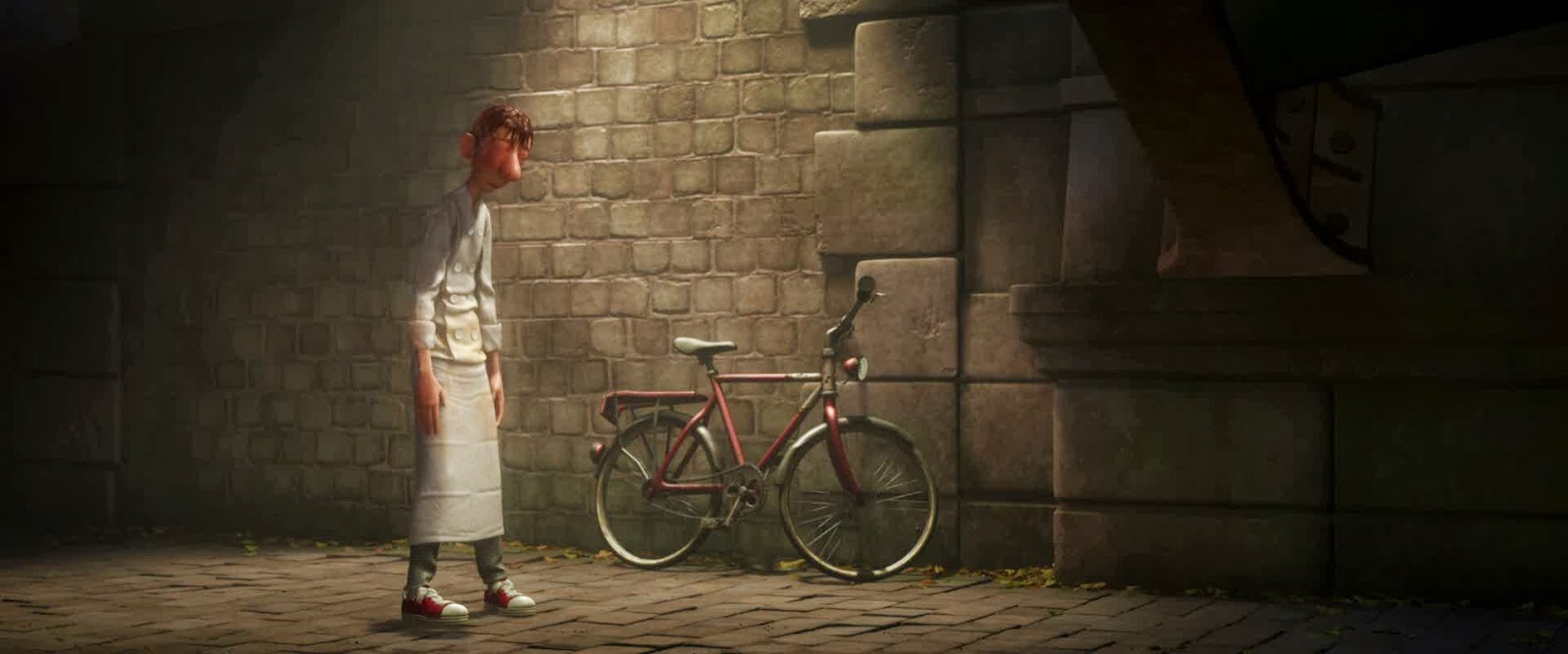
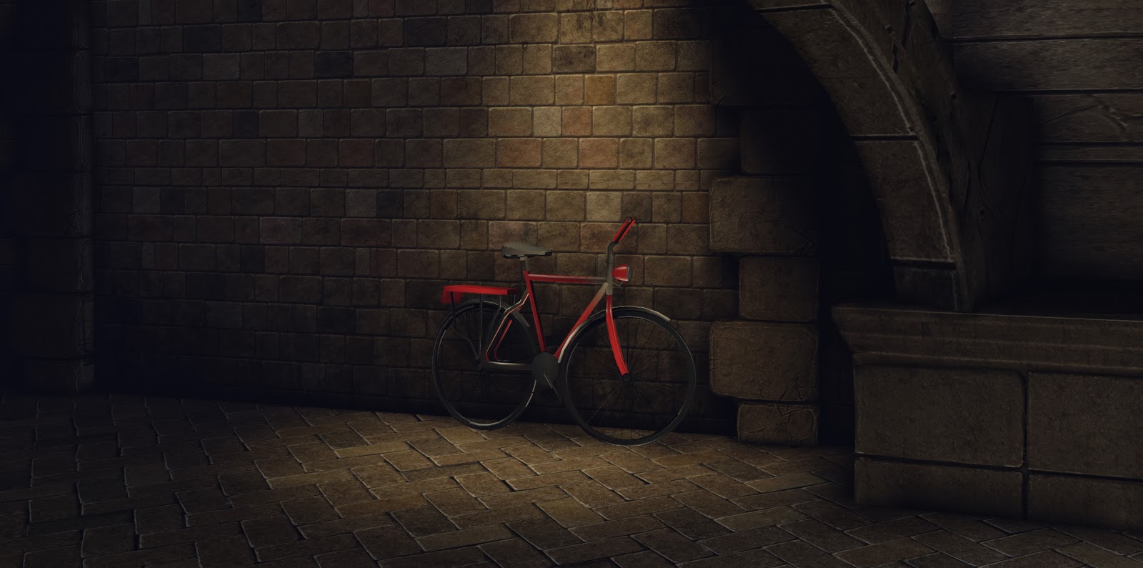
and Here is the current update.
(currently too dark, trying to fix ... Goshh why lighting so hard :P )
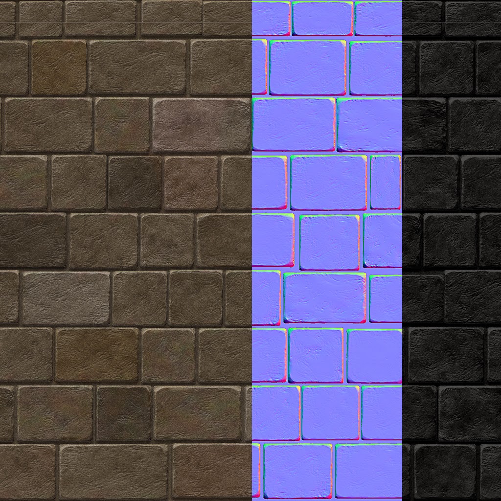
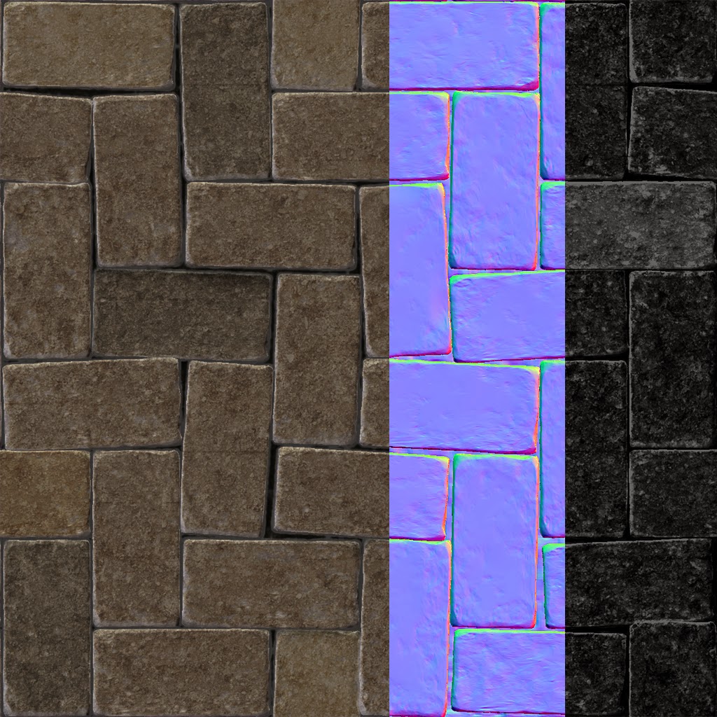
Tilable textures:
Brick
floor
Here is the Reference shot:
and Here is the current update.
(currently too dark, trying to fix ... Goshh why lighting so hard :P )
Tilable textures:
Brick
floor
Replies
Let me know what you think ? Any way I can improvise ?
Right away the first thing I noticed is the color. The Ratatouille scene is very green, while yours is blue.
Their spot light is much wider than yours as well.
Good luck!
I watched this movie last month and found that very scene to have such great atmosphere and rich coloration. It's incredibly striking, great choice! As someone who's extremely interested in lighting and mood, you have my full attention, and it's refreshing to see someone who wants to make that the focus of their project. Good on ya!
I think there are some other shots which show the golden glow amidst the cool blues and purples of the night. I think it's imperative to re-think your composition so that you can recreate the full beauty of the mood in the scene. Looking straight at the wall is not very intriguing so I really suggest cheating the camera more to the left so we get the sweeping view that's in the film.
Here's some better reference:
Hopefully you can shoot for this composition so that you can work the night sky/dense fog into the scene. There's some great framing here as well,where the bridge completely silhouettes over the warm lighting against the wall. See if you're comfortable enough to work with this new composition and I think you'll have a much more interesting outcome. You can work with the fog terminator so that you can transition from the blues to the oranges.
Your current light needs to be hotter at the source point and falls off into a soft bounce once hitting the ground. We need to feel the influence more. There's one thing I was noticing about this movie - it's very soft. Push and pull intensity vs. bounce. Another thing people don't do much of is supplementing additional light. GI will not do all the work for you. Your light pooling falls off unrealistically, so you might want to add an additional (and gentle) bounce light at the impact point so the light will have a greater influence over the ground. If you think you're too dark still, adjust the environment color vs. the number of bounces in the scene.
Dear lord, sorry to throw so much stuff at you but I got excited and started firing off like crazy. I'll follow this thread and should be able to help you out as you zero in on the composition and the mechanics of the lighting.
Good Luck,
-Jon
I'll start modeling more and work with the new composition soon.
Thanks Jon, will update soon
[ahh, you are the one who wrote "Getting The Most Bake For Your Buck", read that long ago, Nice blog (Y)]
Right now stones are way to dark (just looking at the diffuse histogram), and it will be difficult to light them properly, if you want nice soft lights, with color variation.
[not happy, but just to show the update]
1. New composition shot
2. Brick wall texture lighten abit
New Problem.
I made the modular walls, with non overlapping UV.. Yet I get some seem on Lit Mode.
Any ideas whats going on ?
New shot looks nice though. One thing that may be a nice touch, in my opinion, is a soft bloom. I can't remember how the movie looked, but the pictures posted look a little 'bloomy'(and pixelated :poly124:). Your light is also a little too neutral, whereas the pictures from Jon shows the light being a little more warm(like a pale red?) and stronger. Some haze would help as well.
Also you have a seem in the diffuse and spec that is a really easy fix.
Subbing though. I'm thinking about doing a few small lighting exercises as well. :thumbup:
Also brighten the brick wall texture. When you say watch the histogram, I dont know what actually to see, but do you think this much bright texture is okay ?
Like brandoom has suggested you should be looking at general colors and tints.
Something you might wanna do is compare color values in photoshop.
like this:
https://www.dropbox.com/s/l8jkyujzn7258zl/lightisdiffuse.png
Check both images with a gaussian blur to have just blurs of colors and to not focus on the detailing. Try to seperate what is light, what is texture to gain a bit more focus!
Keep it up, it is looking great already.
About the curves, you'll want to have a good distribution of values, and have a neutral diffuse (ok not all the time).
I just desaturate your diffuse, and applied an ugly level. There's padding in the curve, but you get the idea.
Firstly, good on ya for changing the composition. I think it's loads more appealing, plus, you can't deny that sweet color contrast. Here's a few things that come to mind:
- Key/Focal Light Execution
- Fog/Atmospheric Scattering
- Post Process
- Some Technical Suggestions
Before I go too in-depth, it might be nice for you to have a lighting only/detail lighting shot as well as one captured from engine so I can see what lights you're using and where.1. Let's talk about your key light. I'm not sure how it's executed - 1 spot, 1 spot and one point at impact? Either way, the amount of dissipation from the top of the wall to the bottom of the wall doesn't seem to justify the amount that's hitting the center of the paved walkway. Where is your source/lights motivation? Maybe you have it angled funny, or maybe you cheated the light outward, but there's a disconnected feeling with how much the light is falling off toward the bike yet how bright it is at ground level. Right now I don't feel like the light is "real".
The color is a bit off too, shoot for a bit more orange than the yellows that are currently there. Intensify the light a bit more too so that it's source point feels as hot as it does in the reference. With a more intense source, you'll probably have to balance indirect scale and indirect saturation as well as the general attenuation of the light. You'll still want that soft gradient, but you want a hotter source. Might also want to look at the number of bounces in the world properties and find a good balance of strength vs. falloff. Finally, the way it's hitting the bike feels off. The bike is somehow falling into shadows, when it should be more pronounced under the light. In the reference, the bike is even casting a shadow so see if you can get that interest in there.
2. Fog is looking pretty good. I like the colors you're getting. One thing you're missing is the swatch of warm atmosphere from some of the lamp posts. You might be able to get this effect with the light terminator angle in the fog.
Terminator is based off of the directional light, facing the light you'll get the "inscattering color", and facing away from the light you'll get the "opposite light color". This is an example from an environment WIP on working on:
Thread is here for reference - http://www.polycount.com/forum/showthread.php?t=126792
Shameless self promotion aside, you'll see in the image that facing the directional light, I had a warm color in the fog and facing away from the directional, I had a cooler color. The terminator angle effects how much of each of the colors you'll see. So, if you create a very soft evening directional light and work the 2 colors, you might have some success getting the soft warm haze screen right and the purple to blue screen left.
3. BLOOM! You'll notice the scene is very soft, almost dreamlike. Aim for a soft warm bloom. You'll want to change the material color of the lamps so that they'll justify the warmth around them in the fog. You can adjust the bloom color on a per light basis, so give that a shot.
4. Finally, there's some minor things that could use love. Your leaves look to float upon the sidewalk and there appears to be some light leaking from the arch to the wall behind it.
If your not familiar with light exclusivity - in the properties of a light, you can marry it to a mesh by flagging it, say, "Custom 1". Then, the mesh you want it to hit, also flag "Custom 1". The reason I say this is that I think you could do a bit of cheating so that the arch is a bit more silhouetted against the warm light. Flag it for a custom light and have that custom light hit it in a much softer fashion than your main key/fill lights.
Quick paintover - I didn't mess with the bike, but it needs some love too:
Suggestions are written on the image. Here's a good link about fog, could help you learn about the terminator as I talked about or even to create a fog volume around the lights so you could fake the atmospheric light scattering: http://http://www.hourences.com/tutorials-ue3-fog/
Sorry for the novel, hope it'll help some,
Love,
-Jon
Appolozies, dint have internet at home since yesterday, so couldn't read the comments or post any update..
I'll go though all of them carefully once I reach home and update accordingly.
For now here is the yesterday's update ,
I kinda like it already, but would be improving to my best..
@AtticusMars: Finally understood, what lighting information on my diffuse map meant. I think I fixed it and made less contrast diffuse for wall and floor.
@Endfinity Jon: I learned so so much, I did try to fix acc. to all the mentioned point.. The new update does look better (I think
I still need to work on better model/texture for
-Cycle
-Bridge
Here is the tonight updates.
Good Night Guys
Do comment/suggest if something is still off..
For now I'm pretty happy , and learn many more thing on UDK lighting this time. Happy I started thing, small environment but found to be effective for lighting Study.
I'm not sure why you weren't getting the results you wanted with your spot light. Looks like you added 2 point lights to supplement. Using points splashes light in every direction and makes the lighting look less driven by a source. A spot with GI should have given you something similar. Supplementing the bounce with a point is okay, but it looks like your key light is your point, which looks strongest in your lighting only. You're also missing some of the softness seen in the film but that comes down to custom fog volumes and working your bloom so that it has a lower threshold allowing things to bloom quicker than normal.
Small technicalities though, your final image looks really nice. You came a long way from your first post, great job keeping with it! Hopefully you learned some new things about lighting in this study and you've got a cool little piece to show for it!
-Jon
thanks, was waiting for you comment , hehe
I had to use the point light to get the diffused light in the floors, which with spotlight only gave me a harsh round spotlight effect in the ground too.
if I increase the indirect lighting, then I'd light the whole scene(not which I want) or elsewhere I dont want it.
Also since you are here, I wasn't getting good shadow. (lightmap resolution for ground/stair wall BSP is 8 ,good enough) I get it before baking and its gone afterwards.. "there is lil shadow in the floor but non in wall"
[I've started working on next project, but I'd still love to fix what I can here]