[UDK] Night Elf Underground Temple (Hand Painted)

polycounter lvl 7
Hi there,
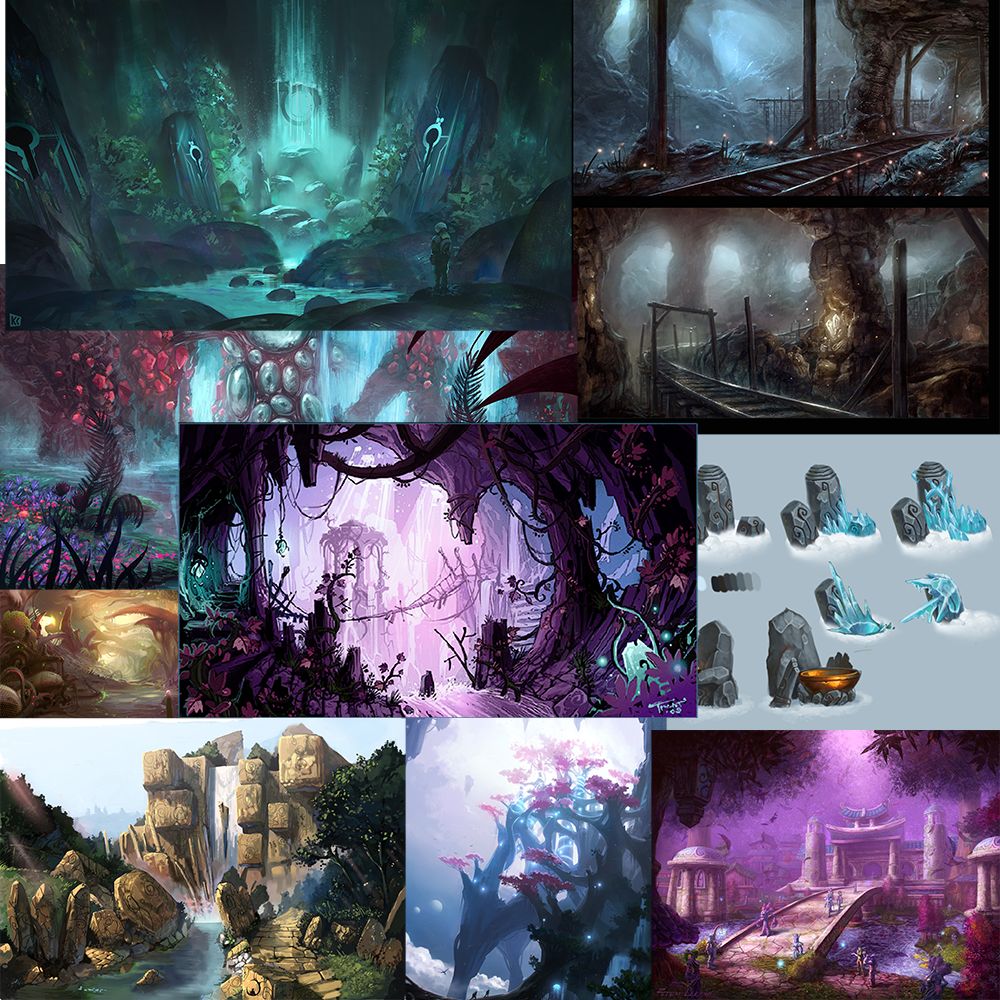
During the summer (and beyond) I decided to create a piece of environment art for my portfolio and since I want to get better at hand painting textures and love that style I decided to give it a go.
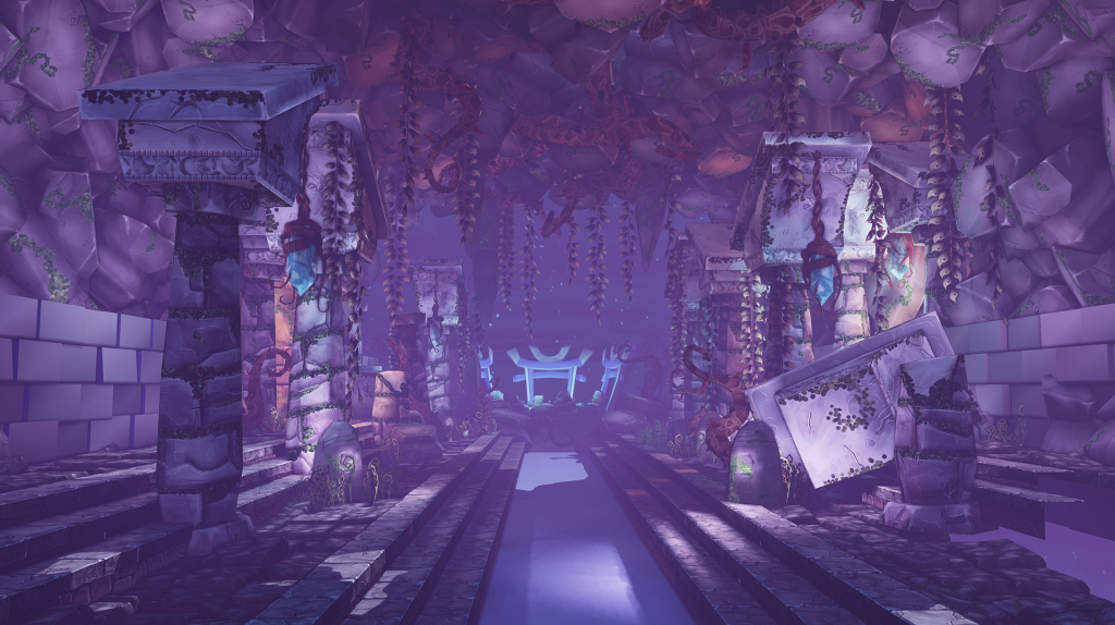
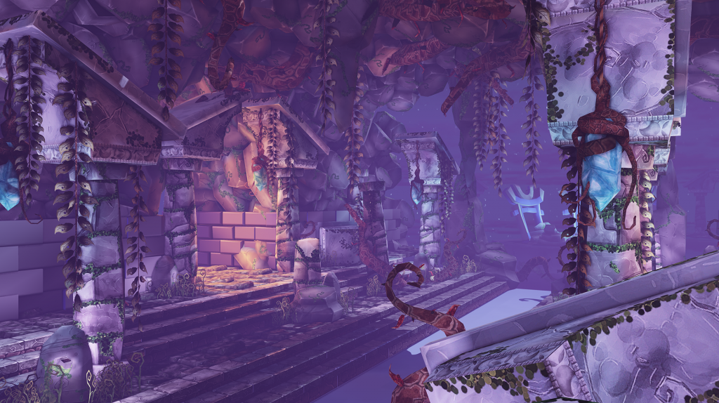
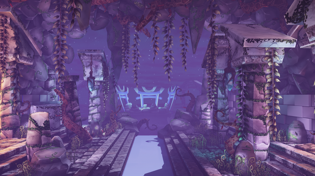
I started out with a cave but then wanted to give it more of a function and settled with it being an underground night elf temple with a moon well in the centre that is the only place that gets direct moonlight from above.
I'm still working on improving the rocks to make a convincing wall and ceiling and the centre still needs a lot of work, but I thought I'd share my progress for you to point out problems and give feedback if you want")


During the summer (and beyond) I decided to create a piece of environment art for my portfolio and since I want to get better at hand painting textures and love that style I decided to give it a go.
I started out with a cave but then wanted to give it more of a function and settled with it being an underground night elf temple with a moon well in the centre that is the only place that gets direct moonlight from above.
I'm still working on improving the rocks to make a convincing wall and ceiling and the centre still needs a lot of work, but I thought I'd share my progress for you to point out problems and give feedback if you want


Replies
I love the way you use your colors.
It's indeed maybe a bit same tinted right now. A few color accents would really make more of an focus point.