Western themed Castle Crashers-ish game (WIP)
Hey all this is my first post, sorry I didn't see a welcoming thread. My name is Ray, and I'm an unemployed ex-Flash artist. I've kinda put off drawing for a couple months since I lost my job so I figured it was time to jump back in full force with a refresher game. My last job was in education and the quality expectations were really low, so I need to hone my stuff quite a bit, but it'll work for now I reckon (I'm from Tennessee :P)
Anyhoo.. to the game.
I'm looking to do a Western type game with a mix of elements from Castle Crashers, Sunset Riders, and Metal Slug. It will of course be a side scroller. I Just want a fun goofy game with over the top bosses, and pretty artful stages. I'm thinking things along the lines an old timey steam train mech for a boss, a giant tobacco spitting spittoon ect. On the NES forum I frequent there has been the thought of the stages being like jobs that Flint (the main character) signs up for, goes mad and has to eliminate all his co-workers, finally finishing off the "Boss" in the end. Going from job to job getting ticked off and killing the panty wastes. Coal miner, saloon worker, railroad worker, sherrif and so on. I'm kinda liking the idea, but I'm still open to changes.
I'm needing any feedback I can get on this one. I'm still open to story line (for the most part), stages, themes, bosses, BG art direction ect. Oh, it would really help if I had some direction on the HUD at the bottom... what it should be made of consist of. Heck even if you think its a good idea or not. I'll update things as I go. Help me out fellas. Thanks!
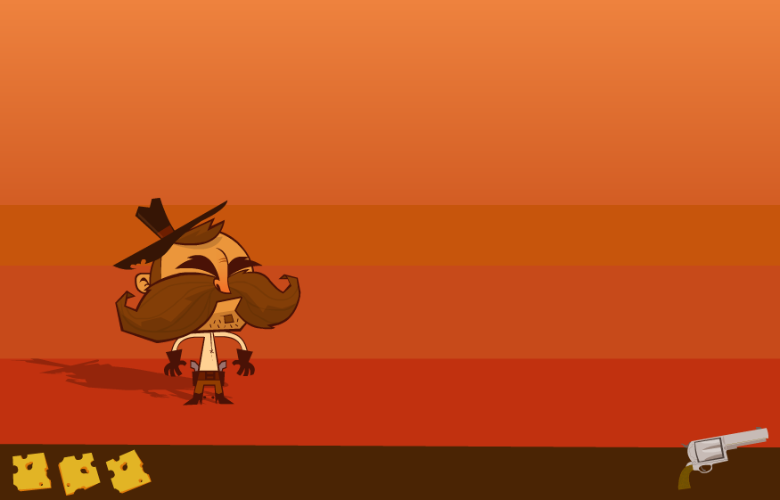
Current look of things SWF: (I just started last night so its very early on)
http://i200.photobucket.com/albums/aa207/maximusfrisbee/Flint_master.swf
Current still of things:
http://i200.photobucket.com/albums/aa207/maximusfrisbee/Flint_master_still.png
Anyhoo.. to the game.
I'm looking to do a Western type game with a mix of elements from Castle Crashers, Sunset Riders, and Metal Slug. It will of course be a side scroller. I Just want a fun goofy game with over the top bosses, and pretty artful stages. I'm thinking things along the lines an old timey steam train mech for a boss, a giant tobacco spitting spittoon ect. On the NES forum I frequent there has been the thought of the stages being like jobs that Flint (the main character) signs up for, goes mad and has to eliminate all his co-workers, finally finishing off the "Boss" in the end. Going from job to job getting ticked off and killing the panty wastes. Coal miner, saloon worker, railroad worker, sherrif and so on. I'm kinda liking the idea, but I'm still open to changes.
I'm needing any feedback I can get on this one. I'm still open to story line (for the most part), stages, themes, bosses, BG art direction ect. Oh, it would really help if I had some direction on the HUD at the bottom... what it should be made of consist of. Heck even if you think its a good idea or not. I'll update things as I go. Help me out fellas. Thanks!
Current look of things SWF: (I just started last night so its very early on)
http://i200.photobucket.com/albums/aa207/maximusfrisbee/Flint_master.swf
Current still of things:
http://i200.photobucket.com/albums/aa207/maximusfrisbee/Flint_master_still.png
Replies
Can't say much apart from maybe he could do with losing the beard stripe in the middle of the chin for a more stereotypical old westerner look. Looking forward to updates!
Does anyone know where I could find a Castle Crashers walk cycle? That would help me out a ton.
he has other videos on there too it looks like, but that's the only one I've watched.
Looks ace, i can't wait to see the rest of the world get fleshed out.
Seriously though, this is looking rad.
Side scrollers look awesome when the backdrop plates are separated for parallax scrolling.
Thanks man, those videos are helping out a ton. Ole' mr. Paladin is SICK.
Agree'd I definitely am going to incorporate that.
Thanks everyone for the input, and the compliments. I've working on this one on and off today. I think I'm still going to keep the HUD minimalist, but make the brown strip look more like a weathered western belt so that it ties in better. I'll post up an update before long.
Other than that I just threw in an extra mouth frame, and threw together a quick BG. I really really have to work on my BG designing :P There will be lots of refrence, and much more time put into the finished products for sure.
UPDATE:
http://i200.photobucket.com/albums/aa207/maximusfrisbee/Flint_master-1.swf
pic..
Although I preferred the more simplistic background - not necessarily just that banded gradient, but something more along those lines, of a few blocks of colour rather than the fine detail and smooth gradients. I feel it made your character (excellent as he is) stand out more. You could also try to create a contrast in colour between character and background, or at least character outline and background. This might help seperate the two, which is no easy task in a western setting, with all it's tan, brown and orange.
No updates as of now, I'm working a walk/run cycle, and it's kicking my butt.
It's been a while but I'm back to working on this one after a huge amount of other projects that took my attention.
Still any ideas are very welcome!
http://megaswf.com/serve/49522/
and
http://megaswf.com/serve/49460/
Shoot me some ideas!
Agree with Xeno, feels a bit like he's only half dressed, only had time to put on his pants and boots. Perhaps have one of those leather vests? perhaps a scarf, making a stereotypical cowboy. Either vest or scarf, might be too busy with both.
Though it might make his top a bit busy, another method could be putting patches of mismatched and different coloured patches on his clothes.
The other option is to put a sheriff star on his shirt.
Just ideas, though looking at it, it works best if it's kept fairly simple, with minimal details, add to many and it becomes too busy. So 1 or 2 details might look good on the shirt.
Really look forward to see this go further.
His nose looks like a womans leg wearing high heels. Sorry, that's all I see now!
I decided to keep from adding a sheriff badge option because of the "job" concept.
EDIT: It may be hard to tell.. but the difference in a few of the designs is the
snugness of the arm hole for the vests.
lol.... great.. now I can think of is Italy sitting square on his face!
If so may I suggest spaghetti instead, ya know spaghetti western.
Completely off topic but thefrisbee's avatar reminds me of this glorious gem:
http://megaswf.com/serve/49793/
After looking at him standing still there I might need to darken the brown outline and boots..
Actually becomes noticeable for me, but it's a very small thing.
Agree with the darker outlines, on the boots, they are almost disappearing against the background, also the little brown dots next to the boots, read like spurs in their position, but colour wise they don't.
Thats all i can see right now.
Why does the revolver spin whilst it's loading? surely it should only spin once it's fully loaded?
Everything looks awesome
All great things you've noticed that need to be fixed. Thanks!
Also I should have a jumping animation down pat here in a little bit that I'd really appreciate some crits on. This is my first decent game and I'd like it to look at nice as possible!
Thanks again guys!
ps: I spotted something in the swf that wasn't visible before: the gun barrel seems to loose itself into the background because there's no highlights.
Help me out guys.
http://megaswf.com/serve/50571/
also, love how his nose looks like a boot
Also why did you remove the mustache animation in the walk/run/shoot cycle.
http://megaswf.com/serve/49522/
I quite enjoyed how his mustache moved up and down in that animation, if you keep a similar movement style for the walk/run cycle, without the mouth opening and closing animation would be really nice.
And then working on a similar style of mustache movement for the jump animation, but just exaggerating it slightly in the jump animation.
Looking at it, the idle animation still seems off with the breathing, though it alot better.
I'd expect for the breathing cycle, breath in(chest out) shoulders move up, breath out(chest in) shoulders down. Which would require either the breath animation to be sped up to match the shoulder movement, or the shoulder movement to be slowed down to match the breath pattern.
Just an idea, would be interesting to see if it works better. Remember to keep revision files(something I often forget to do)
Then there are small things that you over looked/left out due to being a simple animation test, such as removing weapon handles from holsters when the character has the weapon in his hand. As you did this in earlier animation tests, I'm sure you are aware of it, but I thought I'd mention it in case you overlooked it.
The spurs are alot better, and I love how the hat moves when he jumps.
Maybe a giant gold star on his chest. (If he's chasin bad guys)
I like the Hud too, maybe put 6 bullets under the gun, when he shoots one vanishes... all gone time to reload.?
And what's wrong with light blue sky? would give alot of contrast to him since he's brown and dirty. A bright yellow spot up high... (of course different levels might be different times of day...
(guess I'm tired of seeing sunset desert themes (aka TF2)