8bitsilence design feedback
polycounter lvl 8
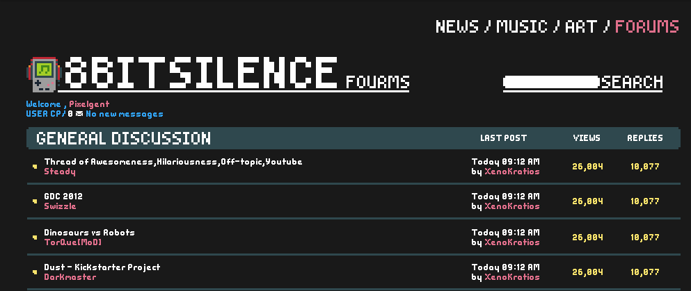
im looking for some feedback in a site design im working on, the threads and names are taken from PC (hope no one minds) This is not a replacement for polycount its a place of pixelart and chiptunes. i add the other pages as i complete them.
Replies
In all seriousness:
I don't like the font, have a look around at http://www.dafont.com/bitmap.php Especially your / are ugly with the one separate pixel on the bottom.
Also, you should realize that you can't fuck around with fancy fonts in most of the body because people don't have your fonts installed and you can't handle everything with images or text-replacing-engines.
The color palette isn't very consistent either. Have your font and div colors reflect the logo, or viceversa.
The logo headphones' grey fades into the background, making the headphones unrecognizable.
You probably need some more color variations to discern different posts etc. while not having to rely on having outlines everywhere.
You should post on PixelJoint and Pixelation too, if you haven't already.