Crit my failed art test
polycounter lvl 10
Hey guise, I created this model as part of an art test for a character art position in a Greek company. I am very disappointed to have not got the job, but on the other hand, I find it cool that they have standards!
Created in one and a half weeks.
Hi-Po
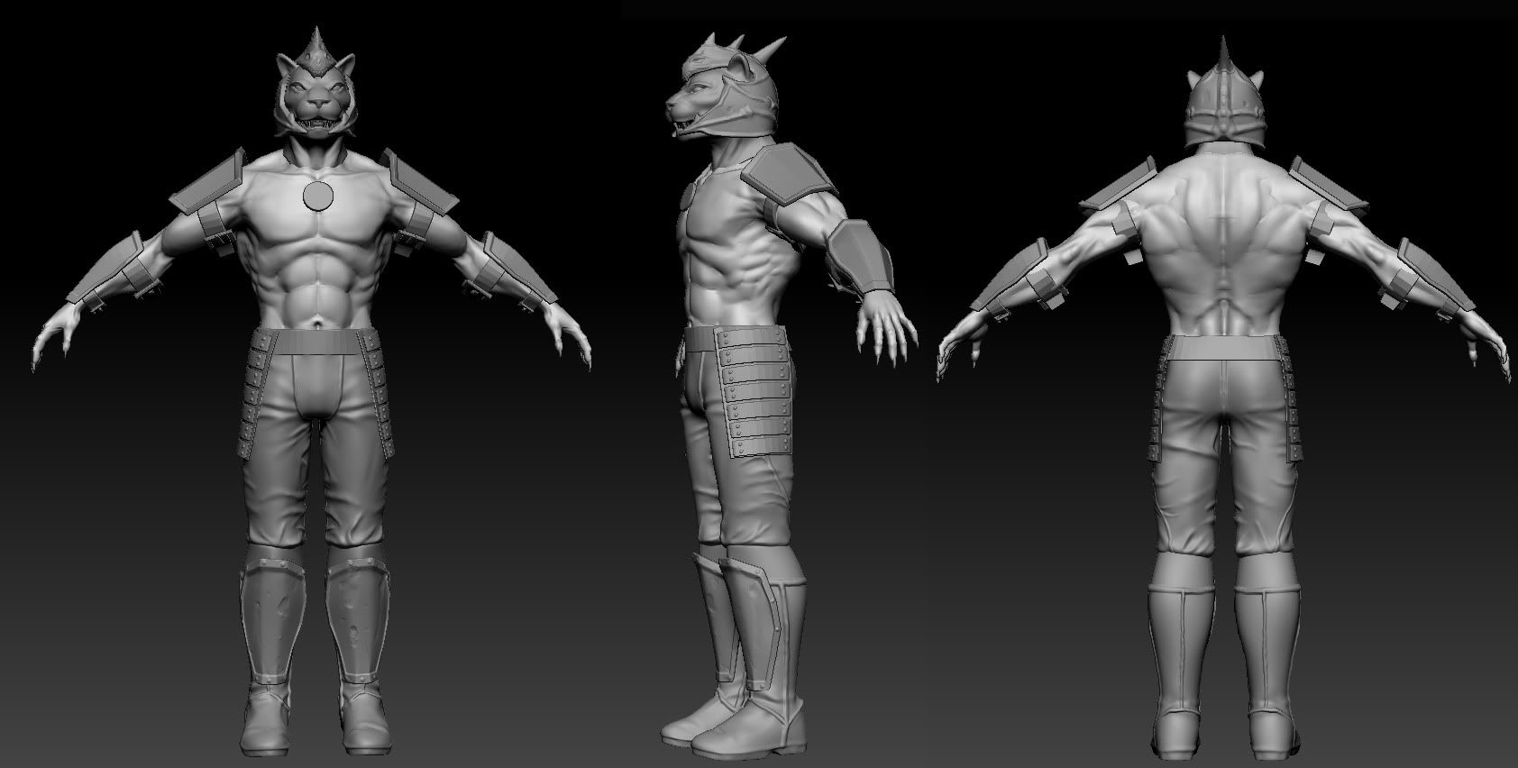
Game rez
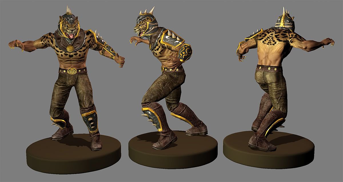
The brief was to create a semi-armoured leopard man based on a concept of their own (not allowed to use that).
Need some good, harsh crits on this one please.
Created in one and a half weeks.
Hi-Po
Game rez
The brief was to create a semi-armoured leopard man based on a concept of their own (not allowed to use that).
Need some good, harsh crits on this one please.
Replies
1. Specular map isn't making things pop
2. You could make the transition from fur to skin a bit softer
3. Scratch damage shouldn't really be white, and I don't really see any on the gold where there should be quite a bit
Good luck on your next test though! Always extremely important to keep a positive attitude when things are rejected. :P
for me, where it all falls apart are at the basics of anatomy. the interraction between the deltoid, pectoral and bicep is just completely messed up. it looks like you're confused between which muscles overlap the other and that's showing in the sculpt. similarly the triceps are shaped very strangely and don't come off as natural, and that's lead to the humerous not being defined properly, and the elbow looking like you've stretched a golf ball and stuck it onto his arm.
the pectorals themselves are very square, there should be a nice roundness to them underneath the nipple. and the abdominals are very over difined. to the point where it's creating a concave area between them, the ribs, and the hips, which just shouldn't be there.
so yeah... i think you should hit the anatomy books for sure. nail those things, and your textures will improve with practice... i mean, you can get better at texturing on the job (i suppose?) but a poor foundation for anatomy is going to show up in EVERYTHING that you do.
Did the company provide you with a concept for this character?
Good luck next time!
Not trying to hijack the thread, it's just I think others, myself included, could probably benefit from a further explanation of this.
Were you given feedback when you were rejected? I mainly ask because this looks like a design that probably would have worked much better if it were more simplified/stylized than realistic and since you can't post the concept it's hard to know if you matched the style or just went with realism.
Ask yourself questions like "Would a leopard man wear this kind of armor? is he a king among the leopard men or a regular grunt?" I know it sounds silly when applied to this example but these questions will help you determine what you should be modeling. The goal is present something that is alive and has character, so everything you model needs a reason. It's bottom up design instead of top down.
For example, what material is his pants made out of? his boots? I really can't tell. His armor looks like plastic with gold trim.
Part of the problem is material definition, but it goes beyond that because in addition to the material reading properly to the viewer you need to have chosen materials that make sense when put together.
Let me start from scratch. I worked on this model for 10 to 11 days, took time off from my job, spent 12+ hours a day on it, drank whole liters of coffee, the works.
I used 1 day for basemeshing, two days for sculpting and the rest is a blur of retopoing/baking/texturing.
I can't post the original concept.
The model stands at 4800 triangles (had to be 4 to 5k tris).
Presentation is Xoliul shader, 3 point lights, and GrabViewport.
While I politely asked, I still haven't got any feedback from the artist who acted as liaison for the process. I hope they do give me some specific feedback, but I'm not holding my breath. I know they're in crunch right now.
So, here's a new pose with GrabViewport and the final version of the sculpt with BPR. The sculpt in my first post was a WIP pic.
/edit: changed the wires pic.
@ nordahl154: I'm so terrible at spec maps for some reason, I know. The scratches are desperate and random and it shows, I agree.
@ almighty_gir: I'm actually glad you called my textures passable! Anatomy is one of my top priorities to get better at right now, along with painting/texturing!
@ Saman: I liked the pants
@ Gannon: Good point. Here's the wires this time, polycount included! It's a shitty pic though. I should probably just take a screenshot and update them.
@ dii: I considered the sculpt to be my strongest suit, so I used the least amount of time on it. If it weren't rushed, I'd never have time for the rest of the stuff, I'm afraid.
@ njc642 & dev-projectgenesis: Thanks
@ artquest: Your post makes a lot of sense. I am disappointed by the armour myself, but in the concept he was wearing black latex tight shorts. It was a rejected concept that they only used for the art tests.
@ chrisradsby: Just imagine that I consider this to be my best lightning setup (it actually is a 3 point system xD). Sigh... I always fuck up the lightning, but that wasn't an issue in this case. They just wanted the model without presentation and no rig (I added those so that I could use it in my portfolio).
Thanks for the replies guys, everything is taken into very serious consideration. It seems like there's a lot of stuff in my workflow that need to be addressed. From anatomy, to texturing, to being more creative with translating concepts to 3d. It's a long road to start working on all these things together, but I hope to get better one model at a time!
Trying a different treatment on the lights and enabled cubemap reflections in the shader...
And overall that's the main pb in your texture : the colors lack of style. Take a look at the witcher 2's stuff, how they mix a bunch of hand painted colors on top of photos.
The mix of skin and fur, mostly with this blending, doesn't work for me too : why would he ever have so much hairs on the top 1/2 of his torso and not on the other part ?
And it shouldn't blend a linear way too, like with a simple fade, but progressively, with zones with a couple of strands, etc. You can use grass to earth junction photo reference to help you... or human hairs.
There are really good examples of color variation in the vigil games contest forum btw.
Good luck.