UDK Octopus Apartment
polycounter lvl 12
Hey Polycount posting my final year project. What I intend to do is to create a piece of environment art that has life in it, not just another Sci Fi hallway, I want a player to walk into the apartment and know what kind of person lives there before they have had chance to see them. I have taken some concept art from Crysis 2 which will highly influence the scene, I will also add to and change things to my liking as I want some creative freedom.
These are the concept and the environment from Crysis 2

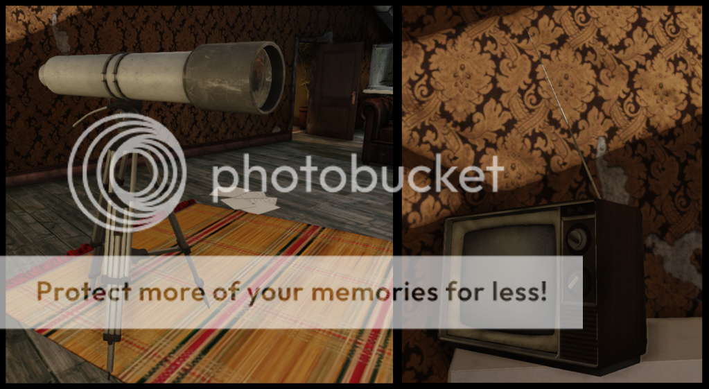
This is My scene with my own spin on it.

This was my first attempt at cloth sculpting.
2nd attempt


Cloth for the Queen Anne seat. I also tried to give the chair a bit more character with the tears in the cloth.


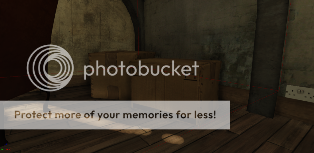
I then sculpted a Cardboard box, a bit over the top but it was a good exercise and i wanted it too look quality. The in game shots don't do em justice i'll get another shot next update")

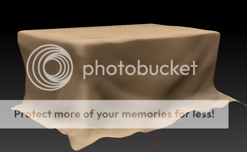
Created an oak coffee table. Not sure if I should add inset marble to the top of it.

prop sheets


I have started the outside vista but it will take me a while to finish so I'll wait until I'v got something worth showing. I'v also been fixing general problems that have been buging me.
Apologies for the picture barrage, hope you enjoy
These are the concept and the environment from Crysis 2
This is My scene with my own spin on it.
This was my first attempt at cloth sculpting.
2nd attempt
Cloth for the Queen Anne seat. I also tried to give the chair a bit more character with the tears in the cloth.
I then sculpted a Cardboard box, a bit over the top but it was a good exercise and i wanted it too look quality. The in game shots don't do em justice i'll get another shot next update
Created an oak coffee table. Not sure if I should add inset marble to the top of it.
prop sheets
I have started the outside vista but it will take me a while to finish so I'll wait until I'v got something worth showing. I'v also been fixing general problems that have been buging me.
Apologies for the picture barrage, hope you enjoy
Replies
So this is the concept:
Here is a quick paintover:
And your most up to date:
Ignoring the obvious color issues with my shot, I pretty much used levels fast and extensively... But in the concept you can see an almost contrast between the warm light of the window and the warm red bounce of the wallpaper against the cold green/blue of the tanks and screens...
Also your scene is a tad to saturated in comparision to the concept it matches pretty well but to the player perspective and againest the fine art style of the concept the udk saturation has whited out the scene a bit instead....
Another point would be the soft edition of volumetric lighting, I could point you here for some reference: http://udn.epicgames.com/Three/VolumetricLightbeamTutorial.html This coming in through the skylights and suggestive in the windows, like you can see in the paintover pops the piece a bit cause the windows and its light seems flat at the minute.... Plus you could use some dust particles or in the volumetric light shader to create a nice effect if it suits...
:thumbup::thumbup:
thanks Prtofdacrowd I'm working on the lighting now
Different Ideas for lighting
Give me your thoughts
I really feel like your losing the focal point of the room. The octopus tanks are the most unique thing about the room but they blend in way too much. I think they would pop more, and the room would look more interesting if you pumped the light from the tanks. Take a look at some saltwater aquariums and see how they really glow a nice flourescent blue. The concept has them glowing green and blue and it balances out the light coming in from the window to make a more balanced composition and your missing that a little bit.
Also, might just be me, but maybe you could use a little bit of spec/gloss on the wood floor, right now it reads like untreated lumber, but even though the floor is old and worn down, there would still be some traces of a wood finish on top.
In the concept, the sump tank for the octopus aquarium in the center is busted, and it looks like theres a puddle of water on the floor there..that might be a neat little detail to add as well.
Overall, I think your props are coming out pretty decent by themselves, but the whole environment could use a little bit of work in terms of lighting and composition to kinda tie everything together a little better.
Keep it up!
As for lighting look at your colour studies above. The main thing that really stands out is that line created by the camera angle. The way the light from the window just falls before the table creating this line through your piece. This is also backed up by the support beam on the roof. I'd lower the light so it falls over the table top and books.
Now did that make sense? Because my thoughts are fighting the TV while I'm writing this. lol
Created a video to show off the scene theres a annoying frame at the start that still needs editing out.
http://www.youtube.com/watch?v=elJAtgmTXtA
Hope you enjoy