Home 3D Art Showcase & Critiques

[CE3] The Bridge

1
polycounter lvl 11
Offline / Send Message
tehrobster2 polycounter lvl 11
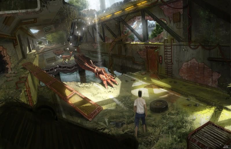
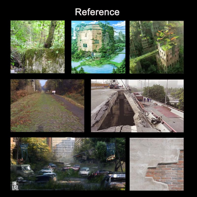
Hey Guys I am going to be starting a new Environment, called the Bridge by Matt Tkocz, his website is http://www.mattmatters.com/?p=637, I was given permission to use his concept. Anyways here is my planning process so far, and some reference, I am planning on doing this piece modularity. I have a pretty good idea on how to break up some of the pieces for this scene. The only part I am stuck on is the Big hole at the top of the bridge, anyways critiques and advice are welcome, and thank you for looking!
NewEnvionment.jpg
NewEnvionmentblockout.jpg
reference.jpg

Replies

  • sltrOlsson
    Options
    Offline / Send Message
    sltrOlsson polycounter lvl 14
    Looks like a big fun project this. I don't understand how you thought when you split this thing up though, atm it's not very modular at all. You reusing 2-3 parts from what i can see?

    You should look into some blending shaders for the broken walls and what not. That would give you all the walls as big chunks of geometry not to worry about. Though you would have to model in the big broken wholes.
  • Ack Master
    Options
    Offline / Send Message
    hey nice concept, i saw someone else working on this concept a while back. A fun exercise and i agree with Sltrolsson.. use blenidng shaders. cant wait to see the progress
  • tehrobster2
    Options
    Offline / Send Message
    tehrobster2 polycounter lvl 11
    Hey Thanks for the comments guys. SltrOlsson, they broken bits and the parts where the bricks are showing, I figured I would just model those sections once, and then as I continued down bridge. I would just reuse those pieces again. But your Idea sounds better so your saying using blending shaders for the brick parts right ? That ways I would only have to model in one part of the concrete wall and the holes, and when the damage and grime comes up use the shader ? This will be first time using blending shaders and using modular and cE3 , so this will be one great learning experience for me =).
  • tehrobster2
    Options
    Offline / Send Message
    tehrobster2 polycounter lvl 11
    Hey guys, sorry its been a few days since I posted , I have been playing around with cs3, been learning how to export from maya and import textures and what not. I have also been researching on how to create a blend shader like SltrOlsson suggested. That way I will only have to model the broken pieces, and everything else can be one concrete mesh that I blend bricks into when I need them. I havent figured out scale in Ce3, so I went a head just blocked everything out in maya for size and composition, I would love any input anyone has =)test-3.jpg
  • Darkleopard
    Options
    Offline / Send Message
    oo im looking forward to watching this
  • jimmypopali
    Options
    Offline / Send Message
    Looks good so far, I'd almost open up the roof hole a bit more, from the concept, it looks like the hole is a lot larger, but just gone off screen (from the amount of light that is showing on the floor).
  • tehrobster2
    Options
    Offline / Send Message
    tehrobster2 polycounter lvl 11
    Hey Guys thanks for the comments! Here is my final block out, I am going to start working on some of the modular pieces, from the block out I have gotten more of an idea of how going to break everything up. There is only piece, I am kinda puzzled on how to do the cables that run against the right wall.
    test3.jpg
  • Jessica Dinh
    Options
    Offline / Send Message
    Jessica Dinh polycounter lvl 10
    I like the blockout, and the concept is really cool! Looks like a fun piece to do. Only I think the tunnel should be longer with the end of it fading into distance fog and overgrowth. That's the part I like about the concept because it provides a good sense of journey. Excited for progress :]
  • tehrobster2
    Options
    Offline / Send Message
    tehrobster2 polycounter lvl 11
    Hey thanks for the comment! Yeah definitely, plan on making it longer,maybe adding more robot parts , and it fading off =D. Thanks for the advice!
  • Rurouni Strife
    Options
    Offline / Send Message
    Rurouni Strife polycounter lvl 10
    If you do this correctly, using enough parts should allow you to extend this as far back as you need to. There is a lot of possibilities for parts to be reused.

    Awesome concept. You're scale might be slightly off (thinking the walls might need to be a smudge higher?) but since I'm the only one who noticed I could also be quite wrong.
  • sltrOlsson
  • SaferDan
    Options
    Offline / Send Message
    SaferDan polycounter lvl 14
    Yeah I agree with Rurouni Strife the walls need to be a bit higher and I think as well it needs to be a bit wider. That robot arm and tire are too close to the right hand side wall.

    Looking good though :)
  • tehrobster2
    Options
    Offline / Send Message
    tehrobster2 polycounter lvl 11
    Hey guys thanks again for the comments! Rurouni Strife and Safer Dan, I will jump on that right away at making it taller and wider. And thanks for the reading, sltrOlsson, I will go ahead and do some testing right away!
  • tehrobster2
    Options
    Offline / Send Message
    tehrobster2 polycounter lvl 11
    So I made things a bit taller and a bit wider, now I am going to start working on the wall assets =)
    test5.jpg
  • Rurouni Strife
    Options
    Offline / Send Message
    Rurouni Strife polycounter lvl 10
    Much better scale. Looking forward to your assets!
  • tehrobster2
    Options
    Offline / Send Message
    tehrobster2 polycounter lvl 11
    Hey Guys, I have gone ahead , and broken up the modular pieces, and I have also started to work on some of the high poly pieces as well! Modularpieces.jpg
    gen.jpg
    fire.jpg
    door.jpg
    roadblock.jpg
  • tehrobster2
    Options
    Offline / Send Message
    tehrobster2 polycounter lvl 11
    Hey guys , here is another update, I finally got the blend layer to work using maya thanks to fine folks on polycount and the crydev forums, here is it so far. waall.jpg Next, I am going to start working on importing my meshes in so I can start setting my scene inside of the engine.
  • tehrobster2
    Options
    Offline / Send Message
    tehrobster2 polycounter lvl 11
    Hey guys I still working away on this, the broken pieces are taking a little bit longer than expected, but I have started importing stuff into the engine, Frame000943.jpg and here is what I have in the engine so far, and more is coming!
  • Ged
    Options
    Offline / Send Message
    Ged interpolator
    the lighting in that tunnell is wierd, is the roof not casting a shadow? is that becaus ethe roof is too thin...like just 1 poly?
  • tehrobster2
    Options
    Offline / Send Message
    tehrobster2 polycounter lvl 11
    Hmmm, I work on fixing that issue. thank you for your comment!
  • tehrobster2
    Options
    Offline / Send Message
    tehrobster2 polycounter lvl 11
    Hey I fixed it! Thanks for the comment again! Frame000025.jpg
  • tehrobster2
    Options
    Offline / Send Message
    tehrobster2 polycounter lvl 11
    Another small update, added the columns and the door and re did the concrete texture,
    new1.jpg
  • tehrobster2
    Options
    Offline / Send Message
    tehrobster2 polycounter lvl 11
    Hey guys here is another update, I got more of the broken pieces into the scene =) Now I am going to start working on the decals for the random dirt and grime on the walls and ceiling and the moss and grass on the ground. Polycount1.jpg
  • tehrobster2
    Options
    Offline / Send Message
    tehrobster2 polycounter lvl 11
    Here is another update guys! I am going to start working on the decals and grass now =D
    new2.jpg
  • JamesWild
    Options
    Offline / Send Message
    JamesWild polycounter lvl 8
    This is a major nitpick but the handle on that door should probably be lower.

    Looks GREAT!
  • tehrobster2
    Options
    Offline / Send Message
    tehrobster2 polycounter lvl 11
    Hey thanks for the comment, and I will fix that! Anyways here is another update with some decals added, and one of the pipes =)
    new3.jpg
  • tehrobster2
    Options
    Offline / Send Message
    tehrobster2 polycounter lvl 11
    Here is another update guys added pipes and working on some more grass to add to the level, and working on some more props. new4.jpg
  • matsman
    Options
    Offline / Send Message
    Hi just saw your image in the WAYWO thread thought I'd reply here.

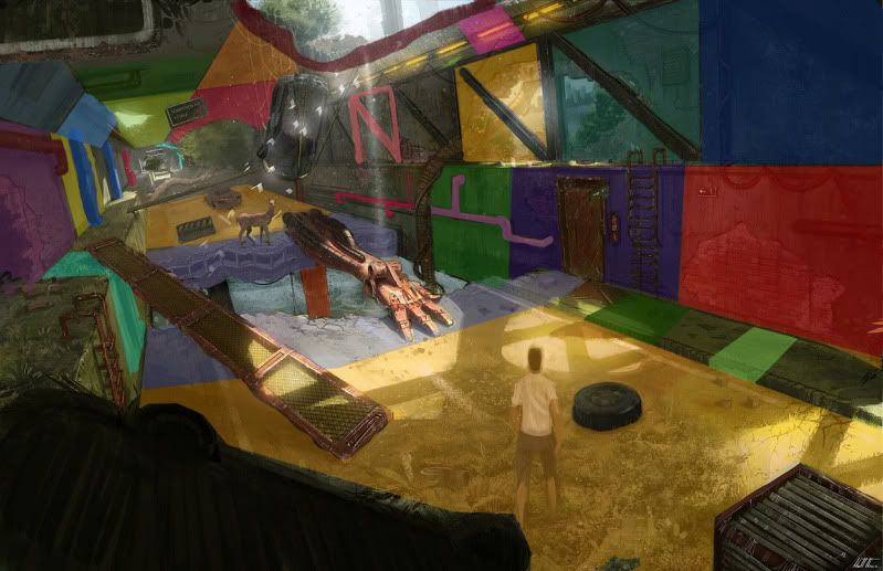
    The first thing I notice is AAH! COLORS! :) I see quite the saturated green and quite the saturated red and some brows but nothing that really ties that together. My advice would be to try and get that red more to an orange hue, since that usually goes better with the green. Also try to get that orange yellow into the light if at all possible.
    This is all in the concept by the way!

    Lastly try to look at that green texture on the left once more... it seems to be more blurry than the rest... and possibly try to work some drips in there, to make the vertical and horizontal different. The concept feels like a moist rainforesty type of environment so I would expect all kinds of moist/water damage to be in the textures

    Hope that helps you look at the work from another perspective! Good work though! keep at it!
  • tehrobster2
    Options
    Offline / Send Message
    tehrobster2 polycounter lvl 11
    Hey thanks for the comment! and I will work on trying to tie them together more and I will take a look the uvs for the texture and see whats up, and I will continue to add more drips and stuff to the sides =D.
  • tehrobster2
    Options
    Offline / Send Message
    tehrobster2 polycounter lvl 11
    Hey Guys I have added some more assets to the scene, and I am continuing to add dirt and grass and moss to the scene. I would love to hear how I can improve it some more! Thanks! new5.jpg
  • tehrobster2
    Options
    Offline / Send Message
    tehrobster2 polycounter lvl 11
    Another update playing with the lighting and fog effects, I would love to hear what you guys think =)new6.jpg
  • Ben Apuna
    Options
    Offline / Send Message
    I think the lighting is a little over the top on the latest screenshot. The lighting in the previous shot is much more appealing and dare I say natural looking. Depends what you are after.

    I also can't help thinking it would be a much more dynamic scene if you path deformed the whole scene to gently curve it.
  • tehrobster2
    Options
    Offline / Send Message
    tehrobster2 polycounter lvl 11
    I will play with the lighting more and see what looks best, and I will try that as well! Thanks for the comment!
  • tehrobster2
    Options
    Offline / Send Message
    tehrobster2 polycounter lvl 11
    Hey Guys! Played around more with the lighting, and then I have added more assets to the scene. new7.jpg
    new8.jpgnew9.jpg
  • Ben Apuna
    Options
    Offline / Send Message
    imho you're still pushing the color saturation of your lighting too hard. On the one hand it's unifying all the different elements together. On the other hand I think it's all being lost in a mush of yellow. Take a look at your concept again or your own screenshot from before. With the concept the lighting is fairly neutral...

    NewEnvionment.jpg

    With your earlier lighting setup I think the bright areas are just warm enough to feel natural and the distance is just cool enough to recede into the background. It feels like a nice daylight scene.

    new5.jpg

    In your later shots it feels like a very polluted environment or a badly white balanced sunset photo. If that's what you're after then never mind what I just said :)

    If you're interested in more lighting info check this site out: http://www.itchy-animation.co.uk/tutorials/light01.htm I think it'll really help you "dial into" whatever it is that you are after.

    There's a thread with more links too: Environment lighting tips or tutorials?
  • tehrobster2
    Options
    Offline / Send Message
    tehrobster2 polycounter lvl 11
    Ok thanks! I will check those out! And thanks for you comment again!
  • tehrobster2
    Options
    Offline / Send Message
    tehrobster2 polycounter lvl 11
    Hey guys another update, Still playing around with the lighting, and adding more grime and stuff =D Frame000018.jpg
  • tehrobster2
    Options
    Offline / Send Message
    tehrobster2 polycounter lvl 11
    Hey guys here is another update continuing to add grass and other things, and almost finished with all the assets, and Would love to hear anybodies C&C on ways I can make it better, anyways thanks! Frame000017.jpg
  • The_Blenderer
    Options
    Offline / Send Message
    Iv seen it on another thread:

    Relating to your last attempt:

    I think the Lighting still needs more work, At this distance the shadows by the red thing at the center should have probably slightly become less focused, they just look way too jagged and sharp IMO. Looking at photograph examples of how real life interacts with environments always helps.

    You also have so many light sources in the scene and it is not clear why they are there and what sort of ambient you are trying to create.
    (both lights on the upper walls and multiple hull breaches as well as the light at the end of the tunnel) So Forgive me for the assumption, but it seems you are no expert on the lighting department yet, that's ok, I can't claim to be one either, so I suggest starting out with a basic Three-point lighting scheme...
    You can read all about it and how to accomplish it here
    http://en.wikipedia.org/wiki/Three-point_lighting
    http://en.wikipedia.org/wiki/Key_Lighting

    Once you setup the basic 3 point lighting system to your satisfaction only then you can start looking into adding additional lights where needed, Theoretically that way you maintain control over how the scene is lit and only add more small lights for fine changes where needed (like if some corners become too dark etc)

    Relating to overall(after viewing the rest of this topic:

    Also your one attempt before last looked much better and more faithful to your concept than your last attempt. (still needs work on these shadows)
    This is just my opinion but evenly lit scenes tend to look bland.
    Hope this helps
  • RexM
    Options
    Offline / Send Message
    Your models look a little flat at the moment. Baking AO into the vertex paint would do wonders.

    The grass seems way too saturated as well. Try to get the colors of the grass to blend with the texture they are on top of.
  • AlexCatMasterSupreme
    Options
    Offline / Send Message
    AlexCatMasterSupreme interpolator
    I think you should desaturate that metal thingy that could be used in place of stairs.
    I don't understand the bricks, it look concrete, yet there are bricks underneath,just my thought, im not a master of building buildings but it looks off. I'd re-work some of the vegetation, that tree in the back looks like it's rocks or something, it took me a while to see that.
    I'd try and add some more excitement to the lights, hmm lets see, more tree roots, it would really emphasize how the land is taking back the human-made stuff.
    It looks good so far but I think you still should take it further and make all the assets just perfect.

    I think the lighting is too cool personally, I like the concept's warmth better.
    I think you should have added that city in the background, the hanging car, and all that, it will take it from looking cool, to looking so damn awesome, it looks challenging but hey you'd prolly learn from it, I certainly couldn't, it's just too barren, and working with the concept art you're lucky enough to have the scene set for you, just lay it out.

    Just trying to give good feedback.
  • tehrobster2
    Options
    Offline / Send Message
    tehrobster2 polycounter lvl 11
    Hey guys thanks for the comments guys!

    The_blenderer yeah I still kinda of noob still when it comes to lighting, I am trying to get better, and I still very new to cryengine 3's light system st, so I will look at those articles right away and will continue to work on my lighting!

    Rexm: Can I bake the highpoly information into my low polys vertex color ? And I will work more on the grass some more and thanks for the comment!

    AlexCatMasterSupreme : I am re working the vegetation as we speak and I will work on the metal piece as well, and I am not finished with the assets yet, and I am still planning on adding the cars and the city and I will add some more trees as well! thanks for the feed back!
  • AlexCatMasterSupreme
    Options
    Offline / Send Message
    AlexCatMasterSupreme interpolator
    Hey guys thanks for the comments guys!
    u=52609"]AlexCatMasterSupreme[/URL][/B] : I am re working the vegetation as we speak and I will work on the metal piece as well, and I am not finished with the assets yet, and I am still planning on adding the cars and the city and I will add some more trees as well! thanks for the feed back!

    WELL HURRY UP I WANNA SEE THE END RESULT:D
    jk but I wanna see, seriously.
    I love Cryengine, and want to see what you can do with it.
  • tehrobster2
    Options
    Offline / Send Message
    tehrobster2 polycounter lvl 11
    Hey Guys I am still working on this! I have started to add vines through the level and buildings into the background and I am almost finished with the cars, The bottom of the cars are taking me longer than expected. Frame000005.jpg
  • e-freak
    Options
    Offline / Send Message
    Hey,

    I think it shows that you put a lot of effort into this already, but I'd step back a little bit for a second. What makes the original concept work so well is the fact that it mainly consists of three colors:

    The red parts (brick, deer, robot hand), the concrete and plants in this desaturated green and grey and the yellowish sunlight.

    So first things first: I think your red tones are a bit over the place. There's the really oversaturated robot arm and the brickwalls that don't really ground in reality.

    Your concrete parts (the wall for example) are just all in very different brightness levels and they really don't look like this was a coherent universe before it got destroyed.

    third, and this might be the biggest problem right now, the lighting is off. The sun in yours looks very green, while in the original concept it has a very bright yellow (almost white). It also bounces off into the rest of the environment and gives an overall very soft lighting to the rest of the scene. In yours the ambient lighting is very dark. But then you turn on these 20 lights in the top right, where in the original concept this is only a very subtle glow - you might be better of using a self illuminated texture for those. On the other side, on the far left you have that room behind the wall lit up, but in the original concept that room is actually very dark. last comment on the lighting/mood: in the original concept fog or dust fades the background giving it a better understanding of the depth in the scene. try to emulate that.

    on the models: I think you need to try to catch the little details more: The ladders are grounded with stains on the walls in the concept, they are not just floating. The metal bars in the wall are set up differently than in yours: the vertical ones stabilize the diagonal ones, in yours they overlap. little things like this can help your scene work more coherent in my opinion.

    last but not least, your perspective is a little off, making it harder to judge how this actually compares to the original concept. try to match that perspective first, as it will allow you to model more precise as well (for example, how tall and how wide should that door on the right be?)
  • tehrobster2
    Options
    Offline / Send Message
    tehrobster2 polycounter lvl 11
    Wow E Freak, thanks all the great suggestions! I will start right away at fixing those problems and thank you for taking the time to give me such great suggestions. I will start on working on the perspective first again and then move along to the other problems and I shall try make another update soon!
  • tehrobster2
    Options
    Offline / Send Message
    tehrobster2 polycounter lvl 11
    Hey Guys I am still working away on this, still working on the lighting and the fog. I am still trying to work getting the fog in the distance, the fog is making it where you can not see the buildings. I have added the cars . and I am working on the last car now that will be hanging from the hole. But anyways, I would love to hear what you guys think of what I got so far! new10.jpg
  • Darkleopard
    Options
    Offline / Send Message
    Gets nicer each time! I would look at the original concept and blur your eyes, take a brush in Photoshop and colour pick each major blob of colour and how far they extend. Try to get similar perspective in your camera and work from there. Its to green right now, off the in distance and the crack in the roof needs much more blue/white.

    Dont give up! Lighting can be a pain
  • Moonshank
    Options
    Offline / Send Message
    Moonshank polycounter lvl 7
    have you used a visarea and portal for this? It might help you to balance the internal lighting and external lighting a bit more. As you will be able to control the internal ambient colour separate from the external lighting.
  • tehrobster2
    Options
    Offline / Send Message
    tehrobster2 polycounter lvl 11
    Hey guys thanks for comments! DarkLeopard, thanks I keep on trying to get better at my lighting, and I will continue to work on the lighting!
    Moonshank: I have not! I will look into those, I have mostly used a mixture of the time of day and environment modes so far and I will look into that and thanks again!
1
Sign In or Register to comment.