BusStop Mini Environment
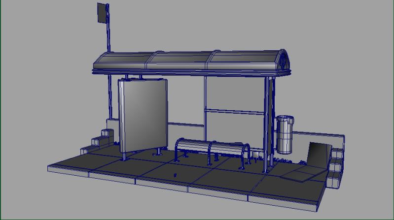
Hey guys. This is a small environment I've been working on. Its a local bus stop I pass damn near everyday. These shots are in Maya as of now. I thought I would throw it up on here to get some advise / crit before putting it back into UDK. Cheers.
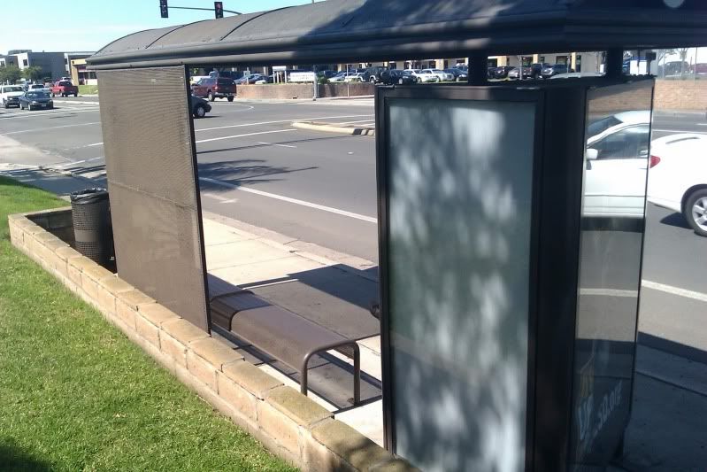
Reference:
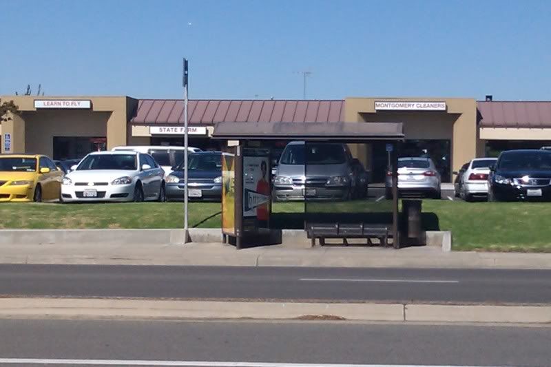
Reference:
Replies
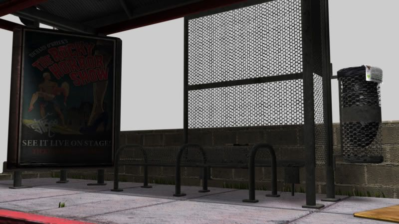
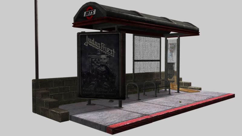
The actual bus stop with the bench look good. I'm a big fan of the side trashcan with the bag in it. That looks great!
I can't really say much about your texturing because it's in maya. None of the shader work is at play here so once you put it in UDK i'll take a look.
Although i loves me some metal, i'd say kill the judas priest sign. It's too distracting. The rocky horror sign works with your scene, but you have ot think artistically, not practically. Not "what would be on this sign" but "what would look good on this sign". That's also another opportunity to give your scene a story of some sort. Maybe an advert for the city it takes place in or something....maybe some graphiti...etc.
I like the idea of having grass coming from the cracks, but i say spend more time on them. Make more dominant looking weeds instead of tiny blades of grass you don't notice. They have to read from a distance since the players are usually looking down at them from about 7 feet up.
All in all jimmy this is LEAPS and bounds better than your voodoo scene i last saw of yours. You just really need to lay down the workflow for high to low poly baking and texturing. Your scene is only as good as your props/texturework. Slap that bad boy in UDK and post it up.
My own personal crits for this would be the following:
the red paint on the curb is almost magenta looking... most red-curb-paint is faded, cracked and caked with layers, and some of the layers below can be white, all the way down to being chipped completely through down to the cement.
One thing that I always like to focus on in scenes like this are transitional materials. For example, where the bus stop meets the cement. This bus stop is old and likely would be dripping rust out the bottom of those support beams, and also would probably show a great deal of corrosion/erosion damage to the cement itself from slight vibrations over the decade(s). The support beams on your photo reference seem different than what you've modeled. You've modeled square support bases for the beams, but I think the ACTUAL supports are fat tubes all the way to the bottom, where they then have a skinny tube protruding out of the bottom of it. Etiher way, my point is that there should be some kind of material transition where these two things meet. Without those transitions it just looks like two 3d assets jammed together.
All of the metals seem to be about the same level of wear/tear where the reference photos show a lot more sun-damage to the paint on the top of the covering. In your texture, that sun damage isn't present. Another thing i notice is that the texture you have on top of the covering is rather noisy, where the photo reference is rather smooth, but sun-beaten. Noisiness should be reserved for things that are gritty, rough textured, or just filthy as hell. This top of the canopy in your reference is none of those things, so I suggest you consider toning down the noisiness. Don't get me wrong, it looks pretty good as it is right now, but I think that your photo reference has some nice character to it that is missing in the 3d.
I happen to rather like your floor cement, even though it is photo sourced. I have no qualms aboujt photo sourced textures. This area seems good. it woulc use some more love with maybe some alpha cards with gum on the ground, or leaves, or like i meantioned earlier having some transitional rust around where the beams meet the ground.
MTS sign - red is a little too saturated and distracting. Also it's very clean looking.
The red trim around the top of the canopy, I like that you decided to add some visual interest by using color there, but again it might be a little too saturated and noisy, making the exact material it's made out of hard to read.
Here's the stuff I really like here.
The cement on the ground (like i just said)
the details you've added with the grass - Wes says to take out the stuff by the bricks, and he has other good suggestions about foliage - but overall I"m just glad to see yo uwent ahead and added these details, now to just take it to t he next level.
trash bin looks great - the bag looks perfect.
I like that there is a bus map posted too.... nice story telling detail
The scope and size of this project is perfect. I LOVE environments of this size.
Overall you're just like a step away from this one really rocking man, and now that Polycount is watching you've got some good motivation to impress a crowd!
Sally forth good sir!
I did a quick paint over..just my take on it
/wall'o'text
lets talk some theory:
This is a pretty boring scene - yet there is potential to tell some sort of interesting story with it. Take the time to stop thinking about the technical process for a minute and put a little creative thought into how you can convey something to the viewer. You don't have to sell some epic story - it can be quite simple. I know you could think of some story to help sell this environment. It will also help you get more interested in the scene as a piece of art and less as a technical exercise. Also more interest means you natural put more effort into it to help make it shine.
That big sign you have there, at the moment, is the natural focal point - start with that. Also, think about how this space is used: its a human bus stop, humans are nasty bitches - put some stains, some gum, some barf, something to help your story. the trashcan: whats in it? would it be overflowing with a specific type of trash? has someone dug in the trash looking for something? etc. etc.
Beyond what props you put in the scene to tell a story, the lighting is the biggest factor letting you down. The sterile white background and the lack of material definition are sucking the life out of this piece. You have that ucky 3d app render going on that just reads as amateur. The background shouldn't be a massive bright area. I would suggest hunting down some of the sweet realtime viewport shaders that are out there for Maya. Also learning some simple lighting techniques will really go a long way. Also, maybe a light source in the scene? like a Florence light built into the underside of the canopy or something.
alright, I'm gonna go out and say some crazy shit, but just hear me out. Have you ever tried getting into 3ds max? I have this gut feeling this would help you break free from a lot of traps I remember myself falling into when I used maya. Not trying to start a maya vs. max flame here and if you want my detailed opinion we can chit chat about it. Just something to think about - I honestly think it would help you.
/endwallotext
By too boring we mean within the already existing scene itself. Well that's what i mean anyways. It's fine if it's just a bus stop, the story doesn't need to be so over the top. You need more subtle story and character. Not like "Hey look a murder happened here!
By story i mean a stain or two on the ground, graffiti on the sign, maybe a half empty bag of jack in the box ruffled up next to the trashcan to make the "player" be like oh hey i wonder who's that is. Don't over complicate your idea and saturate it with more ideas. It's a modern day bus stop..i would just leave it at that for now. Once you get a solid workflow down then i would deal with high concept ideas.
Also i wouldn't get rid of the bricks behind the bus stop...i would just improve upon them.
sculpts on bricks, the curb, some of the sidewalk panels
high poly bakedown of the hard-surface models
cracked glass - or if plexi-glass, heavy scratches on the plexi from where there was once graffitti but was vigorously removed with a textured scrubber brush of some kind - you know what I mean?
Drainage gap under the curb, cigarette butts on the ground, old flyers on the ground, bugers on the seats, desaturated signage that's been bleached by the sun/weather/age.
area-specific wear and tear - right now all the grunge seems to be haphazardly painted on in photoshop. The pee stains under the bench look a bit too green. Usually sidewalk stains lose their colors within a few hours and just turn black-ish and nasty.
Are these poles bolted in to the ground or just resting on top of it? I imagine it should be embedded in the ground, and therefore, there would be lots of cracking and splitting of the cement near the bases of the poles, easily accomplished in a sculpt.
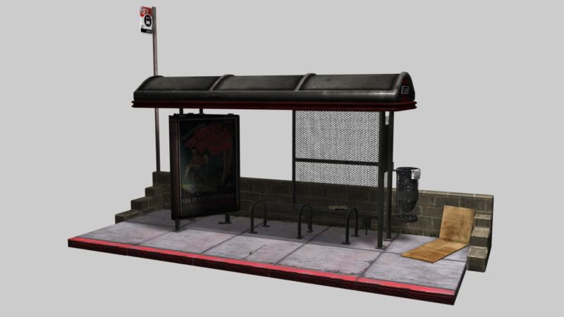
I like what you did with the textures on the canopy - it looks a lot more like the reference and the decreased noise makes more sense now.
I REALLY like what Austin did with the curb, the drainage ditch, and VERY much I like what he did with the cement. Do that!
I like how here you can see a tire smudge on the curb, and some areas that are worn off, other ares are perfectly painted still
herer you can see the white under-coating on the curb paint
or here, the curb has been badly damaged - this would be AWESOME to sculpt.
http://www.flickr.com/photos/hshuldman/4383372613/ NSFW
or see the "no dumping - dolphins" things painted on the ground?
http://www.flickr.com/photos/maxvon_d/2312452830/#/photos/maxvon_d/2312452830/lightbox/
Check this out:
http://www.visualphotos.com/photo/1x7776603/an_old_woman_standing_at_the_bus_stop_np01066251.jpg
The concrete below is clearly cleaner/dryer (though still filthy) under the roof.
Consider people sleeping/sitting/idling around in certain spots, leaning against things.
Though that image is washed out -- I feel that exaggerating some of the details may help.
Currently everything looks flat. I'm not seeing any accents/highlights on the edge of the roof thing -- what is it made of? Plastic? I'm not sure right now.
The glass on the advert block could do with some reflective love, it's also reading very flat. Those glass windows ontop of the advertisement tend to be made out of low quality plastic, and thus are somewhat bubbly.
A perfect opportunity for a very light normal map on there to help stretch the reflection. I'd use a bump offset on the normal/reflection as to not mess with the flat paper behind it.
Your red paint is still very saturated, and the transition from painted to unpainted seems very random. Perhaps sharper edges, some spec & normal details will help make it pop.
Perhaps some pured concrete bases under the support beams for the roof?
as seen here:
http://www.zombiezodiac.com/rob/ped/busstop/keio_bus_stop.JPG
That may help break up the ground some.
The seats themselves seem to be a bit tall -- the rounded part is too large -- making the spot where you put your bum seem small:
something like this?
http://2.bp.blogspot.com/_UmCKhILb2Zk/TLTwBCh7HSI/AAAAAAAAFNY/N-hcA3uNrMM/s1600/BlueBench.JPG
On that last image, note the stains at the base of the poles holding the bench up -- the clearly filler concrete that's a lighter color to begin with, but the brown stains from water pooling down the poles onto the ground.
Also-- let's get some better lighting on this before doing much else. You have enough to get a very good idea of how the lighting will affect the scene and materials at this point.
@ Pope Adam -- "NSFW" posted from work, I lol'd.
good job so far.
Those bricks need to be redone. It seems like the green channel on them is possibly inverted as it looks like the cement between the bricks extrudes outward from the bricks themselves. Again hard to tell from the overall lighting.
Here's a good start on making light maps. http://www.hourences.com/tutorials-ue3-lightmapping/
I would also work on your lightmaps. I can tell that you either dont have any, or they're just auto unwrapped.
Right now a lot of your textures are overly grungy when there is no point in them being so. Remeber to make something look worn and used you dont need a ton of dirt added too it. That just makes things look like there in some super ghetto and hobos threw dirt all over everything just for fun.
Its a common mistake a lot of people make. Trying to make things look "realistic" by adding a ton of wear/dirt and grunge. When in reality you would be hard pressed to find a lot of bus stops in that shape.
I am mainly focusing on the sidewalk here as that is the biggest offender IMO. It gives off the vibe of "I added grunge to make it look next gen realistic". When a more subelt approach I think would come across better. Take a look at the concrete in the picture Adam posted. That is what I would expect to see around a bus station.
The concrete is visabley dirty with some slight darkened color variation spots, paint splotches and minor cracks. Its clearly an area that gets a lot of foot traffic having two intersecting cross walks but it dosnt look blackened as if a dump truck just spilled on it. Some of the separating pieces of concrete have collected more grim and dirt and therefore appear darker while others have less and are more subtle. There is not a high amount of contrast in the concrete itself as thats not what happens to concrete unless there is a layer of dirt on it or something crazy stained it.
Staining the areas right under where the bus stop meets the ground is a good touch as that is generally something that would happen. But right now your concrete is overly grungy and way to contrasty to look realistic.
The same can be applied to the red paint along the curb. It is overly grungy, damaged and splotchy. If you look in the other image Adam posted, you will see that the paint on top of the concrete chips away. Right now you have it having this odd soft falloff which is not something you would expect too see. Also having some sublet rubber black scuff marks along the edges is great, but dont over do it! Keep it simple stupid is an expression that rightly so fits in with texturing as it dose with pretty much everything in life. Dont over grunge things up to make them dirty. It loses the impact of the grunge and grim when its all over the place. Having well selected wear and tear works far better then having a ton of it.
Looking good, but tone down some of the contrast, dont overly grunge things and dont lite your scene too dark.