Art Wall

polycounter lvl 12
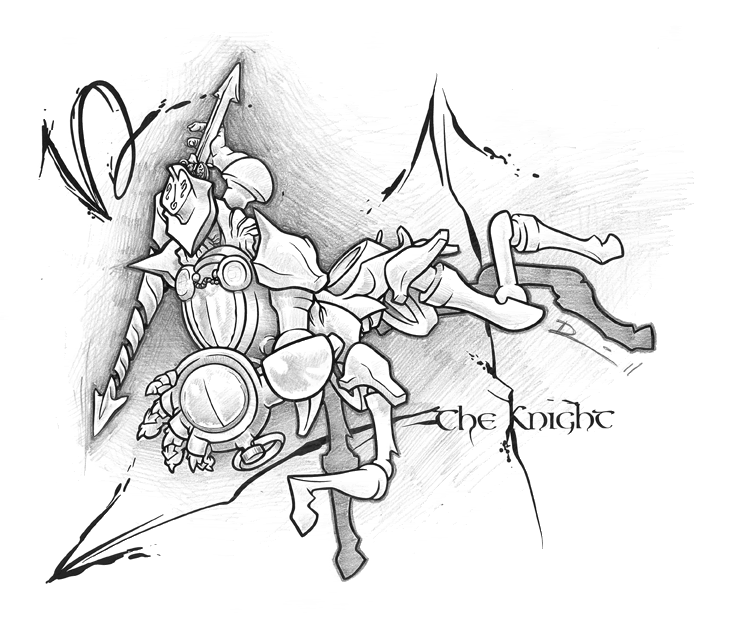
A friend and myself are putting together an art wall at a local gaming tavern. I'm handling the concept and the characters, she's building the backdrop and painting it. I'll try and get some in progress photos of the wall up later, but for now here are the in progress characters that will be going up on it.
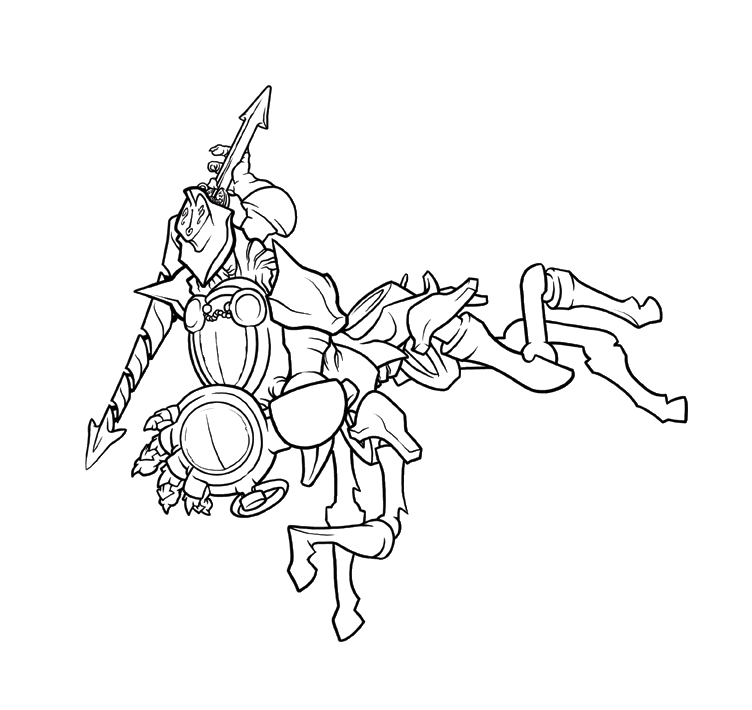
The second and third critters there still need a bit of work on their line weights before I declare them ready for shading. I'm still trying to decide if I want to shade them in pencil or in half-tone I've never worked with half-tone before, but I'm not entirely sold on the results of the pencil work. Here's a test piece. Ignore the clock hands, they're just there because I'm fanzigures.
The second and third critters there still need a bit of work on their line weights before I declare them ready for shading. I'm still trying to decide if I want to shade them in pencil or in half-tone I've never worked with half-tone before, but I'm not entirely sold on the results of the pencil work. Here's a test piece. Ignore the clock hands, they're just there because I'm fanzigures.
Replies
If they're just supposed to look cool and not be seen as actual creatures, I can see them looking neat just as a picture rather than as a concept.
If you want them to look like creatures, and have the person picture them moving or existing in their heads - I'd rework the poses. Maybe have the centaur thing...standing or something, rather than just kinda flying.
@RoosterMAP: Thanks for the compliment. I'm a big fan of clean work, though I'm sure I can make my stuff sharper.
@ ErichWK & Two Listen: Thanks for the critique, I've been feeling like something wasn't coming through as well as it could for a while. It's good to hear it the way you worded it. The look I'm aiming for is a hard but sentient plastic. Each of their heads is marked out with the sundial, so you can always find that, but truthfully there's very little that marks these creatures out as alive.
Here is a collection of influences I'm bringing in on this project, hopeful it will help you see what I'm aiming for:
The reason they have no sense of ground is they're going to be placed on a wall in a collage style, images around another image. They're not actually going to be standing on anything. You can see some of that in the rest of the characters here.
With that in mind, what do you think I should do to push the characters? I'm aiming for dynamic poses on these guys, as that's not something I really push myself on, also the really heavy emphasis on hardened organic shapes.
Your centaur "knight" as an example, could be seen jumping (kinda like a horse jumps over hurdles and what not). It's dynamic, got some motion - is a recognizable shape and form people are familiar with. At the moment it's kinda like your centaur was jumping, but was then hit by a flyswatter.
Though - I think your queen's right hand might be uh...backwards. Take a look at her thumb and pointer finger, and try to do that yourself. Not sure if that was intentional or not but something I noticed just now. If that was intentional then no worries.
seconded
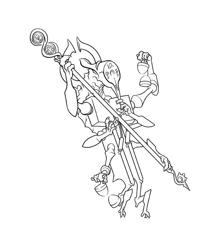
The space marine looking guy is a member of the Army Corp of Engineers. He's the hero of the story, but yeah he sort of stands out in contrast to the other art style. Is that good or bad? I'm not sure just yet. He's supposed to be a focal point in of the project, so maybe it's good? I'm super interested in other opinions though.
@TwoListen: Well it helps that she's largely humanoid (goddamned right hand, thanks for the spot on that, I'll fix it in post). I think you have a good point about the Knight though. Something I could try would be to make the individual pieces that make these characters up significantly less chunky so they dont overlap as much. when I draw them I'm confined to an 8.5x11 piece of paper and that keeps me from miniaturizing too much. A final pass on the computer would have no such limitations though so that could be a good place to re-envision how these guys are supposed to be put together. I'll try and put together some sketches to see where I can push these designs now that I have the basic shapes nailed down.
@Achillesian: Thanks for the 2nd opinion doc, any suggestions on how to make them pop a little better?
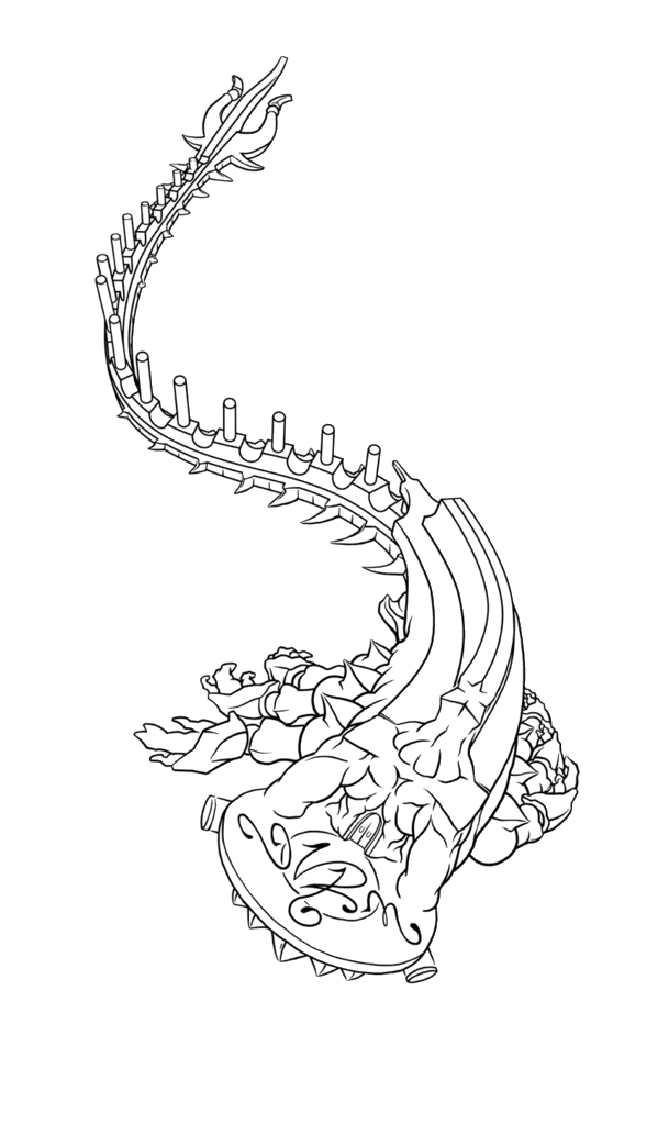
If anyone has any suggestions of where I can push this they would be welcome. The core feel of this entity should be that of a shark crossed with cutlery. I'm definitively thinking I can push that further.
i think the other pieces would work fine if they weren't cluttered and had a clear core concept to them as they are, they loose focus because the viewer cant tell what part is body and what part is extra limbs and /or weapons and such. as for the soldier guy, if your going to do a wall based on chess pieces then maybe he should be more chess like? if there are more regular dudes then he's cool. btw i'd love to see you do a rook. i think you could make it pretty awesome.
1. Because weaponized cod pieces are cool.
2. Because I'm trying to find a new direction, I'm kind of bad at concept sketches, and it is that, a concept sketch. The cleaner, finalized work takes hours and hours.
I think you're largely correct, using the outline to indicate complexity, and doing so only in specifically targeted areas.
Also the Rook is the third one down from the top of this thread. The only piece not represented is the King because in the story he's a little metaphorical. The chess theme isn't even the point really, I simply started using it both as a way to limit the number of critters I was drawing and to give a touch of visual direction. The characters are actually 4th dimensional grim reapers forced into the 3rd dimension. Their forms are partially decided by the person looking at them. This is all stuff I didn't want to get into because it's a long and convoluted plot and the designs need to stand on their own without that explanation. It's clear that they aren't.
@Shotgun: It's a Shogun Nobody from Kingdom Hearts 2. They are fantastic games with amazing visual direction, and good beat-em-up action. You should play them if you haven't already.
I removed a lot of the detail lines, directly connected a lot of it's parts that were previously connected like GI*Joe arms, and tried to thin up a bit of his bulk. I'm not entirely sold on the chest hatchet just yet, but I really like the idea of his whole torso being a blade of some sort. I also dumped the lance, which was a bit overwrought. Admittedly a rapier is really no less overwrought, but at least it's localized excess.
And for good measure I drew the guy with this mouth open. all of the critters have mouths somewhere on them.
What do you guys think of the changes? what still needs work? Let me know!
:thumbup:
@Razgriz: Thanks. The chess suggestion came from a friend based off my earlier work on these critters. It really helped shore up the distinctions between them.
@Pior: I certainly hope it all ends up looking cool!
So the Rook, just the main body of the Rook not its ark, is reaching a completion point, but I'm running into the problem of how its forearms should look/work. They're supposed to act like drills or grinders so when it slams them on the ground they rotate at high speed to propel it forward.
So as it stands I'm not please with the idea of the treads made of clock arrows. It gets too busy. I'm appealing to you all for suggestions here? what should replace those with the idea that they need to rotate and pull him along?