Home 3D Art Showcase & Critiques

Fantasy props (Based on WoW concept)

Rhoutermans
polycounter lvl 12
Offline / Send Message
Rhoutermans polycounter lvl 12
Hello Polycounters!

I want to add some more fantasy stuff to my portfolio. So I looked up some fantasy concept art, and couldn't resist blizzards artwork >< I'll add more props and perhaps build a scene out of it all. Next update; Texture!
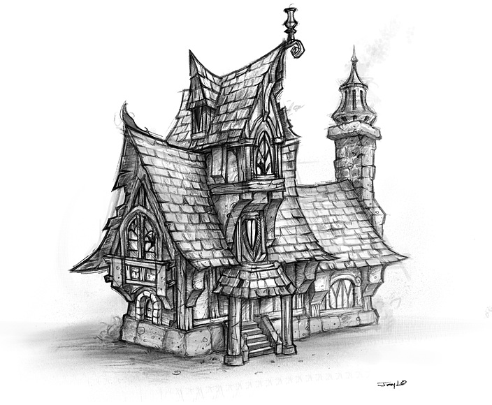
Random house:
housegz.jpg

Blizzard concept.
env-building-01-large.jpg

Any feedback on this and future fantasy stuff is really appreciated.

Thanks in advance!

Replies

  • Zpanzer
    Offline / Send Message
    Zpanzer polycounter lvl 8
    Looking great! Although if you wanna follow the concept art a bit more, heres what stands out to me:
    hourse_critic.jpg

    The red lines indicate proportion and the blue is missing features
  • lewist
    I've seen this concept art a couple of times and there are a few of things that jump out at me with your model that I think could be improved upon.

    I did a quick overlay of your pic with the concept art to trace out a few points.

    environPaintover.jpg

    (1) Emphasize the vertical - The peak of your building seems much shorter than what is illustrated. I would definitely make that rooftop a little taller to add more visual interest.

    (2) Be wary of your silhouette - The concept art has really playful and exaggerated silhouette, especially with the way the rooftop curves. Yours is pretty tame by comparison. Nailing an interesting silhouette is key to making an interesting model!

    (3) Chimney stuff - I might considering adding that thing on the chimney. It's interesting and adds visual movement to the buildings exterior.

    Otherwise, I think you're off to a great start! I can't wait to see it finished! :)
  • tharle
    Offline / Send Message
    tharle polycounter lvl 9
    i think you need to exaggerate some of your proportions a little more - things like the balcony, columns and windows are much more pronounced in the concept art which helps to give it that classic blizzard semi cartoony style. really good start though.
  • Justin Meisse
    Offline / Send Message
    Justin Meisse polycounter lvl 18
    the texture is what will make or break this. For extra points model an interior as well.
  • HughieDM
    Offline / Send Message
    HughieDM polycounter lvl 7
    Haha I did the same concept Ill keep an eye on this lookin good so far keep it up

    also that piece in the concept thats above the door below the third floor upper peace I think is a window not an object hanging down
  • Rhoutermans
    Offline / Send Message
    Rhoutermans polycounter lvl 12
    thanks for the great feedback! a little update on the model;

    houseo.jpg

    houseby.jpg

    Right now I'm making the texture before I'm starting the unwrapping. Different tiles for the roofs, windows, rock/metal and wood. Update soon :)
  • Mcejn
    Offline / Send Message
    Mcejn polycounter lvl 12
    the texture is what will make or break this

    I think you should also spend a bit more time with the lowpoly and really try to nail it before you move on to applying textures. Right now the proportions aren't lining up with the concept.

    I'd recommend trying to find this asset, or one like it, in Warcraft or Warhammer and see how it might have been interpreted before.

    My only other crit would be the middle roof piece is a bit messy and looks like the window and rooftop are a single mesh.

    Otherwise, pretty good start, have fun with this one!
  • Rhoutermans
    Offline / Send Message
    Rhoutermans polycounter lvl 12
    I also pushed the proportions some more.
    Here's some texturing progress. I decided not to go with the color palette Blizzard used for the Worgen houses (purple....). Will see how it turns out :)

    housebr.jpg

    Any advice on the painting is also very much appreciated.
  • willy-wilson
    Offline / Send Message
    willy-wilson polycounter lvl 8
    the model is great but the tiles need more depth crappy paintover and crappy couple min non tileing texture that repeats like crazy but hopefully makes the point.

    housebr.png

    tiles.png
  • Rhoutermans
    Offline / Send Message
    Rhoutermans polycounter lvl 12
    still very WIP:

    houserv.jpg

    willy-wilson : Thanks for the ref on the panels, will get them more into shape!
  • snake85027
    Offline / Send Message
    snake85027 polycounter lvl 18
    more strokes in that roof texture...more color value...get it done
  • sybrix
    Offline / Send Message
    sybrix polycounter lvl 13
    I love this so far. I'm a fan of the style. Keep going! :thumbup:

    Might want to tone down the colors on the roof texture though. It looks a bit too saturated for my tastes, but that's just me.
  • chrisradsby
    Offline / Send Message
    chrisradsby polycounter lvl 14
    Maybe breaking up some of those straight lines will help a bit, like modeling out some of the panels, or the straight sides at the bottom of the roof. :) Good work so far!
  • Sandro
    Why don't you just bake out AO pass and do your painting/presentation in fullbright mode?

    These sorts of assets are never meant to be rendered, so why bother? It washes textures out and emphasizes blocky nature of geometry.
  • Rhoutermans
    Offline / Send Message
    Rhoutermans polycounter lvl 12
    Thanks for the feedback, really appreciated :D

    Tried to get most of the feedback in there, here it is;

    housefz.jpg

    Gonna repaint the wood texture, guess it still looks a bit weird, and I'm still working on the lamp.
    Gonna start thinking about the rest of the scene as well now that I got my main piece looking somewhat the way I want it to.

    Cheers!
  • D4V1DC
    Offline / Send Message
    D4V1DC polycounter lvl 18
    tharle wrote: »
    i think you need to exaggerate some of your proportions a little more - things like the balcony, columns and windows are much more pronounced in the concept art which helps to give it that classic blizzard semi cartoony style. really good start though.

    You've seemed to ignore key critiques, especially the one above which makes or breaks the attempts to re-create this style.

    Having said that since you probably will not be redoing work, and fixing what is being mentioned in this thread & which is a part of working for the industry which is reworking everything (maybe even scrapping and starting from scratch.)

    To add to the above besides what most have said previously, pillars and stairs should appear fatter in width/height, over all this concept feels compact and stylized as most have also said.

    Just want to say you asked for comments and helpful suggestions but ignore the most important ones, I feel that you kind of ignored their suggestions and didn't even attempt to take them into consideration.(based by your updates)

    This is not an attack on you, I am actually trying to help but in a more strict way I guess & I know It's frustrating to get back to almost the start but if you can't do It here with personal projects how can you when you get a position?

    Other than that I like your texturing progress thus far their are still points besides what's been mentioned that you don't have that is in the concept, you've changed the roofing entrance details, top roofing part with little window (shown in image 'X') doesn't have the covering panels above the window, bunch of stuff.

    But if this is what you wanted and not an actual replication of the concept then by all means ignore me and do what you wish. :)

    Best of luck can't wait to see the rest!
    Hope this very rough image helps you...
  • Rhoutermans
    Offline / Send Message
    Rhoutermans polycounter lvl 12
    $!nz wrote: »
    You've seemed to ignore key critiques, especially the one above which makes or breaks the attempts to re-create this style.

    Having said that since you probably will not be redoing work, and fixing what is being mentioned in this thread & which is a part of working for the industry which is reworking everything (maybe even scrapping and starting from scratch.)

    To add to the above besides what most have said previously, pillars and stairs should appear fatter in width/height, over all this concept feels compact and stylized as most have also said.

    Just want to say you asked for comments and helpful suggestions but ignore the most important ones, I feel that you kind of ignored their suggestions and didn't even attempt to take them into consideration.(based by your updates)

    This is not an attack on you, I am actually trying to help but in a more strict way I guess & I know It's frustrating to get back to almost the start but if you can't do It here with personal projects how can you when you get a position?

    Other than that I like your texturing progress thus far their are still points besides what's been mentioned that you don't have that is in the concept, you've changed the roofing entrance details, top roofing part with little window (shown in image 'X') doesn't have the covering panels above the window, bunch of stuff.

    But if this is what you wanted and not an actual replication of the concept then by all means ignore me and do what you wish. :)

    Best of luck can't wait to see the rest!
    Hope this very rough image helps you...

    It's true that at first (for myself anyway) I wanted to base the model loosely on the concept. But now that I'm getting this sort of precise feedback I wanted to push it more towards the concept, which seemed like a good opportunity.
    I'm used to redoing work so that's no issue, changing the proportions won't be a problem considering how I've handled texturing thus far. I'm finding it pretty hard to nail this model based on the concept atm, but that's no reason to stop now.

    I'm not really ignoring the feedback, I'm just not all that experienced with precise concept -> model workflow. So go apeshit, I can handle the crits ;) Thanks for the paintover on the proportions and texture, I'll move some stuff around.
  • David-J
    Offline / Send Message
    David-J polycounter lvl 11
    It's looking really good. What needs more work IMO is the rock texture you have at the base of the house. It's too uniform and not interesting to look at. it needs more detail and shape and color variation.
  • Rhoutermans
    Offline / Send Message
    Rhoutermans polycounter lvl 12
    Okey, added some more stuff in;

    housex.jpg

    Adding another material for the support pieces was a nice idea $!nz thanks. David-J ; I also modeled in some more detail for the base-/rock.

    More feedback is always welcome, I'm gonna work on a bit of a scene for this piece.
  • Two Listen
    Offline / Send Message
    Two Listen polycount sponsor
    I think the lamp thing up top is looking a little big at the moment, it might not actually be - it may only look that way because of what I'm about to say next. The perch it's on, I really would like to see more of that spiraled end like in the concept. You're hinting at it now, but I think going the full spiral could really just...add something. Difficult to describe, but I think perhaps lacking it is putting more of that focus on the lamp, which makes it feel more "prominent".

    I think your base rocks at the moment are too large/extruding, they're really pulling focus from the rest of the house protruding as far out from the walls as they do. I didn't even hardly notice the base stone in the concept and because they weren't so large it helped lead into the flow and motion motion of the building's shapes from the ground going up a bit better. I'd perhaps try and go that way a bit more?

    Sorry I can only critique from a design standpoint, I understand what people are talking about seeing them talk about 3D work but I'm not about to try and get too technical myself. :)

    That being said, I also want to say I've enjoyed the nice attitude you've kept up through this project. It's nice seeing people take in critique without getting fussy, really striving to make something better. :thumbup: Keep it up.
  • Rhoutermans
    Offline / Send Message
    Rhoutermans polycounter lvl 12
    Got some more shape into the perch. Also Two Listen, you were right about the heigth of the rocks-support they were too high. I also added some sort of turntable-mini environment. I'm probably gonna add a camera float-/rotating around it.

    Still working on painting a repeatable grass/rock and sand texture. Might also add a well and a mini-bridge ;) Any more idea's / feedback (about the model or the presentation) is appreciated!

    housejo.jpg

    PS. the weird light errors are a lack of UV's.

    cheers!
  • Rhoutermans
    Offline / Send Message
    Rhoutermans polycounter lvl 12
    little paintover..

    houseky.jpg

    Drew in a well but it was too distracting from the mainpiece..seeing it here the green might be a bit too..green
  • Jessica Dinh
    Offline / Send Message
    Jessica Dinh polycounter lvl 10
    This thread is really interesting to me, as I'm kindof doing the same thing right now haha (except you're doing a house and I'm just making a little ol' well xD) Keep up the good work! I really love the roof texture :) As for the environment wip, that grass IS too green in my opinion. The first post kindof reminded me of a little, snowy winter environment, which would have been nice :) but if you still wanna stick with the grass, then yeah the green is pretty blinding. Can't wait for updates!!!
  • MeintevdS
    Offline / Send Message
    MeintevdS keyframe
    I'm a bit late to the party, but two things I noticed are:
    1: Top left, the mesh of the tiles and the mesh of the wooden beam are one piece. it would have used a few more triangles but it would look a lot better. (For some reason this was the first thing to attract my eye :p)
    2: The sides of the roof have little bites out of it to stay true to the concept and to make the silhouette more interesting(?), however they feel a bit too random at the moment. Maybe if they were aligned with the tiles a bit better then would make more sense, but at the moment some gaps start and end in the middle of a tile in a way that seems really impossible, even for a fantasy game asset ;)

    Other than those 2 points it's looking good I think! I agree that the grass on your concept is a bit to green and distracting from the house.

    Keep up the good work!

    Oh, one more thing. For some reason the shadows created by UDK are bothering me, not sure why. At some places they just look a bit jagged and glitchy.
  • Rhoutermans
    Offline / Send Message
    Rhoutermans polycounter lvl 12
    Thanks for the feedback :)

    I added in some model changes; and I also changed the size of the turntable.

    housew.jpg

    I liked the idea of a snow setting, I was already doubting and someone else suggested it as well, so I added it into the paintover. These two images are very quick paintovers for the concept (still with the old turntable size and old house model):

    housesu.jpg
    (Still some green visible)

    housepj.jpg
    (Heavier snow, almost no green visible)

    I got a lot of texture painting to do, will probably use modelling for adding snow on the house and vertex paiting on the turntable. Thanks for the feedback, really motivating me to keep on working on this :)
  • Rhoutermans
    Offline / Send Message
    Rhoutermans polycounter lvl 12
    alright, this is turning out entirely different from the paintover (much better tbh :P)

    houseoo.jpg

    Now on to adding snow on top of the house..More tomorrow :)
  • Rhoutermans
    Offline / Send Message
    Rhoutermans polycounter lvl 12
    housenef.jpg

    Adding rocks in there tomorrow, will see if I can get a turn table video working as well. Any feedback is appreciated.
  • MeintevdS
    Offline / Send Message
    MeintevdS keyframe
    Not sure if the snow on the roof is final yet, but I'd get rid of the sharp edge on the side of the snow. The sharp edged combined with the dark gray shadow makes the snow look like stone/concrete rather than snow. Snow is fluffy, white and lets a ton of light through.

    Here is an example of shadow on snow, notice the soft and blueish shadow.

    Looking good! Keep it up.

    edit: changed the image to an url since it was sorta big.
  • Warotic
    how many tris did you get it down to? :o
  • Rhoutermans
    Offline / Send Message
    Rhoutermans polycounter lvl 12
    I think it was around 3500 triangles in the end. I probably could've tweaked some more but yea..I'm gonnna check out ur building, saw the thread :)
  • purkie103
    Hey love the last picture the addition of the snow is really nice but you made need to add some snow to the house texture as it seems to clean to have been snowed on recently
  • Rhoutermans
    Offline / Send Message
    Rhoutermans polycounter lvl 12
    been quite a while since I worked on this one some more screens;

    housefh.jpg
    houseoa.jpg
    houseqh.jpg

    agreed the roof tiles could use some snow painted on them
  • Warotic
    cool cool, snow or not love your roof
  • Skibur
    Offline / Send Message
    Skibur polycounter lvl 5
    One thing that bothers me is the bricks on the chimney not lining up.

    Sorry if this has been pointed out already.
  • Jeff Parrott
    Offline / Send Message
    Jeff Parrott polycounter lvl 19
    Looking nice. Fix the stretching UVs on the window in the top shots. It's staring at me the whole time.

    Chimney needs some better modeling and textures as well. More detailed model and a proper texture for a chimney.
Sign In or Register to comment.