Van Crit
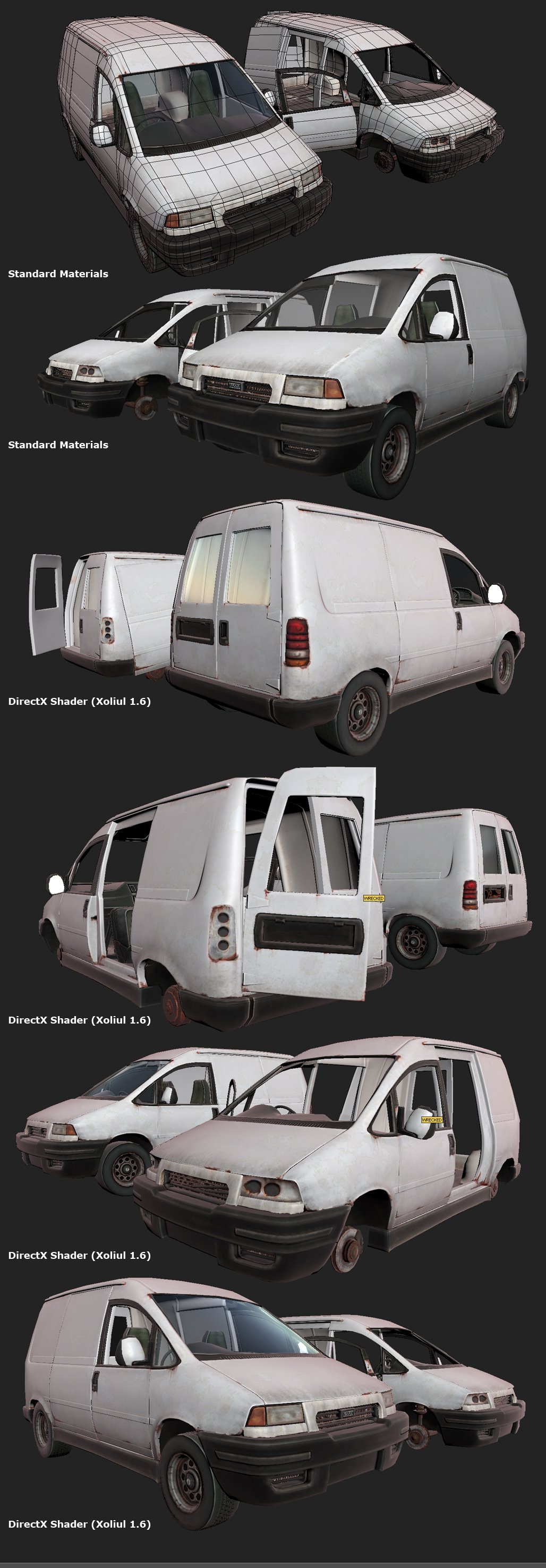
Ive been wrapping up a load of half finished models in between art tests and interviews... Ive been picking away at my old van model - rebaked it, repainted the maps and added some things here and there. Im at the point where Id like to get some constructive feedback from ye wise polycounters to see if you can give me ideas on how to add a bit more personality or general quality to it.
This is still WIP; I plan to add details to the insides of the doors, detail the dash more, paint spec and gloss maps and texture the glass.
Stats:
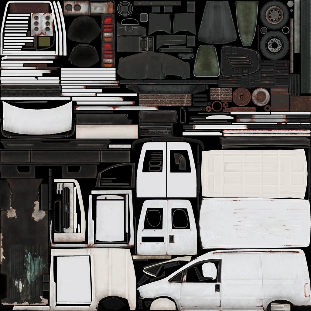
1x 1024 + 1x 256 map set (body and glass)
"Good" version: 10446 tris
"Junk" version: 8183 tris
I realize the tri count is probably higher than it should be, but since this is just a port piece I figured I could get away with it")
Thanks!
-N
This is still WIP; I plan to add details to the insides of the doors, detail the dash more, paint spec and gloss maps and texture the glass.
Stats:
1x 1024 + 1x 256 map set (body and glass)
"Good" version: 10446 tris
"Junk" version: 8183 tris
I realize the tri count is probably higher than it should be, but since this is just a port piece I figured I could get away with it
Thanks!
-N
Replies
I still see quite a bit of opportunity to reduce the polycount - Lots of unneeded edge loops right now.
it would be one thing if it was intended to deform in a morph target or something, but i think its safe to assume thats not the case, based on the lack of geo along the middle.
There aren't that many overly skinny tris here either, which i could see causing display or lighting issues (although, that pole up near either side of the driver and passenger's seat could maybe cause some weird artifacts in less direct lighting, and i've read those type of convergences should be avoided anyway simply because of how the engine analyzes the mesh. ie not being able to hop smoothly from vert to vert, a bottleneck in a sense).
but anyway, there are definitely opportunities for some optimization here as was mentioned above, and that is just a legitimate question question I have for Southpaw as to if I am overlooking something as to why those tris should not be included?
Nice model tho, and i like the texture in particular.
on an aestheic level you could add some history t the van, add some scratches or paint flakes to the interior where the owner has been loading and unloading tools, wooden ladders, plasterboard etc, whatever the van was used for.
the wheels have too hard an edge, and then they have that strong highlight which only emphasises the problem. not sure if your reference showed that but most tires are quite rounded on the edges.
First off: Does anybody know a good technique for painting grime on glass? Im driving myself nuts playing with alphas and spec
I agree with those of you who pointed out the tri count is on the high side. It was suggested to me a while back that adding extra loops for port pieces isnt too bad a sin, as its really easy to remove them later on should the model need to be optimized.
@ Rick_D - I tried to normalize everything on the texture sheet so I had constant resolution across the model - Would it be better practice to just cut the texture space for small details to buy more room for big parts? Also, I TOTALLY agree about my disorganized sheet - I did loose a lot of time in PS because everything is so scattered. The reason for so many uv shells is just because of the smooth groups I had to set to get a good bake off my high poly. If I wasnt normal mapping this thing, I certainly would have merged many more chunks into more logical pieces... Unless I totally set up my bake wrong lol
The cavity map and hilights on the tires is making them look a bit strange, but I think a spec map will help a lot. I agree lots of car tires are more rounded, but it seems most commercial tires have a bit more square of an edge to them, which is what I went with for this model
:thumbup: