young Storm - Comicon '10
veteran polycounter
as everyone jumps on the bandwagon of opening up a thread about the comicon entry, i'll d the same + i've been asked to show my progress here. i'll start with the finished one and will add the progress in the next post
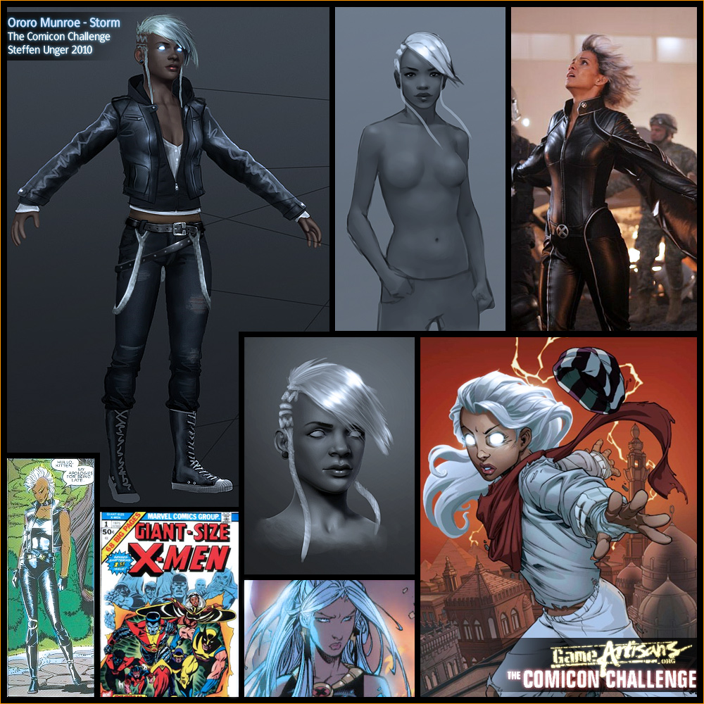
The Concept Sheet, my initial ida was contrary to the usual super hero depections, to use more generic less super proportions, i wanted to create a believable contemporary character. Also i wanted to work less with the colorcontrast and wanted to define the character more by material contrast, using glossy materials in contrast with dull materials and only let the person herself be the color, so skin and eyes should have been the only colourspots.
In the end it turned out that i needed to add at least a few colour spots to support the overall look, without letting it take control of the focus of my character.
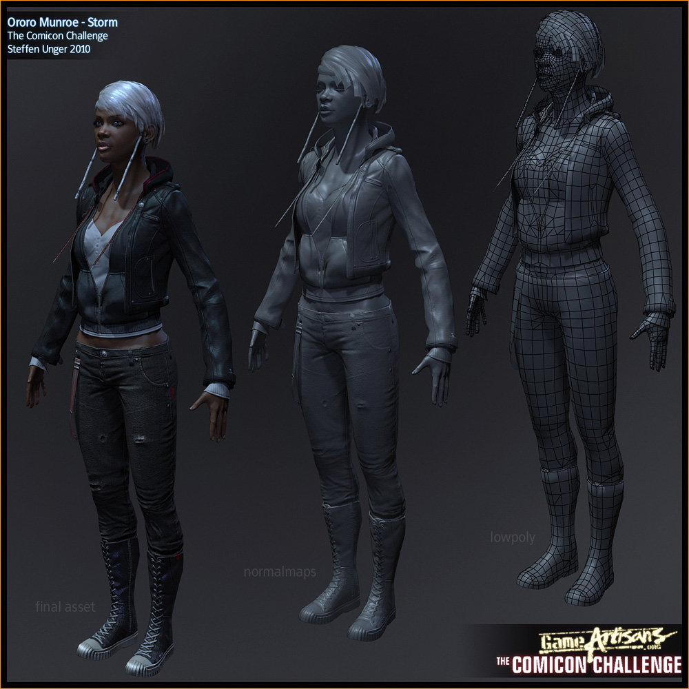
My Construction Sheet, aim was 12k tris top, i had to cut out a lot of stuff and ended up 2 tris below that count. I used 4 2k maps - for diffuse, normals, specular and glossiness. If i'd had made the rules i'd at first allow more polies and possibly cut down the texture sizes but let the artist decide which sizes he wants to use for what, basicly i'd have spolit the char into a few smaller sheets - dependent on having an alpha or using a different shader. right now i'm using 2 shaders, one for the skin and one for the rest of the character.
But thats not my decision to make and so i sticked with it ^^
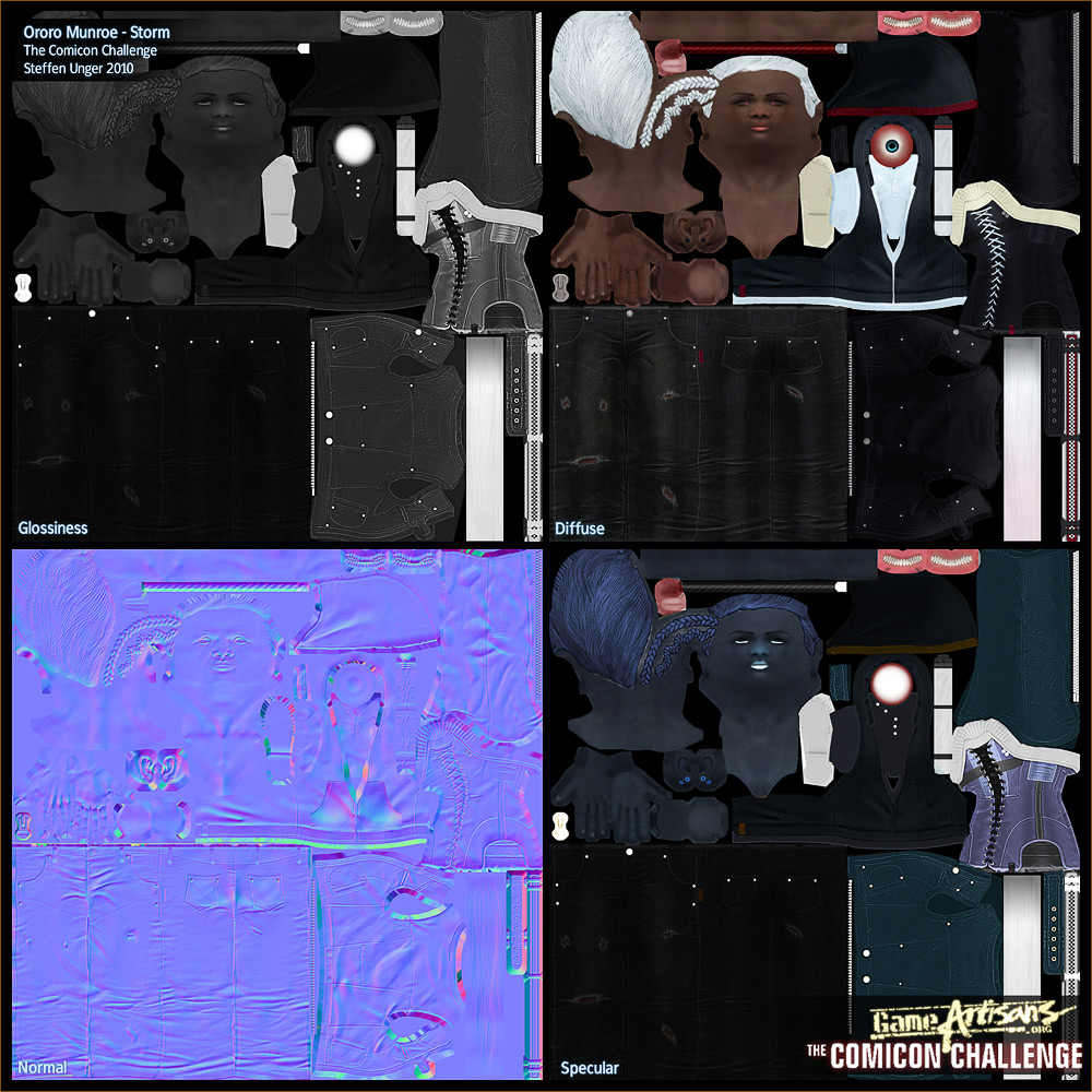
here are these 3 texturesheets, this time i decided to do it as opposed to how i would normally do realistic stuff for clients, without using photos and handpainted everything - this also includes creating more sculpted details for the highres to have more information to bake informations from into the textures for the lowres mesh
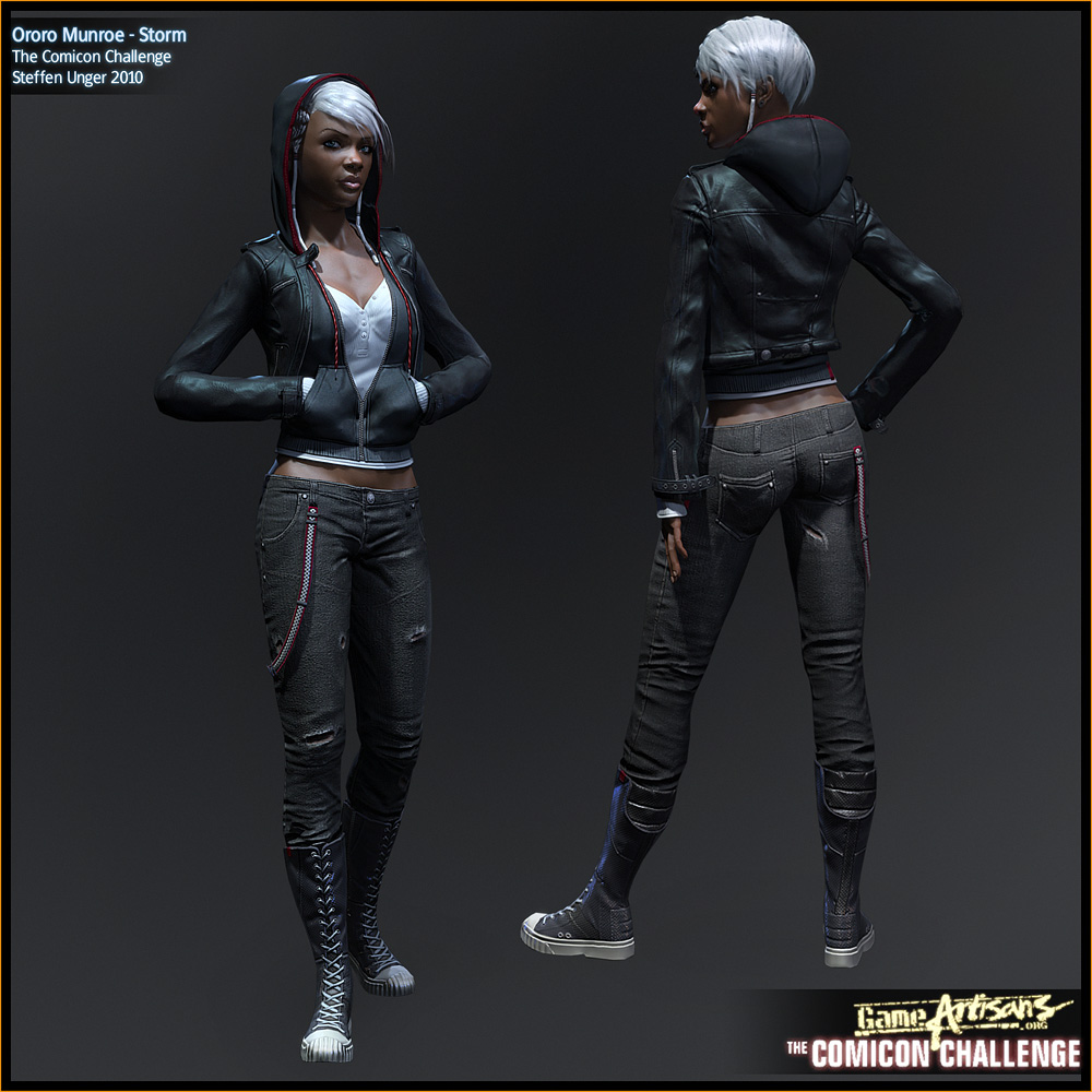
my presentation sheet, a front and back view, i initially planned on giving her a pedestal, but it sucked so i dropped it after sculpting, retopo and baking it.
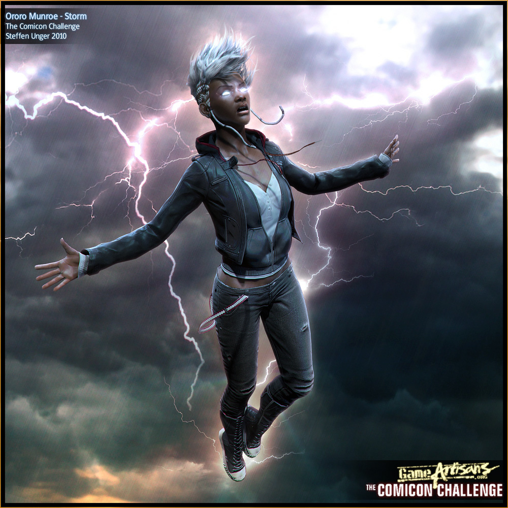
the final beauty sheet, man i was tired when i finished this at 5:30am local time on friday. I'm totally unhappy with it - the pose stinks, the facial expression stinks, its cheesy and the total opposite of what i wanted to do. however from 3am to 5:30 my body and brain have been in zombielike autopilot i wasn't able to produce anything more memorable. It's now "finished" and will stay this way - i doubt the one hour i had left till the deadline would have helped me a lot, so i call this done.
next post will be my work in progress stuff with some thoughts etc. have to talk to a client first.
The Concept Sheet, my initial ida was contrary to the usual super hero depections, to use more generic less super proportions, i wanted to create a believable contemporary character. Also i wanted to work less with the colorcontrast and wanted to define the character more by material contrast, using glossy materials in contrast with dull materials and only let the person herself be the color, so skin and eyes should have been the only colourspots.
In the end it turned out that i needed to add at least a few colour spots to support the overall look, without letting it take control of the focus of my character.
My Construction Sheet, aim was 12k tris top, i had to cut out a lot of stuff and ended up 2 tris below that count. I used 4 2k maps - for diffuse, normals, specular and glossiness. If i'd had made the rules i'd at first allow more polies and possibly cut down the texture sizes but let the artist decide which sizes he wants to use for what, basicly i'd have spolit the char into a few smaller sheets - dependent on having an alpha or using a different shader. right now i'm using 2 shaders, one for the skin and one for the rest of the character.
But thats not my decision to make and so i sticked with it ^^
here are these 3 texturesheets, this time i decided to do it as opposed to how i would normally do realistic stuff for clients, without using photos and handpainted everything - this also includes creating more sculpted details for the highres to have more information to bake informations from into the textures for the lowres mesh
my presentation sheet, a front and back view, i initially planned on giving her a pedestal, but it sucked so i dropped it after sculpting, retopo and baking it.
the final beauty sheet, man i was tired when i finished this at 5:30am local time on friday. I'm totally unhappy with it - the pose stinks, the facial expression stinks, its cheesy and the total opposite of what i wanted to do. however from 3am to 5:30 my body and brain have been in zombielike autopilot i wasn't able to produce anything more memorable. It's now "finished" and will stay this way - i doubt the one hour i had left till the deadline would have helped me a lot, so i call this done.
next post will be my work in progress stuff with some thoughts etc. have to talk to a client first.
Replies
Honestly Steffen, I think you're being way too hard on yourself. The final pose is good, the facial expression is good and the hair in the beauty shot is awesome. Maybe you could've pushed the expression a little further, but it's still far from bad.
I really like the poses in the front / rear view presentation sheet - very natural, good use of the costume, very stylish. I also like the flourishes of color in the outfit, too - just enough to break up the darks, without being too overbearing or looking slapped on.
You've really nailed the essence of the character; it's obviously, recognizably Storm just looking at her, but she's got this excellent street-vibe thing happening. Awesome work, just...awesome.
Just an FYI, her real name is spelled 'Aurora', as in Borealis.
P.S i seen your name is Steffen, my name is actually Stefan( and if im correct we probably say our names the same way
FUCK YEA!
Great job Steffen, your work is always inspiring!
Love it!
Don't go beating yourself up over a few details..
If anything ever deserved to go on the banner, this one does..
The only thing that went through my mind was HOLY Shizballs! that is awesome.:)
Goodjob !
@danshewan: i took the name from the youngster storm comic, i guess its somewhat like a origin comic but dunno its also missing a lot, the cover just made me want to attempt a younger version of storm
http://marvel.com/digitalcomics/titles/Ororo~colon~_Before_The_Storm.2005
i actually bought the comic and was somewhat dissappointed it was a (at least to me) pretty random story compared to wolverines origins
But i guess aurora still makes sense and while it might not be spelled that way it might be spoken a bit like aurora
@Arcanox : i sure hope he costume is less cheesy
it somewhat fits the xmen theme but i initially planned on something different but ran out of time, but it was fun messing around with the hair and windsystems and so i kept it - but i still think something more subtle would fit the overall presentation better
@Purplepaint: i somewhat doubt it
anyways doesn't matter, i got used to it ^^
thanks man
@vailas: yeah thats what i loved about the boot, actually its a modified gstar i once saw in a shop, i liked the converse vibe especially because it wasn't a converse and hat some different cuts which made it more interesting to me
@haiddasalami: yeah its great to see what this challenge has brought up, some very interesting pieces, i also love how different everyone took the topic, looking forward to dominance war - while i'm not going to be part of it i really hope for some awesome pieces
@b1ll&earthquake: thanks guys it means a lot
ok now lets start with the promised retrospective
when i initially started this project i felt like i wanted to expand my portfolio in a direction thats usually not what i do - in freetime - i from time to time do more realistic works but most are under NDA, some companies died out and the stuff is still under NDA, sucks :X
so i decided that comicon would be a nice, smaller, challenge to participate and keep the motivation high. especially with all those great participants around.
What i wanted to do is something different, depict a believable character thats subtle as opposed to overexposed as most xmen are when adult, they are a bit like super heroes - not like superman but still - and some of them of course dress and behave like superheroes. What i wanted to do is to show one of them before he/she became the person he is in the comics.
Wolverine was too obvious as was superman or batman, most people know the backstory of these, never was a fan of cyclops or some other xmen characters and i felt like it would be interesting to A. do a girl and B, do someone from a different ethnic background as the people around me, it just forced me to do some more research, this might upset some but its really more or less a historic background. Because of germanys colonial background here are just not as many black people as i met in the us or france or the uk, i love my black friends but i don't see am that often so it was somewhat of a challenge with myself to do someone i'm not that much used to see around.
It forced me not only to research more it also forced me to go through the streets with more focus, i usually check faces and clothing details when i'm not reading, dunno just doing that but now i was forced to have a different focus which was kinda nice and refreshing.
Ok going on in the retrospective - i did a lot of kids in my carreer and also quite a lot adults so after doing some scribbling and thinking about it i decided to go in a stage between those too, iatriki and some other dudes already showed they are going to do an aged storm or a storm in the middle of her life just like in the comics so the idea was set, she will become younger than usual but not too young to still be a teen, maybe something around the early 20ies.
i researched a bit and was so inspired by the haircuts Lolitaarts does a lot that i wanted to do something similar, partly shaved, partly long haired
I started sketching and came up with this
i soon realized that painting the concept as i planned it would just take me too much time, i'm not that skilled in conceptpainting, my background comes from modelling and sculpting and i knew if i wanted to finish this piece i'd have to focus more on my strengths also for the concept part, i know i lost a lot opf challenge with myself due to this decision.
so i started sculpting and did overpaints like this
i started sculpting and layed out the hair
i wanted her to be slim, agile, her background is on the streets beeing a pickpocket, i'm usually more into more female characters (i guess this is why i love jacos catwoman so much) so it was another thing thats different from my usual patterns
i'm going to skip some images, if you want to see all steps i'm going to post the link in the end of this post, some quick tutorials will be in the next post
then i started roughing out the layout for the clothing, as i wanted to focus on materials i had to find some stuff that is contrasting in material and not just only colour, i decided to make her black and white with her skin and eyes beeing the only colours going on
so i mixed some dull and some more shiny materials, but i felt the middle section was somewhat empty and played around with an idea that i partly took to the final asset and partly dropped because of seeking too much attention, subtlety was my aim - some might call it boring - but i thought it might be a interesting change for some view habits as there is stuff to explore and not getting the full load of a overexposed character right in your face
so based on that i started sculpting the clothes, layed out the basic cuts etc.
sculpted details, which i later partly dropped, like some stuff on the boot which i felt where distracting and not working
retopo done in 3dcoat, unwrap just plain boring 3dsmax, i have been asked how i did it and i just don't see anything special about it, organic stuff is so easy these days and automatic unwrapping so often gave me bad results so i did it the "classical" way in max. I still remember times where unwrapping even lowpoly models took more time than actually modelling them as you had to unwrap every vert by hand, guess that gave me some patience
the almost final lowpoly asset some details are still missing, such as the hood - i first had to find a way to unwrap the lowpoly in both states to have a minimum stretching for the hood beeing on the head or on her back
One thing that i was sure about from the beginning when reading the rules was, that i want to do more with MR - i've been doing a lot of moviework lately (which includes weeks of modelling roots with lofts :X) and i just wanted to do more rendering and understand how i can speed up things, how the skinshader works, how area lights work, how i can set up IBL and such things
first texturing pass, needed more variation, changes in scatter depths and totally needed some change on the hairs, its too obvious how they are built
pretty much everything baked down, some small details still missing, reworked the hair to be more lose, mesh needed still some twaking to remove the last few obvious edges. It was a bit of a pain as the sorting in max is so... not awesome
some friends and me felt like some colour was missing, so i did some overpaints, they did some overpaints, in the end we felt like something in that direction would work
the red stripes i fron felt too forced, so i thought of ways to implement them more suiting and subtle less focus changing, also it somewhat looked like a poloshirt of some grandpa golfplayer with the tripes beeing offset that much.
Though i loved the the wider stripes on the hoof, the stretching of the uvs didn't let me do it that nice, as i unwrapped it as a inbetween state of hood on and off its not super clean, but cleaner than one direction beeing unwrapped and then morphed.
Then it hit me, those stupid hoody cords i always take out of all of my hoodies, perfect fit, subtle and they can float in the wind, that was the idea i needed
then i built a base, which i decided sucked and doesn't fit the 1000x1000 dimension we needed to used to i dropped that
next post
mini tutorials, some guys wanted to know how i built the hair, how i let it float in the wind, how i unwrap some things and how i built the base, so this is going to come
thanks for taking the time xD
ok here are some of the promised tutorials, will have to do the other ones when i have some time to spend, but as minecraft is down because of some idiots i guess i'll find some time this weekend
first of all one about how to easy set up hair planes, it was always a struggle for me, doing edge extruction/cloning, took way to much time and was pretty abstract as well
the second one is about how i let the hair blow in the wind, i used max' cloth simulation for it, which surprisingly gave me pretty solid results. I wanted to do it with softselections but it was pretty nasty to do, so i tried cloth and it worked out just great, in the end i just used softselections to tweak the overall shape and move strands around
Nice hair tutorial
Thanks for the walkthrough, the animators on the last project I worked on used the same method you used for the hair in the beauty shot to create our ingame hair animation...convinced a lot of guys that we had a "proper" realtime hair physics solution for a while.