Backstreet Environment - C&C for portfolio piece.

polycounter lvl 14
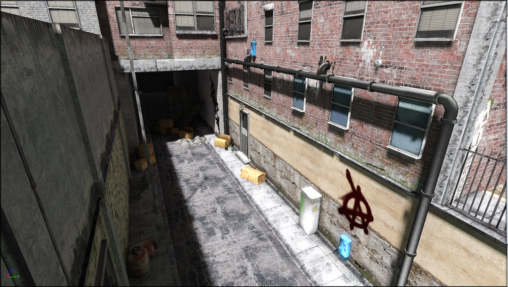
I really need a decent environment piece for my portfolio so I've been working on a small scene. Iv been working on it for a bit and im beginning to draw a blank and could really do with some c&c to get this up to a professional standard.
This is a UDK screenshot. I think I need to familiar myself more with lighting and light mass, atm there is just a single directional light lighting the scene.

Please note:
The corrugated iron sheets and chain link fence in the tunnel are props from unreal, they are just filler at the moment and will be replaced as I continue. Beyond the tunnel still needs to be filled.
This is a UDK screenshot. I think I need to familiar myself more with lighting and light mass, atm there is just a single directional light lighting the scene.
Please note:
The corrugated iron sheets and chain link fence in the tunnel are props from unreal, they are just filler at the moment and will be replaced as I continue. Beyond the tunnel still needs to be filled.
Replies
The only other things that really popped out at me were the asphalt and that graffiti.
The asphalt looks like ice at the moment, darken it up and try to break up the tiling (its too obvious right now).
The graffiti is too thick. I would thin out the strokes and fade it a little.
EDIT: Sorry, forgot to add.... It does look great as it stands now, these were just little nitpicks :P
A few things:
I'm not sure if the seam running up the back building is intentional, either way it's distracting and looks like a seam... EDIT: Nevermind, my bad, I guess the building has a bit of a indent, maybe add some grunge in that corner to help define the shape better.
The cardboard boxes look a bit too saturated compared to the rest of the scene. They become focal points because of it and I'm not too sure you'd want them being the center of attention.
DarthNater made a good point about adding some color to the scene. You might not have to use more lights, try changing the environment color setting to something other than white. It's under View -> World Properties -> Lightmass -> Lightmass Settings -> Environment Color.
Something weird is going on with that pole on the left side of the alleyway. The repeating dark/light pattern, not sure what it is, light map maybe.
Maybe add some water stains to the ground and/or a small puddle under the air conditioner unit.
A few more bits of trash and debris along the edges of the walls might be nice addition.
Whatever that white box is (utility box?) it needs a tiny bit more grunge or water stain on the bottom edge where it meets the ground.
Its a daylight shot and looks like one to me.
Like that one gta copycat playing in london cant remember the name.
Maybe a night shot with some illuminated windows and lights to test some more lightning.
Your lighting is also really flat across the piece. Which is fairly accurate for daytime lighting, since the sunlight will bounce all over the place and illuminate most things pretty evenly, but it makes it a little less interesting to look at. Maybe add some clotheslines across the alley to get some more shadows into the scene to help break up the light. Since you're obviously intending a daytime shot, it might be worth experimenting in ways to subtract areas of light through adding well placed shadows instead of finding ways to add in more and more lights.
tlovemark - Yeh, I see what everyone means about the graffiti, I'll either find away of making the graffiti work or remove it and find another way of breaking up the repeating wall. Thanks for the idea of the clotheslines lines to create more interesting shadows.
Diwan - Thanks for the c&c, iv began to play with the light intensity and going to try adding dirt to the corners of the buildings so they read more clearly.
Progg, Disco Stu, Canadian Ink, thanks for the comments.
Ben Apuna - Yeh the "seam" is a corner, but I can see why it could look like a seam,.I think ill try darkening up some of the corners of the buildings so they read better, should make them look more interesting too. I'll try the environment colour too.
DarthNater - See what you mean about the asphalt texture, I have began to break up some of the repeating wall texture and forgot about the ground.
I'm going to carrying on updating until its "done".
Been working on a few props to litter the ground with. Re-did the cardboard boxes too.
a couple of things though the boxes grime texture on the bottom look a bit wrong? I think it need a variation in the colour?
also the texture on the breeze blocks is a bit wrong it looks like they are made of polystyrene
Updated the window textures with sky reflection, added vegetation, wires etc, some drain like concrete slabs. Also some off screen blocks to cast some shadows and suggest there are buildings out of view.
Currently working on breaking up the floor texture and making it look more like old tarmac or concrete.
Getting rid of the anarchy decal was definitely a good call, though.
1. There seems to be a mix of hand painted and photoreferenced textures. The bricks and whatnot look like its a direct photo texture where things like your pipes and props look very hand painted. You might look for some consistancy there.
2. I think the decal of the grafitti would work well, but it was too dark and saturated. like it was layed on top of the wall. Thry to bring more of the background texture through the paint, that would have blended it in a bit more.
3. the texture on the left side with the stucko/brick has too much uniform noise. like the holes are spread evenly across the wall. Try to incorporate pockets of detail in key places (where would the wall actually wear?) and not so peppery.
4. there is an odd bounced light on your propane tanks there. that area should be in shadow.
5. Check your proportions. The gutter seems too wide for the size of the curb, and the street. The cinder block look about 2 feet tall:). The off proportions are making the scene look really small in some places and large in others. It's kind of confusing to look at.
6. AO. I see very little if any in places like where the door on the left meets the wall, or where the pipes are close to the walls.
7. The connection where the wires meet the left wall look a bit odd, maybe have them come from over the wall? Or but some sort of weather head there.
Just small small things. It's looking good, though. Your getting close!
The door on the left looks strange to me. It looks kind of like plastic, and I can't see a handle.
as it stands now, like most people have said, it looks great and pretty realistic. take it a step further and make it a scene. make it a composition. this does not stand out amongst the crowd, and that is your goal with your art, to stand out and stand out well. although it really looks great, it's still just an alleyway.
break some of the pipe up and add in some water flowing out of it (or not)... blow away part of the building and show some intense something happening in the background. blow away part of the other sides of the buildings and show us the structure falling apart and the insides of them. more foliage like this place has not been taken care of AT ALL.... just ideas to get your head moving and not saying this is the direction you should take by any means, but really push yourself to be above the rest of the pack and i promise it will pay off in the end.
kdm3d I think I see what you mean, I'll look to go back over some of the props and work them up in the same amount of detail. And getting some consistant scale between Max and UDK is proving difficult and I end up scaling them by eye in UDK. With Maya I used to create a "person" sized box and work from that and that seemed to work for me, but max not so much. :poly141:
3DLee Thanks for the c&c. Door is still a little work in progress
Firebert I'm not sure which pole you mean, the pipe on the left? Looking at it appears to be quite far off the war, I think getting some more AO along with some better detail might help sell it. Or moving into a place that makes more sense.
While blowing apart the buildings isn't where I want to go with the scene, but I hear what your saying
Thanks for the comments.
I have kind of taken a step back from the back-street environment and trying to focus on a handful of textures and props to see how I can better improve my modelling,texturing,normal mapping, etc.
Iv been trying some different stuff out. Playing with UDK material editor, breaking apart UT3 maps and putting them back together again to see how they function. Observing, making notes, etc.
Now this work isn't mind-blowing or anything, but there are bits and pieces from which I have learnt some new tricks. There are some details that could be pushed further but this is what I have so far.
The pipes diffuse map:
Its worth mentioning that I mapped this with the intention that the elements could be scaled and moved around to create different variations, so I gave objects like the valve a little more uv space so they could be scaled up. I think there is plenty more room for detail.
On to some WIP stuff.
A trouble I have is that alot of these objects have separate diffuse maps. I really need to become more efficient, planning better uv layouts and building objects that can share the same map. So I dug through alot of the packages in the UT3 editor to get a taste for how their static meshes and uv maps are laid out.
I then sketched out a selection of objects that I might want. They consist of building chunks, pillars, walls, trim, etc and then some smaller details like vents and wooden planks I can lay over for variation.
Rough Sketch:
These are by no means all the objects but its a start.
Here is some WIP mudbox shots of pillar variations.
And a mock up of how they could be used:
Please note these are optimized/poly crunched versions just as a demo so look a little nasty.
Also Those more familiar with UT3 may recognised the set-up. I don't want to copy/recreate/ them, but study them and learn from them the best I can.
EDIT: In hindsight they are pretty similar to the models from UT3, i'll probably work to change that.