Hand Painted Fantasy Environment
polycounter lvl 10
Here we go again!..
Edit: Here's how the 3d scene stands at this point:
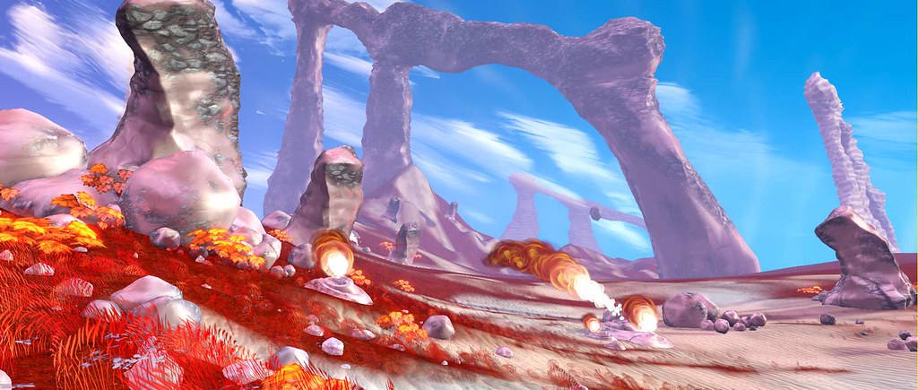
/end edit
Threw this concept together last night for my game preproduction class. We're learning the imoprtance of color in 3d scenes as well as a strong base composition. Although it's important to have nice rendering and all that jazz, the main focus of this is to create a scene with an eye for the technology you'll be using at the time. Flora's palced with forethought to foliage volumes, etc, etc. The hours your spend here are incredibly important! I've learned the hard way on past projects how weeks spent on assets can be a waste if there isn't a large plan for the environment. Environment art isn't about slaving for weeks on tons of assets. It's all about quality over quantity and assets that build on each other in all artistic respects. A few good flora assets, some rocks and some solid ground textures and you can have a great outdoor game art scene, just look at borderlands (just got it last week, hence the last minute concepting!).
I'm going to do my best and take queues from adam's environment thread to make this a group learning experience for all of us. Edumacation can be fun!
Anyway, enough rambeling here's the concept:
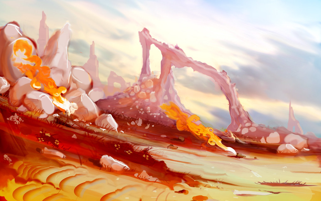
The smoke puffin' up off the ground are from geysers, which i'll be doing sillhouette studies of in the near future.
I'd love to get some suggestions from you guys, right now the scene feels a little generic for a fantasy environment, need to come up with some cool props to try some hand painting on. Didn't have much time to explore man made props but i'd like to get some in the scene so get some ideas out there! I'm actually waiting on some feedback from my teacher so that feedback will take precident, since you guys don't have any impact on me failing this class .
.
Lookin' forward to updating this with actual 3d work in UDK starting next week after midterms.
Edit: I've dabbled in hand painting, but never tried a full on scene so this should be interesting, i'll be sure to include some of my utter failures as i make these textures.
Edit: Here's how the 3d scene stands at this point:
/end edit
Threw this concept together last night for my game preproduction class. We're learning the imoprtance of color in 3d scenes as well as a strong base composition. Although it's important to have nice rendering and all that jazz, the main focus of this is to create a scene with an eye for the technology you'll be using at the time. Flora's palced with forethought to foliage volumes, etc, etc. The hours your spend here are incredibly important! I've learned the hard way on past projects how weeks spent on assets can be a waste if there isn't a large plan for the environment. Environment art isn't about slaving for weeks on tons of assets. It's all about quality over quantity and assets that build on each other in all artistic respects. A few good flora assets, some rocks and some solid ground textures and you can have a great outdoor game art scene, just look at borderlands (just got it last week, hence the last minute concepting!).
I'm going to do my best and take queues from adam's environment thread to make this a group learning experience for all of us. Edumacation can be fun!
Anyway, enough rambeling here's the concept:
The smoke puffin' up off the ground are from geysers, which i'll be doing sillhouette studies of in the near future.
I'd love to get some suggestions from you guys, right now the scene feels a little generic for a fantasy environment, need to come up with some cool props to try some hand painting on. Didn't have much time to explore man made props but i'd like to get some in the scene so get some ideas out there! I'm actually waiting on some feedback from my teacher so that feedback will take precident, since you guys don't have any impact on me failing this class
Lookin' forward to updating this with actual 3d work in UDK starting next week after midterms.
Edit: I've dabbled in hand painting, but never tried a full on scene so this should be interesting, i'll be sure to include some of my utter failures as i make these textures.
Replies
I recommend Wayne Barlowe's expedition, it mostly focuses on creatures but it has some cool alien landscapes in it as well. There's another cool book but I can't remember it's title, it's an art book about all the planets and moons in our solar system, there's some really cool alien landscapes, like how a the sky on a planet with rings might look.
Looks like the school u r going to is teaching truly good stuff. Seriously, havent seen such approach that often even though it is really important. I am wondering what school is that.
Indeed, many ppl plan to do a large enviro and right away start making a barrel or concrete barrier in ZBrush before actually blocking out the level geometry :P
Keep it up!
I've never done an environment like this so I'd be interested in seeing how you go about it.
If anything comes to mind for fantasy props in this type of setting I'll lend a hand. Best of skill!
You have a great concept going here, but the above statement is true to da game.
^ this.
Thanks for the suggestions and kind words guys, really adds to the motivation. Going to get some some more of the sky color in the sand and try for some really far out heavy blue flora here and there, we'll play it by ear.
Started the first pass on the rock today. As always i picked some place holder stuff and started liking it enough that i think i'm just going to keep it. It's mostly just tweaked photo reference, so we'll see how much of a "hand painted" look i can cram into it in the future, for now i'm happy with it though:
Trying to match general color and lighitng to the original concept so far.
Base mesh was a simple geosphere at low iteration. I selected all edges and did a cut, this is kind of like doing a tesellate or adding subdivisions without smooth in Zbrush. From there i applied a mesh smooth, since it had slightly higher subdivisions, the rock rounded its edges while maintaining a nice geometric shape, this was the look i was going for, a bit of smoothness while still geometric.
From here i did the UV map. The base UVs assigned to geospheres leave too many edges, so i did a planar map (just to zap all seams) and broke a UV slit in the back down one side. From here just relaxed the mesh. Gave me a nice fairly well distributed mesh. The one side with the seam is easily hidden in the ground, or can be blasted away to save polys. The geo can also be modified to allow different formations of rock, though i'm pretty happy with the current form, just did some quick scale adjustments.
In order to get more of its geometric form back I exported an OBJ to zbrush and just really quickly outlined the edges. I used this as a mask and multiplied the spec of the edges of the rock to be more powerful than the rest of the surface, giving a subtle hint to its edges.
I've been wanting to give vertex blending a go, so i created 2 base materials for the rock, and created a blending system inspired by shadows to help reduce the "blurry" transition you usually see in masked LERPS. The resulting material will paint over the dark ressesses of the rock faster than the crystal surfaces jutting out. I was suprised how quick and easy it was to set this all up. Just subtract the red node from your height map (more or less) and vertex paint in the red channel (very easy to do). This brings up the supposed extra geo on the rocks. Theoretically a few edges could be taken out, but because these rocks are being vertex painted, it's important to have a decent distribution of vertices. Here's what the vertex painting looks like in UDK, this is the main factor in the masking of the 2 materials:
Went ahead and tried to make these look wind swept, pretty happy with the result. I made a quick "smoke" texture and multiplied it against itself, panning it in 2 different directions to create some steady distortion, i then multiplied this texture by the Mask used to control the sandy and rocky textures. The result is what looks like wind swept rocks as sand piles on and off of the surface. This wind effect only happens in the grey area of the mask so I'm able to paint which side of the rock will be affected by wind. Nothing crazy awesome, but worth a look if you consider yourself begginer to intermediate.
Here's a link to the current package:
http://dl.dropbox.com/u/1451094/aEnvironment.upk
NOTE: In order to see the material in action you're going to need to vertex paint into the red chanel after throwing some testrocks into the scene (ignore testrock2).
Another versions of the rock at a higher tile:
Next update should include some terrain/ terrain materials and some decals, maybe some flora.
After I finish my work for today I'll post up a tiling trick you could use if you are interested, could go well on that large stone thing in the background.
Here's where I'm at now, just some fairly simple terrain materials and matching the terrain as best i could to the concept. Used some simple point lights to break up the terrain a bit. Used a pre made UDK skybox.
Pixel, any and all tips are appreciated, might be similar to the one i used on my terrain to tile a texture on itself to break it up a bit.
Not to happy with the rocks as they are, went a little crazy, made the second Mat super red, just over it for now. It's a pain in the arse to tweak this stuff once you have a fairly complicated mat going sometimes.
Anyway, lookin' forward to slammin out some geysers tomorrow, should be some pretty cool stuff going on including some particle effects.
Here is that small tip. Its not that special but it helps for some things where a soft blended vertex mask fails.
Ignore my terrible tiling textures. lol
Very preliminary particle effect, will eventually have at least one secondary particle at the base with more plumage/whitish smoke:
Anuxinamoon:
Nope, no white box, just diving in. It's all organic shapes at the moment, so no real need for perfect placement. Trying to go fast so i can have time to mock up and place some man made gazebo's or something by GDC, want this to be a major piece with all the trimmings!
And thanks for the tiling tutorial, might try some new stuff when my brain's up for it
Edit: Annnnnd crash, there goes 2 hours of particle work, dag nabbed auto save doesn't do a damned thing for packages :P
Love the concept crazyfingers! That fire in it looks sweet!
Brought it back to this point, still can't figure out how to make the particles change color or fade over time, but it's looking pretty dope in real time. I really like the hand painted nature of the particles, gives me something to shoot for in my other textures in future passes.
Files if you feel like checkin' it out:
http://dl.dropbox.com/u/1451094/aEnvironment.upk
http://dl.dropbox.com/u/1451094/JBenvironment.udk
Advice on particles very appreciated! Want them to match concept as best as possible.
Used the alpha to raise it to a power (turning it white) and then tapered off the color by multiplying it to darken the end bit. Still plenty of fine tuning to do:
Welp, sleep calls. I'll try to slow down on the updates so i don't flood this thread with garbage now that i feel like i'm on the right track with particles. Thanks again everyone
Also, that fire is awesome! Especially love the Okami-esque painted flame from the concept.
I know it's still all WIP, just thinking you should get more red/orange in your bounced light like your concept. I think it will help visually connect the rock formations with the ground.
Other than that, keep on rocking this
Flora's in now and the rock formation's done.
Things are a little on the photo real side, but i'm going to work on pulling that back... somehow, haha, don't know exactly how yet, but it'll happen. Probably start with the ground textures, they're from photo reference and cover most of the scene.
Wasn't trying to copy other environments, but when you throw in simple grass flora it just suddenly looks like 50 other pieces out there, so it goes. But it sure livens up the ground! and the subtle distortion on the nearby horizon line makes a huge difference for believability.
Having some sorting issues with the particles, it wants to render the grass in front of the geyser particles, anyone know of a solution for this? I know zsorting issues with particles has been a headache since the dawn of time so i might just have to live with it.
Image showing how i slapped together the rear rock formation quickly (need to clean it up a bit):
Simple blockout, chamfered all edges, modified the geo a little to give it some decent rock shapes. threw on a meshsmooth, little bit of soft selecting, and then a noise modifier. UV'd just like the rock, plane map. Cut the seams in half, then a quick relax, didn't worry about seams since this is only visible from one side. Bing, bang, boom. Threw the sand texture on it once it was in.
If anyone wants to check it out in motion, or just snoop around the package (it's a bit messy right now) here are the files:
http://dl.dropbox.com/u/1451094/JBenvironment.udk
http://dl.dropbox.com/u/1451094/aEnvironment.upk
Followed your advice ben and threw in an orange-brown in the transmision color to get more of the feel from the concept:
Update:
Haha, jacob, best advice i can give for working fast is work smarter not harder. But you gotta bust your ass and make lots of mistakes before you're smart about it! Spend as little time in Max as possible, don't bother with renders or materials there. Put all your textures and materials together in UDK and just dive right into it. Once you know UDK you can start making all kinds of materials for lots of different objects using some very basic textures. My flora for example is a very simple plane with a very simple diffuse and most the data in the normal, but some gnarly material shader stuff going on. Easier to pull this stuff in a "hand painted" organic environment of course.
One more update to the piece before I show the first pass and get feedback from my teacher:
Update on the class: Teachers seemed to really like it, but i jumped the gun a bit. The course is called "game preproduction" and i hit it really hard in a one week period so they want me to do another version of it for critique. One of the few cases where working ahead fast can shoot you in the foot! Here's the secondary concept color scheme i'm following this time around:
This was one of my base layers coming up with the full red version, but they liked it enough that i'll be using it as a base for this secondary scene:
Trying out a couple things, buddy of mine remarked that this scene would look cool in borderlands so i tried to give it a hint of cell shading by using some reverse fresnels in the diffuse. Tell me what you guys think of the piece overall. I'm still partial to the original and that one is definitely not abandoned this is simply to show that i'm able to take a concept of various color ranges and execute them on in 3d. As I type this i think i'll go ahead and make this scene change color in real time as if the sun's setting or something, might be fun.
Talk about style, wow man, this is going straight into my inspiration box. Keep it up!
Also wanted more of the sky color in the ground to harmonize it so i used the same technique i used to get the cell shading effect, but softened it and instead of darkening the texture made it light blue. Not exactly realistic but it's a stylized scene so who cares!
Thinking of concepting out a ruined entrance to a cave. I can just use lots of rocks and a bit of man made ruins so i wont have too much on my plate and be sure to have a full scene to show at GDC.
If anyone has some suggestions for a different kind of prop for the scene i'm all ears!
I think you need to go in and bump up the contrast on this image a little bit more (not too much) but just a little to brighten the scene a bit.
My vote for a prop is a broken down wagon. It implies "new frontier" and also that there are dangers that aren't seen in what looks to be a beautiful world.
The saturation is cool, but right now the whole scene is SO saturated. It really feels like its going nuclear. maybe try dropping the intensity of the lights a bit.
Right now its colors make it look a bit chaotic to me, but the concept had great color sceme imo.
Nate: Went ahead and tried a desaturated version and kept the desaturated sky in the second version as well.
Vcortis: Bumped up the contrast a bit.
Matroskin: Spent a good bit of time revisiting the original concept and bringing the colors together.
The revisions:
Also wanted a few more rocks without being too "noisy" so i bunched some up on the left side. Planning on adding some more unique rock structures after I get some concepts done for the wagons. I'm also leaning towards adding some indian tents to tell a story. Good old indians assaulting the westerners deal, lots of arrows sticking out of stuff.
Edit: Started missing the old version so here's a quick new composition for that one
Annnnnd... some concept progression i threw together for the indian tents that are going to compliment the broken down wagon (concepts to come for that). Very modular, porbably going to reuse the texture on the side to make some bundeled up blankets, work smarter not harder and all that. If you guys are familiar with me and Erich's Unearthly Challenge scene with the airships you'll see how i can use some tricks I learned for making rope and knots that i'm going to use for these tents:
Really liking the scene and it's refreshing to see something so different. You're latest update looks good but I think I'm going to agree with Rory_M as I feel the reds are a little too hot and bright. I think the colours you had in your previous update (the third image) looked better. Your reds were slightly darker and just a tad cooler mainly because of the darker sky and I feel that toning down the reds just a bit in your newest image will really help. But again, this is just personal opinion.
Otherwise, great job on this and thanks for all the help you've given on my thread.
Other than that looking great, and a huge inspiration and one of the main reasons I've decided to hand paint an environment myself.
Probably tune the smoke more later, too yellow.
I love this one, as to me red/orange theme for the ground is a win