Portfolio pieces C&C
polycounter lvl 19
Hi everyone, i'm running out of time (and $$) to find a job so the last two months i've been really pushing to get more stuff finished and presentable for my new portfolio. While i'm still working on the layout itself, i'd be extremely grateful for any C&C on some pieces that will be going into the next version. I'l be posting updates and wip's here along with what i'm trying to specifically show with each piece.
Going for env./prop artist
First up, some props i was working on for a scene inside of source that i just dont have time to revisit ATM. Plus, source has a way of really kicking your work in the nuts so i figure a current gen engine might be better suited:
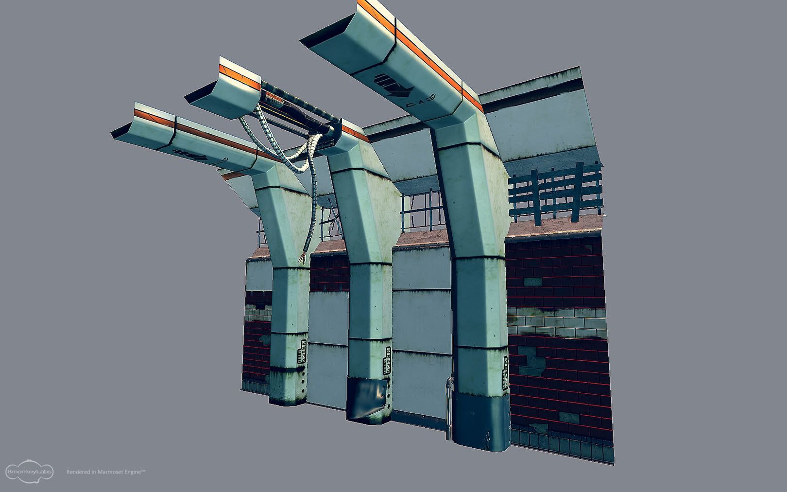
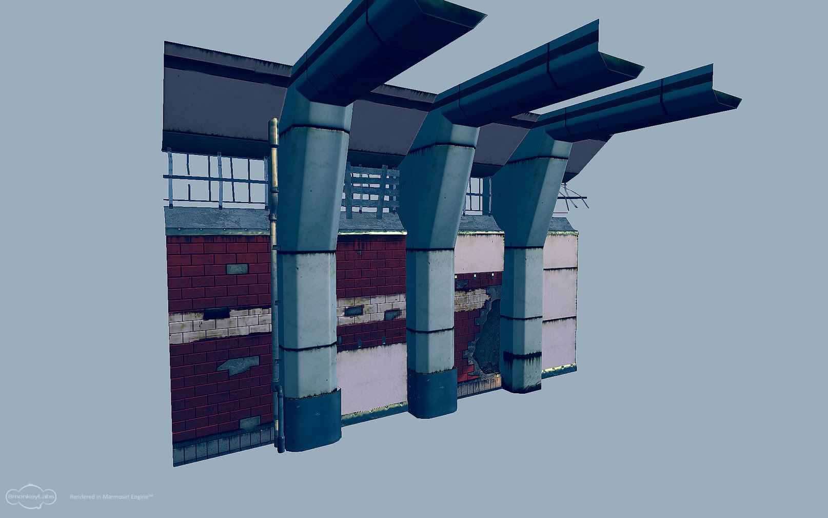
With the first two shots, i wanted to show some modular pieces thrown together in different ways. each piece is modular, the plastic panels can be swapped out, there are 4 variations in tiled walls, the kick plates and bars over the windows are all interchangeable.
And in the third shot i just wanted a unique piece that would fit well with the modular assets.
fire away, i'l be trying to get a new piece up at least every other day, ideally every day.
edit:just noticed some specular issues on the tile walls, dont mind that, already on it
Going for env./prop artist
First up, some props i was working on for a scene inside of source that i just dont have time to revisit ATM. Plus, source has a way of really kicking your work in the nuts so i figure a current gen engine might be better suited:
With the first two shots, i wanted to show some modular pieces thrown together in different ways. each piece is modular, the plastic panels can be swapped out, there are 4 variations in tiled walls, the kick plates and bars over the windows are all interchangeable.
And in the third shot i just wanted a unique piece that would fit well with the modular assets.
fire away, i'l be trying to get a new piece up at least every other day, ideally every day.
edit:just noticed some specular issues on the tile walls, dont mind that, already on it
Replies
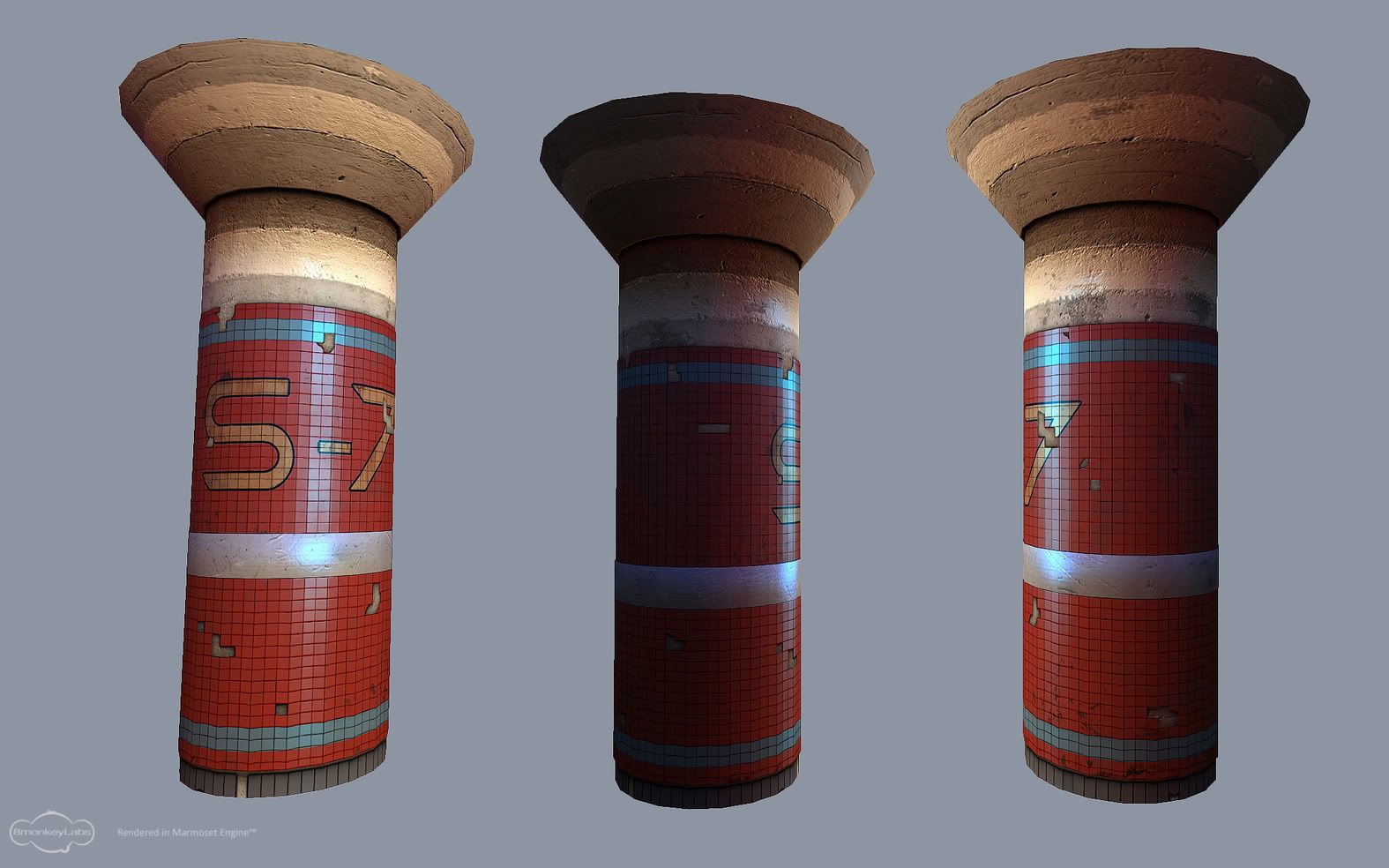
The tiles on the pillars look just like a texture... not really popping out like tiles should I think. Perhaps more space between the tiles and push out the tile polies more like maybe an extrude? Maybe that's too crude of a way to do it but you get what I mean.
I can appreciate the interesting designs you're presenting here, although simple. They're well lit to suggest their environment as well. I could see them in some more stylized game, so they do have some value as they are. What they tell me is you can communicate the idea and materials clearly. What they don't do is tell me if you can texture aiming for a realistic image like say 'Gears of War'.
Hope the remarks help, I like these
I noticed the sloppy gray row rite after i posted, so i went back, rebaked and touched up the diffuse. The lines themselves were straight, but my cylindrical bake came out wobbly.
This any better?
hopefully there's a bit more depth
I do like the walls though, they're architecturally interesting. I agree you should complete a section of hallway/station wherever they belong to.
Thegodzero: Yeah, that was poor planning when i first did the highpoly. I've learned since then how to properly bake cylinders. Originally i did this as a test for a duplicateAlongCurve script i found so not much time was wasted in placing each tile since i had 6 or 7 different tiles then i just duplicated around a nurbs circle to fit the column. If i were to re-do it i would do it just how you described. Thanks for the help
Figure i'l do a mini scene as most of you have suggested, going for an abandoned outdoor subway/train platform.
Crits on the new layout much appreciated, dont wanna get too far into the revamp if it's looking off this early on
The materials on the walls are confusing. Why do some bits have tile and others not? Did the tiling fall off? There doesnt' seem to be much reason behind the placement of the tiled wall and then the barren wall.
Also, ditch the horizontal line grunge or at least soften it. Makes reading the scene very hard, kinda like how zebras are hard to look at but its 10x worse in video game art. Same with the horizontal lines on the grates, unless you're really close to 'em they're just going to blend together and turn to noise, very evident if you look at the far away gratings, almost looks like a TV on a channel with no signal.
The tile work is ace (love the rich colors) and the composition looks good enough to me, if a bit overdone. Reminds me of recent brink videos and Left for Dead, but that's hardly a bad thing. If it works it works!
I guess the back wall isnt reading clearly. The idea was to have an older station that had at one point been renovated with the white plastic everywhere, so the white pannels are actually covering the tiles, not whats behind them. But i'l prolly scrap them if its not working rite.
I hear ya on the lines for the grates, really noisy rite now, i'm gonna have to increase the size or something. I'l figure it out...
When you say to ditch the horizontal line grunge, do you mean the lines separating the panels on the white plastic stuff?
Dont mind the breaks in the tiles, i was just doing a spacing test when i put the new scene in marmoset
About 70% the sculpt, gonna try to wrap it up by tonight and on to retopo and baking tomorrow.
going off this concept:
http://fineartamerica.com/images-medium/maasai-warrior-frazetta-nicholas-bockelman.jpg
As for your railway scene, just some other architecture to tie the scene together so it's not so airy would be a snap. I know what you mean though not knowing exactly what to put there. Eventually [near future usually] you'd get inspired by seeing something in real life or online and know right away how to tie up the scene.
I'm gonna go back and do a second pattern for the front of the shield just for fun, i've got a few different ideas in mind. Also going to add some arrow's sticking out of the front along with some battle damage
Stil gotta add a bit of flair to the spear, i'm thinking some sort of cloth wrapped around the top of the grip, suggestions welcome!
together they sit at 2866 tri's
I think you should break off the pillars so you can rotate them, making it easier to hide the repeating details.
I look forward to seeing more.
There's also an easy way by adding different tint/color variations on those tiles so that they'd be harder to notice and more details going on. A subway pillar wouldn't be maintained so much.
The scene itself can end up a really cool piece if you consider some buildings to populate the background and add say an overpass for mid ground. It will make the scene pop a lot.