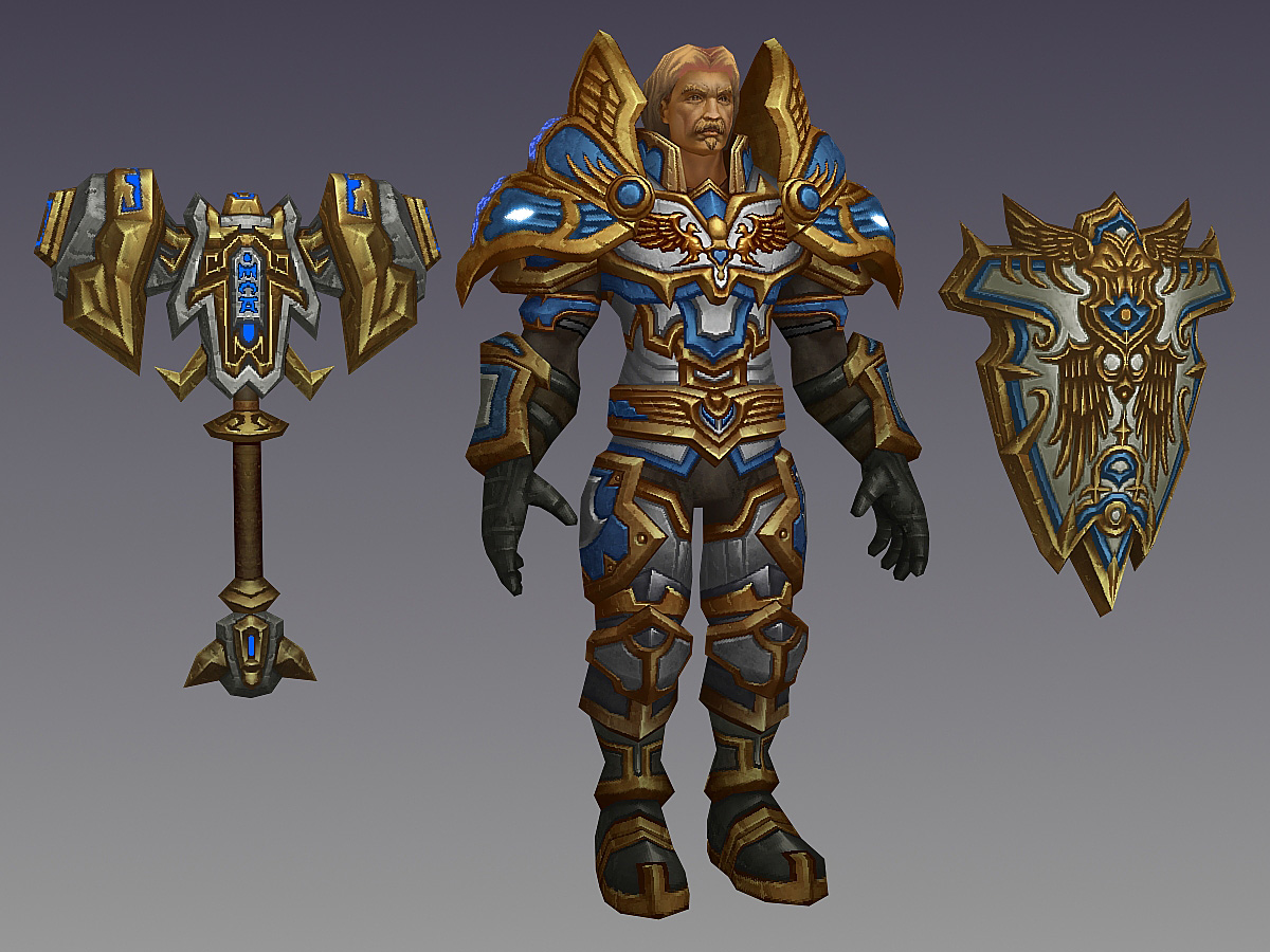
Asturias of Strongholm (WoW Inspired Fan Art)
polycounter
Just some Fan Art I created based on WoW.
Inspired by the Tier 9 Set.
^_^
I'm planning to rig him up and work on a cooler presentation shot.
Crits comments and suggestions welcome.
^_^
Inspired by the Tier 9 Set.
^_^
I'm planning to rig him up and work on a cooler presentation shot.
Crits comments and suggestions welcome.
^_^
Replies
They'd be lucky to have you on that game! Looks like it would fit right in...
I'd like to see a bit more fake shadow/AO type interaction going on between the larger forms. To be honest, when I saw the auto-shrunken image on here, I thought it was a 2d painting. There's a lot of neat shading on the small details, but nothing to suggest where big parts sit on top of other things. There's a little in the armpit area, but I think you could push it further and do the same on the other armor bits as well.
Amezing work.
only thing that seems a bit odd to me at least is he has a pretty asian looking face but with blond hair! Maybe its just me but it kinda defocused me from everything else to focus on that.
looks great though
You really nailed the style, with the model, design, and texture. Great job with the painting! Also, seconding that the peach coloured roots look funny. Bad dye job.
the textures or rendering style (i'm not sure) kinda remindsme of Allods Online
Awesome work, you've absolutely nailed the WoW style, but this piece is awesome in itself regardless of the influence!
let's see some beauty shots
I added the cape, but I'm not sure if it works very well with him (maybe I can do something to improve it, but I think I'm likely going to ditch it).
I also turned down the Self Illumination from 100% to 75%, and threw in a couple of colored lights.
Jon: DUUUUUUUUUUUUUUUDE
achillesian:
Here it is (don't want to pollute this thread with too many of the same images)
http://www.jacquechoi.com/images/filtered.jpg
Junkie_XL: Not really sure if there are. I'm still not completely convinced I'm doing it the right way (I think I'm doing a lot of post-layering work, rather than just applying things impressionistic). If there's enough interest I might be able to write something.
Mike Dashow (Walrus - Diablo 2 Artist), wrote one a while back that's pretty helpful
http://www.michaeldashow.com/tips_texturepainting.html
DKK/Hazardous - THanks guys!
Turpedo: Thanks man! I added the shadow tones in the hair and finessed it (hope this fixed it). I deepened the AO a bit on everything, and added some extra shadows under the pauldrons and pants area. I created a simple spec just by desaturating the diffuse (blacking out the fleshy areas). Really just using it to capture some colour from the lights, but it's toned down quite a bit.
I tried the cape suggestion too, but I'm not sure if it really works for this character for some reason (maybe I'm doing it wrong).
**Gav suggested maybe making it lighter, longer and wider**
Frump: Thanks man! Recurring crit! I hope I addressed it!
Flaringo: I freakin LOVE the look of that game!!!!
Pavel: Thanks man!
Stu: For the Alliance!!
.... Sunder Sunder Shield Bash Sunder ...
First Keeper - ^_^
dur - DOOOOOOD!
Anux / 22 - Thanks guys! Glad you like it!
Vig - Awwwww, LOL glad you like the work at least. I like the style a lot!
AlexK - WORGEN FTW!
TGZ - Thanks bro!
Hntr - just a fewwwww... more tweaks ..... XD
The cape's cool - it makes him read bulkier from a distance. Maybe something bigger / longer?
http://inapcache.boston.com/universal/site_graphics/blogs/bigpicture/toughguy_02_03/t19_0MWK2459.jpg
Regardless, lookin nice
(If you played old WoW you'd know what im talking about =p)
Nah just kidding, looks good.
great work!
I don't know if it would kill the silhouette too much, but maybe you can have the cape wrapping around his upper arm to his shoulder pads.
Kind of like Arthas - http://mikeandsteventwo.files.wordpress.com/2009/03/wotlk_arthas_pose.jpg
I think everything will come together once it is posed though. Awesome work!
Think it may be a bit *too* harsh on the contrast, almost like there isnt enough value going on in the "in-between" sections like from under the breast to abdomen, abdomen to belt, across shoulder pads. One thing ive noticed a lot in the recent WoW armor (the Wrath stuff) is a lot of color play in the "shadow" area of the model. You've done some here, but i think you could push it a bit further.
its a really great texture, but it kind of has a feel of too much detail with out much harmony of shapes and colors, if that makes sense.
NoChance: Thanks a ton man! As much as I'd like to, I think I'm calling it done (I might revisit doing a helm one day).
Moose: Thanks a ton! Really helped a lot. I went into my shadow layers, and started painting some more cooler tones (I hope it shows). I added in some more shadows into those in between areas, and upped the AO a bit. I've been told it might be a bit too detailed, but I think it does fall in line with a LOT of the tier 9's and 10's. I'm really working on my character design skills as well, and hopefully be able to start pushing that aspect a lot more in my work.
I'm a pretty big fan of your stuff. Do you have any suggestions on where I might be able to look for that? Tutorials, or maybe just sites you might go to for inspiration?
Turpedo: Thanks dude! Yeah, I made it a bit longer, and pointy. I freakin LOVE Arthas, but I don't think that really fits with this current design (although it does look cool).
Rollin: Thanks man!
MartinH - Thanks man! I'll Totally double up on it when I design a Tier 20 set. XD
Brad - Here ya go! It's at proper rez as well.
Vig/DKK - HA!
Gav: DUUUDE! Yeah Got the cape longer and bulkier! Think it helps a LOT!
^_^
One thing to try on the next bugger is to maybe pull back slightly on the contrast between shapes. Check out the Warlock Season 8 pvp gear (omg so fucking good) and look at how smooth some of the shapes flow into one another. If you look just at the shoulder bit, there is a fantastic blend of color to shadow to show the depth.
I think you really nailed the head of the hammer with this idea, and it does show how you went back in on it!
the Mage S8 gear may be a better example to relate to this texture. What strikes me as strong in this one is how they chose to accent the metal trims. You handled it similarly on the chest piece, by the neck, but i think in general the trims on the Mage armor are lower in value with more calculated peaks and highlights around the model.
The end result of this dude came out great, its definitely a cool piece that plays homage to the original, but it also does not lose the flavor and cool-ness your textures have comparatively.
Maybe somethin else to try in the future would be to expand your color pallete some with more complimentary colors. I notice on your flat you have a select set of 3 colors with ranging values - which is a great method, but add more color!! I use CS4's Kuler extension (http://kuler.adobe.com/) for quick ideas of complementary colors and color schemes. You could add a real richness to the painting by tossing a few of those in instead of a more monochromatic approach. By "mixing" complimentary colors in, you can also really create some "pop" in shapes by putting the pure colors in as accents and highlights/shadows!