Home 3D Art Showcase & Critiques

Orc oil pot dumper thing

Danglebob
polycounter lvl 15
Offline / Send Message
Danglebob polycounter lvl 15
hey all. dont post on here too often, but i lurk every time i open the internet.
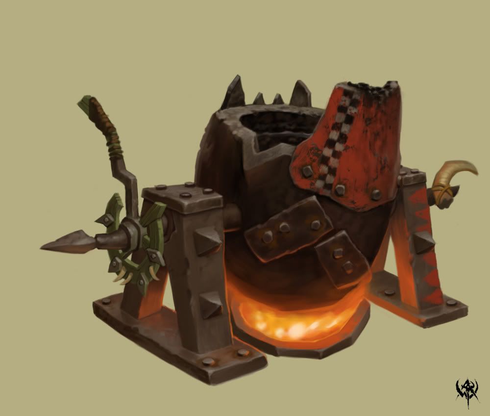
took a concept from the warhammer online website.
heres the concept:
CA0802_19.jpg

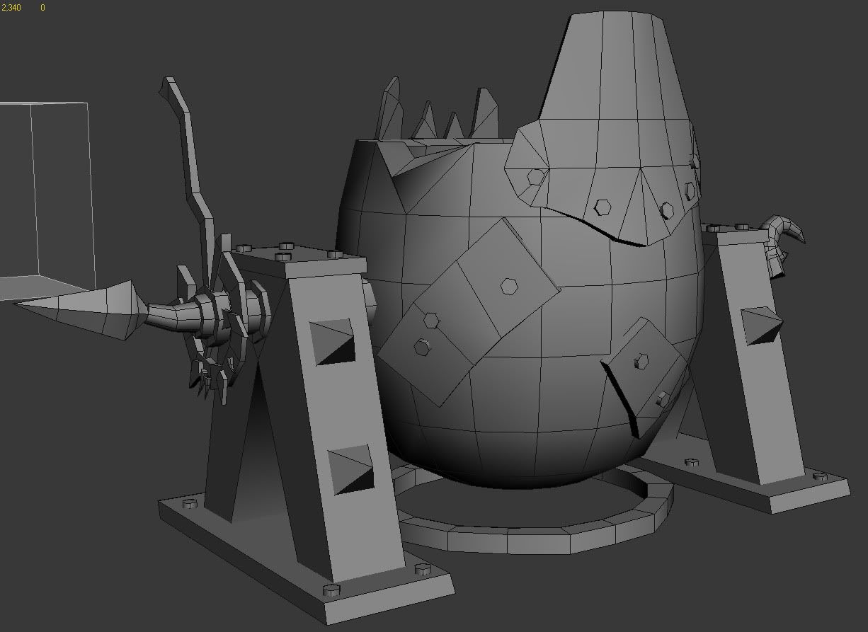
and heres my progress:
orcoil_wires.jpg
orcoil.jpg

Replies

  • P442
    Options
    Offline / Send Message
    P442 polycounter lvl 8
    cool. the top of the pouring tip needs to be more messed up, and the checkers need to be darker/more faded
  • A-N-P
    Options
    Offline / Send Message
    A-N-P polycounter lvl 6
    Nice work. Reminds me of WoW too :P I like this look about games, kinda stylized.
  • Daniel Doerksen
    looks good bud, also the handle to tip the pot, i tihnk needs to be bulkier
  • S_ource
    Options
    Offline / Send Message
    S_ource polycounter lvl 9
    Lovely work here, warhammer got some really nice concepts indeed. I really like your texture style, do you think you could share how you made it?
  • Gallows
    Options
    Offline / Send Message
    Gallows polycounter lvl 9
    Definitely sick work, and I agree with S_ource. I'd love to see a breakdown of your texture work.
  • Leech
    Options
    Offline / Send Message
    Leech polycounter lvl 18
    Well done - I think you are %90 of the way there.

    I think your lines and forms are too uniform. The pot belly isn't a smooth egg shape - its a beat up lump of steel, warped from the orcs heating it over flame. So are those patches applied to it with bolts. In your version they are very neat, perfect little bandages - in the concept they have character, an orc banged on some metal scraps he pulled off some dead warriors armor and banged them onto the pot.

    Exaggerate, pull some points around, you don't really need to add any geometry. Give it character, tweak every vertex ever so slightly so it loses that "machined" look. If you want a quick and dirty example, put a noise modifier on the vert level and slowly crank it up. See what kind of ideas that gives you.
  • PredatorGSR
    Options
    Offline / Send Message
    PredatorGSR polycounter lvl 14
    Great start, I would smash up the edges of the metal strips and pot in the normal map.
  • cholden
    Options
    Offline / Send Message
    cholden polycounter lvl 18
    Texturing looks good. I could use more burn marks on the pouring section of the mechanism.

    Only problem is modeled small details are too thin. As in, plates on cauldron need to be thicker, everything on that greeen torus, and so on (everything).

    Greenskins don't have perfection, everything is shoddily contrived with poop and rope. If it looks like it's going to fall apart and smell bad, you've done your job right.
  • Danglebob
    Options
    Offline / Send Message
    Danglebob polycounter lvl 15
    thanks for the feedback everybody. id say its about 60% done texture wise. i still have to work on the oil and the handle. plus the main body of it needs some dings and dents (just like everybody said :D)
    S_ource wrote: »
    Lovely work here, warhammer got some really nice concepts indeed. I really like your texture style, do you think you could share how you made it?

    no prob.

    first i baked a skylight light map with render to texture in 3ds max. (just create a skylight>render to texture>lightingmap>render)
    that set my up with a pretty good base for the shadows.
    cranked the opacity down so it wasnt so dark and set to multiply.

    for the metal, i had a base color i liked.
    added a new layer on top, set it to color dodge, filled with pure black.
    using a softer brush set to opacity 10% flow 75%, built up highlights with pure white. i applied highlights as if the object was lit from top down.

    from then on it was adding scratches and dirt and stuff.
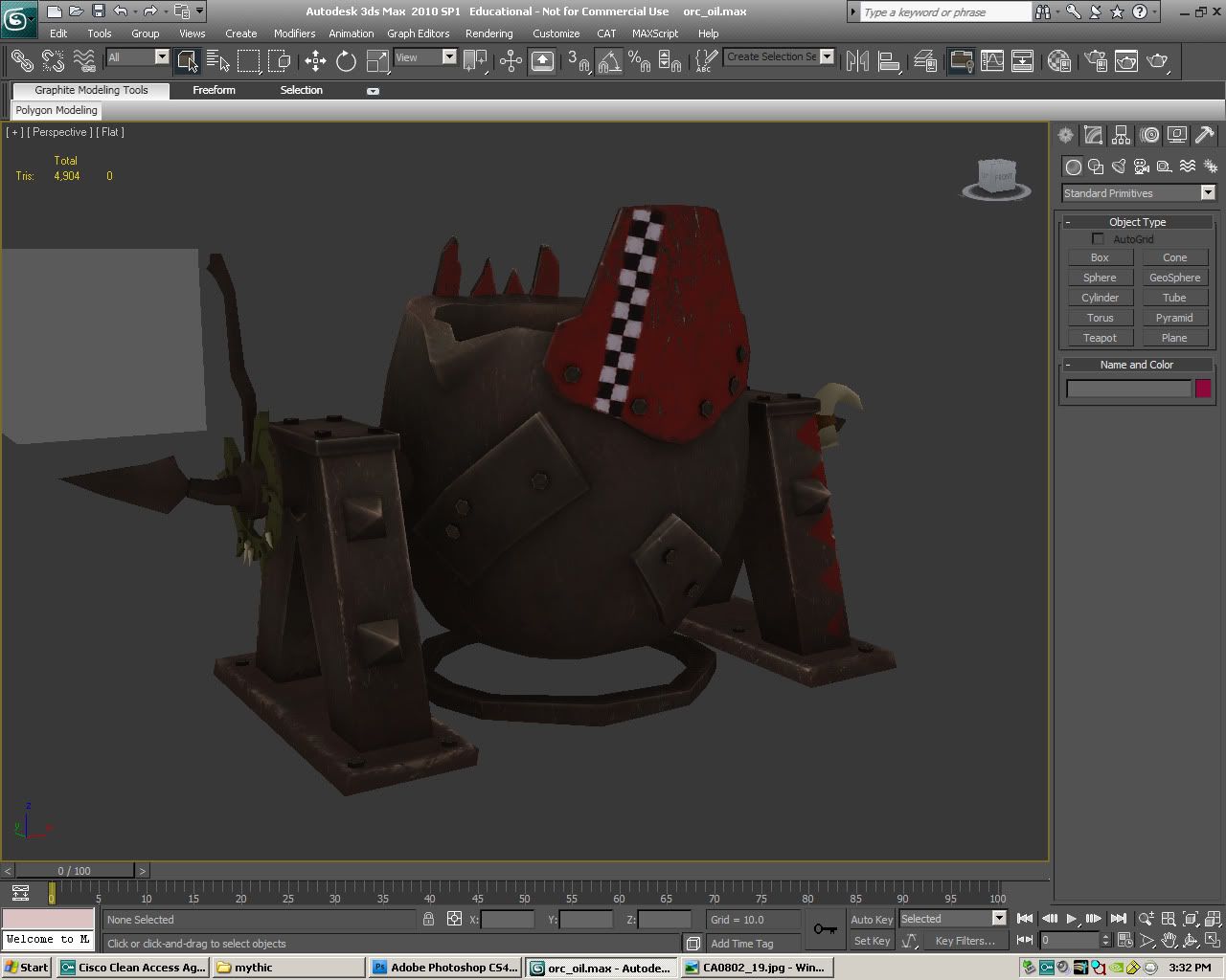
    here's a large gif :D
    7VD35_.gif


    its by no means done. and ill post an update as soon as i do something noticeably new HA
  • Danglebob
    Options
    Offline / Send Message
    Danglebob polycounter lvl 15
    trucking away.
    Untitled-1-5.jpg
  • 55joe
    Options
    Offline / Send Message
    really nice and clean!
  • Sean VanGorder
    Options
    Offline / Send Message
    It's coming along very nicely. The one thing that sticks out to me right away is that black and white checker pattern. It seems too clean and bright. On the concept it has more wear and tear and you can kind of see the layer of paint thats underneath it.
  • Art-Machine
    Options
    Offline / Send Message
    I like the charm of it, like something out of TF2. But where did the orcs get what looks to be the door-metal of a taxi? Kind of confuses the universe it's from for me... My brain wants it to be more medieval metal, just another kind. If it's meant to be clan paintings though, that pattern is looking like a taxi to me.

    The support legs and spinning handle areas lost some stylized interest from the concept sketch however. Might want to tweak their forms and proportions a bit to literally match the image's. The legs had a nice arc to them, and the green thing around the handle is larger and 'fatter' in the image as well. Might also want to try a 'fatter' edge bevel in the legs' texture. And I'd like to see it lit from underneath like the concept too, if its able to be!

    Edit --
    If this taxi metal matches the Warhammer universe, then it's cool as is.
  • Kovac
    Options
    Offline / Send Message
    Kovac polycounter lvl 18
    Art-Machine: He's making this from a piece of concept art from Warhammer Online; they love taxis. Nice looking mesh for it so far, the heat transfer to the metal on the bottom of the pot should really sell it's purpose.
  • DrunkShaman
    Options
    Offline / Send Message
    DrunkShaman polycounter lvl 14
    Nice work, thanks for sharing.
  • FirstKeeper
    Options
    Offline / Send Message
    Orcs!Orcs!Orcs!Orcs! I like it.
  • Danglebob
    Options
    Offline / Send Message
    Danglebob polycounter lvl 15
    a should-have-been-in-bed-but-decided-to-texture update:
    screen1.jpg
    screen2.jpg
  • EMC3D
    Options
    Offline / Send Message
    EMC3D polycounter lvl 7
    Looks really nice, love the subtle detail and the highlights, which higlight method did you use?
  • Danglebob
    Options
    Offline / Send Message
    Danglebob polycounter lvl 15
    been working a lot lately havent really sat down at my computer in a week other than to check the email.
    anyways heres the progress. crits welcome and probably be rewarded with a high five.
    screenie1-1.jpg
    screenie2-1.jpg
    100% hand painted for those that want to know.


    @Mr Bear:
    i filled a layer above all the others with 100% black. i set the black layer to color dodge and painted in the highlights with white. my brush is usually set to 10% opacity and 75% flow when i add the white. its easier to blend and build color. also dont use the eraser tool on the black layer, just paint black back on whatever you want to get rid of. hope that helps :D
Sign In or Register to comment.