[Environment] Industrial Level

polycounter lvl 11
Hey guys!
Long time since I posted anything here. Due to lack of time.")
Anyways. I decided to sit down and make a whole level, from scratch, so I started working on some textures that I was happy with, then a material. And then I modeled away.
This is what I have so far:
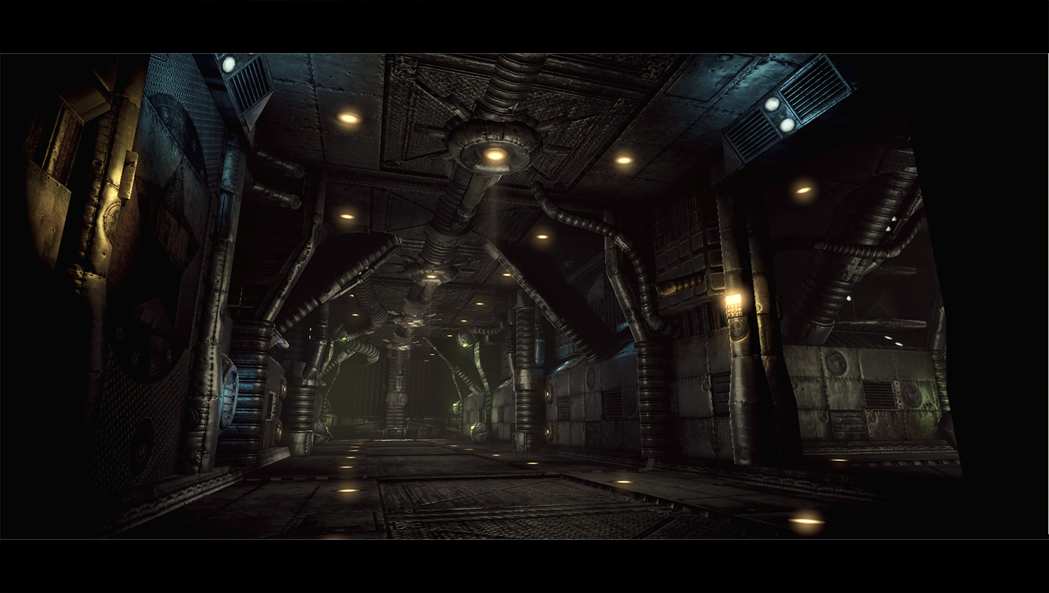
Hope you like it, and please let me know what you think!
I am currently working on the main chamber. This is just one of the hallways.
Cheers!
Long time since I posted anything here. Due to lack of time.
Anyways. I decided to sit down and make a whole level, from scratch, so I started working on some textures that I was happy with, then a material. And then I modeled away.
This is what I have so far:
Hope you like it, and please let me know what you think!
I am currently working on the main chamber. This is just one of the hallways.
Cheers!
Replies
Anyway... I like you level so far. If I had to make a suggestion it would be to make some variation in the texture colors. It seems like a lot of black/brown. Just my opinion though.
Keep it up!
Oh yeah, I'll definately think about adding more colours. Or at least enhance them.
I'm using a post processing volume in the Unreal Editor, which dampens the colours a bit, so that might be a really good idea.
I'll have a look at it.
You started with a texture then went to modeling!?, you just turned my world upside down. Very interesting workflow, I need to give that it try.
As a small nitpick, I'd say it's looking a tad repetitive right now, but just barely, and it's a hallway so I suppose that's to be expected. Some props would probably break it up nicely.
I'm looking forward to updates.
Yeah, you should definately try it. It's a really fast workflow.
I made a quick test with a new lighting setup.
Please let me know if I made it worse or better. ^^
If you ever get a chance, maybe you could elaborate a bit on your workflow that you mentioned that sounds pretty interesting for sure!
Thank you!
Oh, the workflow is actually really simple.
Basicly what you do is just to make a texture with a lot of tileable areas, and some pretty generic details that can be used a lot without screaming "Hey! Look at me! I'm re-used 100 times!"
Here's an example of one of my textures used in the level:
Then, when I'm happy with the texture, I use crazybump to generate a normal map. This can take a bit of tinkering before you get it right, but is usually very simple.
Now that the textures are done you can start modeling.
I find modeling after a texture really great, since you can get ideas for the model by looking at the texture.
Oh, and sometimes you realize that some parts of the texture are unecessary or that you want something else there. Just remake the texture a bit. ^^
Modeling after a texture takes a bit of practise and requires that you use a certain approach to get it right, but once you get the hang of it, it'll go super fast to model.
Hope this explains enough. ^^
Are you using UT3 or the UDK?
Sometimes I find creating a greyscale version of your diffuse texture from scratch will give the best results, especially for hard surfaces such as these.
To touch on the lighting - the second version seems to be very washed out - perhaps all the light cones are killing the contrast in the textures.
also some of your normals are confusing, the diffuse makes me thingk they are metal panels while the form in the normal makes me think that they are some kind of padding or insulation around pipes.
having said that the overall impression of your scene (comp lighting etc) is good
I remade the normals, and I think this looks a lot better!
I made the diffuse greyscale and enhanced the contrast in it and then used that for making the normals, and that lead to a lot cleaner normals that reduced the padded look.
Please let me know what you think. It's not a HUGE difference, but I think it looks a lot sharper and more hard.
What I would do personally with the scene is to give it some depth, some depth of field in the back of the room? And I would definetly have more cables from the ceiling hanging, i think it would add more to the "shadow play". But its good to see some stuff from you, at least one of us is actually making stuff ^^.
BTW: Dunno, but i liked the lighting better in the first pic.