Blast Tunnel
**UPDATE BELOW**
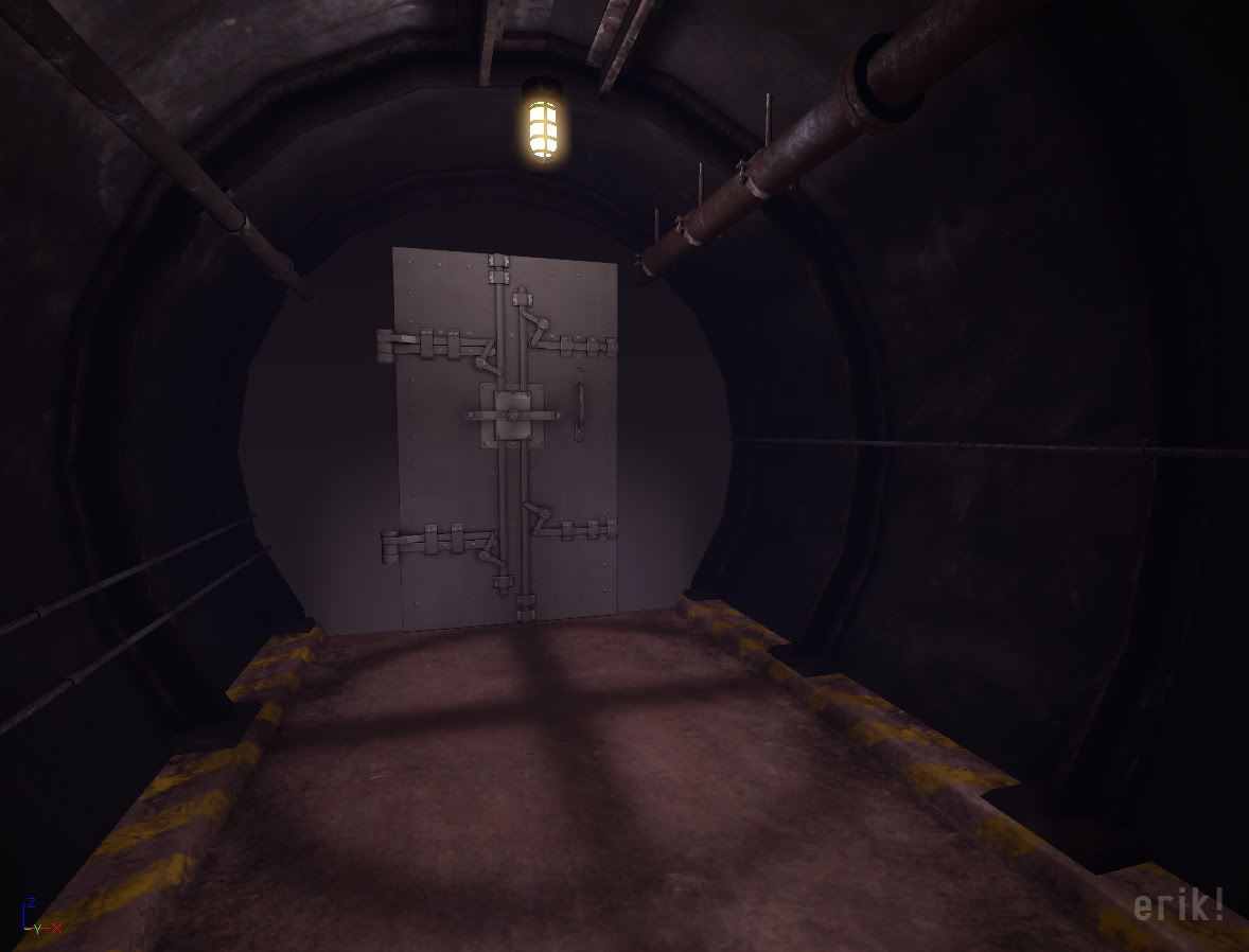
Here's a little something I've been working on recently. It's a simple tunnel, something to pad my portfolio and get me a little more experience in Unreal.
It's pretty sparse right now. I've got some electrical wires and fuse box things I need to texture and place. The door and wall it's in need to be textured. I'd like to put in some signage and maybe some grunge decals to break things up and add a little more interest.
The lighting if very WIP and kinda dark. I was messing with light functions to see if I could fake shadows cast by the light bulb cover/guard, need to tweak it some more, make it more believable.
I could punch up the materials as well, really make the metal pop.
Let me know what you think!
Replies
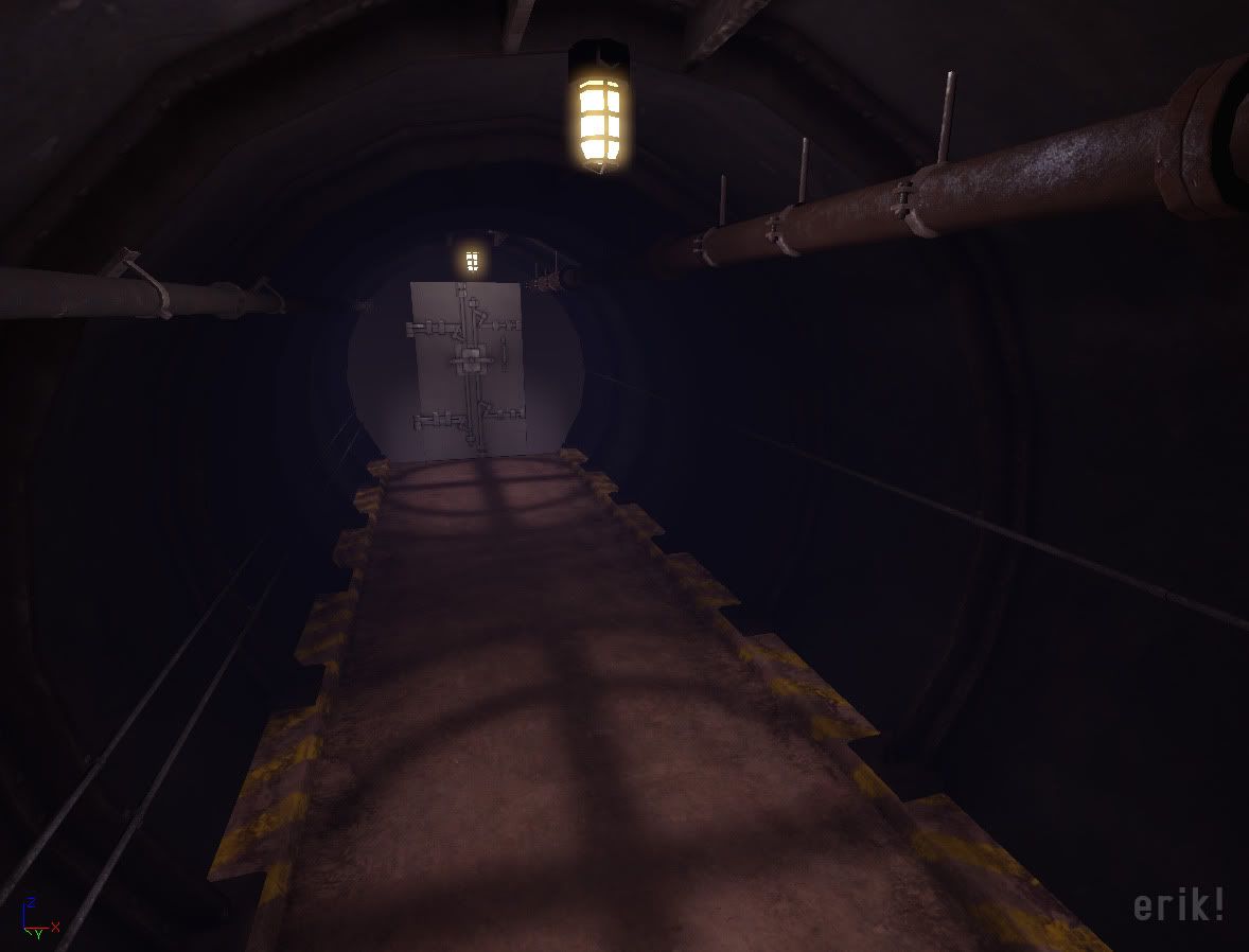
Got around to doing a bit more on this, not much though. I tried to bump up the materials a bit more, hard to get things to read well in low light and still images.
Oops, forget some electircal wiring. Oh well, it were kinda of lame anyway. Got the fuse boxes in there along with the door. Trying to make the door and the immediate surrounding area the focal point here, but it all seems a little boring to me, but I don't want to go overboard with elaborate set pieces and props. Think I should put some decals or small meshes so the pipes blend with the wall a little bit better there. My intent is to keep this whole thing it fairly simple, but well executed. Don't think I've gotten there yet!
-or depending on capabilities of the engine, add some planes across aligned to the rib structure. on these planes use a animated UV alpha texture of dust falling, if its subtle and has breaks in the texture could look really convincing as though explosives are being set off
Right now all the patterns (just a few) are to predictable and chunky- they loop to often and there are to many naked surfaces. Instead try to add:
wires, lamps, pipes, dirt, panels, signs, electricity, some rails (not necessarily of a train- but something to guide),...
here is what I mean (Prussian underground tunnels)
Crits:
- I agree with Shep on the fog.
- I like the glow on the lights you first had, now its being blown out and destroying the light guard detail which makes the shadows on the floor hard to understand.
- There's a little too much ambient light.
- You could probably take out the light in the middle, and turn down the other two. Which should bring back some of the shadows giving you light and dark areas to play with.
- Or possibly remove the last light by the door and replace it with a small less powerful light above the door, maybe a sign.
- I think you need to work on the materials a little more, especailly the spec. A lot of the materials are reading pretty much the same. If its meant to be all metal then you might want to think about switching up the materials, toss in some concrete, add in some enamel painted pieces along with pieces that have been there a while and are duller.
- For the door I was thinking I could set it in a mini hallway with a sort of emergency/warning light that blinks or spins when shit's going down.
- My initial idea has multiple tunnels branching off, I think I'll do that now and put little signs/directions indicating what it leads to.
- I'll try making the walls concrete, see how that works (was how I had it initially!). If I do that maybe I can put little chunks here and there like they've been blown off.
- I like the idea of ventilation
- Hand rails?
- More wires? A loud speaker system?
Back to work!
I disagree with renderhjs in that it has to be more complex. I think you're on the right track geometry wise, but it's the current lighting and material setup letting the scene down. Most blast tunnels are minimal in design, here's some more refs:
http://i42.tinypic.com/orv8l5.jpg
http://i41.tinypic.com/148j6zb.jpg
http://i43.tinypic.com/qrev5s.jpg
http://i39.tinypic.com/4h2rlu.jpg
http://i42.tinypic.com/10sew3r.jpg
http://i40.tinypic.com/w0e38.jpg
Some changes I'd suggest:
- Add more geometry to the tunnel walls. Given that there most likely won't be a lot of highly detailed props, you could easily get away with it and it'd would drastically help. The angles of the walls were the first thing I noticed, to be honest.
- Adjust the UV's on the wires to the box so that they aren't perfectly aligned. Right now the specular and normal map detail coming from the wires are exactly the same, making it look unnatural. Grime would build up differently on each.
- Change the texture on the concrete slabs going down the side so that the yellow paint is at the side. This would help distinguish the slabs from the floor, which seem to blend together at the moment.
- Tone down the ambient lighting, add more lights with a quicker falloff, but higher intensity. For an example of what I mean, http://i43.tinypic.com/qrev5s.jpg. IMO, this will give the entire piece a much moodier feel. For uniqueness sake, maybe have one that is shorting out, giving off sparks and flickering/fading?
- Don't over-optimize yourself. Compare the texture clarity of the props compared to the walls. The walls are a much lower res when as it stands now you're depending on them to fill out most of the scene. Maybe throw together two or three variations of wall textures with different levels of water damage and other effects.
http://images.google.com/images?hl=en&um=1&sa=1&q=russian+underground+tunnel+&btnG=Search+Images&aq=f&oq=russian+underground+tunnel+o
I know however that the majority of those pictures is from a photo series that I once saw on a photoblog. One nice photo blog for example is
http://butdoesitfloat.com/
it auto-loads as soon as you hit the bottom of the page - so its endless inpsiration fun
that said, i dont think u need to add 100 stuff, focus on design - if simple - and make it work.
as said mostly lighting effects - think this is 100% darkness with lamps.. make them illuminate, they are just blank almost. fog is ok if lighting penetrates it.
you can make this as cool as you can, with insane designs that evoke speed and movement, it doesnt matter if it looks cool its good.
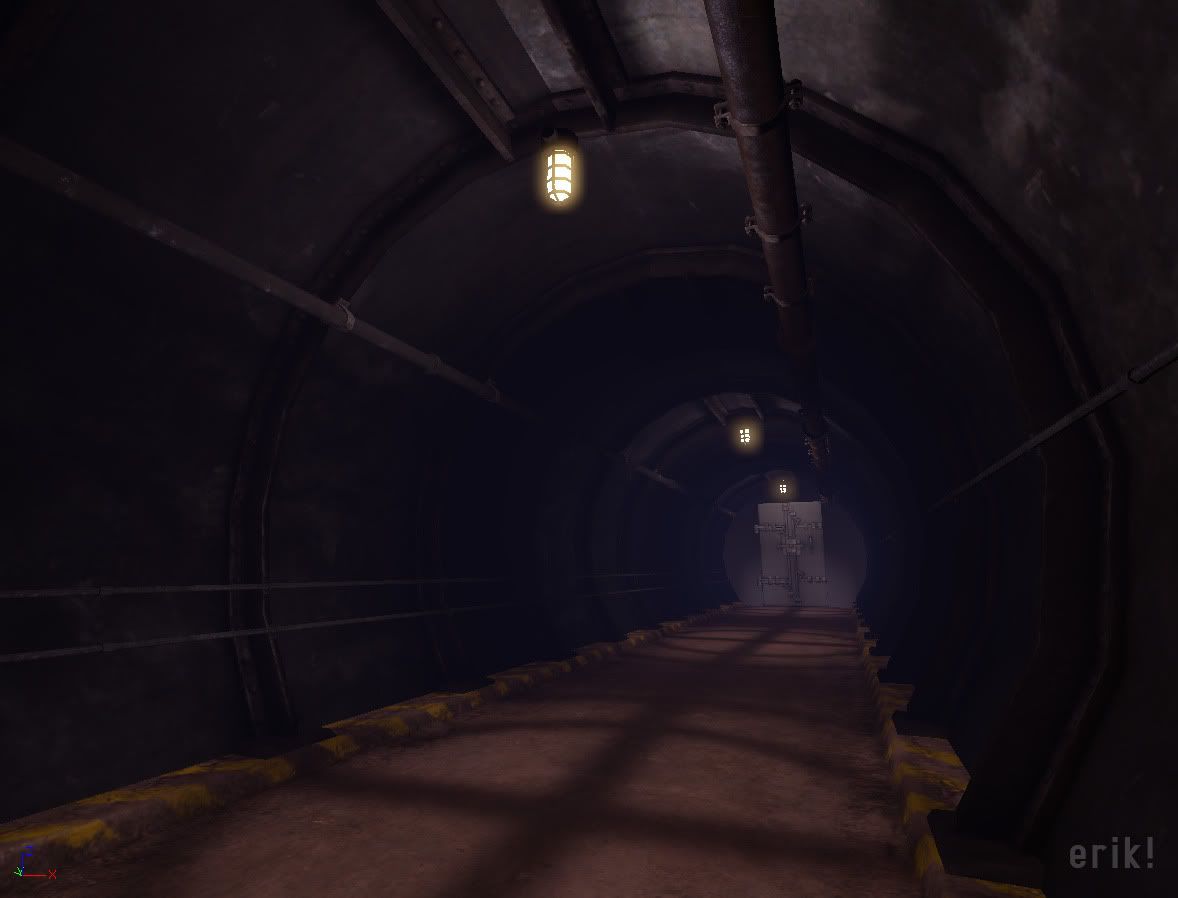
Didn't do much really. Messed with the wall texture, dicked with lighting A LOT, though it doesn't look like it. I feel like the lighting/atmosphere (or lack there of) is bringing it down. I can make props to add until day's end, but if the lighting blows then it doesn't matter. It's too dark now, to me anway. Modular wires/pipes don't curved walls, makes for difficult placement, hence the reason nothing is going around the corners. I've got some typical tunnel sections (straight walls, curved ceiling) that I'll try. So hard not to just scrap it and move on to something more interesting! Red light district anyone? Speaking of red lights, the mini hallway the door sits in is really flattened by that red light. Oh and colors? Red/yellow/blue primary colors in there, not really feeling that.