None too shabby Wes. I'd say the most noticeable thing is on that comet like ellipse on the bottom side, you may want to round off that top portion to get a smooth curve like in the concept.
Other than that, looking good, be great to see how the low poly turns out.
Looking good so far. I'm pretty sure it's just my screen but it's kinda difficult to see some the details you've done in the high poly. If you could post a wire frame would help me out.
Can't wait to see how the low poly with the bake turns out. Keep up the good work Wes.
Looking good so far. I'm pretty sure it's just my screen but it's kinda difficult to see some the details you've done in the high poly. If you could post a wire frame would help me out.
Can't wait to see how the low poly with the bake turns out. Keep up the good work Wes.
Thanks man. Yeah it's that damn sky light. I'm going to stop using that. It always over lights everything, to the point of not being able to see the fine details.
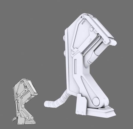
I'd say take a closer look at the ref, your sizing is a bit off, the bottom connector on yours looks like it has a foot or so between the clamp on the floor and the tube connector and in the ref it has like maybe a couple inches.
The ref it's a bit beefier up top then your model is, and the ref image has rounded corners all over it look all rounded out and yours has way too many hard square edges.

Replies
Other than that, looking good, be great to see how the low poly turns out.
Looking good so far. I'm pretty sure it's just my screen but it's kinda difficult to see some the details you've done in the high poly. If you could post a wire frame would help me out.
Can't wait to see how the low poly with the bake turns out. Keep up the good work Wes.
Thanks man. Yeah it's that damn sky light. I'm going to stop using that. It always over lights everything, to the point of not being able to see the fine details.
The ref it's a bit beefier up top then your model is, and the ref image has rounded corners all over it look all rounded out and yours has way too many hard square edges.
Good start though.
Great start though, Emer will be proud