Dominance War help
polycounter lvl 18
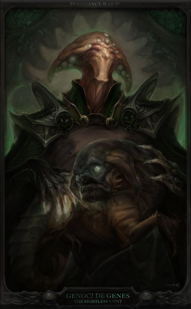
I'm wrapping up my entry for the 2D mini but working out the contrasts and color balance on my el cheapo Dell Ultrasharp is turning out to be a headache.
Could any one of you guys with a calibrated monitor try adjusting the levels on these to something that's reasonably balanced and let me know what kind of adjustments you made, to the contrast/levels/saturation/whatever?
While working on it, I could see detail in pretty every area of the painting, and mid saturation on the green background, the general's face, and the dog.
Thanks! Last minute nitpicks also welcome")
Raw

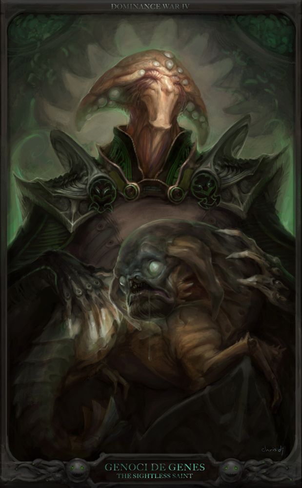
Auto Contrast
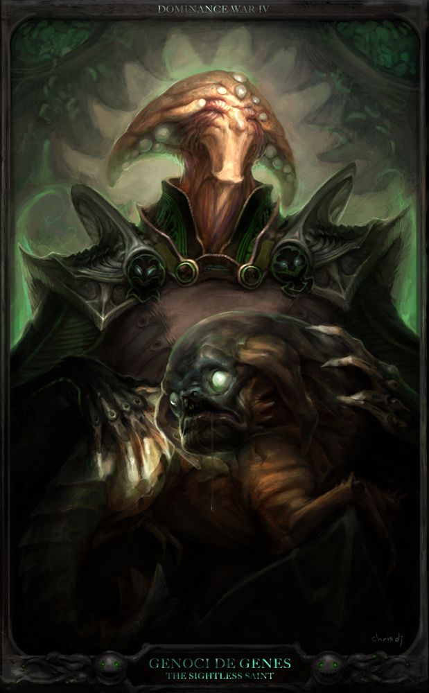
Manual Adjustment + Overlay punchups
Could any one of you guys with a calibrated monitor try adjusting the levels on these to something that's reasonably balanced and let me know what kind of adjustments you made, to the contrast/levels/saturation/whatever?
While working on it, I could see detail in pretty every area of the painting, and mid saturation on the green background, the general's face, and the dog.
Thanks! Last minute nitpicks also welcome
Raw
Auto Contrast
Manual Adjustment + Overlay punchups
Replies
Trajan
http://www.linotype.com/1547/trajan-family.html
freeware version:
http://www.dafont.com/optimusprinceps.font
Personally I think the background is not working,- the light grey does not stand in good contrast with the middle of the character (almost same tone). Also some lousy brush strokes are more visible at the top on the background - it looks speed painted there - maybe that is because of the high contrast because of the light grey shade.
good luck
render- yup i had a second look at the background after some rest and i agree, it's way too loose. already started giving it more sharpness and volume.