Home 3D Art Showcase & Critiques

Concept Station Terminal

polycounter lvl 12
Offline / Send Message
Shogun3d polycounter lvl 12
Hey guys,
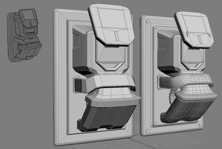
I've been working on a station terminal off of this concept drawing. I'm currently working on the high poly version of the terminal and would like some feedback overall in the modelling etc. Any ideas or suggestions to enhance the details through the high poly normals would be appreciated as i'm capped on the low poly to 1500 tri's.

I'm still working on adding subtle details as well as cleaning the mesh (areas where my SUBD's don't connect to lower poly areas) as I go with the high poly so please forgive the mess in those areas.

Thanks everyone!

terminal_wip_1.jpg

terminal_wip_hp1.jpg

Replies

  • snake85027
    Options
    Offline / Send Message
    snake85027 polycounter lvl 18
    The only difference I can even point out is the monitor needs to be longer in height. Other than that sweet 2d-3d conversion.
  • Shogun3d
    Options
    Offline / Send Message
    Shogun3d polycounter lvl 12
    Aye, thanks that might have been a mistake I made when rendering as I rendered to 720 by 468, not sure but i'll double check. Thanks again.
  • nrek
    Options
    Offline / Send Message
    nrek polycounter lvl 14
    Looking good so far, along with what snake said I would round the back plates corners more to match the concept and tighten the front corners of that strap looking thing that wraps around the front.
  • DInusty
    Options
    Offline / Send Message
    DInusty polycounter lvl 17
    I agree with snake also, the corners of the outside frame should be more rounded and some of the indents you have look like they need to be deeper to match the concept more closely. Its coming a long though and obviously your still working on it so i cant really say those crits are really valid you might not have been to the point where you are getting to them. where is the concept from?
  • Shogun3d
    Options
    Offline / Send Message
    Shogun3d polycounter lvl 12
    Hey guys,
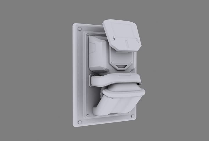
    I've got an update and am open to feedback and suggestions. I've got another week to work on it so would like to take the time to tweak based on user feedback. Thanks a ton.

    Render_Sheet.jpg

    Diffuse
    diffuse_map.jpg

    Normal
    normal_map.jpg

    Specular
    spec_map.jpg
  • renderhjs
    Options
    Offline / Send Message
    renderhjs sublime tool
    to much scratch FX imo.
  • shotgun
    Options
    Offline / Send Message
    shotgun polycounter lvl 19
    i agree with render here. what's more disappointing about this is that the texture does the design no justice. its so stylish and interesting, but the texture is so dull and boring. put some colors! metal vs. painted metal (then u can play more with the scratched/peeled-off paint look u like).
  • Racer445
    Options
    Offline / Send Message
    Racer445 polycounter lvl 12
    The scratches are too random and squiggly I think. I would make less scratches, but more dense edging. Also play with color man. This is a sleek futuristic design and you could add some really pronounced colors to push the look. Solid colored paint and such.

    I think you may also want to consider changing some of the material to plastic.

    good modeling and design though!
  • Cojax
    Options
    Offline / Send Message
    Cojax polycounter lvl 10
    Looks like your having some smoothing group issues buddy.
  • Shogun3d
    Options
    Offline / Send Message
    Shogun3d polycounter lvl 12
    Thanks for the suggestions guys, I see that now about the scratches and I do agree with the color idea, I've just been having some troubles coming up with a good color scheme and design to match this puppy. But agreed though, I need to fit that in.

    I'll be adjusting and fixing the smoothing groups as well.

    So thanks...buddy.

    Cheers all thanks
  • alexk
    Options
    Offline / Send Message
    alexk polycounter lvl 12
    Hey I ain't your buddy, guy! Along with fixing the scratches, how about adding an emissive for the glowy parts
  • salman_fas
    Options
    Offline / Send Message
    I think you could also add some color variation as right now everything is gray.
  • vj_box
    Options
    Offline / Send Message
    looking good,but as some one said ,the spec just does nt work well here,too many artificial scratches and the over all levels needs further work.You need to decide on the level of specularity that you intend on this piece.
    You also need an emissive map for the monitor,if you,may be import this to some game engine like unreal.
    Keep it coming
    vj
  • Shogun3d
    Options
    Offline / Send Message
    Shogun3d polycounter lvl 12
    Thanks for the advice guys,
    I cleaned up the scratches and added some paint chips along the edges instead. Also cleaned up the spec quite a bit as well as the normals.

    I can't however, wrap my head around a color scheme. I went with some variations so please let me know what you think. Thanks

    Render_Colorlist.jpg
  • SHEPEIRO
    Options
    Offline / Send Message
    SHEPEIRO polycounter lvl 17
    dont do a colour scheme, decide whart materials are what (add more) and do it like that, it will look alot more thought out.

    eg- the wall plate would be a different metal to the casing and there might one or two plastic panels

    grey metal, orange plastic with a wee touch of copper get my votes
  • shotgun
    Options
    Offline / Send Message
    shotgun polycounter lvl 19
    yes, shepiro correct. focus on the bigger forms being different materials, and not on cutout shapes within. this will accentuate your design rather than disturb it. cutout shapes within are fine as additional data (detailing the big forms), but the first step is to make what you have work, then detail.
  • dur23
    Options
    Offline / Send Message
    dur23 polycounter lvl 19
    Your normal map doesn't appear to be doing much. Mostly on the big parts. It kinda looks like it was baked with hard edges?
  • frubes
    Options
    Offline / Send Message
    http://forums.cgsociety.org/showthread.php?t=373024

    take a look at the texturing tutorial. Your scratches are kind of letting this down, I think you need to put more thought into them and where they might appear. Raised edges furthest from the wall would take the most beating yet your model has hardly any scratches there.
  • Shogun3d
    Options
    Offline / Send Message
    Shogun3d polycounter lvl 12
    Thanks frubes,
    This is the biggest problem for me, and i'll go back in and work that.

    My problem is I have a hard time making the materials look the way they should. How do you enhance a sections spec to make it LOOK like plastic, and metal vice versa. How do you distinguish it without different colors?

    If anyone has any advice on how I can achieve this I would appreciate it as I would like to really nail this down before finishing it. Thanks all.
  • okno
    Options
    Offline / Send Message
    I agree with frubes about more logical treatment of the texture. Think of areas that are least exposed and how dirt might collect there, where some part might rust, and how exposed parts would be worn. As for differentiating metal and plastic/paint, it really helps to study references. I took loads of photos of worn out tools and other painted metal things to understand how the spec would vary for the model in my sig. (I made the the metal's spec hardness much lower than the paint)
  • alexk
    Options
    Offline / Send Message
    alexk polycounter lvl 12
    kaburan wrote: »
    Thanks frubes,
    This is the biggest problem for me, and i'll go back in and work that.

    My problem is I have a hard time making the materials look the way they should. How do you enhance a sections spec to make it LOOK like plastic, and metal vice versa. How do you distinguish it without different colors?

    If anyone has any advice on how I can achieve this I would appreciate it as I would like to really nail this down before finishing it. Thanks all.

    Maybe this can help with your spec map in the metal areas: http://www.iddevnet.com/quake4/ArtReference_SpecularMaps

    but in my humble opinion, I think go back to your diffuse and work on it a little more, try to add a metal overlay to help sell it for the metal parts. for plastic, well.. not sure if there's much to do on diffuse, but you'll definetly want to get it perfect for those parts on the specular map. Plastic has a very recognizable shine to it, it's even and very reflective. So try to even out those areas on your spec map, take off those AO shadings on the plastic areas and turn it up. I think shine is also a bit dependant on the renderer(?). Maybe 3dmax/Maya has different ways of showing specularity, like, will the renderer treat the specular as being very focused (like metal) or is it spread out (like wood)? so yah, my 2 cents, hope I didn't make things more complicated :) also, hope I didn't make you want to go down the dark path of obsessing over your programs render settings. I've been down there, it's not a good place. How bout some realtime shots? ughh. I'm rambling late night
  • Shogun3d
    Options
    Offline / Send Message
    Shogun3d polycounter lvl 12
    More revisions

    Alex thanks for the tutorial and your crits. The entire thing is going to be made up of metal so thats pretty much that. When I find a solid piece of plastic to work on, I will definitely remember all that was brought up here. As for this terminal I finally it a place and purpose.

    From hence forward it will be known as

    P.A.P.A
    Principal Automatronic Programming Agent

    The name was recommended by my chunky friend Papabear and definitely zings. Its a terminal that could be used in a machine shop or future mechanical type bot factory. By then i'm sure they've moved on from "plastic". :)

    Anyhows I went back into the diffuse and completely made a new base layer, went step by step with what I had and tried to tweak what I had without starting over. I think next time im just going to follow the cgtut step by step. My "buddy" (yall love this term don't you) Adam explained to me the paint bucket fill trick that I wasn't gettin`

    Anywho, let me know if yall think this is the step in the right direction. Cheers.

    final_revision_1.jpg
  • SHEPEIRO
    Options
    Offline / Send Message
    SHEPEIRO polycounter lvl 17
    much better but the blue grey pattern is too messy and needs to be really tight/straight to look manufactured
  • Shogun3d
    Options
    Offline / Send Message
    Shogun3d polycounter lvl 12
    I agree, I have put the final touches and for what it is i've learned a ton from this. Especially with materials. So thanks everyone for your help. I'll definitely keep them in mind on my future pieces. Thanks again, and here's a final render.

    final_revision_1-1.jpg
  • Kevin Johnstone
    Options
    Offline / Send Message
    Kevin Johnstone polycounter lvl 19
    This piece just grew stronger, its nice and clear cut now and its easy to tell what the forms are while getting a sense of corporate history in the flaky paint and logos.
  • Shogun3d
    Options
    Offline / Send Message
    Shogun3d polycounter lvl 12
    Thank you Kevin, always appreciate your insight.

    PAPA_FinalSheet.jpg
  • oidipusss
    Options
    Offline / Send Message
    to much specular, a bit to grey, nice design!!
    cheerz
  • osman
    Options
    Offline / Send Message
    osman polycounter lvl 18
    Looking much better. At the moment you have a white glow around the monitor. How about the opposite, no glow there, because of the dirt thats covering the inside edges.
  • byder
    Options
    Offline / Send Message
    Nice!! Its come a long way from day one! Spec is rather intense ;)

    ~C
  • vj_box
    Options
    Offline / Send Message
    starting to look much better,the scratches are looking believable now!
    keep it coming
    Vj
  • Razorb
    Options
    Offline / Send Message
    Razorb polycounter lvl 15
    i dunno.. i don't think the spec is that intense.. i mean it is made out of metal n all so it should have high contrast from the looks of things .. i dunno im tired :)

    but yea its defo improved!
  • JonathanArmstrong
    I'm liking it. The keypad seems a bit small it's hard to get a sense of scale. I think even if you put a simple silhouette of a human next to your graphic, it would help a lot with imagining the functionality and location in an environment of this piece. Cool design :).
Sign In or Register to comment.