Backyard Style Environment
polycounter lvl 9
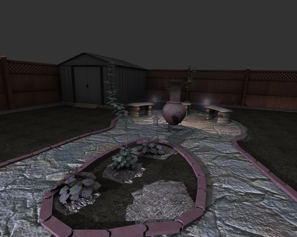
What is left to do:
- Another plant left to still put into the scene.
- The bricks need some dirtying up and maybe some dirt to trim between the edge of the bricks and the walkway.
- Add a grass to the outer area that looks good.
- Add a sky
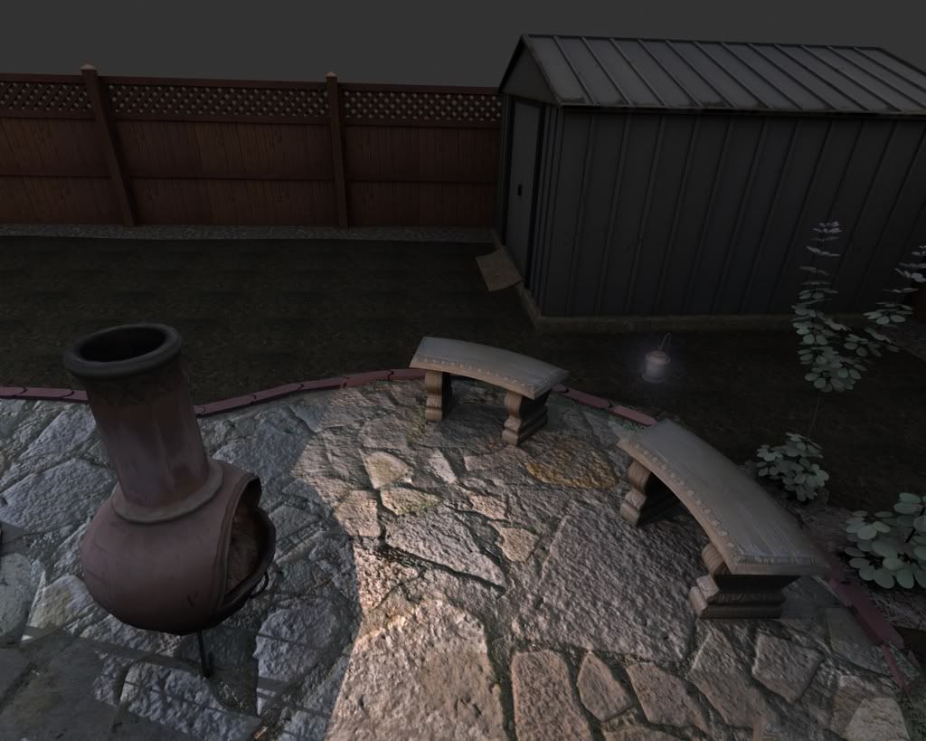
- Effects like smoke from the chiminea, and a crisper glow from the lights.
- Need to add bricks to the outer trim near the fence, holding in the rocks that are on a textured plane there.
-Work on lighting and camera angles
What I think may need to be changed:
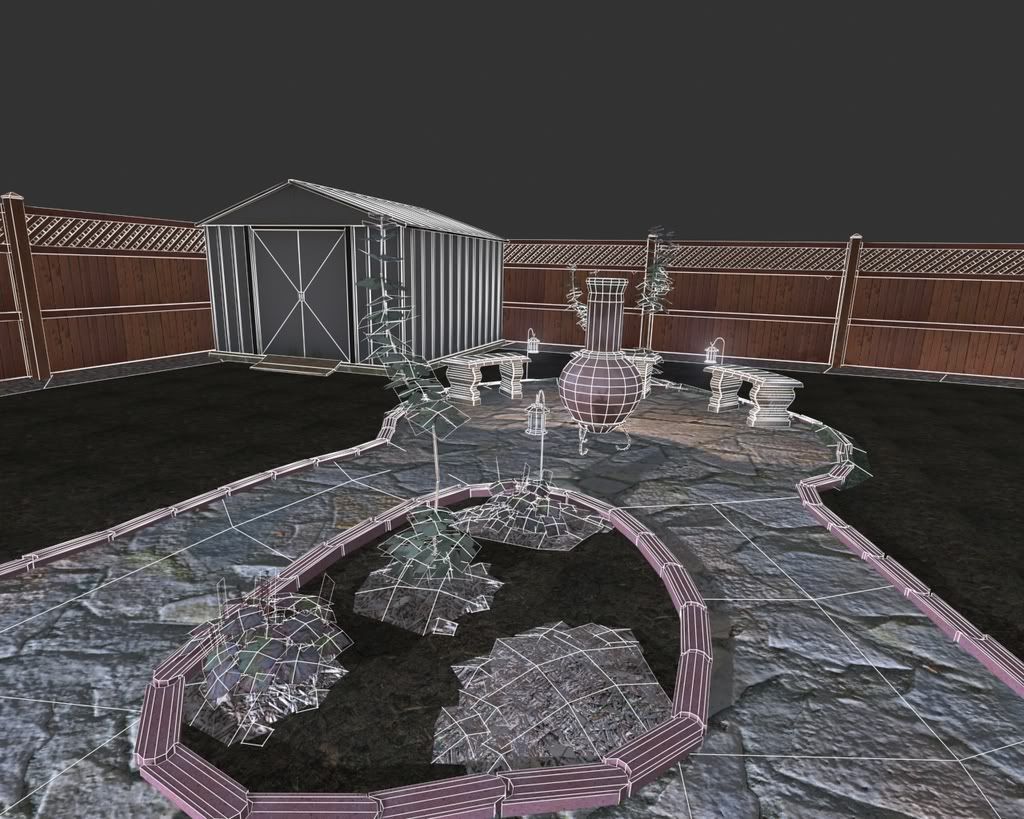
- The bricks are quite a lot of polys with how many there are of them I was trying to think of a better way of doing it, but couldn't think of anything efficient that would look good.
All Textures are 512x512 or smaller except the stone walkway.
So Far the scene has 9,129 polys total.
All comments and suggestions welcome.
Replies
Depending on how much focus will be placed on the fence, I think the crisscross details would work just as well as a single alpha plane, which will save you ALOT of polys that could be redistributed to some more vegetation, flower beds, fruit trees, tiki sticks ... etc (as the scene is looking quite bare to me). What you *could* do, is keep the fence now as you have it as a high poly version and bake the ambient shadows into a low poly version.
I also think you need to improve on the lighting. I'm no lighting expert but it just doesn't umph enough. I'll leave that advice to someone who knows what they're talking about in that respect
Great stuff sofar, keep going!
Can you post some of your textures?
The tiling on the grass is rather apparent, and I think your plants could use some more definition. But post the textures and we'll have a better idea of all of that.
Here is an update of the scene, still plenty of work to be done.
I have included some of my textures, I sized a few of them down.
Your plants still seem kind of washed out. On your texture sheet it looks like the leaves you used are shiny, so the picture you took them from has a lot of reflection on top of the leaf, which is altering the true color a lot. I might try to find a different image to work from, or see if you can paint some of that reflected light out.
I think I am pretty much done with this scene, unless anyone see's something that is ruining the scene.
I want to move onto something else, something a little more creative.
*edit
I darkened the stone path way a bit in the daytime pic.
It looked better in the darker scene.
Greatest considerations are directed towards the stone path - too noisy and undefined in structure - If this is a single static scene (or otherwise) model each stone independently, same goes for everything else.
The lighting needs work -In the night scene it looks too sharp in some areas and in others, near the shed, looks like some errors are occouring.
- Check out 3 point lighting
*I know your saying you want to move on but if it were me I would stick with it till you have a great scene. I know there's lots of headbashing and frustration to be had but I see potential that hasn't been realised yet by you the artist.
And the rocks seems to have over sized grain...though noisy as well...
For my next project I was thinking of doing some modular building designs, so I think I will Incorporate a couple into the background of this and then add some depth to the scene.
The lighting I agree with needs some work but I am trying to get it to look realistic while at the same time have something that frames the scene well. I have researched the 3 point lighting and use it with some of my characters, but I don't understand how to apply it to a large scene, such as this, that is rendered at night with various light sources.
Man you already finished your second environment. Its looking really good considering how fast you finished this one.
Looking forward to seeing more in class.
Yeah I thought I was finished with this environment but then I posted it here and got a lot of good suggestions so I am still working on it at the moment. I think there is a lot more potential to the scene so I am gonna keep working on it.
your spec seems a bit blown out in areas too- maybe try adjusting the spec first, then your difuse, then one final time if needed to dial everything in perfect.
you should definatly save this scene for future use. It would be sweet to use it as a base for a zombie scene, or some giant sub terrainian worm scene, busting out of the ground. maybe a freaky space creature space crash, etc etc.
REALLY nice textures though. I`m getting the slight vibe that you took the photos for them?
I can definitely work on the spec and diffuse a bit more and try to eliminate the milky white feel.
Keep it up.
Not sure which software package you are using, but in Maya you can use an IBL Node or a Ball Environment Sphere, then plug an HDR image or a hand painted one into it, and tell the ambient occlusion shader to sample not just a "bright" color and "dark" color, but actually have it sample the HDR so you get color variation in the bright areas.
Just my two cents.
Other than that, this came out great!