An Attempt at Modularity (European Building)
This scene would be my first shot at trying some true hard surface modularity.
The Scene was based on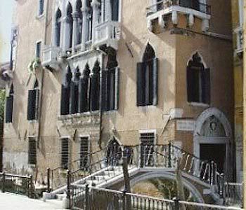
I wasn't going for an exact copy of it so i gave it a little bit of my own touches with textures and a few changes in it's structure.
So this would be the final shot of it
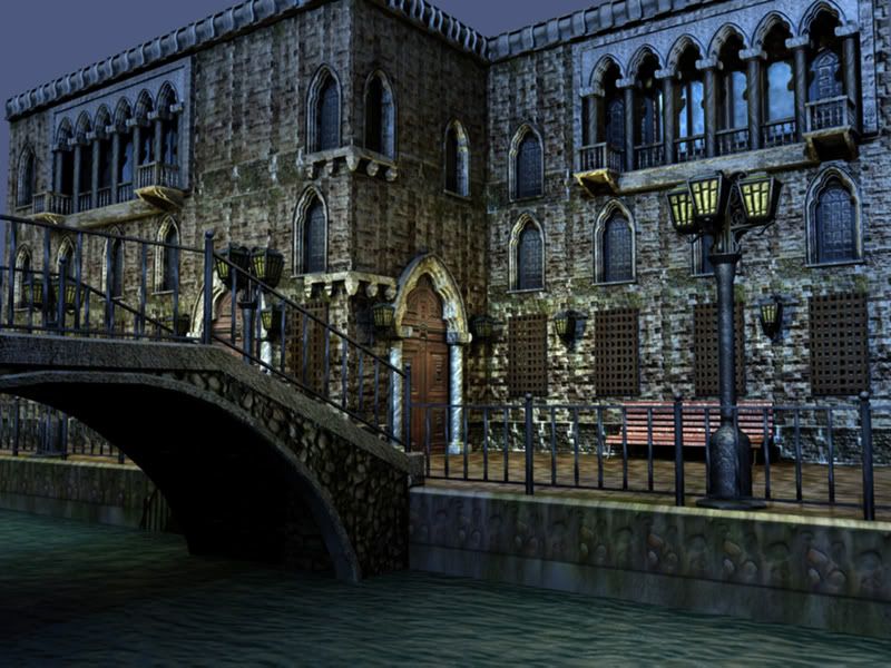
Default Light
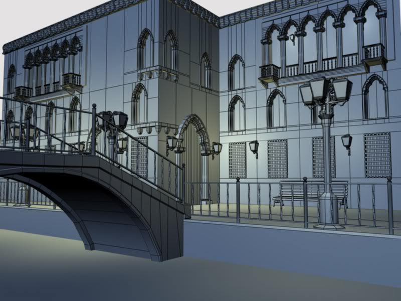
Wire Frame
(Forgot to pull the lights before i rendered it ><)
And a Few props
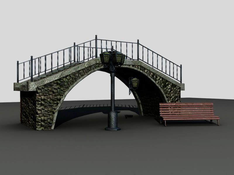
Input/suggestions? I feel the scaling might be a tad off...the bench seems a little low rider to me.
The Scene was based on
I wasn't going for an exact copy of it so i gave it a little bit of my own touches with textures and a few changes in it's structure.
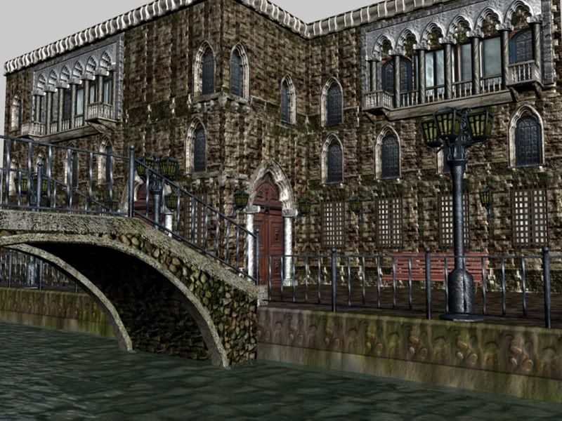
So this would be the final shot of it
Default Light
Wire Frame
(Forgot to pull the lights before i rendered it ><)
And a Few props
Input/suggestions? I feel the scaling might be a tad off...the bench seems a little low rider to me.
Replies
There are a few things that stick out. None of them are really all that major, but together they add up and end up throwing it off enough a player might notice something is kind of off.
Crits:
- The texture on the lamp stands need to look like its glowing. The version you have is fine for the lights being off/out but not correct to be used to light the scene.
- The canal is really shallow, and the water a bit too transparent. The height of the bridge indicates that its raised for small boat traffic, but the actual depth is much to shallow for that kind of traffic.
- The sky is a bit too bright for a night scene which is what the ambient/cool colors are indicating.
- There appears to be a quite a bit of wasted polys, mostly in the lower windows, upper building trim, the extra loops in straight edges like the bridge and the roundness of the posts.
- The texture of the stones, for the bridge has lighting info coming from below, you should remove the shadows from the stones or make sure it jives with your scene correctly.
- Like you mentioned the scale does seem off, one thing that will help is put a player sized measuring stick in your scene. If your using 3dsmax thats about 72 default max units high. If you stacked three of these on top of each other, and added some padding you'd roughly get a sense of how high a 3 story building should be, right now it looks like you have 3 floors crammed into a 2 story building. The middle floor looks to be the most smashed.
- Remember that windows don't always go floor to ceiling, and that a window frame is not an accurate module to gage story height.
- Know that between each livable area are; support beams, plumbing, wiring and dead space to kill noise. Your floor might be a paper thin plane, but in real life there is about a 1ft gap between floors sometimes more.
- The ref building looks to be some kind of stucco, or plaster, the brick you choose works, but is a bit noisy and if the aim was to recreate the ref, it really should be stucco. Also the two construction methods are a little different leading to different details being used on the facade.
- After trimming out a lot of the wasted polys, more details like building trim that separates the floors could easily be added. I would sweep a custom shape around a spline around the building to quickly knock out that kind of trim detail.
All great points. I was going to work on a map for that but due to time of it being due for my final in 6 hours i was calling it a night for it. The update in my portfolio, this, and a character model (not going to post her yet...few things at a time) were all done in the last 2 weeks. I have been living in front of my PC and yea...its kinda nap time before class at noon.
So yes the lamp i was planning on making a glow map for it, the light blue background was due to the ambient occlusion overlay. Once i make an actual sky for the background that should fix that issue. Poly count i am sure can be worked on. Although i don't think the Wire frame render is doing it justice. I'll try to get a better close up of it so it doesn't look so dense up there. As for the rocks i never really thought of that so i'll work on that as well.
Thanks for the replyes.
And I agree with Vig about the lighting information on your texture (I also agree with everything else he said, but that was my main crit).
Can't wait to see more from you buddy.
The main thing I see lacking is lighting. I'm not 100% positive if this is at night or during the day; I write this assuming it's at night:
I'm noticing that there is an overall blotchiness and washed-out feel to the image, though - I think it's a combination of your spec and lighting. Everything looks wet and is picking up the blue from the moon. It all blends together in a kind of camouflage 'noise' and is flattening and hiding your details in your scene.
Try toning down the spec and bit and fiddling with the falloff so things aren't so wet, and introduce some more intentional hot spots with your lighting; use it to cut out shapes from the scene and get some nice silhouette action. Right now we can see TOO much.
Quick paintover (sorry, not the best, but hopefully it explains the idea regarding the lighting):
Hope that helps...not sure how clear it is. Let me know if ya want a wire render or a different set up to see the pieces.
@ edwardE
Thanks for the pain over, it looks good for getting the message across. Thats about how i would want it to look. Just have to figure out what kinda of map to use for the lights to glow..or be cheap and use post effects.
As for the wet feel i agree. But some of it i kinda wanted. Although yes at the top level so far from the water it wouldn't be wet like that. So i'll work on that as well to try and get it to look mike marble/stone.
As far as post effects go, don't feel like you're violating unwritten rule by using them - simple ones like contrast, color, exposure, bloom and the like ARE used in modern realtime engines. Obviously I wouln't go too crazy with your post, but this scene you're working on does look like it would be in an engine that supports the aforementioned effects.
For now i fixed the specularity but the main light is still giving me issues. I'm thinking of maybe adding some negative light to get some shadows. Moving the moon seems to make to much of a highlight on the top of the building and it's loosing some of its contrast. So a little more tweeking is in order.
Hows it looking now?
Edit...Just realized Vig updated his crit and brought up a few more really good points about the scaling. Changing the scale will change the lighting so...back to work i guess. Oh and Vig i said i did want to change the texture of the building and not do a direct copy. The reference was just to get an idea in my head to get started.
I agree about the post production adjustments. Don't go too far, but certainly use whats available in modern engines. Color corrections, bloom, DoF bla bla bla.
I mostly brought up the texture, because its easier to tile stucco with a smaller texture then it is to tile brick. With brick you'll need more variation and possibly more trim to help keep the tiles looking unique.
Stucco, takes a few overlays really well and holds its detail at a distance. It helps if you're trying to work in color shapes and silhouettes.
Brick can be nice and nasty close up it sometimes take more work too get it looking nice at both. Stucco seems to hold detail easier at both distances with less work.
Its all a matter of personal choice for sure, what you have is fine, its not something I would personally choose but that doesn't mean its bad.
also the water isnt so hot, you could try reducing the opacity upping the reflection (and giving it a fresnel filter). then add some (10) layers of 10% opacity polys with a dark green colour underneath, this will give it a feeling of volume Gtas water effects
Because right now it shows a rather bad use of bumpmaps and geometry and every change and deviation you've done from the reference photo has been a rather unlucky decision.
Nothing that's currently there is either applicable or a desiderable use of resources for a game.
but yeah besides that, I don't think this shows modularity in a good way, since you could have built that mesh uniquely without it being different or more optimized, the base principle of modularity is re-usability, if this doesn't work, then you can consider this a more or less failed attempt. Have a look at how epic used modularity to create unique environments in gears of war and ut3, the kind of meshes they are using, etc.
DEATH ROOM MARIO, DEATH ROOM !!!
I'm sure he learned a lot and bagging on the guys work without pointing out what he did wrong, or even nudging him in the direction to do things "correctly" is kind of a waste and you just come off as an unhelpful dick. Even when I know you're a very helpful cock monger.
I'd help Vig, but i don't want to waste my time either, there's always a 50% chance people dont want to hear it. If he wants criticism i'll happily oblige.
Oh Trust me id want to hear. Please Tear it apart and help me bring it back up. Again it is a first try so anything i can learn from it would help me do it better next time.
Thanks for all the comments/crits everyone.
First off, you need to decide where this is going, old gen, next gen... Right now it's built rather old gen'ish, the bumpmaps aren't so hot and rather disturbing with their strength.
Were you to remove the bumpmaps you'd have a working old gen scene, and it takes more than tiling textures with bumpmaps to make something next gen.
The building right now looks like it should be standing in the jungle with overgrown vines over it and monkeys running around. The materials simply don't work.
If the building has anything more complicated than flat walls, you wouldn't be able to make out any shapes with all the texture noise.
The materials are generally too noisy and the exagerated bumpmaps make it all worse.
even the streetlamp seems made out of stone.
Very first thing to do would be to tone down those normalmaps. For metals, who tend to be rather smooth, you should only have a very subtle normalmap. If i want more than that, i sometimes paint large cloudy grayscale shapes on a new file, convert them to normalmaps and add them to the original metal normalmap.
What this does is give the metal a soft ondulated look, a nice effect when the light shines across.
I'd go back to the photo reference as what's there, works pretty well. Whether you want to stick to bricks or take something more pleasing to the eye like the stucco in the original reference, you can't have that much contrast in the material.
The more a texture is going to tile (and yours tiles a lot) the more homogen (feature and contrast -less) it should be.
The whitish parts seem made out of marble and while marble is a neat material, it's out of place there, too noisy and misplaced as you have it. You can find so much more interesting white stuccos and stone textures that would look much better and fitting there.
The things that could actually profit from a normalmap/bumpmap and would scream 'next-gen' are the ones that actually have no normalmap for them.
The trim on the roof, and the several bevels on the windows eat up an unneded insane amount of polygons.
The roof trim should just have the horizontal curvature modeled, all the detail itself should be a normalmap.
You can eitehr do these by baking the trim you have now into a normalmap and occlusion, or you can paint it in grayscales (black/white for simple bevels) in photoshop and run the NVidia normalmap plugin on them.
Same with the windows. Keep the outline, but get rid of all the bevels, either bake what you have there now as a normalmap to aplly to the simplier version, or repaint it in PS. Hope that makes sense... a bit short of time right now.
As it is now, it would be useless in a game, too expensive for such small pieces that are reused so often. Even if it was old gen, the bevels would be something you paint on the window frame texture, rathert han modeling them all.
I would generally pay more attention to the reference, they're a great source to learn from.
If you look at the bridge in the photo, the white parts there have trims and the white half circle is much thicker than yours.
Doing your own thing is only good if you know when to, kinda like knowing to pick your fights.
Your bridge looks rather unbalanced with the thin white half circle, not something you'll find much on real bridges out there and our minds always then to fall back to what we're accostumed to see and will find that to look 'right'.
On the modeling side, there's a lot of unnecessary loops everywhere, on the top of the bridge, the flat walls on the building etc. I'd clean that up a bit.
Modularity... is great, but also needs to be somewhat comfortable to use, if you break things down too much like you have, you get a lot repetition from the texture and it will be a pain for the LD or enviro guy to put something together with it. It ends up being counterproductive and in most engines slower than if you feed it bigger chunks.
hmm i'll do a quick paintover tomorrow on how to break it down better and how to make the seams less obvious...
It would be nice to see the textures you've been using so far... and probably even nicer if you just trashed them all and picked new ones, unless you just wanna call the scene done and move on to something else.
If not, I'd try browsing through http://www.cgtextures.com/
They have a limit of 10MB that you can access every day... so be sure you really want a texture before you click on it to get the larger version, or you'll waste your 10MB for the day rather quick.
If you go to Plaster -> plaster white dirty - within the site, you'll have some white textures with great weatheration that would look awesome on those windows and door frame.
gotta go, can finish shredding your work tomorrow.
The brick and arch way came from this picture
i found it while i was researching archways.
At first the building and bridge were all stucko and to me it just looked boring. So i started to play around with the stone.
As for the wall texture here it is
I'd like to try and stick with the stone feel. But if i'm just beating a dead horse it can be changed.
your diffuse maps have too much lighting info already baked on them, particularly the tiling wall. You want the shaders to take care of the forms, and this will help get rid of the noisy feel.
But yeah if this isnt applicable just ignore that.
I would also suggest watching [ame="
SF is dead on about the wall texture. It does have a large amount of noise. I STRONGLY urge you to try out something less noisy, if its not stucco (which I think you should at least try) turn down the dodge burn, and overactive lighting/bump.
Also, when working with metal, not only is a subtle normal map important like SF pointed out, but a very subtle often colorized spec map will help metal along A LOT.
The plant life is more in line with castle ruins instead of a maintained building down town. I would hang onto the texture, and use it on another scene.
The brick has too much dodge/burn. Think larger more flat colors. Step back away from your computer and squint, or shrink a render down to 25% and see what major shapes are standing out. If you can't read the windows and trim then its time to revisit the textures. Sometimes less is more.
The bump has a seam that won't tile properly. It also contains repeating textures inside the unique space. Considering its going to tile like mad use the space effectively and not lazily.
Going back to the wasted polys, in addition to the things SF outlined, keep in mind my original comments about the posts, lower windows and upper molding.
The 6 arch piece could be broken into 1-2 pieces and given unique textures.
Each module could be given trim to help hide seams. trim can be a few different pieces, it could be something like a drain pipe, wires, or regular wood/stone trim. Having a few pieces will give you some options.
Also creating alternate modules with variation will help break up the repeating.
Personally I would close this chapter and start a new scene rather then reworking this one. Chose something new and go crazy with what you now know. I would also encourage you to check in here at each step, concept/modeling (even if you just gather ref images), UV layout, materials, placement and lighting and then rendering. We'll be able to give valuable feed back that could have helped you save yourself some of the headaches you ran into this time around. But honestly its good to hit those because you learned and thats why I count this as a success not a failure. Besides it looks pretty decent
I will usually up the contrast in those textures just a little notch.
Yeah, i can imagine stucco would seem boring at first glance but you can have some really nice weatheration patterns going on, and makes the whole scene always a bit easier to read.
You can stick to stones but you'll need something more pleasing to the eye.
YOu can grab some from CGtextures and just replace what you have for a start, without bothering about the tiling until you find something you think will work for you.
When you have the stuff you can rebuild the textures and we can add some porper dust and dirt overlays in the right spots if you post your results.
The bright window glass texture... drop it, make it dark too like the small one, it looks pretty weird right now.
As for the modularity, it's a pretty simple building so you can get away with simple pieces too.
Try to see modularity as if it was lego. You are the big brother making pieces for your little brother, you were given the brains, he was given the toolbox to play with. He wants to build a big lego city so he can battles in it with his marvel Legends figures and the build-a-figure 16'' galactus figure!
Your job is not to give the LD (or whoever) single lego pieces, but to put together interesting facades etc with them.
You keep the single small lego parts for yourself.
Commonly, the more smaller pieces and options you give an LD or layout artist, the worst what they put together will be. Limit the options to comfortable and quick to use pieces that you feel will look good, and wont let them mess things up. If they need some custom or new variants of a piece for their specific ideas they'll let you know soon enough.
If you had to be able to have different heights etc of the building then i would break away the ground floor from the top floors, but since it's all the same height and we want to keep it simple, that image would work.
It's all a bit problematic because no 2 sections on your building look the same (displaced windows, doors etc), there's always something (as it is right now) that makes it impossible to make the building properly modular keeping the look exactly as it is.
Yet, all the arbitrary changes don't help at all at making the areas look unique.
1. Always have the basic facade of the building, with all the windows (and one with no windows), no cuts etc. This will be your base piece from which you cut and form all the others.
2. Same as 1, but you would spare/cut out whatever you need so it that it would work with piece 5.
Commonly, you would resize the width of piece 5 to work better with the basic facade.
Alternatively, you can make the facade 1 and 2 wider to encompass 3 windows (horizontally) instead of 2, whatever lets you place the pieces better together in the end.
3. A version of the facade with the door...and in your case it doubles as a corner piece, the trim on the roof would have to work in corners. It's not ideal but if yuo want to keep the actual shape of the building and the location of the doors etc, it will have to be like that i guess.
4. A corner piece. The corner piece is not just that 1 side of the facade, it would include the side you can't see.
5. that piece, the length of it or of the facades changed a bit to work better with the modular facade pieces, or make it part of a modular facade piece having 3 facades = a left side, middle section and right side.
Stick always to simple grid sizes, 2, 3, 4 meters etc.
The larger the piece, the less texture tiling/repeating you can probably have which is good, but the less flexible the pieces will be. Both extremes are equally bad.
These are some examples of similar pieces from dark sector
http://www.strangefate.com/webby/dsmodu.jpg
http://www.strangefate.com/webby/dsmodu2.jpg
The cube piece (second from the right) doubles as corner piece too. The orange piece in the background is just a floating mesh I did as part of that set to put in the background.
Vertical pillars are great to hide seams so you dont have to worry about them at all and can size the wall texture as you please.
In the end it looks like this.
http://www.strangefate.com/portfolio/2007/SchoolExterior.jpg
Another similar example:
http://www.strangefate.com/portfolio/2007/SchoolPatio.jpg
There's 5 pieces there, a straight arch section (1 arch wide, all 3 floors), 2 corner pieces (right/left), the large arch over the door, and the large vertical pillars at the sides of the door arch.
The pillars were meant to be used on the large arch wall sections too to break up the rather repeating effect you get from a large wall with arches, I put them there but alas, at some point during the editing and resizing of the area they were removed. The more separate pieces and options you give people the more likely they are to make the wrong decisions, forget to put things in or use them at all etc.
To add one thing that SF touched on, trim your modules, sometimes only one side (keeping in mind you'll stack another piece next to it) it can be helpful to make the trim modules. Keeping in mind trim can be a variety of things like pipes, wire bundles, as well as classic decorative boarders. If you trim your pieces carefully the trim will hold up on a corner and you won't have to make corner pieces if you're really pinched for resources.
A quick way to do trim, is select the edge and convert it to shape, this gives a spline, you can then apply a sweep modifier to it and either apply a custom shape, make it a cylinder or just a regular box. Works great!
Edit:
Oh and thank you all for your time and helping me out.
so far today i have baked the trim, found a nice stucco texture, found a nice stone texture, and am working on it as we speak. i should have an update up by tomorrow.
But...
I like the feedback these guys are giving... it's good stuff for the most part.
Someone may have touched on this... and a lot may not agree with me. But i noticed you're mapping everything to one bitmap. I generally use more tiling textures for structures... especially large ones the player would get close to. In Gears they used a lot of custom unwrapped stuff, like detailed columns and windows/supports. But they also used a lot of BSP and tiled textures on it.
There's many ways you can break up your modularity, the decision depends on what the camera angles look like, how close the player will get to the asset... and the decision is based on where you expect the player is going to be.
If the player has a higher range of motion in xyz than in a standard FPS, then you would have to distribute the detail more evenly and possibly use even more tiling textures to maintain pixel densities.
But if the player is going to be on the ground most of the time except for areas where they climb steps or ladders... then you can be more willy nilly with stuff and create lower resolution/more custom modular pieces for the "background" or things the player won't necissarily get close enough to to care about the finer detail in surfaces.
For the textures themselves, they exhibit too much directional light (like they've already mentioned) but i've found that it's not bad to put SOME lighting in the texture, so long as it's not too directional... if that makes sense. I like to have a slight downward light on my texture, but mostly coming from the w axis... it helps surfaces in situations where the lighting might not be JUST right... otherwise in some game engines i find the diffuse colour is simply too flat. Until we have a lighting solution that can accurately approximate bounded light in real time, i will continue to do this
If you're going to put vegitation on the building, you might concider doing that with "floating planes" in front of the walls and do something that looks more natural than smoodged ewz... the green bits look like algae or something... and i don't see it in either of your reference.
and if you're going to but green stuff on the windows... you got to put it on the wall at the waters edge...
The bridge and the wall (what's that kind of wall called... ) aren't connected imo. I feel like the bridge isn't grounded enough. Perhaps the materials on the bridge and the wall are too different. or maybe the wall itself looks too unnatural and isn't feeling right in the environment. Or maybe it's the texture choice of the wall (granted, texture choices -as has been mentioned previously - are not in line with what my personal decision would have been, though i wouldn't call it an EPIC FAIL or anything... but they're pretty bad.)
I would definately concentrate more of the greens closer to the ground.
If there's specular on the structure, i don't see it. Lower contrast on the textures, makes some effective normal maps.. and specular maps that are appropriate for the different surface properties you are trying to simulate... Glass (lower contrast spec with high gloss) Stone(higher contrasty bits over a low contrast matte specular mask with lower gloss) etc...
I would break my textures up like this:
Wall textures
Ground textures
Unwrapped details (decorative columns/windows/lamps) on 1 or maybe 2 maps...
Detail Trims
and then figure out how you are most likely to reuse the modules.
(I like SF's breakup instructions... they are sound. It's also good to mention that memory limitations come into play... Having fewer larger objects is better for rendering in most cases, but worse for memory. If you have tighter memory limitations you might concider breaking the ground floor from the upper floors as well... and reusng the upper floor more frequently, but still allowing you to customize the lower floors more.)
... however the more you reuse an asset, the more you notice it as well. Without having a real memory limitation, i would just do what SF says... he's smart. or she... i don't remember...
and think about how you would reuse these assets in a completed nextgeen environment for a game you would expect to pay 56 dollars for.
If you're aiming for yestergen you're wasting your time.
But I like it... overall... it's not bad *otherwise i wouldn't say anything at all* If i don't post in your thread, it's either cause it sucks too bad... or it's too awesomes. You'll ahve to decide when that day comes
Thanks for the thought out reply. To answer a few of your points ill give you a quick rundown.
Yes the floor is separate from the building.
And the way you suggest laying out the textures is about how i have it. The wall stuff is on one texture (the one i posted), ground is on another, and assets are on 2 more (lamp on a 256, and the molding archways ect are on a 1024)
I think there is only 5 maps used for the whole thing.
as for the random moss green stuff i agree it got carried away. at my school they stress dirt..on everything. "If you think it looks dirty make it dirtier." now thats something i'm not all to used to. and sometimes go overboard with it trying to just throw stuff around. on the new one that i am working on there is no green moss on the walls except for the lower areas.
So yes as of right now the Poly count has dropped and the Normal map backing is up.
I'll keep chugging away at it and hope to have an update soon.
That's not a bad thing, just have to be smart about it. If they tell you to add dirt everywhere they should also teach you the best way to do it and what to pay attention to.
The green stuff isn't gonna do it, too jungle like. If you redo your textures and post them here we can go through that and add the dirt.
hmm What I would do is take the lowpoly trim and UV map the segment (from a modular wall piece) to occupy the whole width of the UV space. From the looks of the trim you'll probably end up using a 1204x256 or whatever space. Then i would just bake the highpoly the UV of the lowpoly to take up the same space... hmm standard high to low poly backing.
If that's to cryptic just make a 1024x256 or 512x256 texture with a stripe of trim, make sure it tiles seamlessly horizontally and map the lowpoly to that space.
Also, I don't know how you're doing the baking, if you know how to bake high to lowpoly then i'd also bake the windows into a lower poly version without all the bevels.
I would probably leave the door bevels as they are, just because.
Then i would put the trim, the window frame, window glass and other custom skinned pieces on the same texture, a 1024x1024. Put the trim at the top or bottom and leave the rest for custom skinned stuff.
If you bake the window frames, you can use the results also for th e arches of that balcony part, the upper part looks the same as the window frames.
If you have space left on that texture, you can take an empty area and fill it with a simple dark metal where you can put all the UVs for the metal bars in the lower windows.
Make it some blackish metal for that with some brighter dirt spots, bird-pooish not rust like, closer to what the street lamp seems to have now, minus the strong bumpmap.
Dirt on noise turns into, lost detail.
Dirt on vanilla turns into detail seen.
Its the same crack "decal" on both textures.
(Not exactly true, I had to turn the brightness down for it to even show up on the brick.)
Jesus...
Like SF said, they need to teach how to think about dirt and where/why it collects and the type of wear and tear elements have on structures... i don't know what kind of class you're taking. It may have been mentioned before, i'm at work though... so i'm not going to look again
Anyways... 5 textures for the whole scene... seems low.
I would have a road texture, a sidewalk/trim texture, decal/dirt map for the ground and another texture for just random shit on the street... that alone would be 4 textures... plus NMs.
I understand being conservative, but I would make a larger set of textures.
you're going to want to show this scene in different camera positions.... otherwise it's somewhat useless as a portfolio piece and testing modularity. Modularity is supposed to provide you a quick way to create/block out functional environments with less visual artifacts/time.
If it ain't functional... it don't work.
I'll post more later with better descriptions and examples. if i don't... it's cause i got distracted ... later
Cut out a lot of geometry, expanded the 2nd floor, added in molding to each floor.
No lights in there right now
No more brick and marble =P
Although i think it makes the bridge look even more out of place now -.-
keep working on it, it will turn out nice
Looking a lot better! Keep going. Now you can start adding dirt/grunge/dents and other unique details to break it up. But the way it looks now, I would keep it subtle. Great improvement in this thread. Don't forget to make the bridge look as nice as the building!
And as cody said, now its time to push those textures more, adding some nice grunge tot he mix (realistic wear and tear) and yes... you gotta give the bridge the same love you gave the building... I wanna say add some sort of light too it, but if you wanna take it an extra step maybe add one of those boats (I don't know the name
Yup that will be tomorrows work. Texture love..in less i decide to Raid with the guild...damn being on vacation and having distractions ><.
And yea i know what boat your talking about and i thought the same thing..but then i thought that it wouldn't make much since for a boat to be randomly there in less there was a dock it was parked at or a person in it.
As for the bridge..yea its way off now. But i liked its stone feel but it doesn't fit anymore. In the reference it is the same stucco as the building but i think that would just make things look to uniform. Maybe use some flat stones instead of the rounded ones?...not sure yet.
Crits:
- It doesn't look like you implemented SF's modularity idea yet. You really need to get that working before anything else.
- The Tiny balcony on the 3rd floor looks to be too tiny for a person to stand on, If you expanded over to cover the next arch way, that might work better. It looks like an air conditioner from a distance.
- Reduce the number of posts in the railing all long the second floor. Save some polys by cutting down on visual noise.
- Turn the lower windows into a texture with an opacity map and save more polys. Hide everything except the grate, switch to an orthogonal (front) view and render out a quick shot, save it as a TGA with alpha, apply that to a plane and you're done.
- Exclude the wall lamps from casting shadows. In 3dsmax select the object, right click it and go to object properties and uncheck cast shadows.
- you might want to experiment with trimming the edges of your modules with vertical trim, especially on the corner of the building?
- The wall running along the canal has a bevel on it, but is basically the street wrapping around. Trim that puppy and give the fence something to anchor into, as well as give you a place to visually break the street from the canal.
- The way the detail is laid out on the building, it kind of goes against "the rules" of architecture and game design. Normally you'll want to pack the detail into the ground floor, and as the stories go up, use less, simply because what players see and interact with is key. With the exception being the upper most floor, they have quite a bit more detail then the other floors, especially around the top but not nearly as much as the 1 floor.
Example 01
Example 02
Example 03
- So trim out the windows on the bottom floor, lay down a kick board around the base of the building and add some decorative supports for the molding that separates the floors.
- The second floor still feel squished, make sure you're working in some kind of solid unit structure and not just eye balling it.
The window placement seams random without a reason why. Its true that you want to break up repeating structures but first you need something that repeats. =P
Paint over:
Are you trying to paint it all rather than using some photosource as base ?
If you make a 1024x1024 wall texture it should cover at least 2 floors
Vigs this is how it is broken up now in terms of modularity.
Not sure if it is still 100% right. Maybe i should connect 1,2,3 together as well and loose the last set of windows and let 5 take care of that.
Strange. yes it is to saturated again that was just a quick check to see whats going on with the stucco. It will be tweeked and fixed soon.
Vig thanks again for a nice paint over i really like the molding around the 1st floor. brings back a little kick to it. i'll be looking into doing that.
As for the balcony it's about as wide as it is in the picture, the wall does go in there so the 2 little spots that stick out are just kinda there. I agree that they look kinda strange but the look strange in the picture as well. I'll see what i can do there. Just seems random to make the sides longer but have a piller kicking it in the middle of an area you would walk by. It almost seems like they were put there just to place a plant or something.
Well back to work.