Home 3D Art Showcase & Critiques

Juno: another WIP...

This is another WIP im... wipping on?

Anyways thought i'd get some feedback before she goes into Zbrush. ooo.gif

Im trying to keep her somewhat cartoony looking.

Shots2.jpg

FacePerspective.jpg
grey
Grey.jpg

Replies

  • oobersli
    Options
    Offline / Send Message
    oobersli polycounter lvl 17
    are the eyes off? like too far apart? they seem odd to me. everything else looks cool tho! smile.gif
  • Cheshire
    Options
    Offline / Send Message
    [ QUOTE ]
    are the eyes off? like too far apart? they seem odd to me. everything else looks cool tho! smile.gif

    [/ QUOTE ]

    i think theres too much white showing on the outside of the eye vs. the inside. Ill tinker with it more. But im tryint to keep the big ol eye look intact.
  • sama.van
    Options
    Offline / Send Message
    sama.van polycounter lvl 14
    For cartoon render I think it can be interresting to add a self illu +30%, and add some luminosity in environnement light... (dsmax press 8 key smile.gif)
    I say that because dark shadow hurt your model.

    I found that on a member profil... click A
    This is very interresting, he gives this link too : click B (for the problem of shadows on screens)
    (Key + Fill + Back light )

    About Cartoon style which style do you want? something more Asiat? or more American? or else... (It can help for critic)
  • Cheshire
    Options
    Offline / Send Message
    I really want a middle place a mix if you will i guess.

    For example when i go into ZB im not planning on adding much detail the the flesh itself i want it more of a porcelain look to it, however the textures should have plenty of color on them.

    Heres some eye tweaks.

    Eyesfixhopepraygahack.jpg
  • Cheshire
    Options
    Offline / Send Message
    well i got this much done in ZB now i think i should grab some sleep.

    Crits are welcome!

    JunoZB1.jpg
  • _Eclipse_
    Options
    Offline / Send Message
    _Eclipse_ polycounter lvl 10
    VERY cool. I just love the overall style!
    I saw too much people wasting their fine cartoon models detailing too much in zbrush. I think you're absolutely right in keeping her face like this.
    can't wait to see the finished model
  • Cheshire
    Options
    Offline / Send Message
    [ QUOTE ]
    VERY cool. I just love the overall style!
    I saw too much people wasting their fine cartoon models detailing too much in zbrush. I think you're absolutely right in keeping her face like this.
    can't wait to see the finished model

    [/ QUOTE ]

    Thanks Eclipse!

    I've been wanting to try this for a while now, though i'll be adding a fair amount of detail, I still want it to be very smooth. Especially the flesh areas. Hopefully it looks as good as im hoping it too. I think ill try and get the head to a reasonable state so I know what the effect will be before goint too far with the body.

    Anyways, I forgot to go to bed, so here's another update:

    JunoZB2.jpg
  • Cheshire
    Options
    Offline / Send Message
    Opted this only to realise i forgot to model the inside of the mouth. frown.gif Oh well I'll have to do that later tonight.

    Ignore the clipping, that will be fixed after the rip. I just fit the model to the ZB model to get a better map result.

    Op.jpg
  • pior
    Options
    Offline / Send Message
    pior grand marshal polycounter
    The sculpted model looks great! Cool to so more Chesh posts!
  • seantree
    Options
    Offline / Send Message
    seantree polycounter lvl 18
    nice piece!!! Good to see you back Chesh!
  • Xenobond
    Options
    Offline / Send Message
    Xenobond polycounter lvl 18
    Looking sweet, there.
    Not going to need help unwrapping this, will you? ^_^
  • Cheshire
    Options
    Offline / Send Message
    Haha! More old faces! I have to admit its really been fun just seeing everyone post on my newer threads.

    BTW Xeno=Kman yes?

    Thanks for the replies all! I'll try and get more tonight.
  • Cheshire
    Options
    Offline / Send Message
    Normal Test.

    Not really as smooth as i wanted yet. Dunno if I should ad some edges or not.

    NormTest3.jpg
  • Cheshire
    Options
    Offline / Send Message
    another update:
    Normals on low poly in Max

    Front
    JunoHeadNormfrnt.jpg
    Perspective
    JunoHeadNorm.jpg
  • stoofoo
    Options
    Offline / Send Message
    stoofoo polycounter lvl 18
    looking good. Keep going.
  • Cheshire
    Options
    Offline / Send Message
    [ QUOTE ]
    looking good. Keep going.

    [/ QUOTE ]

    JHC where you been Stoo>? I have to bug KP with all my randome thoughts these days. Doesnt really seem fair to him. :P
  • Cheshire
    Options
    Offline / Send Message
    OK I have to admit. Im sort of lost on how to paint this characters flesh. Im not sure how far to go with it. I seem to be achieving what I wanted, but it feels so alien atm to just layer up colors with the airbrush. Im sure the eyebrows will help alot, but I hate to do them till I have the flesh... fleshed out?

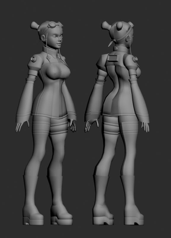
    Anyways, I thouight I'd post this up for crits or ideas as to how far to go with the flesh.

    ColorStart.jpg

    threequarter.jpg
  • Wetterschneider
    Options
    Offline / Send Message
    Wetterschneider polycounter lvl 18
    Maybe knock down the brightness of the whites of her eyes until they are about the same level as her skin. That way highlights will really pop, and her eyes will look spherical and not flat.
  • Aldo
    Options
    Offline / Send Message
    Good Job so far. Just a few things that really aren't problems but you could look into. I think her weight is distributed to the front a little..like she would fall over if she was standing that way. Also, this may just be a personal preference, but I find her face to be pretty realistic, not cartoony...from the shoulders up look like a pretty realistic character, but then the big bust and small waist throw it into stylized territory. Personally, I would like to see the realistic proportions carried all the way through because it would be a unique realistic character instead of a slightly cliche stylized character. Or on the other hand, you could make the shoulders and legs a little more stylized and it would be good too but as is...you seem to be straddling the fence a little.
  • Cheshire
    Options
    Offline / Send Message
    Thanks for the replies!

    The stylised on the fence is sort of what i want, hopefully it will look how I inteded when im finished.

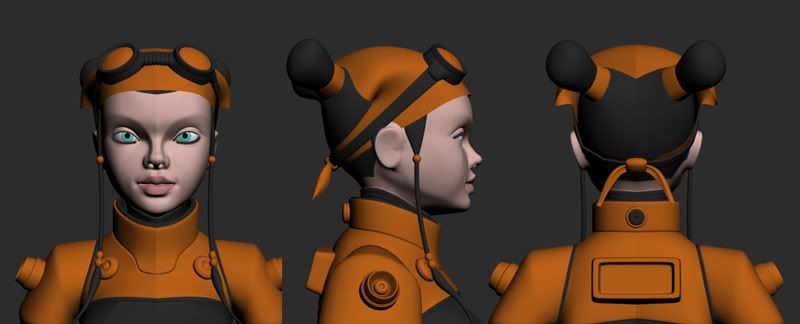
    As to the whites of the eyes that too is intentional, but ive added a reflec map to enhance them and thier geometry.

    Update:
    brows.jpg
  • oobersli
    Options
    Offline / Send Message
    oobersli polycounter lvl 17
    lookin very cool now. Like what ya did to move the eyes around a bit, doesn't look crossed eye'd anymore! nice job.
  • Cheshire
    Options
    Offline / Send Message
    [ QUOTE ]
    lookin very cool now. Like what ya did to move the eyes around a bit, doesn't look crossed eye'd anymore! nice job.

    [/ QUOTE ]

    Thanks Oobersil.

    I didnt move the eyes just reshaped the eyelids.

    Heres an updated. Started paintin on the spec.
    JunoSkinnin.jpg
  • Cheshire
    Options
    Offline / Send Message
    Just some minor adjustments to get this closer to the stlye I wanted. I should be able to finish up the body in ZB and whatnot easier now.
    JunoGoesToCamp.jpg
  • HonkyPunch
    Options
    Offline / Send Message
    HonkyPunch polycounter lvl 18
    Is it just me or does anime style only work with cell shading?
    Or sprites?
    It's a good model but it looks very strange to me, because it seems you have anime style proportioning but, yet seems going for a more realistic look with textures and shaders, and I think the idea behind anime gets lost somewhere along the way.
    Just my personal thoughts, but by all means continue on the model, as it's nicely made
  • Cheshire
    Options
    Offline / Send Message
    [ QUOTE ]
    Is it just me or does anime style only work with cell shading?
    Or sprites?
    It's a good model but it looks very strange to me, because it seems you have anime style proportioning but, yet seems going for a more realistic look with textures and shaders, and I think the idea behind anime gets lost somewhere along the way.
    Just my personal thoughts, but by all means continue on the model, as it's nicely made

    [/ QUOTE ]

    Well I wanted to do something different. The mix is exactly what Im goin for, however newer games use this alot, Soul Caliber4 the FF's ect, maybe its just my style that doesnt suit.

    Anyways, heres an update.

    NeckShouldersZB.jpg
  • Cheshire
  • Cheshire
    Options
    Offline / Send Message
    Added a powered mechy knee.

    GaryGnu.jpg

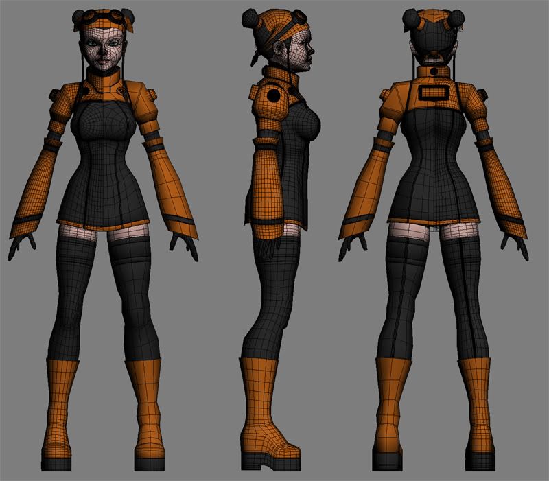
    Just need to get some more detail on the hands and im ready to finish up the Zbrushing and start UVs and Rippin.
  • sama.van
    Options
    Offline / Send Message
    sama.van polycounter lvl 14
    Strangely lines on cloth and breast form remember me Magnacarta...
    But I'm a little disapointed about choice of diffuse renderer on head sad1.gif...

    Some links of MagnaCarta : A B C D
    I know! Asian touch crazy.gif

    I like follow your WIP, I say nothing but this is interresting! Keep it up!
  • Cheshire
    Options
    Offline / Send Message
    [ QUOTE ]
    Strangely lines on cloth and breast form remember me Magnacarta...
    But I'm a little disapointed about choice of diffuse renderer on head sad1.gif...

    Some links of MagnaCarta : A B C D
    I know! Asian touch crazy.gif

    I like follow your WIP, I say nothing but this is interresting! Keep it up!

    [/ QUOTE ]

    TY Sama.

    Im not sure how the final render is going to be yet, though the maps are how i want them. I have done some test renders with illun upped, and I may go with that in the final, but I need to finish her body before Im sure.

    The Magna Carta Art is very cool, is that game any good?

    Anyways thanks for the reply heres another small update.

    boot.jpg
  • Zephir62
    Options
    Offline / Send Message
    Zephir62 polycounter lvl 12
    The color on the face is too uniform.. try more yellows hues on the forehead, red on the cheeks and nose, and blue around the chin area. The way you currently have it looks fake and plastic.
  • Cheshire
    Options
    Offline / Send Message
  • Cheshire
  • killingpeople
    Options
    Offline / Send Message
    killingpeople polycounter lvl 18
    looking pretty good man. that knee pad makes me think of the kenetic generator knee brace thing i just read about on gizmodo. her oni jumps and flips would charge her ipod.
  • Cheshire
    Options
    Offline / Send Message
    [ QUOTE ]
    looking pretty good man. that knee pad makes me think of the kenetic generator knee brace thing i just read about on gizmodo. her oni jumps and flips would charge her ipod.

    [/ QUOTE ]

    lol very nice! Im just hopin it will as to her anims as my friend told me it could.

    Redesigned the power box for the knee gizmo. Looked a bit too much like a cheap camera.

    NewBox.jpg
  • Cheshire
    Options
    Offline / Send Message
    spec goin now. Just need to decide if the leggings need a texture or not then i can move on to the body.

    legaroos.jpg
  • Belltann
    Options
    Offline / Send Message
    Belltann polycounter lvl 17
    Hello cheshire.
    Thats a very nice and clean model you got there, but have you thought of giving the orange part some small hue differenses, to brake it up just a tiny bit? Thing that will make the clothes more intresting. Just a thought smile.gif

    Take care!
Sign In or Register to comment.