Bruges, Belgium Environment

polycounter lvl 10
Alright so my next project is going to be an alley way in Bruges. Gonna put it in Unreal 3 so although it's going to be just an alley I want it to look complete at every angle.
Here's some of my ref:
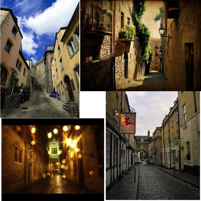
and progress:
Definitely would like some comments, ideas, and critiques before I get too far into this thing. Thanks guys.
Here's some of my ref:
and progress:
Definitely would like some comments, ideas, and critiques before I get too far into this thing. Thanks guys.
Replies
Are you going to do high res work for your normal maps?
Lastly, the front of your building is a mess. You need to cut it up so you can better re-use textures and increase the overall texture density when you're done.
Good luck.
Also research some of the items that's not in there which you can add in like bikes...appliances, furnitures etc.
Gamedev: I've never done tillable textures before because I've never modeled anything as big as a building, so I'm not entirely sure how my edges are supposed to look.
Also, in order to apply a tillable texture to a particular part of the building do I need to detach that portion and unwrap it separately? Like so?
Any tutorials or help you guys can give me would be awesome. Also if anyone knows of any tutorial to create bushes (the kind that is seen in the top right image in my first post) that would be great.
Basically you should cut your geometry to allow for the altering, stretching, skewing, resizing, replacing, and detailing the side of your wall in a fashion similar to this. Right now, you could do the entire wall with just 1x1024 texture that is like this, BUT you wont have any texture density at all.
Don't render it from far back, render it at point blank range with your face right next to it. Does the texture hold up? Nice work.
In order to achieve this, you need to cut your geometry in such a way that you can overlay specific areas as needed (especially the center areas) and reuse those UVs. In my texture example, I might reuse some of the center pieces such as this:
And therefore getting more re-usability out of my texture, as well as maximum texture density. Feel free to play around with your geometry, hide seams in creative ways, and really push your polygons.
Any company using UT3 is going to be more impressed with your ability to maximize texture density and texture counts than they will whether this scene were 5k or 30k tris.
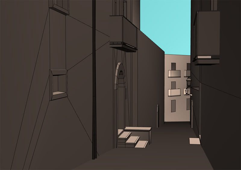
Progress:
[/ QUOTE ]
do you have a good example of building geometry that demonstrates this technique?
Any company using UT3 is going to be more impressed with your ability to maximize texture density and texture counts than they will whether this scene were 5k or 30k tris.
[/ QUOTE ]
I disagree.
While your above demonstration is nice, in the grand scheme of things texture density is trivial so long as its not noticeable. And unless you're playing an FPS, how the texture holds up with your 'face right next to it', doesn't matter.
What will hold up in a decent environment portfolio is the understanding of what it is you're creating and the methods needed to achieve the goal. Texture density is just another piece of the pie.
Keen, your scene is nice but I'd continue to flush it out completely before moving on to the actual unwrap process. To answer your question, you'll want to have edges cut in to the wall facade for wherever you'd like there to be a different texture used. Ott's example above, particularly his last iamge, shows how a wall could be broken up in to 6 different horizontal strips for use of 6 different textures.
However, and this is totally dependent on the technology you're using, it's been my experience that only a couple - perhaps 3, maybe 4 - slices would be needed. The rest can be left up to decals, lightmaps, and shadows.
To critique the piece itself, the angle and geometry is uninteresting... so far! There's much more you could do with something like this. Watch some movie and see how they use camera lenses and angles to achieve a feeling within a frame. From there, try and think of a way you can show this environment as a place with history, story, or character. Don't simply recreate what you're seeing in the references. Push this design, push yourself. Role play. Where are you? What's happening? Why is this interesting for someone to look at?
Get creative, and keep posting
I think you should try to mak a upright format and put more perspective in it.
Right now it looks not very inviting, some big windows would be nice.
I disagree.
[/ QUOTE ]
So let me get this straight - 30k tris is NOT as taxing on the engine as your "6 textures with lightmaps and shadows"?
This is what you are saying? I am hearing you right?
While my example was relatively primitive in the grand scheme of things, go ahead and put 6 textures and decals on the sides of your walls and see how much texture memory you have left in your environment on the Xbox360 - let alone the PS3.
Keep in mind Keen - if you are looking at studios making stuff for the XBox 360, you aren't doing it with the low end end / low res in mind....you are working with 720p high def specs in mind, for games that are coming out in 1-3 years from now. How a 512x512 texture looks on your screen may lose a LOT of its res on an HD TV if you aren't using it a little more efficiently.
Open up UE3 and take a look at how Epic textures their buildings and the tricks they use with overlaying UVs and modularity rather than trying to cram 10 textures on each wall. As a matter of fact, a HUGE amount of their objects are using 1 material call. Awesome stuff, and the resource size on a per-object basis is amazing.
[ QUOTE ]
"go ahead and put 6 textures and decals on the sides of your walls"
[/ QUOTE ]
Haha, ok? Done. Daily. Textures vary in resolution and memory so careful with what you're saying.
I still stand by my original reply - I think there's bigger fish to fry for you Keen. Please don't let Ott or I derail or discourage you.
EDIT: Keen - are you using anything as a size reference in your scene? I usually make a box that's about the height of a person when I do my environments to make sure things are as to scale as possible. I'm asking because it looks like some areas of your scene are off (door sizes) but it could be from the perspective.
Still have lots to model, specially the buildings in the back. But more critiques and suggestion would be dynamite.
Here's What I got:
Oh and Adam, I am using size reference, got an old ut2004 character helping me out.
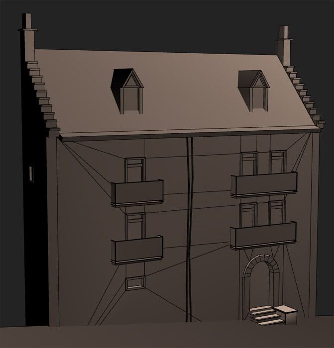
You might want to break the doorways away from the main mesh of the buildings and make them modular. Also you don't need to cut every window into the building. you can build modular windows that have a convincing window texture built into a plane that sits just behind the frame, or go with the old faithful method of adding shutters. Make sure the frame extends into the building and the plane sits just in front so it covers up the base building tile. The window on the right next to the barrel might be a good candidate for that but I normally would reserve that trick for higher up on the buildings where players won't easily look into the window.
Also along the lines of building modularly using ott's texture example you can build modular pieces that fit into those areas, being able to mix and match the pieces to create new interesting buildings from the same textures/pieces.
Looking good, keep at it, work some detail into the street/alley. Shallow Curbs, a gutter maybe. Sink the center of the street slightly to indicate wear. If you select the horizontal edges of the street and hit the connect button in the Edit Poly rollout, it will give you a new edge running down the center of your street.
Something tells me you haven't gotten that far yet, but don't forget to include it. You can't really afford to skimp on the details that are close to the player. Most players will never be able to tell you what texture was on the ceiling but they can tell you what was on the floor.
Here's my perception:
As far as my windows and doors go, I'll definitely do what you suggested Vig, but I think I'll keep low windows and doors cut out, cause I think it looks better that way. All your other suggestion I'll try to fit in as well. Thanks.
Here's a slight update:
First, no, it doesn't HAVE to be an specific texture size as far as 512, 256 etc...it's more of a personal scale - Where do you want the most details? Is size an issue as far as the object scale? (bricks, holes, moss, etc...)
The main idea is simply to cut your geometry in such a way that you can also overlay the UVs. In your original geometry the only thing you could do is overlay 1 simple repeating texture, which is generally dull and too repetitive.
As far as getting a smaller texture size in a bigger texture goes, all that means is that you would simply stretch the UVs more. The more you stretch the UV's the less detail it will get...but you could only have that part of your texture sheet something small...and the geometry cuts something big.
I cut the geo into the windows because these can actually be changed and reposed to be opened.
Even taking the same wall and just doing a texture change with a different material will go a long ways.
The texture mirroring on the pillar bothers me though. Either try and hide that by tucking it into a corner, or spare the texture space and paint another side.
Also Adam I sent you the .obj of the scene to your gmail.
I've seen a number of scene's like this before and always think that, while technically good, they could always use a bit more 'mmph' to really grab the viewer.
For your piece here I tried adding a dramatic angle to the camera and focus on the road. What's down there? Why are we looking at it? Who's bike is that? Are any of these buildings important or are they JUST buildings?
I also added some shapes to the far building on the right to help its silhouette. Nothing kills realism more than a straight edge. And while to us, looking at the real world, we may seem nothing but straight edges that is never the case. Since we can't get down to the nitty-gritty angles for a real-time videogame we can 'fake' that illusion with large bends and angles in what would normally be thought of as a straight edge.
Also, I used a wide angle camera lense (35mm) to make the road seem longer than it is. This also created some non-parallel lines to things that are near the edge of the frame which I think helps making things look less straight. A wide angle can also add drama where there normally wouldn't be.
Consider these elements for your final shot so you can add a rather interesting aspect to what normally can be a 'plain' (but good!) idea.
Now, for the overall scene itself.
You've got a lot of flat surfaces where a beveled edge would really happy catch some light. And, on everything that you've twinned (re: two identical windows beside eachother) consider breaking their mirror up by opening up one and closing the other.
None of your details are smaller than a basketball and this scene needs a lot of that geometrical noise. Streets are dirty, buildings are old, people are filthy. And try and not have a flat wall like you do on the far right. A general rule-of-thumb I use when working is if the surface if flat for more than 3 meters then I've got to put something there to break it up.
I'm going for dinner now but I will try and write more later
Keep going!
You simply move around the camera with ASWD if I recall correctly, have'nt touched ue3 much in a while though so I might be wrong.
Keep it coming!
Somewhere at the beginning u asked how to do hanging bushes/plants.
Here is a mesh layout as an answer to ur question:
about the hanhing plant.... it depends on how you are gonna use them but plants like that can be very expensive due to over draw, in my experience i found that giving each frond more tris and some shape can allow you to reduce the no# fronds which can much reduce the overdraw compared to screen coverage. this allows you to cover whole sides of buildings etc without it framing out
Currently this is just a quick mock up of a color scheme I'm thinking about going with. It's rough I know, but it helps me see what I want to accomplish. I'm not the greatest when it comes to color schemes so any suggestions or critiques would be good before I get detailed with it.
Lastly, with the bush in the back (the green glob back there). I'm going to go with modeling most the bush and adding planes to push the silhouette as was suggested here http://boards.polycount.net/showflat.php?Cat=0&Number=260200&an=0&page=0#Post260200.
Does it look like I could pull it off the way I made it?
Adam I did move around my geometry to avoid the straight lines, still have more to mess up but I'm going to texture most of it first (read your post in GD).
EDIT: Also, when in UE3 I plan on making this a night scene. Just FYI.
Anyways, I'm starting to get the hang of Unreal and getting models and textures inside it. Having trouble getting nice lighting though, anyone have any tips or tutorials for ligting? I would like the scene to have a full moon with warm lights shining from inside the buildings. But by just adding lights the whole building lights up rather than just where the light source is coming from.
Although is this built in a subtraction? It's best to use the new additive stuff.
I can't tell, are those lights inside that building?
And I'm not really sure but maybe you could fake some window glow with a little emissive material work? Maybe have 2 or 3 windows just have a faint emissive glow, and then stick an actual light over top one window to make it look like lights are on in that one.
I'm glad you're keeping with this though, I can't wait to see the final!
Vertex guy, I plan to add alpha planes with grunge on them to the buildings later. Also I'll keep adding models where areas seem sparse.
Cody, my flats don't have much detail in them at this point, I'll post them later when I've added more to them.
Anyways, here's a second building, I'm cruious what you guys think of the buildings. Think color scheme between the two buildings work together?
And clay bricks are a very popular and commonly seen building material in Brugge, not entirely reflected right now.
The board at the door says Olhallen which is Norsk for "the beerhall" as far as I know. Norway lays more than 1000 KM from Belgium.
Your lighting issue comes from interpolated vertex lighting, read this : http://book.hourences.com/tutorialsue3lightmap.htm to get an idea about lightmap baking in Unreal.
Optionally also go over this : http://book.hourences.com/tutorialsue3modeling2.htm as it can be beneficial to split meshes a certain way, for the lighting.
#1:
you skewed it to much and dont have the polygons to support it. For example, whats those things going down the wall? the really segmented looks kinda throw it off and i cant identify it. is it a drainpipe? same goes for the corner of the building. In general when you can count the polys on an object it aint got the right shape
#2:
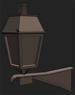
you got scale issues. compare the decorations on the balconys compared to the wallamps for example. Also i cant help thinking the stones around that door looks way thick aswell.