Interior environment crits please
Hi guys, hope everyone is doing well.
I am currently working on this interior environment and any crits would be great. Thanks.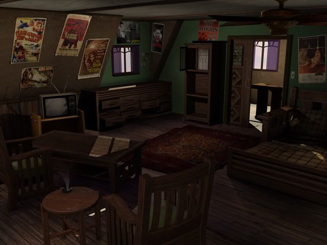
http://royrage.com/
I am currently working on this interior environment and any crits would be great. Thanks.
http://royrage.com/
Replies
http://royrage.com/
The main wall with posters on it, you could divide that up. While keeping your poly could low, you also don't want too many single HUGE polygons.
I'd check the polydensity - in some places (backs of the chair, TV) you've got a whole load packed in there that could be culled.
Nice to trim on almost every surface - that break it up and lets you re-use flatter textures.
Finally - it's too tidy. Student posters? Where are all the clothes and coke bottles and plates and tissues? No toys/books/pens/music?
Good stuff, I like the layout. Good scale and spacing between objects. The pixel density seems to be pretty constistant. You definite have a good grasp on the tools used in the industry and with VERY little direction I think you could be in great shape to slide right in. Your portfolio is looking good too BTW.
Crits:
- Things are a touch too high poly and could be further optimized. It looks like you started to optimize a few thing and you kept it in mind when making things but I think greater care could be taken to actually make every polygon count. I think you could have the same level of detail and shave roughly 20-50k polys from this scene. 20-50k polys is a lot more detail you can put in the room shelves, a desk with a laptop, books, mags and clutter.
- The tables, TV and the posters seem higher poly than they should be. The beveled inner parts could be done 100% with the normal map. Normals aren't just for bump detail they also fake recessed geometry pretty well especially on the table and the TV screen.
- The rug looks like it was a really high poly plane that was poorly optimized, I would suggest taking the time to properly clean it up and really shave some polys out of it or just rebuild it properly.
- The ceiling and floor seem to have a few polys to them however they are not contributing to any kind of shape. I can think of a few reasons for this however I don't see you using any of them. If the polys don't need to be there, take them out and use a tileable texture.
- Intersecting geometry is ok. Not every thing needs to be welded together, having one piece clip into another one is perfectly fine with 99.9999% of engines.
- The smoke effect on the cig needs to be less like a gradient/tornado and more like wispy curls of smoke.
- The lighting could use a little work. I think more care to the overall ambient lighting is needed, depending on the engine you will most likely be working with try to use a similar lighting set up with as few lights as possible. If you're going for beauty renders really push with it can do. Some dusty volumetric lighting and maybe a projection map or two could cast some really dramatic shadows and help fill some of the space.
I'd only add that the furniture needs to look used... student rooms usually have recycled furniture in them... places with a lot of traffic would be worn and faded/bleached... arm rests would be lighter on the areas that people leaned on... Also, very rarely would a student's room have such matching furniture... i know mine and none of my friends did... usually had an old recliner with some wicked 70s chair with the styrophome seat cushions covered with some really cheap plastic... they were usually yellow
coins and wadded up dollar bills usually rest on my counter tops... 1$ bills
I would also suggest turning that back room/entrance into a closet or something... the sliding door for the room doesn't read well and it looks wierd imo...
Also, another way to look at what Vig was saying with the normal maps is "if you can't see it in the silhouette, you shouldn't model it." everything else could most likely be done in normal map.
All the details you have in the furniture in the back of the room could definatley be normal mapped... and i wouldn't suggest modeling every drawer... cracking open 1 or 2 would give you the effect you need... right now it looks like a freakishly clean kid just moved out of the place and didn't want any of his furniture...
I really like the work that you've done so far... just a few things to think about before you wrap it up...
Right now, the textures themselves aren't working too much for me. The wood in particular, has very dark (near black) lines on it.
Also, the materials in general can be spanked up a bit. Get some specular on that wood - it's just not the same without it.
Lastly, the lighting seems odd to me. Can't quite put my finger on it, perhaps it has to do with the textures. One thing I can see though, are a few weird shadows. The shadow at the foot of the bed, and on the TV (from the knobs) are unusually strong. Since they're not in a direct path of sunlight, and are mostly distant/blocked from the sun, those shadows would be a bit more diffuse and lighter.
ALLYX, RICK, VIG, NFRRTY, and VASSAGO.
I really appreciate them. Seeing as its a WIP I have a lot left to do but getting such good crits helps me out for all that future work to be done. Thanks again everyone for taking the time to look it over and give me constructive crits. Have a good one everyone!
The main wall with posters on it, you could divide that up. While keeping your poly could low, you also don't want too many single HUGE polygons.
[/ QUOTE ]
Why is that bad?
a lot of them in a scene, often means your fillrate goes up significantly.
Anyway, dividing it up into more polygons allows for texture tiling.
So, besides the mesh density issues with the furniture the only thing I'd say could help the final render is some stronger lighting. I really love this piece.
I may be making a statement of the obvious... but everything looks brown.
[/ QUOTE ]
Thats how you know its a "Next-Gen" Environment. =P
Seriously tho, you paint mood in games with colors, lights and music. Using rainbow "Viva Pinata" patterns when you're trying to convey a quite setting with sense of nostalgia is the wrong way to go.
Well, THANKS again for all your crits everyone, as soon as I get done with the current art test Im about to start I am going to go back and add to this piece.
At my school they kinda drilled into us early that everything has to be welded and airtight, because of the previous unreal engine lighting...and my furniture really showed that my mindset was still there when making them. Floating geometry, or geometry "snapped" to each other isnt bad! From now on I will be implementing that technique!
[/ QUOTE ]
Good to hear you can break some of the bad habits they grind into their students. Please do me a favor and punch your teacher(s) in the nuts, repeatedly. We don't need more teachers giving out misinformation and we certainly don't need them procreating and passing that info on. All that advice will do is cause students to NOT land jobs. Or maybe they will land jobs but it will be in an alternate dimension where everything is backwards and covered in peanut butter.
As you are punching them in the nuts, repeatedly, you might want to enlighten them as to the truth.
1) You use unrealEd to build your world hull, only that needs to be air tight, and it almost always is due to the fact that you carve it out of negative space. It is built in to be self sealing to avoid just that problem. You don't want props and things split wide open as it "CAN" effect the lighting but 99% of the time you can have an open mesh or an un-welded corner and everything is just fine with no hits to performance or the lighting system.
2) You use Maya and Max to build your props or "actors" and you have always been able to clip one piece of geometry into another when building them.
3) Because they grind this misinformation into students heads we spend weeks trying to break them of it.
Every time I hear that people are teaching this crap it fills me with rage. I feel like going on a world tour and punching teachers in the nuts. "Do you tell your students everything must be welded and objects can't clip into each other? Do you tell them photos are the answer for all textures? Do you not bother with silly things teaching level design but instead push character animation? Answer this carefully because I am about to remove your DNA from the gene pool"
/off soapbox...
ha ha ha.
- texture 'swimming' (a serious issue on PS2, but every graphics system can be affected by it)
- huge hits to fill rate performance
Environments are a delicate balance between fill and transform rates. Too much of one can affect performance badly. If it's PC dev, it's really not much of an issue anymore. But if your models are poorly built/textured, it can still bring the 360/PS3 to it's knees.
Gotcha, I haven't had a chance to play with Unreal3, I don't remember that being an issue in Unreal2? But then again most of my meshes where closed...
This doesn't mean that geometry must be joined and welded at every intersection does it? That really sucks if everything in an object must be one continuous mesh... Pretty engine or not I don't see how they can cut the artists off at the knees like that?
Lets say you have a ground plane, with a box on top. That box will need to have a a bottom polygon on it. It cannot be open-faced. So if you stick a metal pipe a few inches into a character, the end cap of that pipe needs to be capped off with polys. Understand? Basically, no open faces like that. You can still have floating/unattached geometry.
It's a shadowing issue though, yes?
And I forget what the solution is for alpha-planes and shit, I think you just turn their shadows off.
http://www.ericchadwick.com/examples/provost/byf1.html
It explains issues with transform/fill rate, and unequal UV distribution.
If all of todays engines aren't doing this then someone has been slackin'
Adam, you had me worried. Thanks for clearing that up guys =P
The first thing i would do in the scene is figure out what kind of lighting you want. Is it in the afternoon and the sun is blasting in, or is it in the evening and you've got all the artificial lights kicked in. Figure out the lighting first, and you'll know exactly what you want from your scene.