Home 3D Art Showcase & Critiques

Italian Street

1
polycounter lvl 17
Offline / Send Message
Armanguy polycounter lvl 17
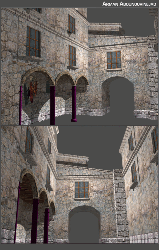
Hey guys finally decided this deserves its own Thread ive been working on this for 3 days on and off cause i had 4 other projects that i needed to get done. expect frequent updates smile.gif
I really want to make this a solid portfolio piece so harsh!!! crits are welcome, Dont spare my feelings :P

wipshot3.gif

Replies

  • low odor
    Options
    Offline / Send Message
    low odor polycounter lvl 17
    That look really good man...Maybe add some light mossy bitts here and there..maybe dirty up the stones neear the bottom. Some ivy might be a cool touch. Or a keystone in the arch with somekind of symbol on it...whatever, looking good..nice start
  • Armanguy
    Options
    Offline / Send Message
    Armanguy polycounter lvl 17
    Still very wip still need to add alot more detail, crits and ideas are welcome:

    wipboxshotitaly1.jpg

    wipboxshotitaly2.jpg
  • danr
    Options
    Offline / Send Message
    danr interpolator
    there's an obvious clash between the photosourced stone and what looks like a hand-painted job on the windows. Definitely something to avoid. While you're about it, you might want to work some semblance of reflection/glassiness (shiny or dirty) into those windows, it currently looks like they've each got solid blue curtains closed behind them. A couple of variations in the panes will add a lot too (eg cracked one here and there)
  • Tumerboy
    Options
    Offline / Send Message
    Tumerboy polycounter lvl 16
    Everything feels very busy & uniform. My eye can't find a good place to rest. I think you would benefit by making some of the areas more solid. Either plastered, or made from single, larger stones.

    Things like the window sills wouldn't be made up of multiple small stones.
  • Cubik
    Options
    Offline / Send Message
    Cubik polycounter lvl 18
    I agree with Tumerboy, it just too busy.

    You haven't given any indications as to what your poly- and texturebudgets, if you are going to use normal and/or spec maps and what game (if any) this is for so it's hard to give any more crits right now.
    I would however seriously consider modeling more middle scale detail such as windowframes, and a frame around the passage under the window.

    A couple of pictures, while they aren't exactly in the same style, they might give you some ideas.

    http://infomotions.com/gallery/rome/Images/alley_3.jpg
    http://infomotions.com/gallery/rome/Images/alley_1.jpg
    http://www.forces.gc.ca/site/Gallery/2003/photos/343AOH.jpg
  • Armanguy
    Options
    Offline / Send Message
    Armanguy polycounter lvl 17
    Thanks for the crits guys ill rework it a little smile.gif
  • Mark Dygert
    Options
    Offline / Send Message
    Looks good, I like what you have so far. Looks like its up to passing standards for most games but could use more loving on the texture front to really bring it to life. I'm not sure how you have laid out your textures but it could really use a grunge pass. Think about rain water and what it does to stone work and metal fixtures attached to the stone work. Normally where the sharp angles meet you get small amounts of plant life and dirt, which when it rains get washed down the walls and leave streaks.

    Definitely check out some alleyways for ambient objects to add.

    Good stuff so far keep workin!
  • Armanguy
    Options
    Offline / Send Message
    Armanguy polycounter lvl 17
    I changed the texture colors of all the textures and added some grunge effects also i made shutters :P still very much wip though should i keep this color or should i change it back? crits welcome.

    Untitled-1.gif
  • Tumerboy
    Options
    Offline / Send Message
    Tumerboy polycounter lvl 16
    looks better. I think a lot of the noise is in your bump, and your bump may be fine, it could just be the odd lighting you have in your scene. Try setting up a more realistic (sunlight) lighting scenario and see how it looks. It could make a drastic difference in your scene.
  • Armanguy
    Options
    Offline / Send Message
    Armanguy polycounter lvl 17
    Thanks for the crit ill take it into consideration smile.gif
  • Armanguy
    Options
    Offline / Send Message
    Armanguy polycounter lvl 17
  • Tumerboy
    Options
    Offline / Send Message
    Tumerboy polycounter lvl 16
    better lighting, but the bump still looks crazy.

    Can we see the texture you're using? I think it's too intense & too noisy, but I'd have to see it.

    I agree with the comment about the window above. You need to add at least 4 or 5 feet between the top of the arches & the bottom of the windows for the scale to be believable.
  • Joao Sapiro
    Options
    Offline / Send Message
    Joao Sapiro sublime tool
    agh bump is ruining it frown.gif add some variation, some small plants growing in the middle of the pannels, make it pop , look more interesting smile.gif
  • Armanguy
    Options
    Offline / Send Message
    Armanguy polycounter lvl 17
    thanks for the info johny ill get rid of the bump and re-post when i get home.
  • Armanguy
    Options
    Offline / Send Message
    Armanguy polycounter lvl 17
    fixed up the textures and toned down the bump maps and made some parts of the scene dirty. would love some crits on what to do next.

    wipshot7.gif

    wipshot6.gif
  • noritsune
    Options
    Offline / Send Message
    noritsune polycounter lvl 17
    rendering with ambient occlusion will make a world of difference.

    johny's suggestion about adding plant life to pop the scene is a good one. likewise, consider using more color and value variation across your big textures to create more areas of focus. with the exception of the scary black tunnel, it's all pretty much uniform color.
  • Tumerboy
    Options
    Offline / Send Message
    Tumerboy polycounter lvl 16
    Yay! looks much better.
    Things that stand out to me:

    The cobble stone doesn't look like it has a bump at all.

    I'm not sure why the sides would be brick and the "road" would be stone.

    The Tunnel needs something other than black. Doors maybe? More of the scene on the other side of the tunnel?

    The Windows need to be raised up, as it is, the window sills would be at or just above the floor level.

    The Window Sills should be 1 solid piece of wood, or stone, not made up of bricks or pieces as they appear now. I don't think that would work out very well. Same with the arches. There should be a series of single large blocks. As it is now, unless they're glued in, all those little blocks would come out and hit people on the head.

    In the first pic, the hard black line between the door and the window is very jarring. I dont' know what that's supposed to be, but it doesn't look like it belongs.

    And as stated, plants, boxes, a vendor, something needs to go into that alcove & around the street to fill in the space.
  • Armanguy
    Options
    Offline / Send Message
    Armanguy polycounter lvl 17
    aight thanks for the help great feed back guys much appreciated smile.gif
  • Joao Sapiro
    Options
    Offline / Send Message
    Joao Sapiro sublime tool
    that black hole is kinda ruining it , its like 1/9 of the image in pure black , maybe a huge ass door ?
  • Armanguy
    Options
    Offline / Send Message
    Armanguy polycounter lvl 17
    do you think a door would fit in very well in this image i might do it ? hmmmm
  • Tumerboy
    Options
    Offline / Send Message
    Tumerboy polycounter lvl 16
    personally I think you'd be better off just making it a short tunnel, and continuing your scene through and on the other side.
  • Armanguy
    Options
    Offline / Send Message
    Armanguy polycounter lvl 17
    i did a quick render is this better or worse than the black or door idea?

    wipshot8.gif
  • Thegodzero
    Options
    Offline / Send Message
    Thegodzero polycounter lvl 18
    better, only now you need to add the archway parts to the tunnel. it will help the edge and give it more of a beefy feel.
  • Tumerboy
    Options
    Offline / Send Message
    Tumerboy polycounter lvl 16
    better, though it feels like the other side of the tunnel is in sunlight, and this side is just in a big room with a bright light.

    But ya, that's what I was talking about. Keep flushing it out, it's coming along nicely.
  • Armanguy
    Options
    Offline / Send Message
    Armanguy polycounter lvl 17
    @thegodzero: i dont seem to entirly understand what oyu want me to do?can you explain it a little more thanks.

    @Tumberboy: ill keep working on this bad boy and the lighting thanks for the crit man.
  • Armanguy
    Options
    Offline / Send Message
    Armanguy polycounter lvl 17
    Made some adjustments to the textures and and tweaked the lighting.

    wipshot9.gif


    need some more crits ill probobly add some fruit boxes and italian trading cart to the scene for sure i might make some fruits too.
  • Tumerboy
    Options
    Offline / Send Message
    Tumerboy polycounter lvl 16
    what thegodzero was saying is that, on the arches on the right, you have some edging along the top (keystones etc.) but on the main tunnel, there's nothing to support the arch. Chances are, on an older building, made out of stone, the support is not internal, so, that tunnel is going to collapse.

    And on the visual side of it, the edge of the tunnel on this side, is very harsh. Look where it goes from dark to light, there's no transition. you need something to break that up.

    again, move the windows! give them some floor space upstairs. ATM it's like the 7 1/2 floor from Being John Malkovich.

    Lighting is better, and I'd leave that and your textures alone for now and move on to building accessory pieces.
  • cholden
    Options
    Offline / Send Message
    cholden polycounter lvl 18
    From what you've been doing here, I have a feeling your not following any sort of reference, but you despirately need one to set a final goal for the look of this piece. Here's some inspiration to help you set a benchmark:

    http://forums.cgsociety.org/showthread.php?f=121&t=366876
    http://forums.cgsociety.org/showthread.php?f=121&t=308066
    http://forums.cgsociety.org/showthread.php?f=121&t=215184
    http://forums.cgsociety.org/showthread.php?f=121&t=186489

    All of those are very similar to what you're trying to achieve.
  • noritsune
    Options
    Offline / Send Message
    noritsune polycounter lvl 17
    I kept looking at this scene and thinking of things I wanted to suggest, so I decided to paint them over your render instead of writing them out. I'm not saying my changes are the best solution, but maybe you can find some directions to push in by looking at them!
    pc_po_04.jpg

    disclaimer: there are some mad hacks in that paintover, faked ambient occlusion and wedding bloom among them.
  • Armanguy
    Options
    Offline / Send Message
    Armanguy polycounter lvl 17
    before i go any farther wich lighting set up do you guys like more?my previous or this one?

    wipshot10.gif
  • dkorch
    Options
    Offline / Send Message
    dkorch polycounter lvl 17
    neither to be honest...they are both pretty boring lighting schemes. I would try and go after what was in the paint over previous to this shot here...further more you should add some stones surronding the center arch way, much like you have on the door on the right...but actually make them look like stones, and do that to the door on the right here as well. the texture could still also be worked upon, right now it seems kind of flat.

    its looking cool though, it will be a great scene if you push it farther and it looks like your totally up to the task, so keep rockin it man.
  • dkorch
    Options
    Offline / Send Message
    dkorch polycounter lvl 17
    ok, I take the lighting thing back actually. if I were to use one of the ones you used, it would be the first one...but still I would push it more and give more mood to it...much like in the paint over.
  • Armanguy
    Options
    Offline / Send Message
    Armanguy polycounter lvl 17
    can someone help me with how i would go about putting up decent lighting?
  • Armanguy
    Options
    Offline / Send Message
    Armanguy polycounter lvl 17
    wipshot11.gif

    adjusted the lighting added fruit boxes made a mock up of what the arch may look like after i model it in.
  • dkorch
    Options
    Offline / Send Message
    dkorch polycounter lvl 17
    ok, well the lay out of the scene is better...however now make a t section in the road so that road doesnt look totally random.

    lighting wise, well there are so many ways you can go about it, I would just look up lighting tutorials, 3d total probably has some. the problem with your lighting right now is the lack of decent shadows, amongst other things...your best bet if you really want to learn lighting would be to study really well lit scenes. look at the paint over again haha, find out what is different and play with your lighting with really small renders, and play with fogs and try to make it look that way...I know, not what you wanted to hear, but thats the best way if you ask me.
  • Tumerboy
    Options
    Offline / Send Message
    Tumerboy polycounter lvl 16
    Here's my problem with all of your lighting thus far. Every wall in the main courtyard is lit evenly. There is no way that sunlight can light 3 walls that are at right angles to each other. At least one of those three has to be in shadow. And the building that wall is attached to will cast a shadow on at least one of the others and the ground and whatever else is in it's way. You're setting your lights up too close to your geometry. Start off with simple 3 point lighting. Set up 1 main spotlight, a hundred feet outside of the scene, pointed toward your courtyard and make it cast shadows (make sure your buildings are complete, so that the light won't go through the back sides of the walls) and put that where you want the sun to be. Then fill in with a bluish fill light to act as sky light. Start there, and see where it goes.
  • Armanguy
    Options
    Offline / Send Message
    Armanguy polycounter lvl 17
    i added an old italian market cart to the scene:

    wipshot12.gif
  • noritsune
    Options
    Offline / Send Message
    noritsune polycounter lvl 17
    hey armanguy -

    you're making some progress but it looks like you still haven't nailed the lighting. I'm a huge proponent of pushing dramatic lighting in environments; it makes all the difference!

    I made a little mock-up of your scene in maya and set up some lights to try to demonstrate the direction I would go. For the sake of the thread I'll just leave the images as links.

    1) most basic light setup of all, just a blue ambient and white directional. This is what Tumerboy suggested. I included a couple of different angles so you could see where my directional was pointing. It's very important to have that directional be casting shadows; with ray-traced shadows turned on, the scene renders like this. once I move the camera to a position like yours is in, here's the result.

    2) First problem I see is that it's clear there's nothing behind us - feels stagey and fake. To help that I added another solid wall behind the camera so that in the render, the whole foreground is in shadow.

    3) Looks nice but it can go further. I added two more lights: a point light with linear decay and weak intensity hovering in the upper part of the courtyard, and a spotlight pointing at the wall that's visible through the archway. The purpose of the point light is to give some subtle variation across the surfaces of the walls in the courtyard, as well as fake a tiny bit of ambient occlusion, if you're unable to render with that feature. The spotlight is to over-brighten the far wall to simulate a greater, brighter space beyond the arch. Neither of these lights need to cast shadows. Here's the result.

    I hope some of these suggestions and screengrabs help you! I think lighting is absolutely the key thing for you to work on with this scene. Looking forward to seeing more!
  • Mark Dygert
    Options
    Offline / Send Message
    Wow this just keeps getting better =) The archway looks really good and more realistic now. I like the building at the end of the street, I can almost see vendor market style stalls down there. I'm not so sure they do that anymore but since you have a pull cart who's to say you can't have fish and veggie stalls =P

    Crits:
    On the right side of the street the grunge on the wall/street doesn't match. I would expect to see more grunge on the ground.

    Are you sure the wall you added the arch detail to is thick enough to have a room above it? You could extend the archway toward the new buildings in the back and maybe do something kind of neat with it, like carve out a doorway?

    You should add the arch detail to the other opposite side also.

    The shadows seem kind of sharp, I'm not sure what program you are using but there should be an attenuation setting which will help soften the shadow edges. If you are using 3DS max and want to go for some really nice lighting play around with a sky light with the advanced lighting set to Light Tracer, give it a bounce value of 1-2 and it will help the ambient light level quite a bit for quick tests turn the rays down to 75 but for final renders turn it back to 250-300. It will increase your render times quite a bit but if you keep your scene low poly it shouldn't be too bad. If you do choose to use some fancy lighting I would also include an unlit version or viewport screen grab in your portfolio.

    The street seems to dead end at the new building in the background. Shouldn't there be a T junction down there? Or some kind curb or doorway? It looks like the building was dropped on the street like a house on the wicked witch of the west=P

    Suggestions:
    I'm pretty sure you will start getting to this level of detail soon so I'll toss out a few ideas.
    Electrical wires running along the outside of the buildings to light fixtures.
    - Gutters and manholes
    - Drain pipes running down into water barrels.
    - Think about how they would light the streets at night. You might want to do another lighting setup for night. Hanging Lights on chains, lamp posts, wall mounted lamps or the classic Italian wall mounted lamp with fancy iron work.
    - The window above the arch is begging for a planter box. Something kind of funky going on with the grunge/shadow there, seems to be a bit too much, but not if you put a planter box! hahaha
  • Tumerboy
    Options
    Offline / Send Message
    Tumerboy polycounter lvl 16
    Listen to the last two posts! Noritsune did a fabulous job of walking you through a basic lighting setup that will add drama and interest to your scene. You may also want to consider moving the camera, as the straight down the tunnel view is kind of boring as well, but I'd wait until you set up the lights & flush things out a bit more.

    And Vig, if you go back to other views, I think that hallway is wide enough to have a small room above it. I think in this last render it's just suffering from foreshortening. However, I totally agree it should be lengthened, and have doorways/alcoves on either side.

    And I'm still begging you to raise those windows a couple feet.
  • Armanguy
    Options
    Offline / Send Message
    Armanguy polycounter lvl 17
    how would i go about makeing realistic looking electric wires running along the walls?
  • Tumerboy
    Options
    Offline / Send Message
    Tumerboy polycounter lvl 16
    3 sided cylinders sliced up & bent around as needed.
  • Matabus
    Options
    Offline / Send Message
    Matabus polycounter lvl 19
    I'm sorry but I just have to randomly comment on how awesome the crits have been in this thread. Just awesome.

    With the lighting solution Nort suggests, this could really shape up to be a killer scene. Cropping the final render vertically when ever you get to your final presentation would be a nice touch I think with the composition you've chosen here. Something like this in Vig's example.
  • dkorch
    Options
    Offline / Send Message
    dkorch polycounter lvl 17
    t section!!! haha now lol. and ok the archway is better but the pillars holding the archway im not digging...just make it a laid in brick archway. you have it going on the right hand door...yet that you need to adjust the color on so its not the same stone as the wall its on...so it pops more...

    also on your wooden door shutters, make the little spacers I guess they would be called? make them bigger and fewer. right now your getting this weird halogram effect that bugs me, if you make them larger and fewer it will get rid off this effect and also make it look more real. also on the note of those break some of them up so they dont look so perfect and start adding some dirt to your textures. it is looking to clean right now...

    keep it going, your getting there!
  • Mark Dygert
    Options
    Offline / Send Message
    [ QUOTE ]
    how would i go about makeing realistic looking electric wires running along the walls?

    [/ QUOTE ]

    There are a few ways to do it, it depends on the program you're using

    - Splines
    - Advanced Painter Script Specifically the toothpaste paint or the line tool. It makes splines so you can control how dense and how many polys in the transitions. Great for wires. You can even make a bundle of wires render out a shot and use it with an opacity/alpha map on a single poly if you're limited for polys. The cool thing about splines is that it can generate UV mapping coordinates for you so you don't have to go back and unwrap what you made. =)
    - By hand with cylinders, this will take you a while but you can get some good results.
  • adam
    Options
    Offline / Send Message
    adam polycounter lvl 19
    Splines are a good bet for the wires. Or simply make a 3 sided cylinder and start extruding.
  • Armanguy
    Options
    Offline / Send Message
    Armanguy polycounter lvl 17
    I cant seem to get any good lighting so im going to put that on hold right now and continue with the scen just need to add a couple more things and im done smile.gif quick edit!!!!!

    wipshot14.gif
  • Tumerboy
    Options
    Offline / Send Message
    Tumerboy polycounter lvl 16
    MOVE THE WINDOWS UP!
    ADD A T AT THE END OF THE ROAD!

    LOL I'm telling you, those two things would make this whole place feel a lot better.

    The blackness of the shutter on the right is odd.

    textures (including bump) are looking better now.
  • dkorch
    Options
    Offline / Send Message
    dkorch polycounter lvl 17
    I think you still need to add alot of details to this scene to really give it life. what is that cart for? put some fruit and shit rolling out of it...or box, or hay or somthing.

    you have to add that T on the road, it makes no sense right now unless you were to put a giant gate at the end of it. but a t will give a better composition.

    is this old italy, or new italy? if new, ok keep the rain drain, but fix the stretching on it. if old, get rid of it and start adding details for old italy, if new add new italian things.

    if old, I dont like the way the window doors look...they look..well..new.

    do an ambient occlusion pass on this too when you get your lighting figured out more...it will help a butt load.

    the walls past the firt arch way you can see there tiling enormously, break that up some how.

    the piller on the right hand side that has the drain going up it, doesnt make sense because it looks like an obvious cube, yet it has worn out stones as its look...either break up its siloute, or make the stones work more for it.

    the forground windows, dont look like windows.

    are you going to do any normal mapping? it could help a ton with this scene since your trying to keep it low poly.

    anyways, hope you get some of the things im talking about. your getting there, but you just need to experiment more, and not be afraid to add more stuff. remember, your going to be judged more on your eye for detail. and if you can mix that with low poly skills you will get a job easy. but you really have to get in there and add some more stuff and pay attention to some of these crits that others have been giving.

    the scene is doing great though, just keep at it and you will really have a great piece to shine with! keep it up!
  • Armanguy
    Options
    Offline / Send Message
    Armanguy polycounter lvl 17
    thanks for the crit i just messed around with the lighting all night this is the best i got frown.gif

    wipshot15.gif
1
Sign In or Register to comment.