Geisha Girl
polycounter lvl 17
Hey, thanks again for the advice guys I think I've made alot of progress since last time. especially digitally.
Right now I'm painting a geisha girls, this is still a WIP as I still have a hand holding a fan to paint :].
here she is, note she is not in full makeup, I used a photo ref from a screen capture of Memoirs of a geisha movie.
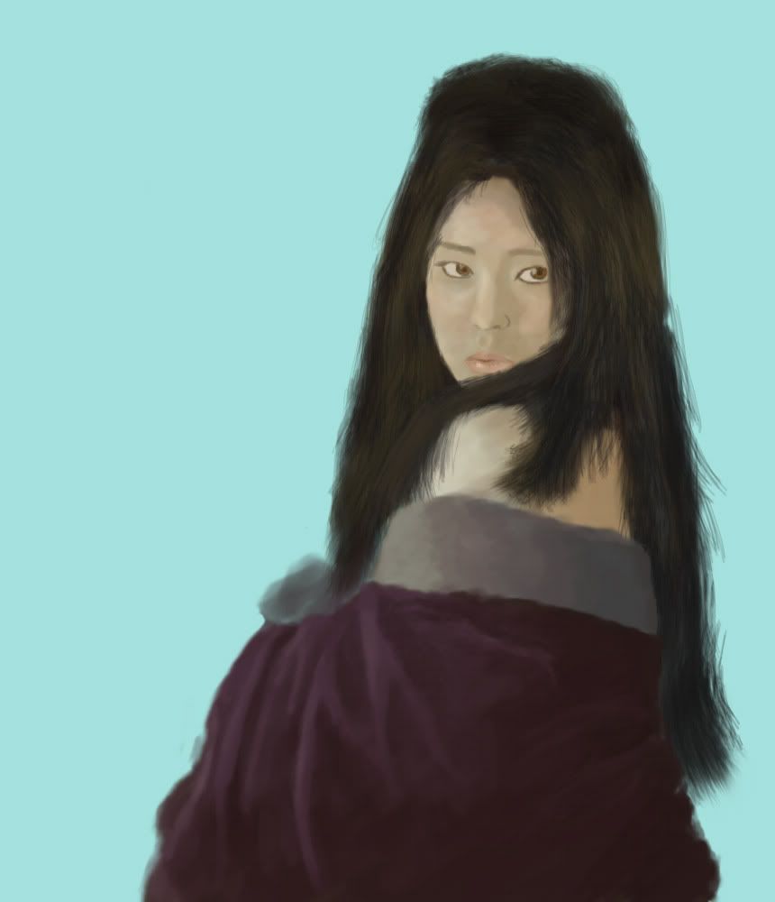
The hair needs to flow more .
.
I also tried adding some colors to the face IE olive green light blue pink in the forehead etc but I think I'll need to do another round of that.
fire away
Right now I'm painting a geisha girls, this is still a WIP as I still have a hand holding a fan to paint :].
here she is, note she is not in full makeup, I used a photo ref from a screen capture of Memoirs of a geisha movie.
The hair needs to flow more
I also tried adding some colors to the face IE olive green light blue pink in the forehead etc but I think I'll need to do another round of that.
fire away
Replies
my hair kinda flows out of my head, don't know about anyone else.
I'm not sure you quite captured the likeness. The face shape is quite different. It might help to grab some other references of Michelle Yeoh without all her boofy hair and the soft lighting.
Also the actress' name is Gong Li (also in Miami Vice!) ... you probably know that
@Jack Although I'm not going for likeness I am planning to define the cheekbone more, I should probably use the horiz flip trick to catch any oddities.
@ Noritsune I think thats the slight differences in the position of the eye, chin level and angle of the eyebrows. If anything, the maker of the game (who actuallylives in japan) asked for "subtle signs of violence" i believe... I'm still working that into the painting, possibly might be in the background if i decide what I want.
@ Hawken : I agree totally. I have little experience with the "hair brushes" I think I might do the hair over again, its 2 seperate layers. I'll sleep on it.
not sure what to do with the background, its for a loading/title screen i believe. I'm doing several more.
i was thinking a scroll or something... not sure at all yet.
heres the almost finished piece.
Also the actress' name is Gong Li
[/ QUOTE ]Gah, I knew that. Lack of sleep is making my brain go mushy.
Your facial structure looks ok, but don't be afraid to use a wider range of value to create more depth. Same with the hand. Actually, the hand doesn't look like it's firmly gripping the fan at the moment. You may want to change that before adding in additional details.
I'm also not a big fan of the background color. The pose reads as mysterious but the background looks like a bright sunny day. They don't go well together.
seriously tho, if you start trying to lay down big juicy shapes that make up the elements: face, hair, clothing, AND start pushing contrast and color...you'll learn a lot faster. don't be afraid to get in there and get messy.
i recommend this: ...give yourself 5 minutes and block in the major elements. then do it again and again. it will help LOTS!!!
KEEP AT IT.
Got a little carried away with this. Consider it a Concept Tag?
The biggest thing it's missing is value contrast. The eye will evaluate value before hue or saturation (which the piece also seem to be missing). You can have all sorts of crazy colors over your geisha, but if the value within that color doesn't obey the form of the figure, it will look wrong. So my advice to you, don't be a pussy. If you think the face should have pink in it, then by god, put some pink down. Don't fiddlefuck with opacity and just barely get some color contrast on there. I'm doing the same thing by trying to push things to the limit, giving your brain abit of a slap. I know it can be hard to realize sometimes, but there are things in Photoshop that can help open your eyes (like the adjustment layers).
First thing that was bugging me was the monochrome colors. All I did was throw on a Hue/Saturation Adjustment layer and crank up the Saturation. I don't know how well versed you are in Photoshop, but on the bottom of the layer palette, the fourth button (looks like a black and white cookie) has all kinds of adjustment layers that you can adjust whenever instead of the permanent change Image -> Adjustments does. I also painted in an alpha on the adjustment layer to tone down the Background as it was an obnoxious blue.
Try not to get all scratchy/blotchly with the colors. Grab a color at 80-90% opacity and start blocking things in. The hair especially looks really chaotic. I think a few well placed rake brush strokes would look better over a solid dark brown instead of haphazardly crisscrossing over other raked strokes. There is more to contrast than value. Sharp vs Blurred, Solid vs Sketchy, Warm vs Cool, Many vs Few, Simple vs Detailed, Blobby vs Hard. When you have lots of the same looking brush strokes, it starts to lose its punch. I also thought the skin was too yellow at that point, so I made it redder and in the process, turned her into some American trash. I did this by going to the Adjustment Layers at the bottom of the palette and going to Curves. At the top I switched to RED (because I want it to be warmer) and played with the curve until I got what I wanted. Word of warning: be gentle with the curves. Too much will do some crazy things with the colors. (...could be an interesting way to get some abstract colors and shapes for starting paintings, have to give that a try)
Next I did the same thing to the skin that I did with the cloth and hair: grab some colors, blob them down. Unfortunately, in the process I turned her from a geisha into American trash
More playing. Eyes looked a little googly. Realized I hardly touched the border thing so same procedure of blocking in the colors. Little more contrast in the face. Blue light in the hair. You'll notice I barely touched the cloth...I still suck at cloth....you enjoy that. I still think the face could use some more contrast, but I'm a pussy.
WORDSWORDSWORDSWORDS
Hope that was helpful and not just ranting information overload.
Check out Prom's Art Tut if you haven't. Lots of great information and examples.
EDIT: MOVING PICTURES!!!!
(first gif...hope I did that right)
Thank you so much, I really dont know what to say.
I really am a color/contrast wuss
I'm about to throw it down :P.
I think the problem was I only tried contrast in moderation... and that doesn't work there has to be contrast within every light and shadow and it wont look right until there is. I was reluctant to see it through to that point but I'm glad you guys are giving me the time of day I think this will turn out so much better than I first imagined.
Thanks again I'll be back with a tricked out geisha!