More forsaken stuff...
polycounter lvl 18
Latest update from the mod team i'm on at our webpage.
Here's my latest stuff for them.
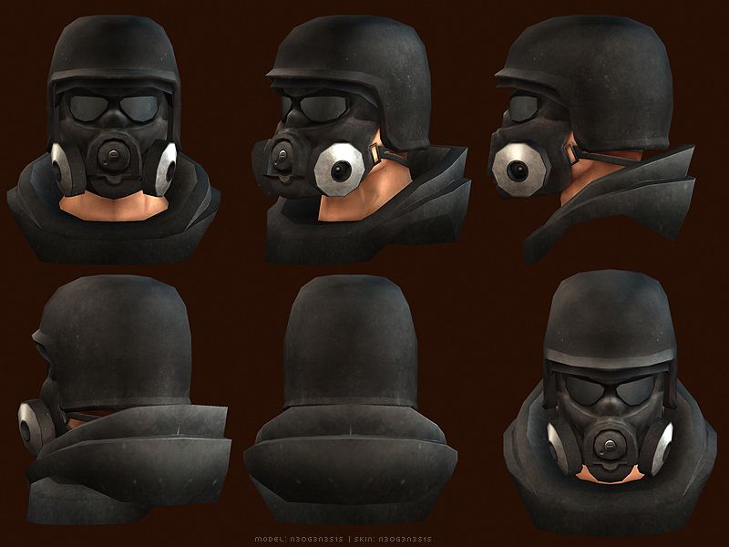
We're working towards alpha testing so i've got alot on my hands right now, I know the vest sucks... I'll probobly be going back later on during beta and reskinning the whole vest.
[edit] Oh yeah, were in the february issues of PCGamer US(special mega shoot edition or something)and PCGamer UK. Look for us if you're subscribed.
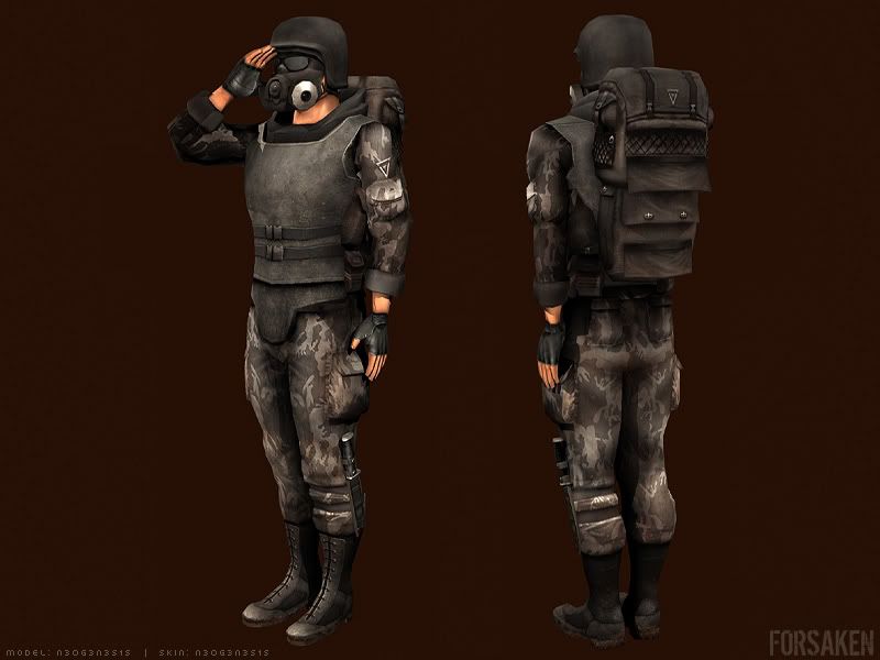
Here's my latest stuff for them.
We're working towards alpha testing so i've got alot on my hands right now, I know the vest sucks... I'll probobly be going back later on during beta and reskinning the whole vest.
[edit] Oh yeah, were in the february issues of PCGamer US(special mega shoot edition or something)and PCGamer UK. Look for us if you're subscribed.
Replies
The lines between his fingers look way too black, makes his fingers look cartoony.
You're right about the vest, it looks pretty boring right now... although it also looks like it's solid, and basic enough to be good armour - not everything has to have little clips and glowing bits everywhere to be practical in a war zone
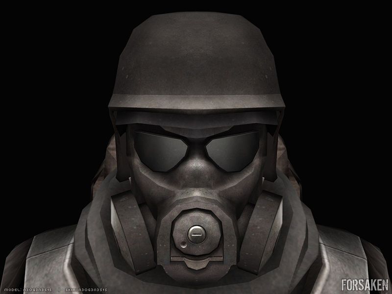
I'd maybe throw a little more colour variation into the metal/plastic on his helmet. Is it gonna have environment maps to better indicate which materials are which? A good spec map would go a long way to making this look really "real" ... good work.
MoP
Yep, the helmet has a spec map on it, and it does reflect what is around it. I'll get some ingame shots of it soon.
You're right though... i think sometimes when you (generalized you) are working on a character like this and its a warzone character... you really don't need hundreds of little bits and bobs. It looks great as a show piece but alot of the time its lost in the action of the game anyway. I do however want to improve this later, just concentrating on getting it out there you know?
Ridiculously minor anatomical crit though. Really nice work.
I'll definantly tweek that.
Tight model/texture. I agree with Daz about the neck thing. I might even pull that edge back further than what he illustrated but that's probably just a stylistic preference.
I personally like the vest. Has a nice dull metalic feel to it. My only crit would be that that upper strap on his lower torso seems off compared to the lower strap. Other than that, maybe just some minor scraping and erosion would look cool.
Overall, a nicely detailed texture map. Like the boots too.
Good luck with the game
-Demon
I'm liking the way it is overall. Texture work is really nice, but head area over all is too dark. The highlights help but the actual color of the head is too black. Maybe make the helmet a little lighter, similar to the vest. That way not only does the real "armor" parts of his clothing match but it'll be easier to sparate the gas mask from the helmet.
But on the other hand the envShader alone will add the same effect i guess (colorvariation).
thanks.
Keep up the good work buddy.