Cyberpunk Street [Unreal Engine 4]

polycounter lvl 11
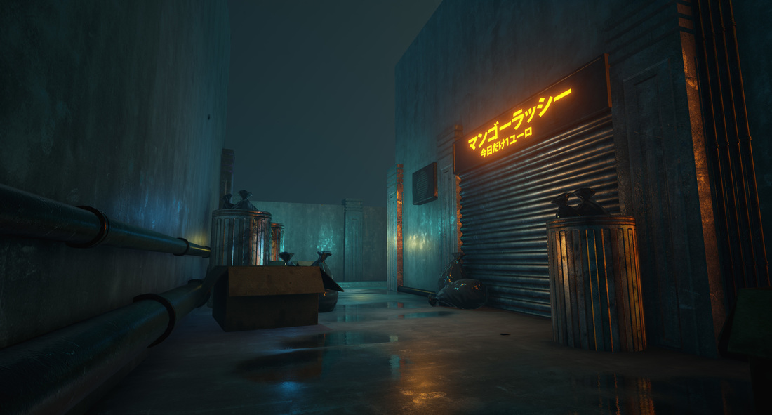
Latest progress:
Hey guys!
So after getting some (really helpfull) portfolio critiques here on polycount, I decided to do one more portfolio piece before I start applying for environment art internships.
Since I really like cyberpunk/sci fi stuff at the moment (and I have nothing scifi-ish in my portfolio) I decided to create a dystopian-cyberpunk street focusing a lot on lighting and atmosphere.
Moodboard:

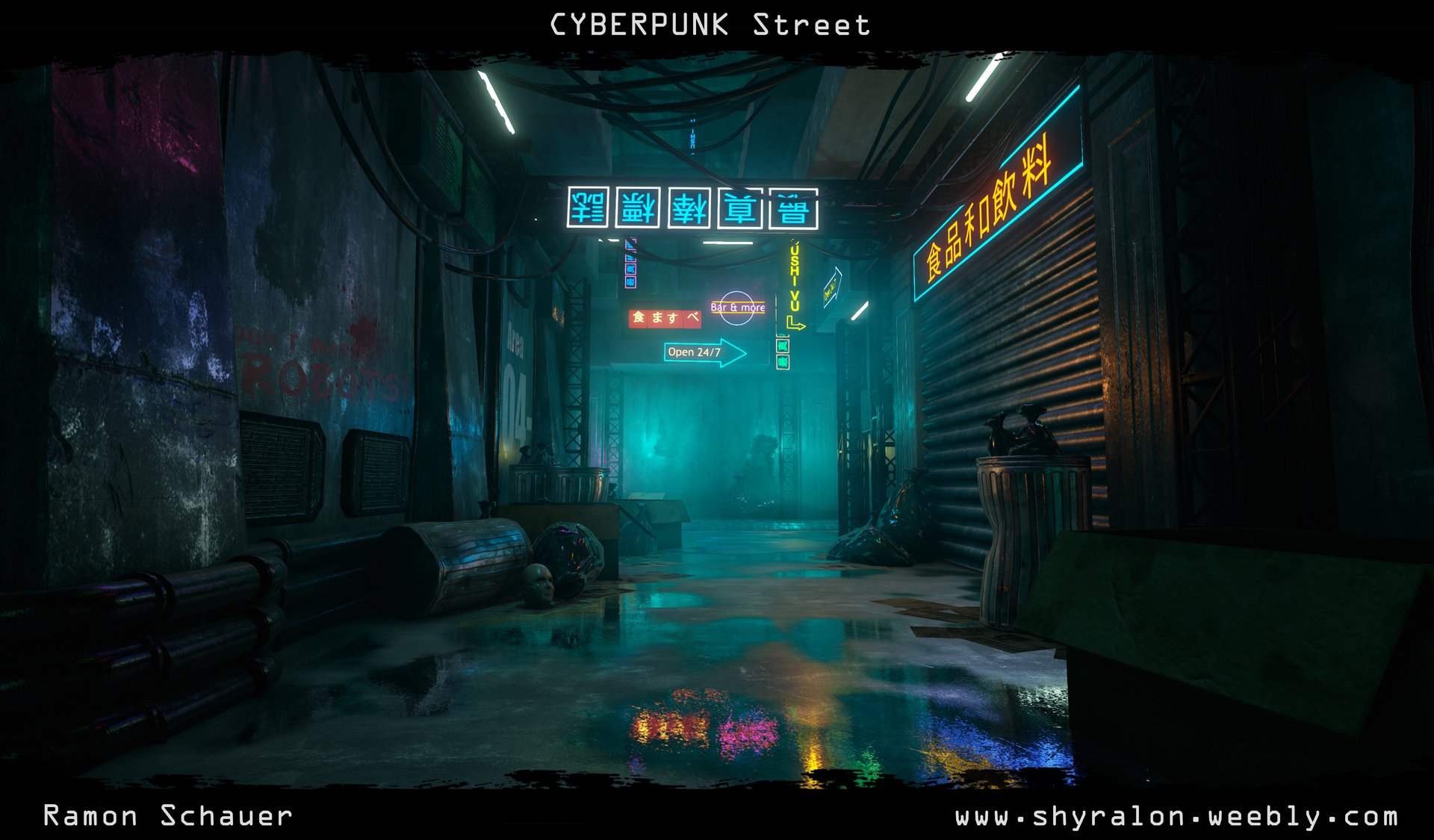
Main colorscheme is supposed to be a greenish blue with some red/yellow/orange accents. Obviously rainy scene (I even plan to create rain particles, but no idea how to do that yet) for the dystopian atmosphere.
First Assets:
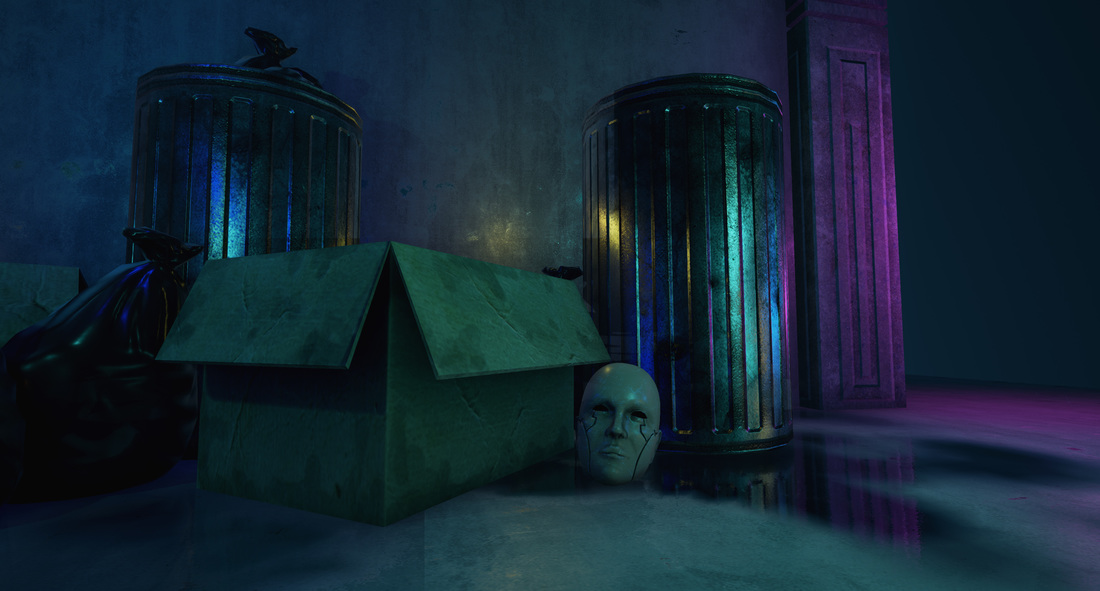
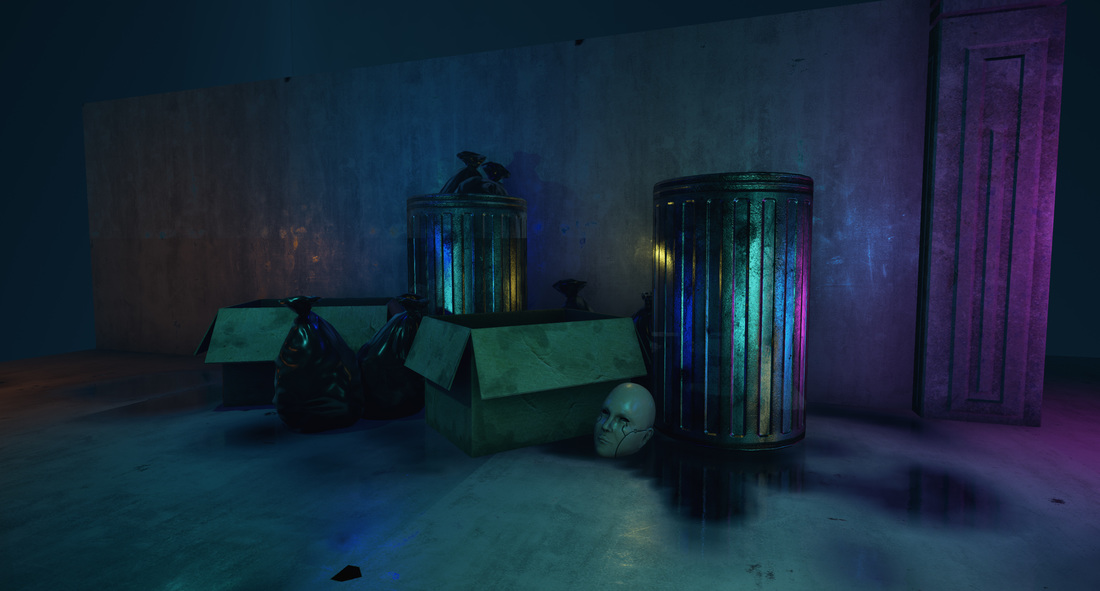
Some of the first assets I created. Lighting is very WIP. The android head is supposed to be a thrown away android kinda like in the moodboard, which is supposed to serve as focal/storypoint of the scene.
Current:
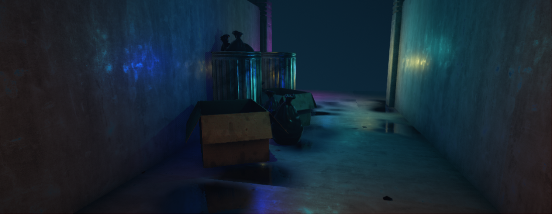
Tweaked the lighting a lot, now I'm far more happy with it and it's much more going into a final direction. Also added a few more assets. Pillars are most likely placeholders for now.
Next I want to start pumping out assets to make it more detailed, but I'm kinda struggling about finding good assets to create except the obvious ones. So if you have any ideas, go ahead and tell me")
And as always, every help, advise and critique is HIGHLY appreciated, since I want to use it as a portfolio piece and therefore plan to polish it as much as I can.
Hey guys!
So after getting some (really helpfull) portfolio critiques here on polycount, I decided to do one more portfolio piece before I start applying for environment art internships.
Since I really like cyberpunk/sci fi stuff at the moment (and I have nothing scifi-ish in my portfolio) I decided to create a dystopian-cyberpunk street focusing a lot on lighting and atmosphere.
Moodboard:
Main colorscheme is supposed to be a greenish blue with some red/yellow/orange accents. Obviously rainy scene (I even plan to create rain particles, but no idea how to do that yet) for the dystopian atmosphere.
First Assets:
Some of the first assets I created. Lighting is very WIP. The android head is supposed to be a thrown away android kinda like in the moodboard, which is supposed to serve as focal/storypoint of the scene.
Current:
Tweaked the lighting a lot, now I'm far more happy with it and it's much more going into a final direction. Also added a few more assets. Pillars are most likely placeholders for now.
Next I want to start pumping out assets to make it more detailed, but I'm kinda struggling about finding good assets to create except the obvious ones. So if you have any ideas, go ahead and tell me
And as always, every help, advise and critique is HIGHLY appreciated, since I want to use it as a portfolio piece and therefore plan to polish it as much as I can.
Replies
Also what is mangorush? a drink?
There seems to be a lack of sense of scale in your scene, the trash cans/pipes/boxes make your door look miniature if you compare them... I'd definitely shrink down the size of them.
For the time being since there still isn't much it's hard to critique in detail but the shaders are looking nice so far (Y)
Fixed the proportions (or at least changed them, will maybe tweak them more when there are more assets to compare heights).
Also did a few more smaller assets in general and a blockout for the houses, which will go more into a sci fi slums direction.
The video on the advertisement screen is just a placeholder
And Papigiulio, yeah it's a drink, don't now if google translator did his job right, it's a reference to our local sushi guy
Cheers!
Houses are still blockout, just applied my street texture as a placeholder.
Currently not too sure how to make the transition between walls and houses..
Considering the input of Doomathon , I think the new occlusion mask in 4.9 would help you to add more grimes and dirt where the ground touch other objects !
1. Your mood board shows city streets, major arterials, festival settings, plenty of humanity. Your project is a microcosm of that: a t-intersection in a claustrophobic alley. That's not a bad thing at all, smaller means you can lavish each individual part with love, but in light of your reduced scale it might be a good idea to update your board to better match the direction the piece is going, so that way your influences are bouying your work, rather than quietly suggesting you're heading in the wrong direction. You can influence your board just as it influences you. I would REALLY recommend looking up Kowloon to see what you've got now, only played out in real life: Kowloon Walled City. From there you just need to spray on some miami neon and chinese signage and you're cyberpunk as fuck.
2. The lighting and framing of your setting makes it feel more like a hallway than an alley thanks to the sameness of the color and tone across your surface. The tv screens on the far wall are so bright they feel like a window at first glance. I'd start by getting some different materials on the walls to separate them from one another. A skirt of tile or dingy white paint would do nicely. From there you could add a drainage line down the middle to give a stronger sense of the outdoor filth, which would also break up the shape of your floor. Maybe some caution-striped, concrete bollards protecting a doorway? A modded up moped?
SUGGESTION: To increase the sense of space without much work you could get that camera angled up! Throw in a shit-ton of wires and electrical boxes. Some brighter lights filtering down from above. rather than the intense light from the front, would enhance the vertical nature of what you've got so far. If you really want those TVs though, consider throwing some static on their screens so it's clear that they aren't a window. It would also reduce their brightness allowing your existing signage to fill the scene better, and give you room to have lights filtering in from the of screen areas of the intersection, further suggesting a wider world than we can see.
Hope this helps, you've got a good start. Just a few tweeks and you'll have something great!
They are actually super simple! just a vertex Paint material with my floor and a black material with roughness of 0 and metalness of 1 for the vertexpainting. I think what really makes the relfections nice is the Screen Space Reflections option and the Distance Field Ambient Occlussion (DFAO).
And also a box reflection capture aswell as 2 smaller sphere reflection captures for important spots.
DiHydro and Stinkhorse, you guys are both right, and I have an updated moodboard/references, just didn't ipload them.
And Thanks a lot for the Kowloon Walled City inspiration, it's awesome! will base it alot more on that. Also removed the TV thing, because you are right, it kinda changes the atmosphere.
When I have more assets in there I will do more lighting passes, also with some fog and so on, but for now I want to focus on creating more detailed assets, before I do finetuning ::
What I did today is (unfortunately not much) a blueprint for splines, so I can place wires and change them individually in the editor.
Also started working on a rain shader, which is just put onto a plane. Not really happy with it, the drops are too big (well, atleast that can be easily adjusted) and all in all it might just be better to go with particles, not too sure about that yet..
First of all, I took out the rain since it's really distracting at the moment and I have no idea right now how to make better rain.
Placement of the wires still needs a bit more work.
Also somehow messed up the reflections, will take a look at them tomorrow.
Still having problems to think of some fitting objects for the scene
The hanging wires could use a terminal or plug of some sort to be grounded to. Right now they crash through the walls.
The key to a good cyberpunk environment is Used Universe principles applied to the scene. Take a look at Bladerunner and study how each asset has a layer of grit to it that sells the idea that the asset has been around for a long time.
Id like to see more trash and grime on the ground and maybe something more on the walls, like graffiti, posters or damage decals.
Some other ideas:
A camera or two overlooking the alley.(could also plug some of those hanging wires to them).
A holographic ad billboards on the wall.
I'd like to see a door to maybe some electronics shop in that clean concrete wall at the end of the corridor(top image) with some more neon/holographic ads for it like "Joes Electronics" or something.
And of course lens flare the sht out of it 8)
Also did a second trashbag, but I'm not too happy with it, will do it again tomorrow, as well as some kind of socket, where the wires on the wall go in..
And I really like the surveilance camera idea, will keep it in mind
my critiques on this so far,
So far this is starting to drift off the setting you were setting out for imo... it's starting to look more like inside a factory warehouse than a street? I'm still trying to pin point what exactly it is that's throwing it in that direction but apart of me is thinking it's because of the lack of anything that resembles features of the exterior of a building e.g. windows, ventilators, etc that a cyber punk style city would have?
Also the lack of any essence of sky being present makes this almost look interior to me.
Maybe the angle isn't selling it well or I'm just a little eye biased since I'm based in Hong Kong and a lot of animation/games studios out here are setup an industrial factory complex and actually look a lot like this which is probably why it strikes this look so harshly with me.
Either way, in terms of execution of models and setup things seem pretty solid (Y) just concept /composition issues for me.
The trash bags could be a little less glossy though, it looks more like latex than a plastic wrap.
Keep going (Y)
blur and grunge the "area 4" a bit and it should be fine, but the "don't waste robots" looks out of place to me
I mean I can't really imagine what kind of writing object one would use to make that, it looks like a really big marker but in real life a marker on such a porous and wet surface would be streaky as hell
it would be more logical to do it with spraypaint
also you can add some variations in the letters, i suggest you do it by hand and not with a font. this can tell a story.
for example good writing for the "don't waste" and it could become more rushed towards the end of the word "robots" because the guy who wrote it got spotted by police and had to run away.
you can make the end of the letter S "fleeing" in one direction as if he started to run while he was still applying paint
I adjusted the dont waste robots sign a bit, add some dirt decals to the walls, fixed the scale of the head, created more advertisements and added some newspaperpages lying around on the ground.
I don't know why, but there are some weird artifacts in the screenshots. Ignore them for the moment, since it's only a WIP, I'll fix them later.
Cheers!
I think the most significant contribution at this point would be to work out a more solid composition; currently it feels like there is a lack of a focus, or anywhere for your eye to travel. The lighting and neon signs you've added at the end of the street help draw the focus there a bit, but there isn't enough distinction between places of visual noise and rest.
I think you have the start to some good approaches; I think the wires and the sloped columns are breaking up the vertical and horizontal lines in your scene, but I think they could be used to better frame whatever it is you choose to be the main focus in your composition.
You have very solid materials! Looking forward to your future posts.
Anyways, continued working on my rainshader.
Now much more happy with it
Still using an animated texture on 3 planes, I'm planning to create a blueprint which will attach these 3 planes as a billboard to the playercamera, so you will always see the rain
subtly is key, so a little bit of rain to sell the effect is already enough.
All in all I'm quite happy with how it turned out, learned a lot about shader creation.
Main thing I want to do different next time is work out a better composition before starting and do more planning in general.
Lighting only:
Thanks, even though the scene is over one year old already - by now I would change up a lot of things, maybe I will do something with a similar setting again in the future