Wills and Wonders screenshots; likes and dislikes

I took screenshots of my game, Wills and Wonders, and looking for feedback on things you liked about them and/or things you disliked; and also very open to suggestions on ways to improve. Looking forward to feedback, thank you for taking a moment to look them over.
The saved games screen.

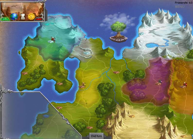
The world map.
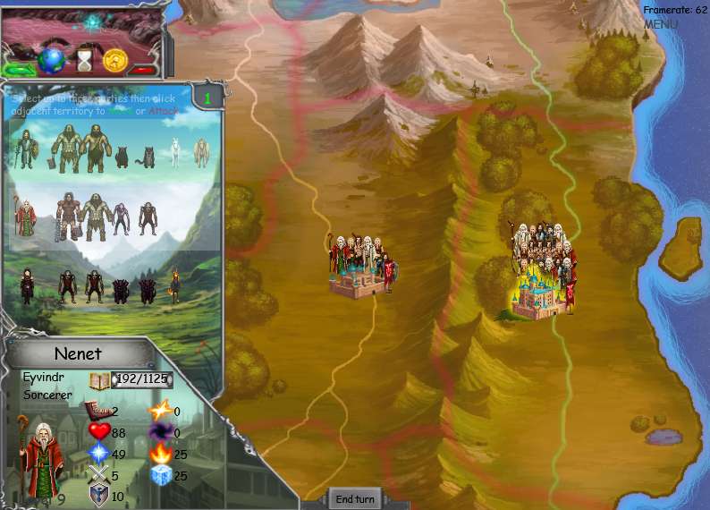
When accessing a territory to move or attack this party selection menu appears.
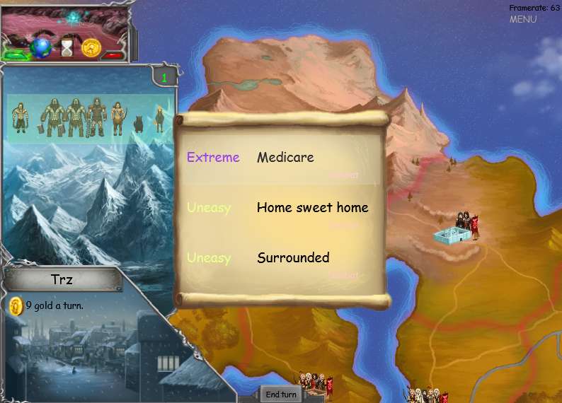
When choosing a quest.
Inspecting a territories parties and items.
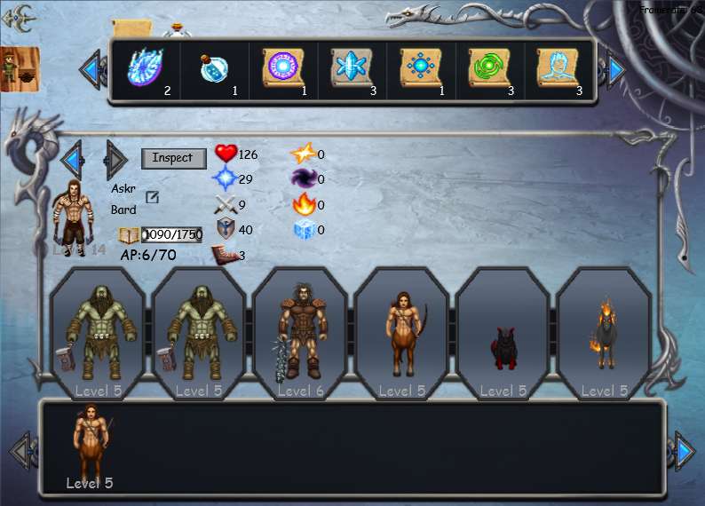
Inspecting a party leader or member.
Upgrading a character.
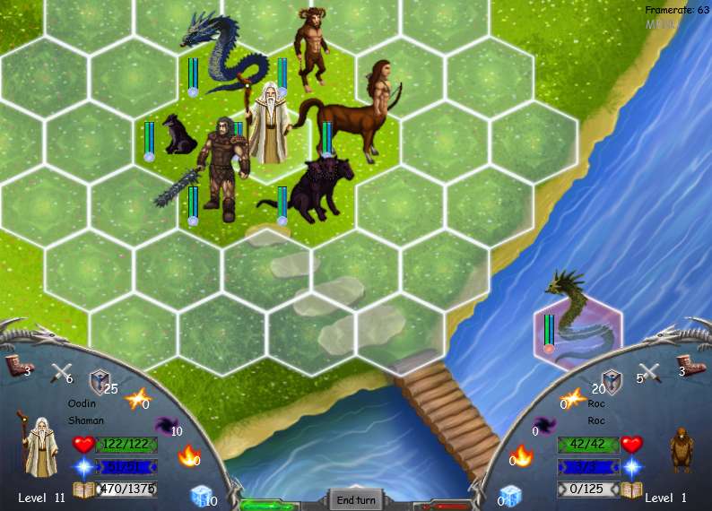
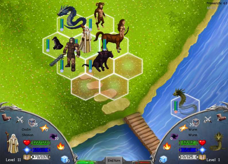
Character movement selection.
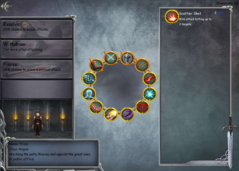
Character's combat ring and on hover tooltip.
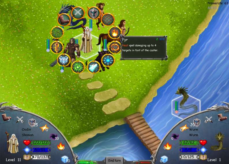
Character's combat selection.
The saved games screen.
The world map.
When accessing a territory to move or attack this party selection menu appears.
When choosing a quest.
Inspecting a territories parties and items.
Inspecting a party leader or member.
Upgrading a character.
Character movement selection.
Character's combat ring and on hover tooltip.
Character's combat selection.
Replies
its the repeating random noise textures and the bevel all the edges kind of look Im not really feeling. Im talking about menus and buttons mostly. also get proper fonts, and dont use the same font for titles.
Take a look at say Hearthstone or Diablo for reference,
as an indie developer myself, I know how hard it is to give as much love to the GUI as you do to the rest of the stuff, its easy to just go "well shit we need some buttons here or the game wont work".
I do this too, but you really have to think of the GUI as just as important as everything else, every button, every icon, every frame, every piece of text should look great. You are only as strong as your weakest link.
in short, if your art looks amazing, but the GUI (or sound for that matter) is bad, your game is bad.
Saved game screen:
The text "Click to start a new game" get lost in the background texture. The X buttons in the corners also suffer from this. Perhaps this screen could benefit from some sort of strong visual indication that there is a button. Since all three elements on the top, middle, and bottom have the same frame around them i just assume that they are either all buttons or all static visual content. Don't be afraid to use some bolder colors as well.
The world map:
I like the look of the map, but the indication of specific areas to click on is very weak. I'm assuming you click on the small brown objects to move to that location? Also, what purpose does the slanted frame serve in the bottom left? If there is not one, then you should remove it. This screen also is subject to my previous suggestion about increasing the visual indication that there is a button. The "Menu" button is almost not visible at all and the end turn button is so small It's hard just to click. I'm also a tad confused on what the box in the upper left is, though I'm assuming it would be more apparent had I played the game. The world map has a lot of potential, but it really just needs some coherency and visual hierarchy.
Territory screen:
Aha, I can now see that the small brown objects are castles. I'm going to agree with Lotet about the fonts , choose something extremely legible that shows up well in multiple resolutions and use a variation or complementing font for titles and important text. The illustrations within all of the frames are nice, but for the sake of readability they should be toned down. In Lotet's Diablo example, the screens still have texture, but it is barely there and complements the text and buttons, it doesn't compete with them. I can now also see the use of those slanted rectangles, but maybe that is not the best shape to display all of that information in; just a thought.
Quest screen:
Again, good potential, but it has a ways to go. The colors here are somewhat blase, dull purple and barely visible yellow. Also There is a word on the right side of each quest that I can not read at all. If this word is important make it readable; If it is something that is used a lot consider turning into an icon. The difficulty and quest name are different colors, but the are still the same font, making it difficult to determine what I'm looking at. Try adding labels to the top and / or changing up the colors / typeface / size for one.
As i now feel that I'm repeating myself quite a bit I'll try to condense my comments
Inspecting territories / parties / items:
Give some indication of what is selected, a gold frame (or something, anything). Label the categories (Items, heroes, territories, etc.). Tell what the items do (on hover?). I can't read the level text of the the current hero (I think his name is Askr?). Name and specialty has the same presence on screen, one should stand out.
Inspecting party leader / member:
Labels please, i have no idea which categories are which. Also, what is the giant circle of icons in the middle? Items?
Upgrading a character:
Far too much text. What am I upgrading, besides their character descriptions? Stats? +1 dmg?
Character movement selection:
Circles are the most inefficient shapes for displaying information inside. What happened to the rectangles? Is that information needed all the time? The Wiz's health bar is being covered by the giant spiky mace guy, should it be overlayed or maybe horizontal? Think about what you really need to show and be consistent.
Combat ring and hover tool tip:
It would bee cool if you could show the range of what you are hovering over. Will you be implementing hotkeys? Beginners may need tool tips, but seasoned players want efficient, clean interaction.
Character combat selection:
"Choose an enemy" would be a good tip to display. I would like to see the range of attacks before I select a method of attack, as I said of the previous screen.
In summary
- Stronger indication of interactions (i.e. buttons)
- Bolder, more readable colors
- Legible typefaces
- Visual hierarchy
If you want really awesome reference for a mechanically similar game I suggest you play Massive Chalice. Their UI is simple, but robust and the game is really fun.
Your pixel art is really pretty but everything else feel like you didn't have enough love for it.
lol Odow, what font would you recommend? I was trying to stick to basic fonts shipped with windows, as I try to find what font I should use.
remember you probably want more then one font. at least one for normal text thats easy to read but still capture the feel of the game. and one for buttons and short texts, such as "critical hit" or click here" and the likes. this font can be more epic and have more of the games style embodied to it, since its mostly used for shorter phrases or even single words.
here is another example for diablo
http://www.blizzplanet.com/wp-content/uploads/2013/11/diablo-iii-change-game-button.jpg
look how the "shadow of the desert" line and the buttons are written in the classic diablo style we know and love, but the actual info text is a lot simpler.
Let me know what ya think of the new fonts.
Your game is very heavy on text, so it has to be the priority.
The 'Delete' button is basically the main element on this last screen. That would be one of the last options I want to do if I was playing. How about a "Resume Game" button as the main focus ("call-to-action" is the marketing term). And still, that font...
Quick example with some font adjustments:
Your 100% correct about the resume button and this will be added. In the previous version of this screen the user would simply click anywhere within the frame. I can see how it seems odd with this new layout. Thanks Shawry.
Going to change the entire UI enlight of the discussions here; the saved games screen is the first step in that direction. I'm sure you will like the new fonts as well as the new way the font rendering is handled. Once I make some more changes to the saved games screen I will post it here.
I also made some changes based on Shawry's recommendations.
Any suggestions to further improve this screen are welcome, thanks for all the great feedback everyone.
Thanks, working late on improving the visuals of the story quest aspect of the game and couldn't help tweaking the previous screen some more. I'll post a scene when it's finished.
http://www.kickstarter.com/projects/1582571627/wills-and-wonders
- Use 3/4 portraits or turn your sprites to 3/4 as often as possible. Right now all the staight-on views of the sprites doesn't do the game justice and makes it look like a cheap flash doll dress-up game
- Use bitmapped fonts with shadows (can't go wrong with metallics like brass). This can be done really easy in PS and angelcode's bitmap font generator. Otherwise you need to hire a UX artist.
- Hire an environment artist or at least create BG art with darker/faded/mature theme to them so that the sprites are easier to read and fit the game. Right now they are so simple and bright they look more at home with a Powerpuff Girls game. Take a look at Final Fantasy 6's battle BGs or even Chrono Trigger's stylized moodiness. Probably the easiest thing to do is just convert photo textures to pixel or painted art.
GL man!
- Just overhauled how the text is handled recently so that is ready to go.
Can you give me an example?
- Do you like the style of the BG otherwise? Basically add more detailed terrain?
Thanks for the feedback.
Very easy to read, simple and professional. Easy to add colors like brass, etc. Or a slight shadow for increased readability:
Here look at this ugly screenshot of Diablo 2--notice how all the colorful characters and items pop from the BG. It's not just the detail but the colors:
Another example from Castevania, notice how dark/faded colors create depth:
- Sort into schools
- Build your own wand
- Have children wizards as playable chars
- Similar spell to petronus or whatever
- Tell people it's inspired by HP
If you're trying to compete with say Age of Wonders or more mature strat games you're going to have an upward battle because they have plenty of AAA art and high expectations.
Wills and Wonders is now available on the steam store for early release. Follow the link below or give us a search on your steam client. Thank you for the support and we hope you enjoy the game.
http://store.steampowered.com/app/513060/