My foray into purely digital concept art
I'd previously only really used Photoshop to colour in line drawings, but I've been branching out into actual digital painting over the last few months.
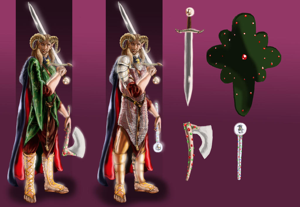
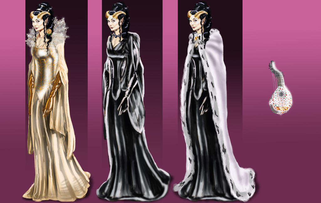
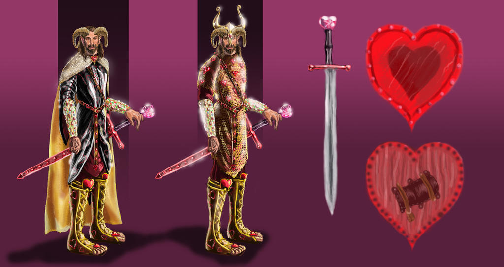
Here are some concepts inspired by The Worm Ouroboros (1922) by E.R. Eddison. All the faces are painted from references of some sort, which is why they tend to look better than the rest of the bodies. I'm working on that.
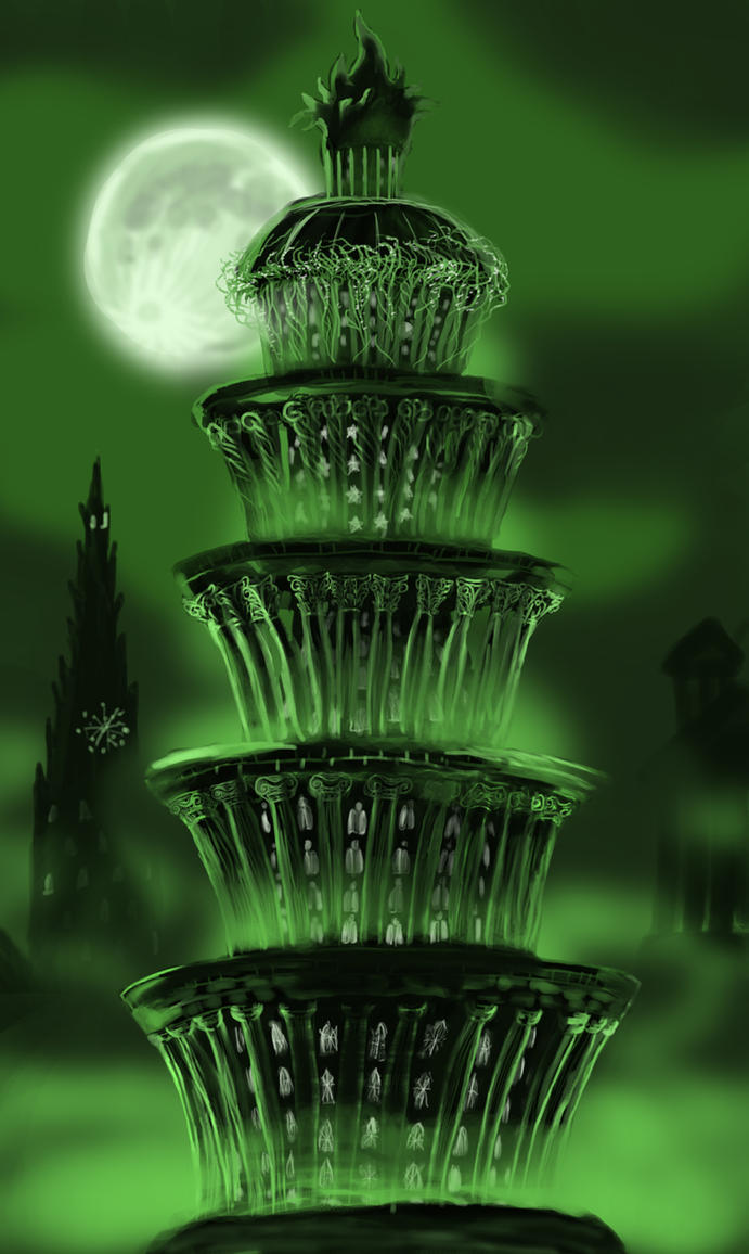
And, an environment, which is way out of my confort zone.
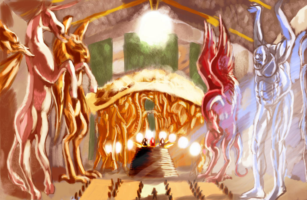
My main problem with this one, I think, is that I was working from a very specific description from the book that had weird elements I found hard to work with (giant columns made out of single flawless jewels carved into the shapes of mythical monsters), which, combined with my lack of talent when it comes to backgrounds, made it very difficult to visualise.
That one made me realise that I need practice with scenery and architecture, so that's what I've been doing lately.


Obviously, I need a lot of improvement. Any suggestions?
Here are some concepts inspired by The Worm Ouroboros (1922) by E.R. Eddison. All the faces are painted from references of some sort, which is why they tend to look better than the rest of the bodies. I'm working on that.
And, an environment, which is way out of my confort zone.
My main problem with this one, I think, is that I was working from a very specific description from the book that had weird elements I found hard to work with (giant columns made out of single flawless jewels carved into the shapes of mythical monsters), which, combined with my lack of talent when it comes to backgrounds, made it very difficult to visualise.
That one made me realise that I need practice with scenery and architecture, so that's what I've been doing lately.
Obviously, I need a lot of improvement. Any suggestions?
Replies
I love this book, and love how you've visualized the story. I'd be curious to see how your stuff would be with a less air-brushy look (i.e., some harder lines?). Cool stuff. I would just say continue to refine your stuff.
As an aside, Have you read The King of Elfland's Daughter by Lord Dunsany?
Oh, the last image in my post there, the Thark caravan from the John Carter books, has been updated. I was experimenting with photo-textures, which I had never used before, and decided to use a free lichen texture for the yellow moss-like vegetation from the book.
Better? Worse?
It's still pretty saturated. I'll try working on that too.
One critique that might help is the same I gave to another artist yesterday, concerning the value range of objects in certain lighting situations.:
http://www.polycount.com/forum/showpost.php?p=2228000&postcount=7
Also, one thing that will help sell the painting is your cast shadow, right now it's just sitting under him, but the light is shining strongly from the right.
Keep it up!
My take on Tars Tarkas of Thark from the Barsoom novels that I did yesterday instead of working on stuff I was supposed to do. I think this one's kind of hard to read, due to all the fiddly bits. And I'll definitely add lighting to the list of things I need to work on.
Anyway, I still have a long way to go, but I think I've improved since I was gone.
Here's a redo of one of the ones I posted at the top:
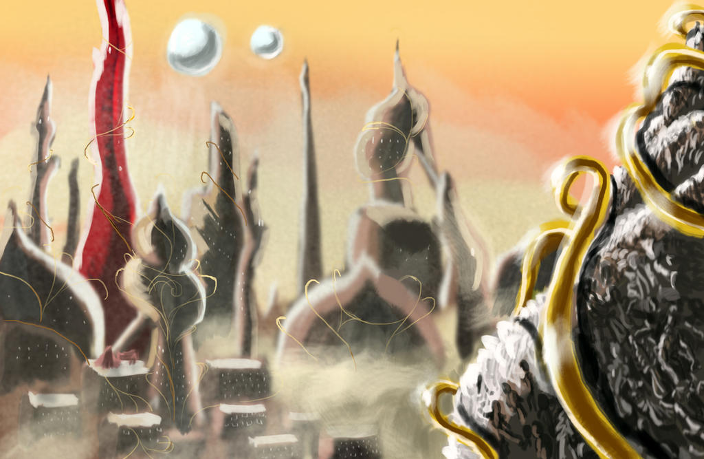
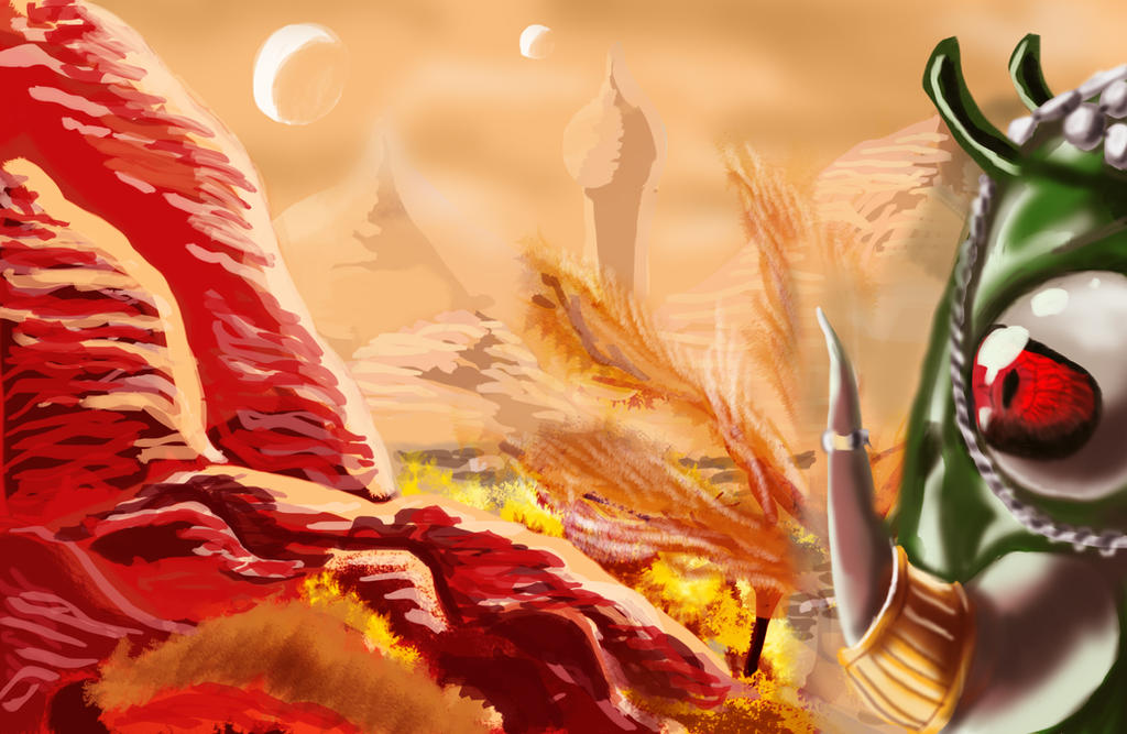
Some more environment stuff:
And some recent character stuff:
Any suggestions on moving forward?
-V
Yeah, I've gone to a lot of life drawing/painting sessions in my life (like I said, my background is in traditional portraiture) but it's never really translated to me being able to make up bodies from scratch. For reference, here's some of my traditional figures:
As you can see, I'm much better when I have something in front of me to work from. The same doesn't apply to working with photos and such, unfortunately, and I can't exactly get a model to pose for make in front of my computer.
Do you think anatomy books would help in a way that photos don't?