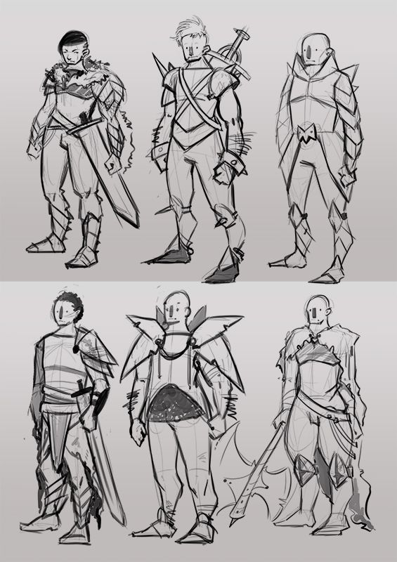
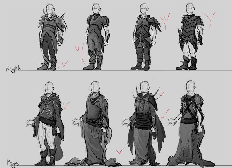
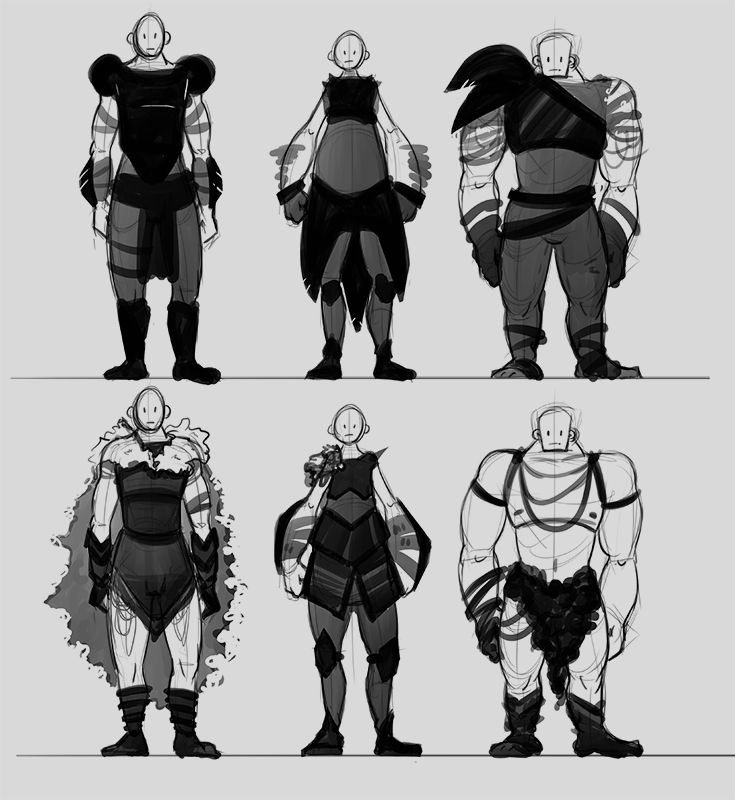
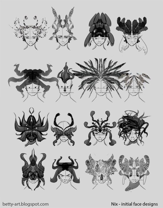
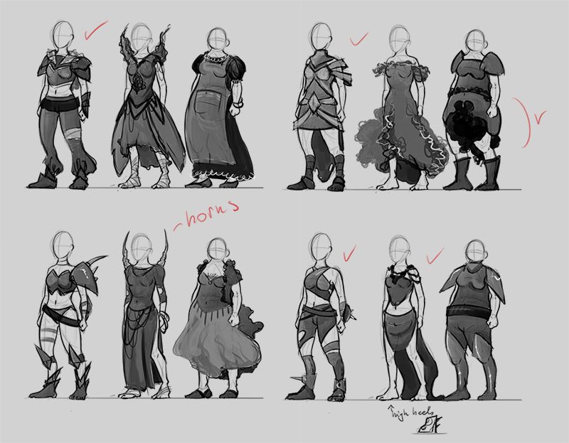
fantasy character concepts
Hi guys. I'm currently on the 3rd year of Digital Film, Games and Animation course at Leeds College of Art and working hard on dissertation. I'd love to hear your opinions about my initial designs for the practical element that will support written work. In short, it's all about identity and MMOs and what I'm trying to achive here is to create a bunch of character concepts that would appeal to the wide audience. It's fantasy themed, a bit of Final Fantasy and World of Warcraft.
Let me know what you think. Appreciate any feedback, crits, comments.
Let me know what you think. Appreciate any feedback, crits, comments.
Replies
Your finished illustrations look really flat (and I do apologize for being blunt with that).
A big contributing factor to this is that your light sources are moving around constantly. See below:
You should probably choose one key light source and make yourself stick to it. Draw it on a layer on top of the canvas if you have to-- but having no particular light source is doing your art a great disservice.
Some final notes, your anatomy is a little wonky. Make sure to use reference from time to time, and maybe do some figure drawing/gesture drawing. Your poses seem to be just a tad stiff and unbalanced sometimes, too, gesture drawing will help with that (<-- if you enjoy reading this can I please implore you to purchase [ame="http://www.amazon.com/Drawn-Life-Classes-Stanchfield-Lectures/dp/0240810961"]Drawn To Life: 20 Golden Years of Disney Masterclasses[/ame], it's full of golden information and is the edited version of the PDF).
I use Pixelovely, but if you can get yourself to IRL groups that's even better.
Your facial construction is also a little off-- the features seem to end up at the bottom of the face a lot.
Generally your ideal eyes will be one eye apart-- don't forget that perspective comes into play at a 4/3 angle, so the gap will be foreshortened.
Also, don't forget to leave your characters a chin! Your mouths are a little low right now. If you're okay with it, I can redline an alternative construction.
Misc links:
http://www.ctrlpaint.com/
http://androidarts.com/art_tut.htm
https://www.anatomy4sculptors.com/anatomy.php (Don't be mislead by the "4sculptors", this reference is incredibly handy! Make sure to check the "blockouts" and "secrets" tabs!)
Sorry if this is a bit much, but I like your designs and I'm looking forward to seeing you improve.
Keep up the good work!