criticize my digital paintings!
Hi Im new in the forum...
and i really want some critiques, sorry if i wrote something wrong...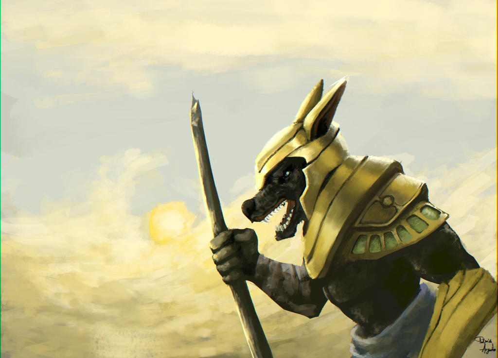
 [IMG]http://www.polycount.com/forum/<object width="450" height="589"><param na[/IMG]
and i really want some critiques, sorry if i wrote something wrong...
[IMG]http://www.polycount.com/forum/<object width="450" height="589"><param na[/IMG]
Replies
The concept for these paintings are interesting and I think they could be executed really well - there's some promising elements here and there so I'd suggest looking at the lighting and values to improve upon it.
For example in the first piece there's a fantastic opportunity for a backlit character. Looking at real life photos of the effects of back-lit objects from the sun should be really enlightening to study for practice.
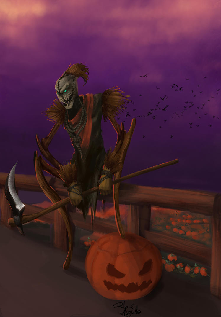
Regarding the Fiddlesticks piece, I'd look at the foundations in terms of having interesting lighting values (try looking at the painting in black and white), using hard and soft edges in places where you want to appropriately attract the eye, having some rhythm and variance in the piece such as the sky, ground, fence, pumpkin, etc, paying attention to the amount of detail such as having higher detail in areas you want to be 'noisy' such as possibly the face, the weapon, the pumpkin maybe?
I'm nit-picking out random areas in case you want to start at those but in general the piece has great potential which I think would be improved by studying the foundations such as lighting, values, composition, detail variance, colours, etc.
Keep it up and please continue to post up your progress!
Best regards,
Gavin
Thank You! it really helped Now i know what to search and learn Thank you!
look into how when the highlights are warm, the shadows are cool, and how different materials have different levels of value in them.
I do agree with studying your values more like Gavin says,
the pictures feel a bit flat, and that's normally down to incorrect values.
Add a layer of full 100% black over the top of your piece and then change the layer mode to saturation, it's a quick way of checking the black and white values in your piece, then you can change it back to colour by hiding the layer and trying to adjust anything that doesn't seem right.
Hope this is useful!
Here is a fan art i did for Video game high school Youtube series: