Understanding light and shadows...
polycounter lvl 5
Is it me or are the shadows here wrong.
It's a beautiful piece by FiguraArto.
Link
Somehow to me the face looks wrongly lit according to the rest of the body.. Of course I'm dumb so don't know what I am talking about so was hoping you guys might help me shed more light.(PUN!) :poly142:
EDIT: Sorry title isn't tagged as NSFW.. I just realised... I would change it if I could...
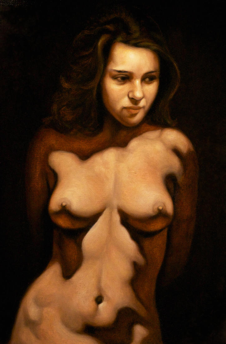
Replies
How strong a light source was used? Were there any reflectors for light to bounce off of?
My problem with the picture is not related to lighting but the face. The painting makes her look too man-ish. Especially with the shadows around her face, it looks like a beard at first.
I agree that the lighting on her face makes her more pleasant but the discontinuity between the shadows on the face and body are so drastic it pulls me out. It feels like bad photoshop where the head is a cutout.
Yes. The lighting beautifully gives shape to her anatomy but then is it worth pulling the viewer out of the image like that? Maybe I am just over analysing..
I realised the highlights are what were pulling me out more... Her body has a different specular quality than her face... Of course the face is oilier but is that natural?
I went through some of his/her other works and this feels perfect.
Hesed
Link
Yes.. I agree her chin is a bit too long here.. It could help in mistaking the shadows as beard...
It looks better with correct, or at least better lighting.
YES! YES! (I really did shout this out loud) The edited lighting looks perfect.
The artist seems to be influenced by the works of Carvaggio.
The dark shadows and strong highlights are prevalent in most of his pieces but the lighting feels uniform..
Over here too the lighting has been emphasised on the centre piece but the shadowing has been uniform..
Is it me or is the top half lit from the right and bottom from the front left? Because the shadowing from the breasts are different...
The self shadowing looks better here. I was wondering what was going on with the neck area.
What would cast that silhouette? The nose shadow also doesn't line up with the light source.
Exactly! If you look the top half seems to be lit from the right while the bottom seems to be lit from the left front..
Really most good looking styles essentially change the value ramp that lights objects, (cell shading, comic dramatic lighting) or simplify the forms being lit. Probably the most notable change would be on anime faces, but even there the key is visual consistency with light direction.