Need some new eyes before I finish this illustration

polycounter lvl 12
Hey guys been a while since I've posted
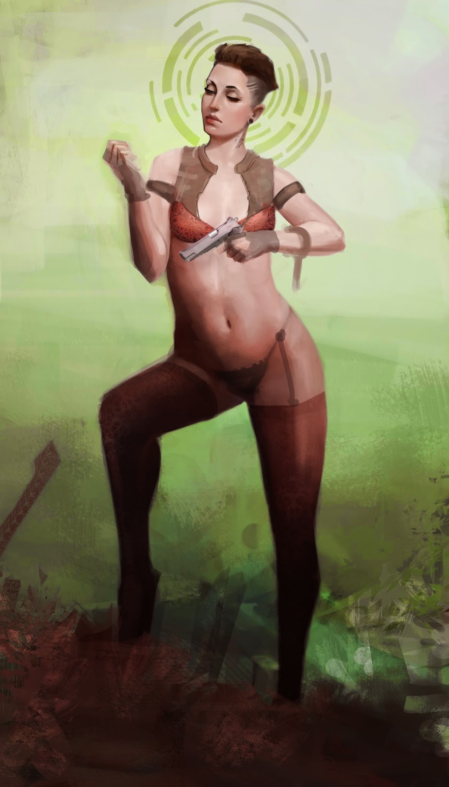
A peice needing some comments and critisms for the pose and figure etc. Wana finish this peice and add some strong character to separate it from the usual crowd somehow.
Still fairly newb to digital painting so any tips/techniques for rendering would be much appreciated.
and yes. she has broke her nail.
Replies
Also the part where her right arm, boob and body intersect is looking weird to me.
I fixed it to show you what I have in mind, as well as the waist proportions:
her bent leg feels far too short even when considering the rules of foreshortening. and i would recommend taking her "weight baring" leg and lining the heel up with the center of her clavicle.
i terms of extra story telling i would recommend adding more points of interest, though not necessarily as rendered as her upper torso needs to be. a 'victim' and something in the extreme foreground would help push the dynamism of this piece.
Thanks for the crit guys - heres a 2nd pass at it. The legs are bugging me abit but probs can get away with it. The last pass will just be fleshing the fg/bg
Gonna keep this outfit minimal , because quite frankly, lost all interest in this :O
Going back to the first version, the main thing that I would have personally done is bring the level of rendering of the arm up to the same level of the face so it looks consistent. The proportions don't bother me since it just looks slightly stylized because the arms appear a bit small due to her lower body being so full/thick.
The 2nd version has lost some of the aspects that made the first version pretty cool. I really liked the facial expression of the first version and feel the 2nd version looks a bit odd around the left leg like you've stated.
I do not quite understand why she is standing in the middle of the wilderness in her underwear and pantyhose tho. If anything, I would simply suggest to crop it into a horizontal cinematic shot (but that's maybe just a matter of personal taste, as a personally tend to prefer these kind of formats in general -I find them to read better on a computer screen)
May I ask you which actress/model you used as a reference, if any ? I am digging her strong, chiseled facial features in the first shot.
Gonna stick with this direction as far as colour/ arrangment goes. Dont know how im gonna crop it but i did add some width.
Will add more outfit stuffs.
Ok, the face is deffo a sticking point - idk why but i really do not like the original face. Although i am way too used to drawing 'ideal' faces so idk. well, i may change it last minute. But the new face does look too 'clean' i acknowledge that.
Tweaked the legs- gave her docs. And will work on the siloette. (will tweak the elbow too)
Ok next upload will be a decently rendered peice I swear. enough with these impressionist brush strokes ha.
Keep the crits coming , its my fuel to push this one to finish.
Pior- I didn't use a face ref - just a selfie pic for lighting reference (hence why the belly is so nicely rendered lol) then just repainted the face from imagination. note the 2nd face I used reference.
I tweaked the preggo belly , chiseled the face. then dashed some colour about.callin it done unless theres some major tweak neeeded.
I'd say you still have the same weird intersection between her boob arm and body that i've pointed in my first post. But if you really want to keep that, it's your choice !
Face is also great btw.
I'll try to break it down as best as I can:
- Why do the legs have so much less form definition than the rest of the body? Introduce some cold bounce-light and give them some definition.
- Foreshortening on the raised thigh is still very strange. Look at the curve of the top of the stocking in particular.
- Not sure whether or not the plan is to go for something more finished for the rest of the piece (i.e. background and dead dude), but they feel weirdly rushed. I know sometimes we get caught up with our focal points and want to get the piece out the door, but that thing she shot should feel like its equally textured to her and similarly rendered. The background doesn't need to be good, it can be rough, but should look like something. It looks like a rough amalgamation of custom brushes atm.
- Warm vs. Cold is one of the most important aspects of colour theory. There are pieces that can get away with pure warm palettes, but you're wavering between. I would suggest either putting a warming photo filter over this guy to push it to the pure-warm sort of palette, or colour balancing blues/cyans into your shadows and balancing your palette.
Hope you don't mind but I did a really quick PO (not perfect but, maybe helpful) You gotta fix her left leg IMO the foreshortening is a bit off, by turning her hip out slightly she has a more solid base. Other than that I have done some noodling pushing around the forms of her shoulders and brought in her waist a little.
Also wanted to bring some attention to the dead thing, because I didn't see it all until I had the image in PS and was zoomed right in.
Also, her knives and tights as they are are very attractive and I hope the loss of them in your paintover was just a side result of having to paint over them. :P
If anything were to change, SSquir33, I'd take a second look at stevston's paintover, where the arm and the body connect. You never got around to fixing that, and it's a real shame.
Overall, though, a nice piece, and I'll be looking forward to what you put up next!