[Portfolio feedback] Mario Manzanares

polycounter lvl 5
Hi everyone!
I recently became a Fine Arts graduate and now Im looking for a job, but before apply for it I wanted to share my portfolio with all of you, because I highly appreciate your feedback and this community.
I'm looking for comments and critics. Feel free to tell me what you think and don't hesitate on saying if something is wrong or if it could be done better. I know I don't have a lot of work done or very much experience, but I really want to be part of the game industry and you can help me with your feedback. Thank you!
Replies
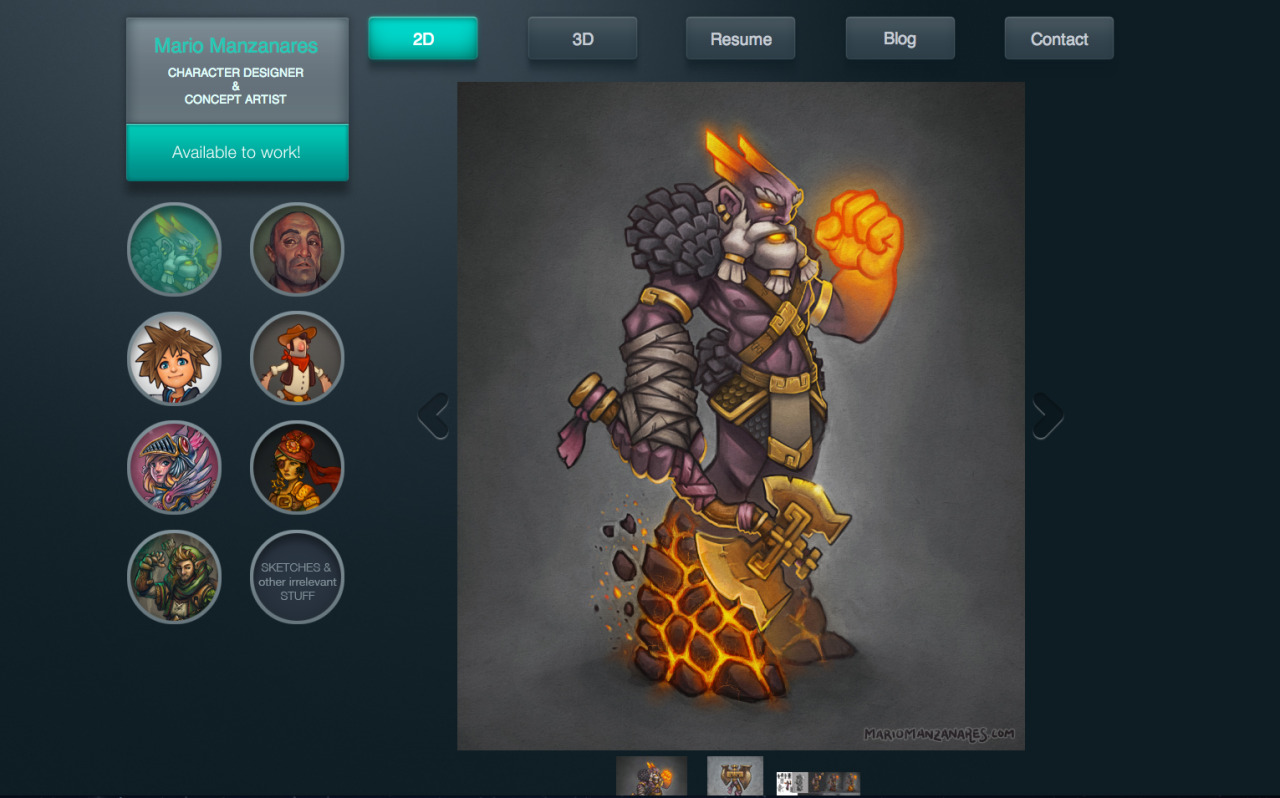
I think breaking navigation in two parts is not good idea. I mean that main navigation is on top and pictures left. And pictures are circles and navigation buttons boxes. Did not first realize that pictures in left change if you use top navigation.
"Available to work" looks like button, but it i not. Confuses navigation. I think it useless anyway. If you send your portfolio to employer they probably know that you are available to work.
Your name fades away. Description under it look bigger and stronger, should be other way round.
Spacing between elements: There is less space between "name box" and "2D" button than between other navigation buttons. Adds more confusion to navigation. And spacing with circles and thumbnails and arrows. Page looks too wide and too cramped same time.
Picture fading effects suck.
Your works speak for them self, so maybe you should consider something almost as simple as this site for example: annaautio.com
Personally, I'd just line up all your work in some kind of grid like Pinterest. Of course you should organize them by project and all.
Page looks upper class visually, works are nice
dont write irrelevant stuff, let the viewer decide, and if you think its not worth showing then dont show it
kHellstr: "Available to work" is going to be a button (contact or email) definitely. I'm also going to fix the space between objects. Thanks for the portfolio reference.
PyrZern: Yeah, now I see maybe it's too much. Anyway, I needed to organize myself. But I'll try to make it simpler.
Inkalicious: Sure, I'm trying to get rid of that damn space at the bottom, but it's getting hard because of the template.
alphajayel: Thanks, dude. It's and honor coming from you, I really love your work.
Shrike: Thanks for the kind words. I'm going to remove "irrelevant stuff" from the button since I was trying to do it like a joke but it's not working that way :S
My only other problem is that we cant save images from your website. I feel like this is very important for a potential employer to be able to do.
Solid work though, I love it!
I see thumbnails galleries as old an UI we should abandon in most cases. They were used because pages like "Big picture" have been technologically too challenging. It would had took too long to load with slow connections of past. Also memory was spare, many big pictures in one page could have lead to memory problems.
This is not your page only, I just needed to write this rant somewhere.
Memory: Thanks! I'm doing the website using Adobe Muse, and I don't know how to enable saving images. Sadly, it has some kind of protection by default. But anyways, you can always take an screenshot, I do it all the time. Thanks anyways for the advise.
kHellstr: Thanks for sharing your thoughts! Really, I think what you are saying is very interesting and I will have it on my mind next time I design something for the internet (which isn't very often). Design is constantly changing and we should stay very open-eyed!