[UDK] Hei Zhen Zhu - Combat Information Center - (Noob Challenge 6)
Hello everyone !
I started the monthly noob challenge 06 and could not finish in time. But I decided I would finish the scene at my own pace, and so I kept working on it here and there.
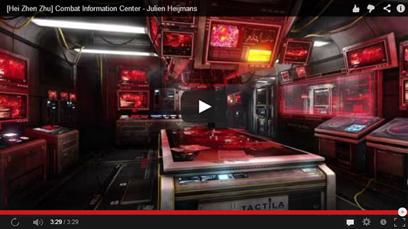
I made a video to showcase it, and some screenshots here. It is not final, I already spotted some mistakes and plan to make another render and showcase video. So all crits and comments are very welcome !
Video (Please, don't hurt my feeling and watch in 1080p !):

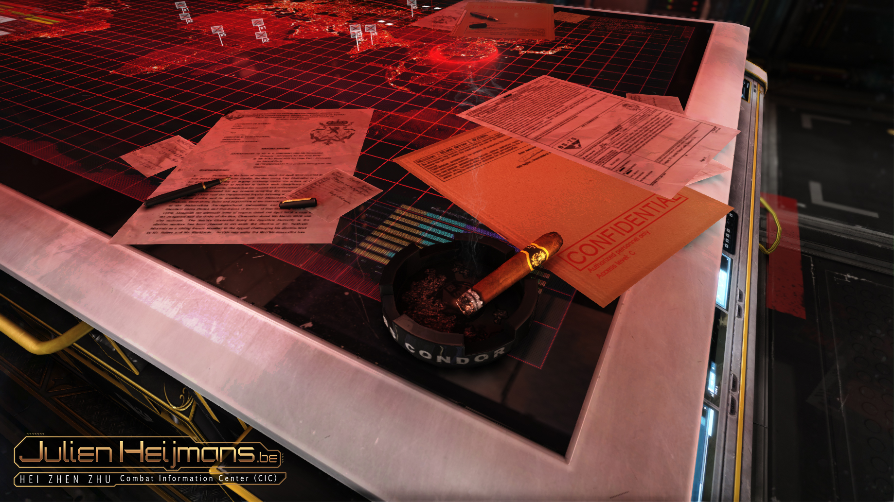
Screenshots (To watch in HD: Right Click - Open Image in a new tab):


Everything has been rendered/post-processed/cut in udk, including the intro sequence.
Reference: http://gryphart.com/files-gryphartcom/Gryphart_Images/Portfolio/Boat_CIC_Room_final_rsfrwb.jpg
By Eric 'Gryphart' Gagnon - http://gryphart.com/
Please share any ideas you have about the scene, the video, or anything else.
(I think the video is too long/slow, at least for recruiters, I should build a faster and shorter version)
Nb:
-I noticed the mistake in the "Breakdown" word at the end of the video, I will fix this in the next version I will make soon.
-The said breakdown will be coming in the next weeks. Rendering all the highpoly, video editing, and everything will take some time.
-My personal website, that url we can see in the video, is an old one, a new one is currently WIP.
I started the monthly noob challenge 06 and could not finish in time. But I decided I would finish the scene at my own pace, and so I kept working on it here and there.
I made a video to showcase it, and some screenshots here. It is not final, I already spotted some mistakes and plan to make another render and showcase video. So all crits and comments are very welcome !
Video (Please, don't hurt my feeling and watch in 1080p !):

Screenshots (To watch in HD: Right Click - Open Image in a new tab):


Everything has been rendered/post-processed/cut in udk, including the intro sequence.
Reference: http://gryphart.com/files-gryphartcom/Gryphart_Images/Portfolio/Boat_CIC_Room_final_rsfrwb.jpg
By Eric 'Gryphart' Gagnon - http://gryphart.com/
Please share any ideas you have about the scene, the video, or anything else.
(I think the video is too long/slow, at least for recruiters, I should build a faster and shorter version)
Nb:
-I noticed the mistake in the "Breakdown" word at the end of the video, I will fix this in the next version I will make soon.
-The said breakdown will be coming in the next weeks. Rendering all the highpoly, video editing, and everything will take some time.
-My personal website, that url we can see in the video, is an old one, a new one is currently WIP.
Replies
Fix thos points you mentioned and itll be superb when thats done..GJ!
Super excited to see that breakdown!
I only have two comments on it :
- You have a lot of very bright values at the same level with the same dominant red and the white bars. It looks cool and futuristic, but it's also a bit hard on the eye. The concept uses a lot of contrast, less screens, less pure white and add a nice light orange tint at the back so that the eye has some sort of main direction. There's no real direction or focus in your main image. Screens are pretty much the same value and color everywhere.
You could, for example, reduce the brightness of all the side screens to put the emphasis on the main table and screens. You could also add some sort of fog at the back corridor to give a better sense of depth. Reducing the white lights may be nice too.
- The screens are a bit "static", especially the main table. That's quite a main point of the scene and the concept seems to play with that. Could be cool to create some sort of great animation, it would render well in the video and increase the focus in the scene.
But this is just nitpicking, it looks really good already. :thumbup:
That map looks so real i cant to touch it
Very great progress and nice video.
The image - description and naming is very distracting - i would put them in a bit more decent order..
Overall very nice - the red is a bit too intense - but maybe its just me.
Great animations too
I'm also noticing a little more balance between warm (screens) and cool (metal) in the concept. This could probably be adjusted by tweaking the metal shader/textures, but I also think some of this balance needs to come through in the lighting. Maybe consider something that could motivate a cool light coming from behind the camera.
I'd also say that the text in your presentation is a bit distracting from the scene itself.
Great work with all the hard surfaces, everything looks clean and executed well at a technical level. Just needs that last 10% of polish.
nice detail everywhere
your presentation on the image is over the top tho, your logo is way too big and could have better proportions, also I would leave the deus ex logo thing out, youre inspired by thousands of things, but why write it on your image.
@Shrike:
You are totally right, like the others... I thought the logo looked cool after making it, so I placed it everywhere... EVERYWHERE ! Hehe, too much, I will fix this and also remove the Deus Ex logo when I will make the screens of the updated version of the scene !
@jStins:
Thank you for the compliments ! It is really nice to hear after spending so much time on this scene.
For the saturation, I will think about it, the think is: WHen you lower saturation of the red, it turns pink, and that is really ugly. Maybe lower the emissive multiplier !
@Alphavader: Thank you
@-Em'-: Merciii !
@Madwish: You are right. The thing is, the lighting of the concept art is not really correct, some stuff are really bright(white) with nearly no light up close, and some part are dark whith the light not too far away, that is something easy to do for composition in photoshop, but harder in 3d. I will play with the lights a bit, try what you suggested and see where it will leads me. Thank you for your really interesting comment !
@St.Sabath ,TheRealFroman, SaferDan, mospheric: Thank you very much for your comments, that is really nice to read !
With the renders to start with, I think it's a little too dark and it's only using predominantly one colour red for the most part and I don't think there's enough contrast in terms of colour. What I mean is I think you have a lot of the white contrasting with the red, but it doesn't really make it stand out, I think it'd look better with a yellow colour to make them pop out more. Also, if you use some post processing to add some ambient colour to the scene too it'd look awesome, like a little tinge of blue or yellow or green and see what looks good.
Another thing too is that it's a bit too dark in terms of the lighting in some areas, there's some parts where it's complete black and I'm not digging it, I think if you raise the ambient a little bit it'd be good. I think the metallic objects in the scene would benefit from ramping up the glossiness and chucking an environment map too to help out with faking the reflections and really get that material definition down.
I'll do a paintover to point out what I mean exactly, but sorry for the long list of complaints man lol! It looks fantastic already though, I think it just needs that little push to make it jizz worthy, KEEP GOING MAN!!!
Get rid of the red on everything and change it to differant colours.... blue, yellow, green etc. You have 20 areas that are all the same lighting wise which is really ruining this piece.
+ Be careful with the glow on the screens it looks like you have just slapped an omni light over the top of some of them rather than them actually glowing.
-too much red
-no focal point in main shot, eyes get drawn around your brightest monitor or turning around with no place to rest.
-this is due to your lighting which is rendering the picture quite flat/monotonous
-some metal surfaces look as dry wood like the outer walls
-cables produce a lot of noise and don't really help in creating a flow in the picture
-very noisy texturing and detail in your objects. Like yellow contour lines everywhere, aluminum that has a lot of wear and tear where it could be a place to rest in between monitors, etc.
Overall for me it's not bad at all, it just lacks a bit of direction on the mainshot, to make it obvious win, assets on their own are not bad at all.