UI Layout Feedback
Hey guys, don't know how much of this kind of thing gets posted on here but I'm mocking up a quick UI design for a little game idea me and a mate came up with, mainly for fun but also to diversify my portfolio a bit. I could use a little feedback on the layout at this stage (not so concerened about graphics yet) as it's pretty uncharted territory for me:
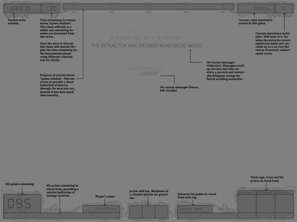
It follows a pretty tried-and-tested format so shouldn't be hard to grasp what everything is if you play tower defence games, DoW: Last Stand and the like. I tried to condense the layout as much as possible whilst keeping the more important things large and giving a left biased to things that are likely to be needed more urgently - something I read somewhere to do with how we read etc. Anyway, any hints, suggestions or nagging feelings of discomfort with it would be great to hear. Also recommendations for tutorials or literature on UI design would be great as this is all pretty new to me.
Cheers!
NB: Navigation and minimap are handled elsewhere so don't worry about their omission.
Replies
Thanks!
You have a big cage there for the HP count, why would you do a seperate bar if you could fit that inside the cage itself ? Also its just too big.
Player name is simply unneeded, but can be used if you going for a symetric thing afterall.
Try leaving the bottom as clean as possible and fit as much around the 3 skill frames as you can, leaving more free space at the bottom. You could potentially shrink the exp and multiplier frame and fit both extractor values under it, which makes sense contextually somehow, and giving free space.
There are many possibilities
looks stylish tho, like the clean lines. Your quadrotor from your portfolio is really nice btw.
Cheers!
The illustration-y bits are still just draft for now, just wanted to get your opinions on the revised layout.
Cheers!