Yet another handpainted weapon.
interpolator
Hey!
Felt like doing something quick and dirty ( or so I thought ) so I figured I'd pick a neat concept and try to knock out one of the WoW-style fancy weapons!
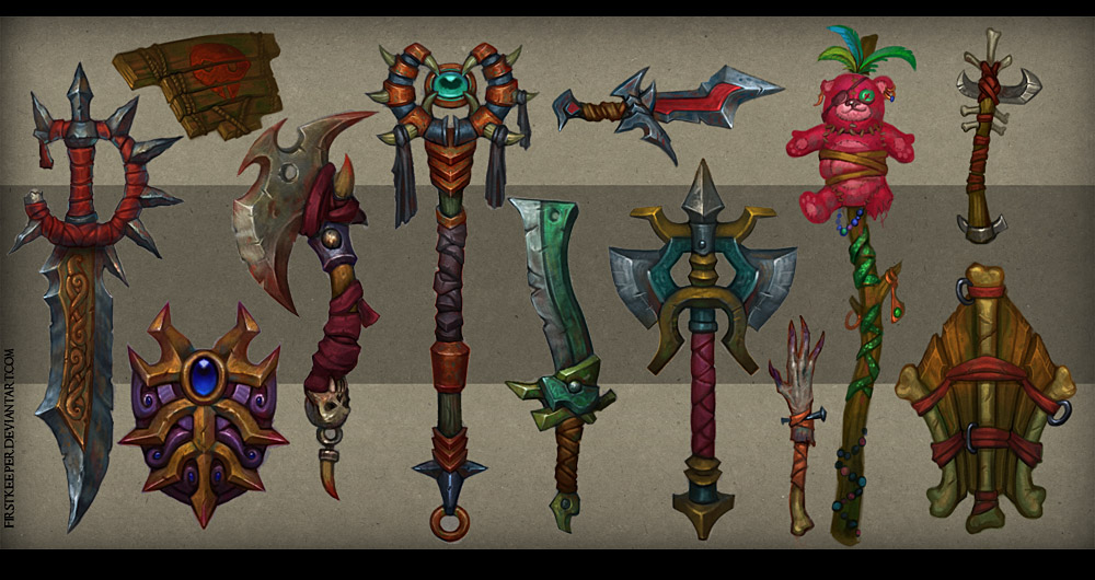
For my attempt I went ahead with a concept by the lovely firstkeeper, in the future I'll ofcourse be making my own concepts after a bit of training.
I've come to the point where I could keep on completing it but I'm just not sure that I'm on the right track. I have strayed quite a bit from the concept and I've redone the blade a bunch of times trying to go balls to the wall with the contrast but it seems I lack the balls to up the contrasts when it comes to both brightness and hue.
Am I on the right track? Should I keep on going?
A pair of unbiased fresh eyes would help alot. Here goes!
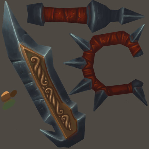
I chose the concept to the far left : http://fc01.deviantart.net/fs70/f/2012/039/8/1/weapons_concept_04_by_firstkeeper-d4p3f05.jpg
Here it is in-game complete with smoothing errors and bad composition! Currently sitting at 324 tris and a 1024x1024 texture downsized to 256x256.
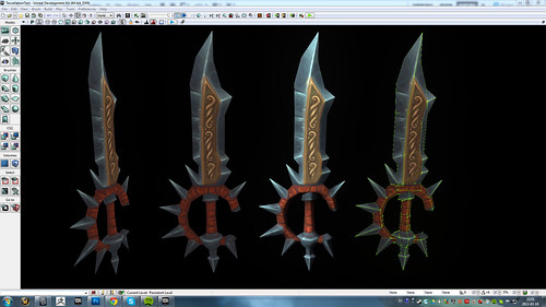
WoWSword_256 by Jakpe, on Flickr
Here's the 1024x1024 texture sheet :
WoWSword_Color by Jakpe, on Flickr
Felt like doing something quick and dirty ( or so I thought ) so I figured I'd pick a neat concept and try to knock out one of the WoW-style fancy weapons!
For my attempt I went ahead with a concept by the lovely firstkeeper, in the future I'll ofcourse be making my own concepts after a bit of training.
I've come to the point where I could keep on completing it but I'm just not sure that I'm on the right track. I have strayed quite a bit from the concept and I've redone the blade a bunch of times trying to go balls to the wall with the contrast but it seems I lack the balls to up the contrasts when it comes to both brightness and hue.
Am I on the right track? Should I keep on going?
A pair of unbiased fresh eyes would help alot. Here goes!
I chose the concept to the far left : http://fc01.deviantart.net/fs70/f/2012/039/8/1/weapons_concept_04_by_firstkeeper-d4p3f05.jpg
Here it is in-game complete with smoothing errors and bad composition! Currently sitting at 324 tris and a 1024x1024 texture downsized to 256x256.
WoWSword_256 by Jakpe, on Flickr
Here's the 1024x1024 texture sheet :
WoWSword_Color by Jakpe, on Flickr
Replies
Hey man, the weapon is looking pretty solid so far, but I think there are some things you can do to push it farther, shown in the paintover above.
I noticed you aren't really defining your planes by value, you're mostly just dividing them by an edge highlight, which isn't really adding a lot of depth to the weapon. So the main thing that I did throughout the weapon was push the lights and the dark's farther to make the weapon a little bit more contrasted. In the concept, there are also some orange hues in the blade, so I crappily added some orange into the blade as well, however I just did it with a simple color overlay layer, it would look better if you actually painted some of the color in. I also darkened the transition from the blade to the handle, and made the shadow a kindof dark saturated red.
Hope this helps you out in some way
I do think the UV layout could be more efficient though.
@St.Sabath : The UDK render is using a 256x256 atm. You're probably right. I had a hard time fitting the handle when I tried to tilt the blade to get more space. If I used 3dcoat instead I could probably get a much more efficient UVmap but I'm just using photoshop at the moment.
@gibson543 : Awesome paintover! I see what you mean. I think my problem initially was that I started out very bright and worked my way down without really clearing the canvas, instead of blocking out the values on the planes anew.
Getting the blade to read as reflective is really hard work with only a diffuse. I think it's getting along preeeetty well though.
@LuisArmstrong : Thanks! Yeah..
@amile duan : Thanks!
Ok, I got a wave of confidence for all the replies but I'm afraid I may have overdone it. You'll be the judge!
Unlit comparison of the New and Old :
WoWSword_Progress by Jakpe, on Flickr
New 1024x1024 texture sheet :
WoWSword_Color by Jakpe, on Flickr
I'm happy with how it turned out and the amount that I've learned is massive!
At this stage I feel like I need to make another weapon to try out what I've learned and do it right from the start this time.
Most of the recent work was put into the handle, screwed myself over bigtime on the bottom of the handle during modelling. The shape is off and it's hard to remedy at this stage. Live and learn!
Added the wavyness from the concept to the spikes which helps alot with the overall feel. Trying to get a nice gradient but I dunno.. Still happy with it! Heh...heh..ehh..
WoWSword_Progress2 by Jakpe, on Flickr
AAaand the 1024x1024 texture
WoWSword_Color by Jakpe, on Flickr
Here's a fancy 3d-thingy aswell ( unable to embed it
http://p3d.in/Bt28k/shadeless
Thanks for all the lovely comments during this short and efficient topic!